Blog Post 6- Disease

Disease has been a constant scourge since humans have existed. As cities began to expand during the Industrial Revolution, the increasing population became a playground for disease. This was due in large part to dirty/contaminated water, overpopulation, and lack of proper sanitation.

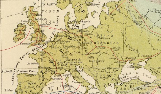
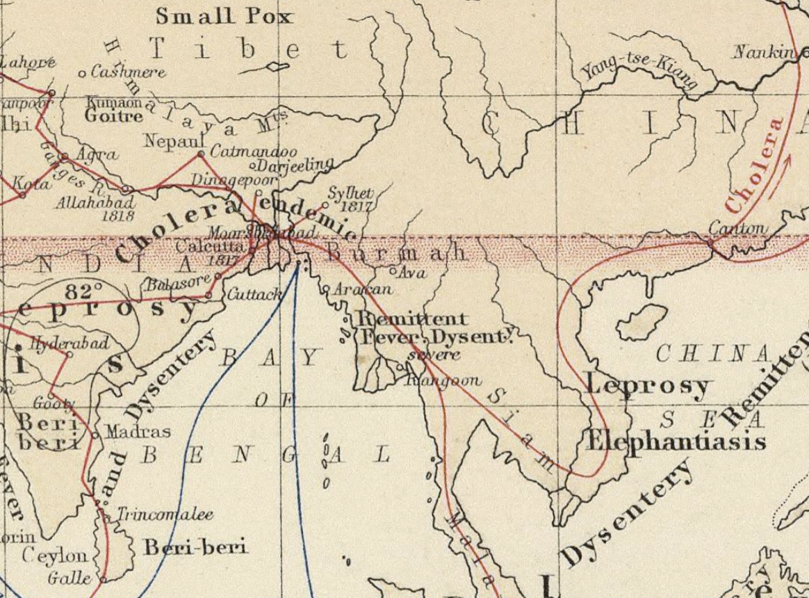
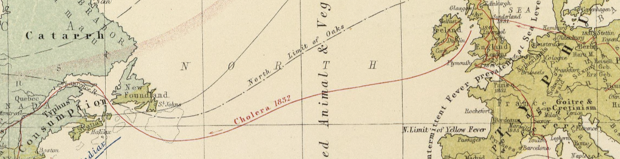
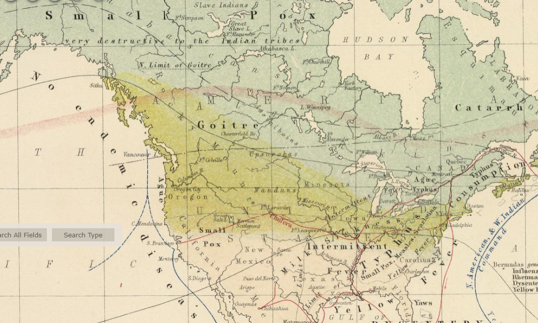
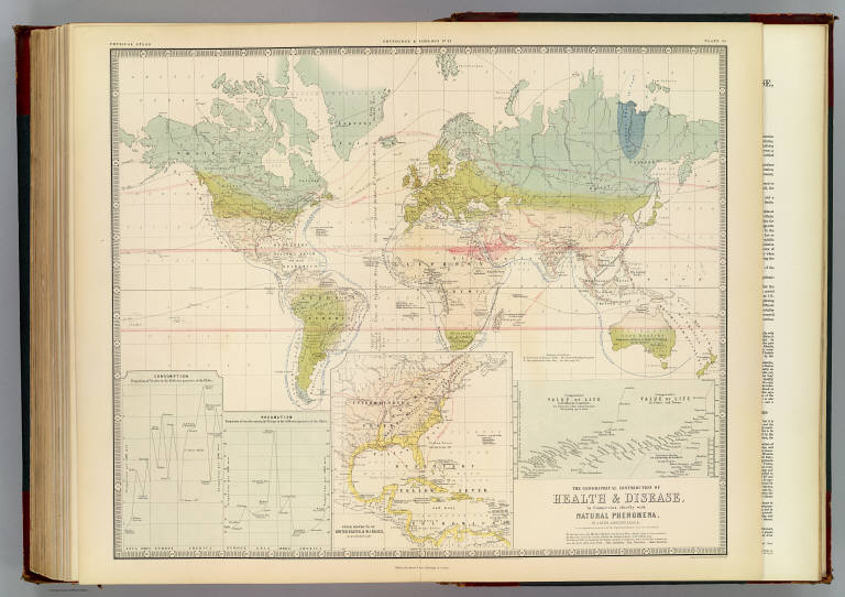
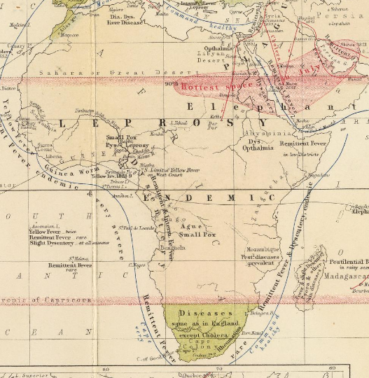
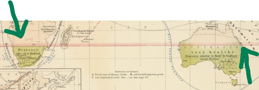
The first map I will break down is the map by Alexander Johnston titled “Geographical Distribution of Health and Disease in Connection Chiefly with Natural Phenomena.

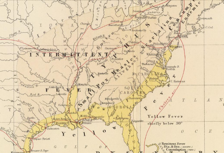
First, the map is extremely detailed in mapping out the path of disease and its effects on populations. Second, the map is detailed in showing how disease spread during the 19th century and Industrial Revolution. At a time during poor safety and hygiene standards it was easy for sailors to fall ill and carry their illness with them to the areas where they were going to trade/sell their goods. However, the map shows that different diseases would affect different area for example; yellow fever and dysentery would effect the southern areas where there is a lot of intense heat and humidity. Cholera would begin in major cities/shipping points and be carried by shipping to other areas by infected people where it would travel through land routes. A final point of note about the map is that it provides statistics and stats on deaths from disease transmissions, showing just how devastating disease could be in the past.

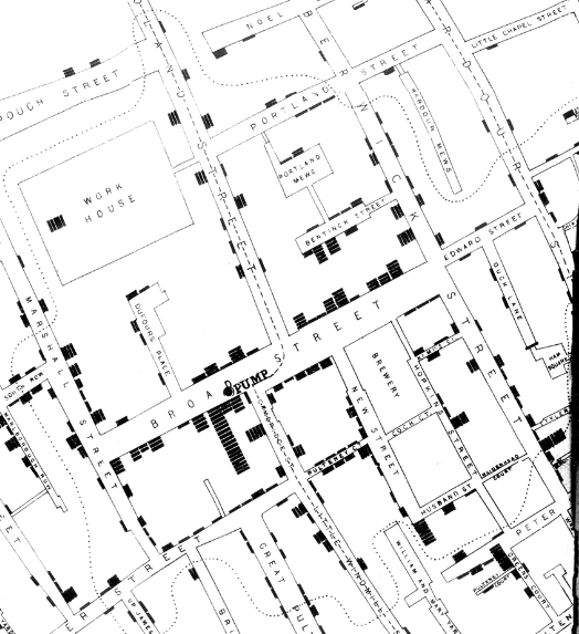
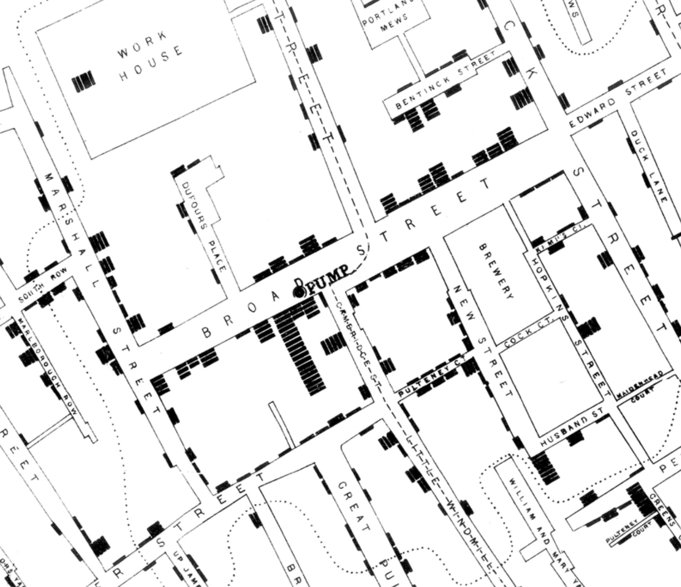
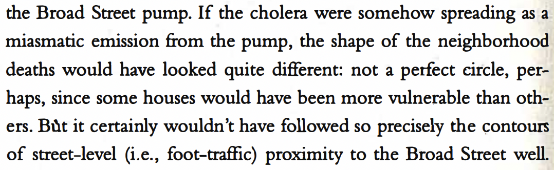
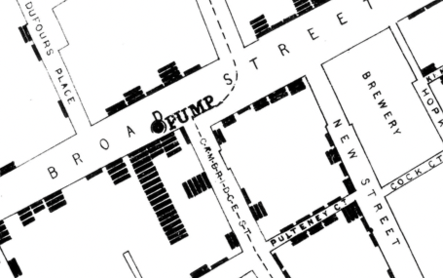
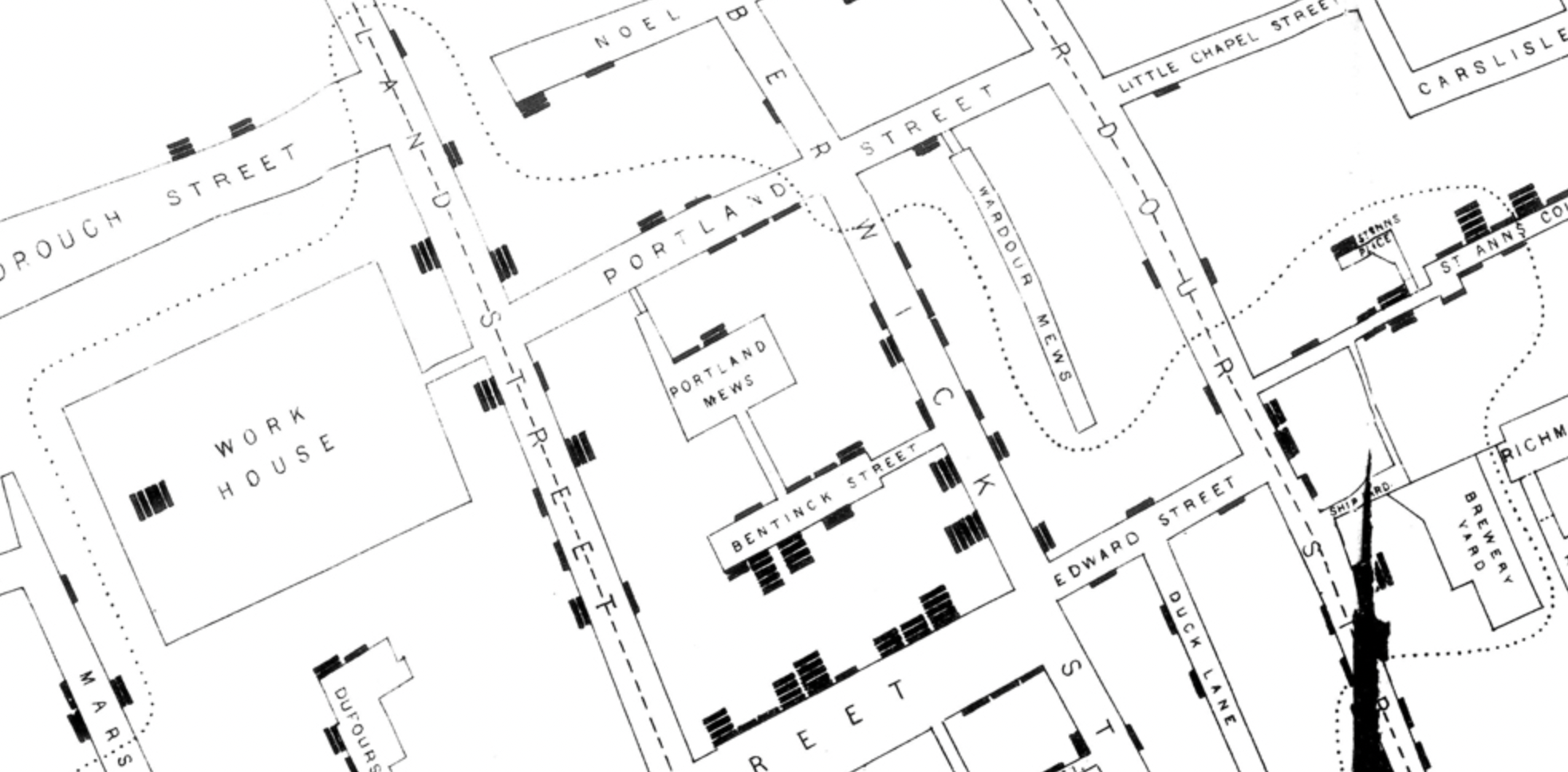
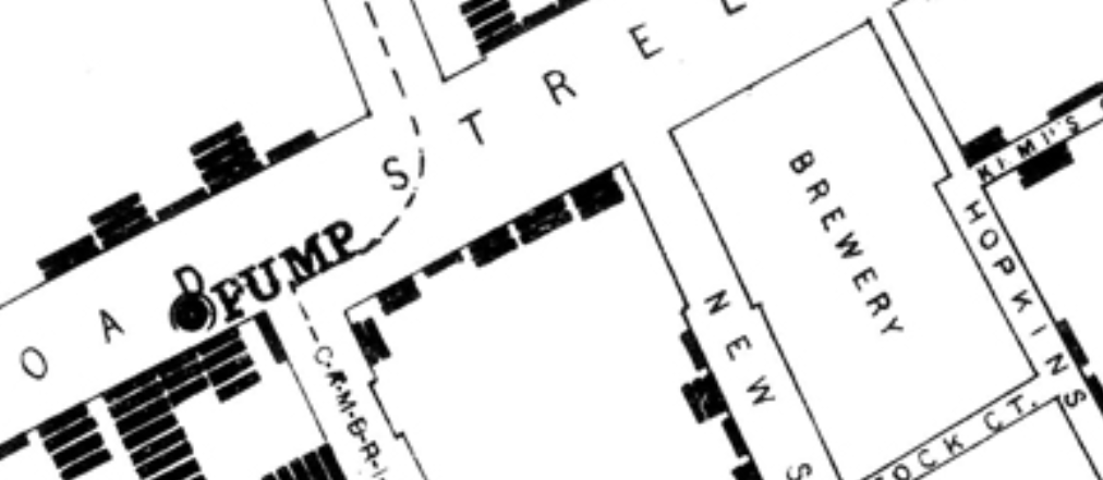
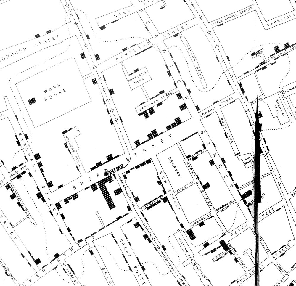
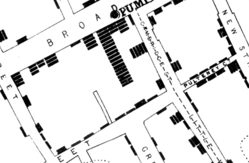
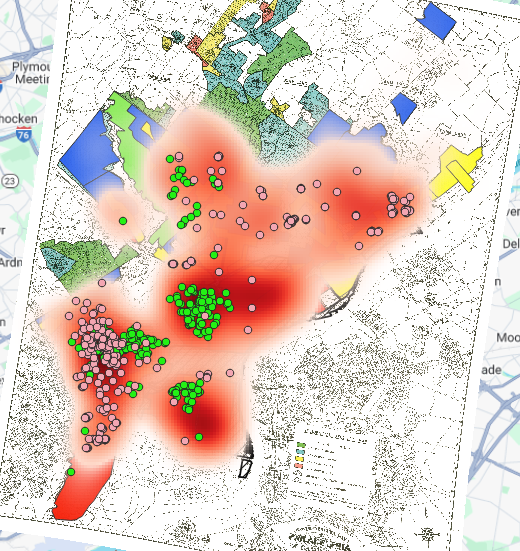
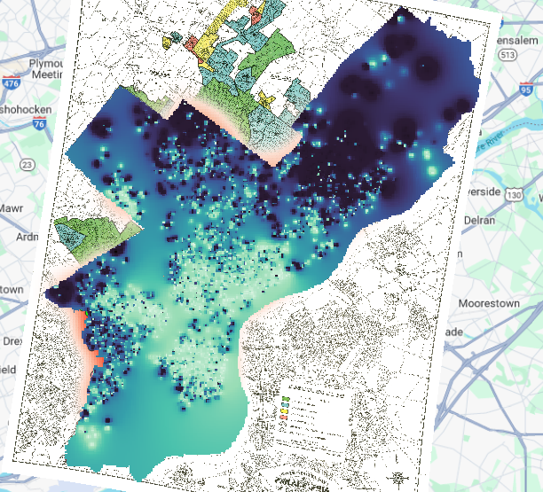
I will include in this section Steve Johnson’s “Ghost Map” and John Snow’s Cholera Map due to their overlap on the topic. As London’s population continued to increases during the 19th century a common scourge was cholera- a disease that spreads by dirty water. This disease would kill thousand during periods of outbreaks throughout London and large cities during the 19th century. At first, no one knew how or where this disease spread or infected other people, the prevailing thought was this “dirty-air/miasma theory of disease spread. That dirty air or rotting organic matter was the reason for why disease spread thought cities. It wasn’t until John Snow did extensive research into why cholera spread around London, his research began in West London. The research Snow found is detailed in the above map, Snow found that cholera was active in areas near water pumps. By taking this data, Snow found that Cholera transmits by contaminated water. Thus, his efforts increased hygiene measures to prevent people from falling ill and dying from the scourge of cholera.

Isabel Blackford Week 8 Blog Post

The correlation between a single source and the spread of disease is a well documented phenomenon in the field of epidemiology especially when the spread is contained to a common area. This was very much the case in the cholera epidemic in 1850s London, where a doctor named John Snow was struggling to plead his case that the disease cholera was spread through water contaminated by sewage (Tuthill, 2003). It was not until Snow received testimony from a woman named Sarah Lewis who’s infant daughter contracted cholera from a pump outside of the Broad Street Pump where Snow had already determined as a source of cholera, that Snow was able to find the root cause of Cholera in the Broad Street Pump that had already affected so many (Tuthill, 2003). This is where one of the largest cholera outbreaks of the time was able to be traced to and this was detailed in the map below which also shows a couple of important details that made is possible to pinpoint the cause of the outbreak.

This not only shows the location of the Broad Street Pump but also highlights a brewery and a workhouse, both of which had no cholera infections that stemmed from either place because they each had their own pump within the areas which protected people from the dangers of the Broad Street Pump (Tuthill, 2003). However, the true killer of the cholera infection was the lack of sanitation present in cities during the 1800s at the high of a population boom due to the industrial revolution (Johnson). Human feces and corpses of all kinds littered the streets of London due to lack of a proper management of waste to serve the public that not only got rid of things like that while also keeping water clean (Johnson 2-3).

At the same time around the world there were other thinkers that were working on similar epidemiological finds to track the route of disease around worldwide. In comparison to John Snow’s method of tracking down the root source of an infection in a particular area, thinkers like Alexander Johnston in Edinburgh in a way that is more large picture. In Johnston’s depictions of the spread of disease it is seen as a linear storm moving from one area to the next, stopping in large cities to infect those with a disease like cholera and others being more stagnant in one geological area.

References:

Johnson, S. (2007). The ghost map. Riverhead Books.

Tuthill, K. (2003, November). John Snow and the Broad Street Pump: On the trail of an epidemic. UCLA Department of Epidemiology: Fielding School of Public Health. https://www.ph.ucla.edu/epi/snow/snowcricketarticle.html

Blog Post 8

In a post-pandemic world, we know understand, and can visualize the rapid spread of disease on a global scale. However, in previous centuries, the mapping of disease and its movement was a much more important practice.

To map and illustrate where certain diseases originated or resided, was crucial information to the public on a number of levels. Maps have been not only crucial in showing where disease is geographically but pinpointing the sources of disease exactly. John Snow’s Cholera map shows where people had contracted and died of cholera in relation to their distance from water pumps during a cholera outbreak in London. Snow noticed that most of the deaths circulated around the Broad Street pump and ultimately indicated cholera was a waterborne or water-spread disease.

Snow, 1855

Johnston’s map showing the distribution of disease especially caught my eye because of its intricacy. Johnston uses lines and arrows to show the movement of disease from country to country detailing the mobility of certain diseases like leprosy, cholera, and typhoid. It’s a map that really shows the interconnectedness of the 19th century. Maps likes these could not only be used to show the origins of disease or the spread but to differentiate groups of people with certain disease. This plays back into our research of how maps can tend to separate people.

Johnston, 1856

I had never really considered the mapping of disease to be one of the uses for maps but just seeing it this week, it’s understandable how useful maps like these could have been in the 17th, 18th, and 19th centuries began to connect the world and allow for the circulation of foreign diseases.

Emily Gaddy: Student Post 6: The Industrial Revolution, Globalization, and Disease

With Industrialization came the invention of new urban centers, as well as technological advances. The Industrial Revolution completely changed the entire world stage- first by increasing globalization and fostering new connections or colonizations of countries for resources, and also leaving a large gap between the emergent, modern generation and the countries/peoples let behind in the pre-industrial age.

The cities emerging in the Industrial Revolution are a prime example of this. The cities and their inhabitants were desperate to fulfill their duties as examples of modernization whilst operating on systems and infrastructures from eras past. These systems and technologies past were sometimes mixed haphazardly with new inventions without any idea how to meld the differing times. An example of this is the water closets installed in the 19th century, which piled on more contaminated water to London neighborhoods, which were already overwhelmed with overflowing sewers and cesspools from Elizabethan London.

Steven Johnson, The Ghost Map.

Another issue with new cities within the Industrial Revolution was the emergence of the new middle class. Victorians held strict social castes, and the emergence of the middle class meant new areas of cities popped up. Effective, Victorian city-planning needed to not only account for public infrastructure, but also segregation of monetary classes:

Steven Johnson, The Ghost Map.

It is ironic that the middle class, themselves an invention of the Industrial Revolution, were saved from industrial ideas. The London government of elites was still of the belief that poor breeding caused disease:

Steven Johnson, The Ghost Map.

However, the epidemiologist, John Snow, was able to find the fallacy within the government’s logic. Utilizing the local knowledge of Henry Whitehead, John Snow was able to combine concepts of how urbanites moved, as well as mathematical equations, to determine how Cholera was spread and where it spread. Snow determined the exact location of the contaminated water pump, as well as the movement of the people who had come into contact with it:

Steven Johnson, The Ghost Map.

Snow’s map, showing the contaminated pump. The black lines represent the deaths surrounding the pump.

Another interesting thing within Snow’s map is the tracking of the movement of the people within the neighborhood:

Snow’s map, the lines represent people moving.

Snow’s map was a posthumous success; other map-makers started utilizing the new techniques demonstrated by Snow to demonstrate the movement of people and the disease carried by them, unseen.

The map from Alexander Johnston is more widespread, showing disease on a global scale. This map is indicative of the globalization and new connections formed from the Industrial Revolution. It mirrors Snow’s map in that it not only shows the locations where disease is common, but also the movement of people on the globe:

Alexander Johnston, “Geographical Distribution of Health and Disease in Connection Chiefly with Natural Phenomenon,” 1856.

The Industrial Revolution is widely thought of as a period of rapid modernization, but the people living in the era and their struggles with modernity are often ignored. Liberalism and new technologies always have to contend, find a balance, or build upon what is already there- the poor often bear the brunt of fighting for innovating. Their attempts at modernity, however, is never achieved without complaints or setbacks, cholera being a shitty example of one.

Feb. 26 Blog Evan Murphy

The first chapter of The Ghost Map discusses the presence of recycling within cultures throughout the history of the world and focuses on the urban environment. Bone-pickers foraged through human waste looking for anything that could make them a buck. The quote below claims that the homeless haunt postindustrial cities which I feel denies the issues that leave many homeless especially in the US, but also sites a change in the resourcefulness of the homeless. I think that this is poorly informed. For a few years I had a great interest in abandoned buildings and would spend more time than was good for me in them. Many of these buildings were too large to be demolish able easily or too problematic to be worth it to fix. However, many of them were full of scrap metal, in the Midwest I saw people consistently not salvaging this metal, probably due to the fact that it is unsustainable year round in the Midwest due to harsh winters and the homeless are not interested in a one time payday for the work that scrapping metal is. However, in the South, specifically New Orleans I saw people consistently going through abandoned buildings scrapping metal as it was possible for them to do it year round. This also may have something to do with the large quantity of abandoned buildings in New Orleans due to the migration out of the city after Hurricane Katrina. I do not think that wages being depressed is the only reason that scavenging remains.

I am unable to access the document On the Mode and Communication of Cholera, 1855 by John Snow for some reason so I will not be writting on it.

The map by Alexander Johnston is incredibly difficult for me to read. I am also having a difficult time understanding it’s practical application. The bottom of the map says that it is tracking disease by natural phenomenon. A map is obviously an inefficient way to capture this information. It seems to me that there was a belief at least for some time that many diseases were linked to a specific natural phenomenon that were not such as Small Pox. Although some diseases (such as cholera) could be tied to a specific site of contamination, most diseases cannot and the screenshot below displays how complicated of an argument Johnston is attempting to make. For me this map completely misses it’s mark and fails to communicate any valuable information.

The screenshot of John Snow’s Cholera map is interesting to me specifically due to the proximity of a brewery to this pump. I am curious whether or not the brewery may have used contaminated water to create whatever alcohol they were making (presumably cider), and if this had any negative impacts on the community past the point of the pumps as the sickness was harder to track.

Blog Post 6: Levi Laib

The mapping of the spread of disease as shown in the maps looked at this week shows much more than just the presence of disease. It also shows human activity. The disease does not just affect humans but also the natural world that surrounds it. The mapping of human disease shows how human activity has contributed to or been impacted by the spreading of disease. 

John Snow’s 1855 map shows the human activity leading up to the Cholera outbreak and describes the infrastructure at the time. As noted in the Ghost Map, it was thought that Cholera was only something that could spread by the air but wasn’t considered to be a water-born disease as Snow suggested. The key to figuring this out was the broad street pump where the most affected families were situated around.  As the map shows, the closer the people were to the pump, the more likely they were to be infected. A map of a city

Description automatically generated

It has been shown that the spread of Cholera was due to the lack of water and sewage infrastructure. Because of the lack of a sewage system, many people threw their waste into the streets which would in turn seep into the water system and affect many more.

Johnston’s map of disease also shows human activity. The map shows the action of the British military, specifically the navy. It looks like the places most impacted by the map are places where the British had a strong presence whether that be militarily (Canada or Australia) or commercially (The US and the rest of Europe). This is not the first time we have seen disease travel across oceans and affect other people located in different places. Smallpox is another example of this when Columbus and other conquistadors landed in the New World.  A map of the world

Description automatically generated

Johnston’s map also shows the presence of disease is most limited to the area above the Tropic of Cancer and below the Tropic of Capricorn. Aside from Africa, this is where most of the world’s population lived. It makes sense that diseases are more common in places where they are more easily spread from person to person.

Ghost Map, steppingintothemap.com/mappinghistory/wp-content/uploads/2018/01/S-Steven-Johnson-The-Ghost-Map-1-22-190-228.pdf. Accessed 25 Feb. 2024. 

“Health, Disease.” Health, Disease. – David Rumsey Historical Map Collection, www.davidrumsey.com/luna/servlet/detail/RUMSEY~8~1~24722~940061:The-geographical-distribution-of-he. Accessed 25 Feb. 2024. 

Blog Post – Mapping Disease in London and Across the Globe

When discussing John Snow’s revolutionary map of the 1854 cholera outbreak in London originating at the Broad Street pump in his book The Ghost Map: The Story of London’s Most Terrifying Epidemic — and How It Changed Science, Cities, and the Modern World, Steven Johnson states, “[T]he real innovation [of Snow’s map] lay in the data that generated that diagram, and in the investigation that compiled the data in the first place. Snow’s Broad Street map was a bird’s eye view, but it was drawn from true street-level knowledge.”[1] The dotted line that builds the Voronoi diagram on Snow’s map demonstrates the local collection of data that Snow and Henry Whitehead undertook that conglomerated which households got their water from the Broad Street Pump.

Note the dotted line outlined in red (my addition) that builds the Voronoi diagram on Snow’s map. | John Snow’s Cholera Map by John Snow, Courtesy Kora.Matrix.MSU.edu.

Without collecting this street-level data and representing it, as Steven Johnson notes, through a Voronoi diagram, Snow’s map does not effectively map the people’s everyday actions which almost always dictate disease transmission.[2]

In contrast to Snow’s map, Alexander Keith Johnston’s map titled The Geographical Distribution of Health and Disease in Connection chiefly with Natural Phenomena lacks much of this local data.

The Geographical Distribution of Health and Disease in Connection chiefly with Natural Phenomena by Alexander Keith Johnston, Courtesy DavidRumsey.com.

While Johnston clearly intended his map to cover global disease prevalence, his use of isarithmic mapping to represent regional disease prevalence reveals that he used little “street-level” data. The wide generalizations isarithmic mapping produces do efficiently map disease prevalence around the world, but they do so with little nuance.

Note the enormous area covering most of Africa characterized as “Leprosy Endemic.” While some diseases are represented within this area through labeling, note the lack of defined isobars that characterize these locales whose absence provide little sub-regional nuance. | The Geographical Distribution of Health and Disease in Connection chiefly with Natural Phenomena by Alexander Keith Johnston, Courtesy DavidRumsey.com.

While the small, local scale of John Snow’s map certainly facilitated local data collection, the lack of similar data in Johnston’s map dramatically decreases its utility. With its many transmission routes mapped across the seas, Johnston’s map seems to have a more artistic and historical purpose as opposed to Snow’s map’s more argumentative and scientific presentation.

Note the circled (my emphasis) transmission routes coupled with dates of transmission in some cases. | The Geographical Distribution of Health and Disease in Connection chiefly with Natural Phenomena by Alexander Keith Johnston, Courtesy DavidRumsey.com.
Note the lack of coloration and other decorum on this map, characteristics which emphasize its more utilitarian and argumentative purpose in comparison to Johnston’s map. | John Snow’s Cholera Map by John Snow, Courtesy Kora.Matrix.MSU.edu.

However, these maps are linked by the state of European epidemiology in the mid-1800s when both these maps were produced. Johnston delineates some disease regions by latitude. The commonly held European belief that “miasma,” or bad, stench-filled air caused disease may have inspired these stark delineations as many believed certain regions contained more “miasma,” and thus higher disease prevalence.

The Geographical Distribution of Health and Disease in Connection chiefly with Natural Phenomena by Alexander Keith Johnston, Courtesy DavidRumsey.com.

John Snow overlaid a Voronoi diagram and used a dot density map to disprove these theories and to reveal the source of the cholera outbreak he mapped was the Broad Street water pump. In this way, the scientific beliefs of their time unite these maps and set them apart from one another.

Bibliography

[1] Steven Johnson, The Ghost Map: The Story of London’s Most Terrifying Epidemic — and How It Changed Science, Cities, and the Modern World (New York: Riverhead Books, 2006), 197.

[2] Johnson, The Ghost Map, 195-196.

Practicum: Vectorized Map

Missouri map from 1966

  1. The hardest parts of this map were the specific county lines. Missouri is based heavily on rivers in densely populated rivers, so working with straight lines was not the easiest.
  2. Significant railways/roads could help bring the map together, understand how densely populated areas remained supplied, and bring light to why there are so many small towns in Missouri.
  3. I have more respect for historical mapping because comparing where modern artificial lines and structures are compared to the historical map took some time. I also realized how many counties lie between more populated areas that I would have never considered to even exist.

Samuel Duncan: Blog Post

This week’s maps are prime examples of how maps can track events in human history while still displaying things like geography, natural landmarks, and artificial structures. Maps can be used to illustrate data or debunk false theories.

This map, created by John Snow in 1855, demonstrates the impact of the cholera epidemic in London. The accepted theory then concluded that sewers and open-air waste were to blame for the health crisis. John Snow used data regarding concentrated deaths by city block and relative location from a certain water pump to conclude that the London water system caused the epidemic. Map’s intentions are sometimes more obvious, like this one. A theory was proved and used to save lives and prevent further tragedy.

In Alexander Johnston’s map, the message is very clear. The comparison of British exploration across the Atlantic and the spread of deadly diseases in the new world is fully displayed. The map also brings up the different types of diseases and their survivability in certain climates. This map is an early form of virology. This map is a long study of what diseases can survive in what temperatures and their effects on the local population. The intent of this map is to educate the audience that the old world’s diseases were responsible for the devastation of the local population at the time. It is also a study on the capabilities of diseases in certain environments.

https://www.davidrumsey.com/luna/servlet/detail/RUMSEY~8~1~24722~940061:The-geographical-distribution-of-he

http://kora.matrix.msu.edu/files/21/121/15-79-54-30-johnsnow-a0a1d5-a_16430.jpg

Johnson, Steven. The Ghost Map: The Story of London’s Most Terrifying Epidemic — and How it Changed Science, Cities, and the Modern World, 10.

Isabel Blackford Redlining and Interpolation

Some patterns that I saw between the mortgage companies and the locations that supplied loan was the correlation between areas with large populations of one race only being supplied by one mortgage company. This divide was mostly because of the racial divide in the city where mortgage companies like Berean which was an African American owned mortgage lender and MetLife which primarily only served the white Philadelphian population, would be the suppliers of loans only for race they represented because White Philadelphians could get loans at a much lower rate than Black Philadelphians through their corresponding mortgage company (Berean or MetLife). This could be seen in the map below that shows the locations of both of the mortgage lending companies with MetLife being represented by pink dots and Berean by green dots. Additionally, the shades of red behind the dots represent the overall rate of mortgages, with the darker the red the higher percentage of mortgages.

Map 1: Heatmap of Mortgage Rate and Different Mortgage Lenders

In comparison to the information shown in the map above, below the map shows the overall interest rates of mortgages. With the lighter the blue, the higher the interest rate with the darker blue showing a lower interest rate for mortgages.

Map 2: Interest Rate of Mortgages

Back to the racial demographics of the city, the map below shows the city’s racial distribution in zones with the lighter colors represent the African American population while the darker colors represent the white population. This clearly shows that the areas with higher black populations had higher interest rates with the areas with yellow areas from the map below directly correlate with the lightest blues in the map above.

Map 3: Racial Distribution in Philadelphia

This is very reflective of the zoning that was performed during the New Deal Era which zoned different areas in accordance to whether they believed an area would pay their loans, where race played a large factor in deciding that they thought an area was eligible to receive and low mortgage interest rate. The zones in the map below are labeled by Green=Grade A, Blue=Grade B, Yellow=Grade C, Red=Grade D, with A having the lowest interest rates and D being the highest.

Map 4: HOLC Zoning Map

The map above was made by the Home Owners Loan Corporation (HOLC) to evaluate the risk of people defaulting their loans and as outlined above there were different grades given to each zone that was evaluated, and more often than not the grades the zones received correlated to the racial majority that lived in the zone, with zones with African Americans and immigrants often getting a lower grade than zones with large white populations. These maps I believe directly caused redlining to occur because it caused most African Americans to be labeled as a financial liability simply for the area they lived in that was graded badly on the basis of race. This led for interest rates in those zones to skyrocket and for their own mortgage lenders to be forced only to be able to offer high interest rates. Since at this time cities were still segregated by race and what was available in the area for those in these areas were the mortgage lenders like Berean which was African American-owned, that meant that African Americans only had one option that was not only close geographically but readily available for them to use and that option has very high interest rates making it hard to be able to afford a mortgage.

An additional layer that would be useful to be able to supply more evidence of discriminatory housing policy would be to see what factors in the environment around the areas with larger African American populations may be affecting the health of those in these areas. Whether that be an industrial plant that creates pollution or the main occupation of people in the area having a high mortality rate from disease caused from their occupation. Since if a populations health is at risk, than that can affect their finances from the lack of ability to work, and if they cannot work then they cannot afford healthcare and this can affect generations. This is called the ecological model in public health and can show how one small factor can affect multiple facets in a persons life.

The map below I believe demonstrates the most compelling evidence of redlining because the bottom layer of the map is the percentage of African Americans in Philadelphia with the lighter areas having a larger African American population and darker areas having a larger white population. While on the top transparent layer, it shows the interest rates and whether they are high (light blue) or low (dark blue). On this map you can see how the light parts of the bottom map directly correlate with the light areas of the top map showing that areas with a high African American population have high interest rates on their mortgage loans making them unable for the most part to take out loans, decreasing their ability to be able to afford to move.

css.php