
My storymap wont’ embed, so here’s the link: https://storymaps.arcgis.com/stories/80d3c91215f24406b954b5d7f65ae8fd
Emily Gaddy- Annotated Bib
Secondary Sources Bednarek Janet R. Daly. The Changing Image of the City : Planning for Downtown Omaha 1945-1973. Lincoln: University of Nebraska Press, 1992. Showcases Omaha’s City Planning and the planning of different highways throughout the metro area. There is few on the North Freeway itself, but it is interesting and helpful to see the other roads surrounding the construction of the Freeway, as they also cut through different minority communities. Hillier, A. E.. “Redlining and the Home Owners’ Loan Corporation.” Journal of Urban History. 29, no. 4 (2003): 394-420. https://doi.org/10.1177/0096144203029004002. This source is helpful in understanding the effect of the HOLC on American cities. The HOLC’s grip on American society and the creation of redlining is great for context to inform my understanding of types of segregation. Karas, David Patrick. “Highway to Inequity: The Disparate Impact of the Interstate Highway System on Poor and Minority Communities in American Cities.” New Visions for Public Affairs. 7, (2015). Karas highlights the disparities between communities of color and their disproportionate number of road systems, compared to wealthier, white neighborhoods who have little highways, noise pollutants, and cars compared to their black counterparts. Leiker, James. “Challenging the Color Line in Kansas and Nebraska/The Revolution at a Regional Nexus.” In Black Americans and the Civil Rights Movement in the West, edited by Bruce A. Glasrud and Cary D. Wintz. Oklahoma: University of Oklahoma Press, 2019. This helps lay the historical groundwork for segregation and racism in Midwestern cities. This specifically mentions Nebraska’s history of racism and racial violence. This has less to do with the road systems, but cultural context. McNichol, Dan. The Roads that Built America: The Incredible Story of the U.S. Interstate System. New York: Sterling, 2006. This lays the groundwork for Einsenhower’s expansion of America’s interstates. This also speaks of how these were funded, either through state grants or the federal government. This puts the highways into context, specifically in the rise of white suburbia and the burgeoning need for highways to transport white people to their homes created during White Flight. Mohl, Raymond A. “The Interstates and the Cities: The U.S. Department of Transportation and the Freeway Revolt, 1966–1973.” Journal of Policy History. 20, no. 2 (2008): 193–226. https://doi.org/10.1353/jph.0.0014. Mohl speaks of divisions created by the U.S. highways and how they affected poor communities and communities of color. This also talks about city suits and other lawsuits put forth against highway building and how most of them failed. Omaha Public Schools. “Making Invisible Histories Visible Collection.” University of Nebraska Omaha Archive and Special Collections. University of Nebraska at Omaha Libraries. https://archives.nebraska.edu/repositories/4/resources/3602. OPS did a project on redlining specifically in Omaha. There are a few references to HOLC and the North Freeway. OPS also acknowledges their part in redlining Omaha and lack of access to resources in North Omaha. Sasse, Adam. “A History of Redlining in Omaha.” North Omaha History, August 2, 2015. https://northomahahistory.com/2015/08/02/a-history-of-red-lining-in-north-omaha/ Adam Sasse is a great resource for Omaha history, specifically North Omaha. Sasse works in tandem with the Omaha Public Library and Black Plains History Museum. This particular article goes into detail on how redlining specifically affected North Omaha and South Omaha, mentioning the HOLC. Sasse, Adam. “History of the North Freeway in Omaha.” North Omaha History, December 3, 2023.https://northomahahistory.com/2020/10/28/history-of-the-north-freeway-in-omaha/comment-page-1/. Again, Adam Sasse creates great articles on Omaha history. This one is the most comprehensive history I could find on the North Omaha Freeway. It lays out the planning of it, the reactions and protests, the demolition of multiple community buildings, and the demographics of the areas destroyed by the North Freeway. Strand, Pamela Joy. “‘Mirror, Mirror, on the Wall…’: Reflections on Fairness and Housing in the Omaha-Council Bluffs Region.” Creighton Law Review. 50, no. 183 (March 1, 2017). https://www.openskypolicy.org/wp-content/uploads/2020/10/StrandRedlining.pdf. Stand, a Professor of Law at Creighton, reflects on Omaha redlining and the power of maps on a community. She goes into detail on socioeconomic and racial segregation seen within Omaha and Council Bluffs and the resources anointed to different populations throughout the cities. Primary SourcesBlack Populations, 1960. nhgis.org, (based on data from U.S. Census Bureau; accessed April 1, 2024). The 1960s were the period in which White Flight was at an all-time high. More black people started to move into North Omaha during this period and built/moved into black suburban neighborhoods. The black middle class was created during this period, most of these neighborhoods clustered around what would later become the area of the North Freeway. This is the decade Eisenhower passed his Highway and Interstate Act and the decade Omaha started planning the North Freeway. Black Populations, 1970. nhgis.org (based on data from U.S. Census Bureau; accessed April 1, 2024). The 1970s saw North Omaha’s demographics become less and less diverse, with most white people having left and the population consisting mostly of Black Americans. This decade saw the construction of the highway begin and civil suits followed from those in the North Omaha community. Black Populations, 1980. nhgis.org (based on data from U.S. Census Bureau; accessed April 1, 2024). This is the decade that the North Freeway was completed. This shows the population density surrounding the Freeway and the new, stricter segregation of Omaha’s quadrants of North, South, East, and West. City of Omaha, Nebraska, Nebraska Department of Roads, and US Department of Transportation Federal Highway Administration. North Freeway Corridor Study/Lake Street to Interstate 680/Omaha, Nebraska. Henningson, Durham, and Richardson, Inc. June 1975. https://govdocs.nebraska.gov/epubs/R6000/B002.0014-1975.pdf. Overall, this is the best resource I have found. This was a study done from the City of Omaha in collaboration with the US Department of Transportation. Within this study there are multiple maps of the city before the Freeway, along with community landmarks that were destroyed. There is also a study of the cultural reaction of the city, the suits that followed construction, and the impact of the Freeway on the community. It is very thorough. Johnson, Lerlean. 1982. Interview by Alonzo Smith. August 25, 1982. Interview MSS-0130, audio, University of Nebraska Omaha Archives and Special Collections, University of Nebraska at Omaha Libraries. University of North Omaha conducted a project to preserve Black Omaha history. Part of this project was their Oral History collection of interviews from Black people all over Omaha. In Lerlean Johnson’s interview he speaks of the North Freeway and how he was one of the people who filed a suit against the city and also protested the construction of the Freeway. Love Jr., Preston. “North Omaha Begins a New Chapter.” Omaha World Herald, July 7, 2022. https://omaha.com/opinion/columnists/column-north-omaha-begins-a-new-chapter/Article_7ead2720-fedb-11ec-a322-83c29e49a99a.html. Preston Love Jr. writes about North Omaha trying to reconcile themselves with the rest of the city after the traumas inflicted and segregation. Impoverished Population, 1960. nghis.org, (based on data from U.S. Census Bureau; accessed April 3, 2024). In 1960, North Omaha, specifically the area around the freeway was not as impoverished as it was later on, but still held a large portion of Omaha’s poorer citizens. This is the decade the idea of the Freeway started development. Impoverished Population, 1970. nghis.org, (based on data from U.S. Census Bureau; accessed April 3, 2024). Richer citizens left during periods of White Flight and during the start of construction of the North Freeway through their neighborhoods in the 1970s. Impoverished Population, 1980. nghis.org, (based on data from U.S. Census Bureau; accessed April 3, 2024). In the 80s, the Freeway was complete and North Omaha was split in half and cut off from the city. This helps to see the rates of poverty increase as the decades went on. Omaha, Nebraska Roads, 2005. dogis.org, (based on data from City planning records; accessed April 2, 2024). Douglas Ct. QGIS has a database of all the roads within the city that I’m able to download as a shapefile. This shows the North Freeway within the city and helps visualize the road. Wirt, Landon and Austin Knippelmeir. “A Freeway Splits and Omaha Neighborhood.” Omaha World Herald, December 18, 2022. https://omaha.com/a-freeway-splits-an-omaha-neighborhood/article_9817cad0-7ce9-11ed-806d-735ceb03ad97.html
(I would like to also mention NOISE Omaha, which has a huge list of resources for redlining including many static maps: https://www.noiseomaha.com/resources/2019/7/12/redlining-resources. Also, Adam Sasse and the Freeway Study have multiple maps throughout the readings, specific to Omaha. These show the old businesses, schools, and other community centers destroyed. The Freeway Study has been a detrimental resource during my research, especially considering both the cultural context and the sheer number of maps and data strewn throughout the document.)
Blog Post- The Ethical Implications of Mapping History
The period of American History ranging from 1877 to 1968 was a violent and politically charged time in our nation’s history. Following the end of the civil war, the plan of Reconstruction under Andrew Johnson fell of from Lincoln’s inital plan and failed to properly address racial tensions in the south. Following the emancipation of former slaves, African Americans were able to practice their constitutional right of voting for the canidates of their choice. At the same time however, white suprimacist across the south began to form groups to fight against this right. One of their many acts aganst African Amricans was voter intemination done to prevent racial and ethnic minorites from voting across the south.
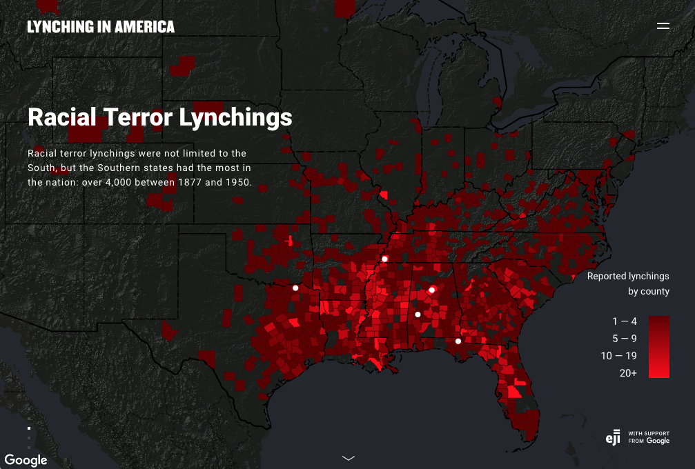
One of the many violent acts these groups commited was a practice called lynching. During the period of Reconstruction, lynching was used as a common tactic by the KKK to scare and prevent African Americans from going out and voting. This map titled “Racial Terror Lynchings” from the article titiled “Racism in the Machine: Visulization Ethics in Digital Humanities Projects.” This resource gives an insightful overview of the violence and persecution African Americans faced across the south from the years of 1877 to 1950. The map allows you to find specific data on a state or region where lynchings occured during this period. From the evidence presented on the map, we can see that ynchings were more common in the “deep south” Alabam, Missippi, Louisiana, and Georgia. We know from historical records that groups such as the KKK had more influence in the “deep south” than anywhere else in the country. However, the map also shows that lynching wasn’t excluively done by white supremacist groups rather, it transitioned during the period of Jim Crow.
With the end of Reconstruction in 1877, governments across the south began to from laws that actively kept African American excluded from regular society. These laws would become known as the “Jim Crow Laws” and would be enforced across the south well into the 1960s. During this time, African Americans became targets of racial mob violence during periods of political turmoil and when an African American faced a trial for a crime against a white person. During particularly violent racial riots enitre African American communities were detroyed and its people displaced. Lynching (as seen in the map above) was used by whites to excute African Americans they viewed guilty.
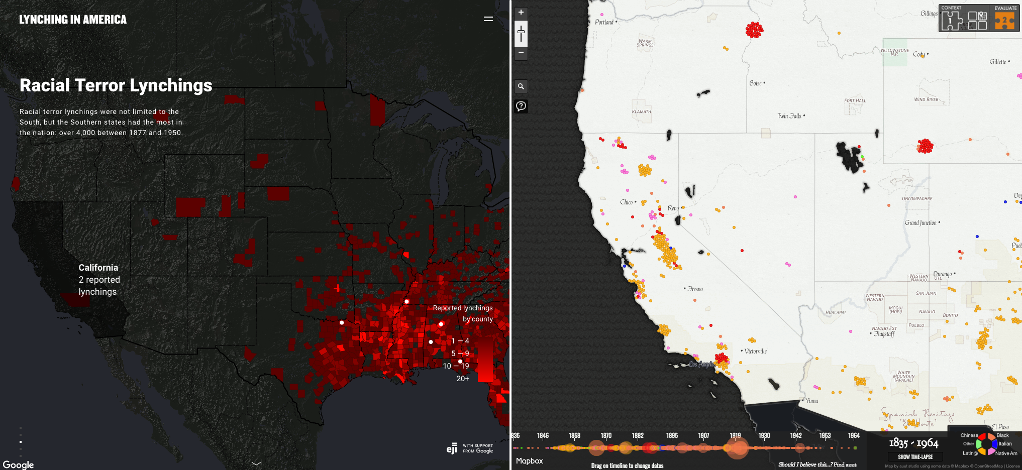
What I really liked about the article provided in the course syllabus was it showed how widespread these riots were. Often, in history class in high school we are taught that racial violence was only occuring in the south and nowehere else in the United States. I can understand why… considering you can cover so much in a high school hitory class. However, it gives an incomplete picture of the reality of the United States during this period of violence and tension. Racial violence in the West Coast of the United States is often overlooked/not discussed as much when we discuss this period of United States History. (As the above map on the right shows) mob violence against ethnic groups ocured in major cities across California and the Western United States. One of the tensions in the west coast was the increasing number of immigrants arriving from the east. White suprimacist and “natavist” groups attacked these immigrants which is presenetd on the map.
A story that is often overlooked during this time period was a form of resistance by an African American during the time of Jim Crow. His name was Monroe Nathan Work who during his time in Savannah, Georgia, witnessed the first segregation laws passed during Jim Crow. While living in Savannah he woud marry a school teacher named Florence Hendrickson, together they would work together in documenting lynching, documenting lack of resources in African American school, sgregation in their community, and pushed for better living conditions for African Americans. Together the two of them would create a program called “Nego Health Week” which was designed to promote healthy living in African Amercian comunities.
Sam Ellerbeck Blog Post 8: Mapping & Ethics
Monroe Work Today’s “Map of White Supremacy Mob Violence” and the Equal Justice Initiative’s map “Lynching in America” are both very powerful depictions of historical racial violence in the form of lynching, but the maps differ heavily in their intended messages. Monroe Work Today portrays the United States’ occurrences of lynching as a widespread issue that has affected all people and geographic locations, whereas the EJI has a much more narrow lens, connecting past lynchings of African Americans to the structural issues that persist today.
The map from Monroe Work Today uses points to represent the lynchings that have occurred in America based on location. Additionally, each point includes information in regard to the lynching event, such as the individual’s name, race, and some background and sources that help provide context. In doing so, the map argues that lynching was a violent act faced by people of various races and ethnicities.

Just as important to its argument, however, is that the focal point of the map is very broad, encompassing the entirety of the United States (with the exception of Alaska and Hawaii), and it emphasizes the great length of history in which lynching has been an issue. In doing so, it makes the case that racial violence in the form of lynching has persisted as a very widespread and prolonged American issue. Lynching is not necessarily unique to one particular people, place, or time.
The EJI’s “Lynching in America” makes a different argument. It uses a choropleth style to tally the lynchings of African Americans by county across the United States. In excluding the lynchings of other races and ethnicities, the map particularly highlights the continual violence and injustice against African American populations, where it calls attention to the structural forces that have perpetuated this into the present day.

In contrast to the first map, the EJI’s map focuses solely on lynchings of African Americans, particularly in southern states, which are centered spatially on the webpage. Also, the timeframe is relatively obscure, and there is no background information regarding each lynching displayed. In doing these things, the map brings structural violence against African Americans collectively to the foreground, narrowing the scope of the mapping significantly and opposing Monroe Work Today’s more all-inclusive approach.
In considering the ethical implications of mapping, Monroe Work Today does a much better job of acknowledging the victim of each lynching as an individual. In recognizing humanity and the historical wrongdoing of lynching, the map more ethically portrays that “the individual deaths are of greater significance than the [geopolitical] boundaries” in which they occurred []. The EJI falls short in this aspect – in using a choropleth map and making each individual event more obscure, it portrays the lynchings of African Americans simply as data and not much else.

Monroe Work Today also acknowledges the difficulties in the ethical decisions of mapping such information by providing a list of additional relevant discussion. Topics such weighing what is considered lynching, the inclusion of particular ethnicities, and even the challenges of collecting and analyzing the sometimes hard-to-find records are all mentioned. It seems to set a good example in considering a wide variety of ethical implications while describing the challenges of retaining dignity when mapping victims of racial violence.
Lastly, while it holds a sort of symbolic notoriety in American history, lynching was not the extent of racialized violence and marginalization that minority populations faced over time [3]. For ethical considerations, it would be important to bring attention to any profound details as such that a particular map may not be able to fully represent.
[1] Monroe & Florence Work Today. 2016. “Map of White Supremacy Mob Violence.” PlainTalkHistory. https://plaintalkhistory.com/monroeandflorencework/?u=2
[2] Equal Justice Initiative. n.d. “Lynching in America.” EJI with support from Google. https://lynchinginamerica.eji.org/explore
[3] Hepworth, Katherine & Christopher Church. 2018. “Racism in the Machine: Visualization Ethics in Digital Humanities Projects.” Digital Humanities Quarterly 12(4). https://digitalhumanities.org/dhq/vol/12/4/000408/000408.html