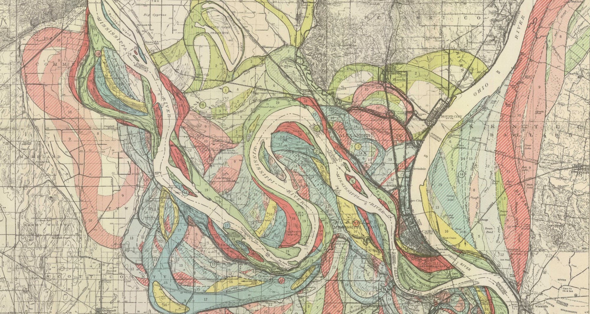
I will encompass the entire area of Cologne, Germany. I want to observe the emigration of citizens out of the city due to bombings by the Allies throughout World War Two. Cologne saw most residents leave or be killed by the end of the war, and I would like to map this using an interactive story map. Due to the nature of the data before 1945, I will need to piece together multiple sources to get an accurate picture of the change in population in relation to events and geography. I have found multiple sources that detail population density after 1950 and some German sources that have information regarding the city’s population during the 1940s. This project aims to give an accurate representation of the effects of World War II on the city and how the city eventually recovered and thrived.
Final Project: Stage 3
Bisel, Kimberly, “HIV/AIDS Cases From 2008 to 2021,” Centers for Disease Control and Prevention, October 2023, https://storymaps.arcgis.com/stories/0009058d46c2464cae6412fcb7cb5e82.
Celentano, David, A Randomized Trial to Evaluate the Effectiveness of Antiretroviral Therapy Plus HIV Primary Care versus HIV Primary Care Alone to Prevent the Sexual Transmission of HIV-1 in Serodiscordant Couples,” HIV Prevention Trials Network, Accessed 2024, https://www.hptn.org/research/studies/hptn-052#block-views-block-study-detail-block-block-2-3.
- Investigating this study also allows me to compare the number of couples and compare it to the data of the 1980s.
Carstens, A, “What does undetectable Equals Untransmittable Mean?,” The Body, November 2023, https://www.thebody.com/article/hiv-undetectable–untransmittable-uu-fact-sheet.
- I am able to look into more recent data and use today’s research in comparison to the research available in the 1980s.
Center for Disease Control and Prevention, “HIV Surveillance Reports Archive,” Center for Disease Control and Prevention, May 7, 2020, https://www.cdc.gov/hiv/library/reports/hiv-surveillance-archive.html.
Center for Disease Control and Prevention, “HIV/AIDS Surveillance Report,” Center for Disease Control and Prevention, January 1991, https://www.cdc.gov/hiv/pdf/library/reports/surveillance/cdc-hiv-surveillance-report-1990-vol-3.pdf.
Department of Public Health, “HIV Health Services,” City and County of San Fransico, Accessed 2024, https://www.sf.gov/departments/department-public-health/hiv-health-services.
- This source can be used in part with the research report to combine data and use that to monitor and track the mortality rate.
Health Resources & Services Administration Data Warehouse, “Find a Ryan White HIV/AIDS Program Medical Provider,” U.S. Department of Health and Human Resources, Accessed April 2024, https://findhivcare.hrsa.gov/?hmpgtile=hmpg-hlth-srvcs.
HIV Health Services, “HIV Health Services Resource Guide,” San Fransico HIV Health Services, 2024, https://sfhivcare.com/.
- This source speaks about the advocacy project and various resources for those infected.
Kaiser Family Foundation, “The Global HIV/AIDS Epidemic,” KFF.org, July 2023, https://www.kff.org/global-health-policy/fact-sheet/the-global-hiv-aids-epidemic/.
- The Kaiser Family Foundation has graphs showing the amount of money donated, as well as a list of outbreaks across the country.
Minority HIV/AIDS Fund, “How is HIV Transmitted?,” HIV.org, June 2022, https://www.hiv.gov/hiv-basics/overview/about-hiv-and-aids/how-is-hiv-transmitted.
- This source addresses the transmission and provides a working map.
Minority HIV/AIDS Fund, “Impact on Racial and Ethnic Minorities, HIV.org, December 2023, https://www.hiv.gov/hiv-basics/overview/data-and-trends/impact-on-racial-and-ethnic-minorities.
- This source breaks down the ethnic and racial minorities that were impacted. I will be using this present data to compare it to previous data.
Target HIV, “Program Locator,” Target HIV, November 2021, https://targethiv.org/community/rwhap-locator?state=All&funding=All&show=map.
- This source allows me to track major outbreaks across the country and is also useful for finding treatment centers.
University of California, Berkeley, “Health Statistics and Data: State and Local Statistics,” The Regents of the University of California, March 27, 2024, https://guides.lib.berkeley.edu/publichealth/healthstatistics/local.
U.S. Department of Health and Human Services, “AIDS Public Information Data in the United States for the years 1981-2002,” Centers for Disease Control and Prevention, Reviewed November 26, 2019, https://wonder.cdc.gov/wonder/help/aids.html#Location.
U.S. Department of Health and Human Services, “Atlas Plus HIV/AIDS Diagnosis Map,” June 2022, https://gis.cdc.gov/grasp/nchhstpatlas/maps.html.
U.S. Department of Health and Human Services, “Atlas Plus HIV Diagnosis 2008-2023,” February 2024, https://gis.cdc.gov/grasp/nchhstpatlas/charts.html.
U.S. Department of Health and Human Services, “Compressed Mortality, 1979-1998 Request,” Centers for Disease Control and Prevention, Reviewed November 26, 2019, https://wonder.cdc.gov/controller/datarequest/D16.
U.S. Department of Health and Human Services, “HIV Prevention to End the HIV Epidemic in the United States,” Center for Disease Control and Prevention, 2021, https://www.cdc.gov/hiv/pdf/policies/profiles/cdc-hiv-california-prep.pdf.
Whirry, Robert, “HIV Mental Health Services in San Fransico: Issues, Challenges, and Opportunities,” San Fransico Department of Public Health and HIV Health Services, January 2024, https://sfhivcare.com//PDFs/Final%20SF%20HIV%20Mental%20Health%20Needs%20Assessment.pdf.
- This report allows me to see the affected population in the San Fransico area.
World Health Organization, “Social Determinants of Health,” World Health Organization, 2023, https://www.who.int/health-topics/social-determinants-of-health#tab=tab_1.
- The World Health Organization tracks epidemics through many different stations across the country and the globe.
Stage 3 – Andrew Merfeld
Ackland Art Museum. “Art and Cultural Exchange along the Silk Road.” Ackland Art Museum, ackland.org/exhibition/art-and-cultural-exchange-along-the-silk-road/#:~:text=The%20trade%20routes%20known%20collectively,of%20government%2C%20literary%20genres%2C%20musical.
Aj, Sachin & Nayaka, V S & Kalal, Prashant & Sanikommu, Vijay Rakesh Reddy. (2023). spices route and trade.
Ciolek, T. Matthew. “Silk Road Seattle.” Old World Trade Routes (OWTRAD). Accessed March 28, www.ciolek.com/OWTRAD/DATA/oddda.html.
Creighton University. “Silk Road GIS Mapping Project.” ArcGIS Online, creighton.maps.arcgis.com/apps/mapviewer/index.html?panel=gallery&suggestField=true&layers=9f27e53937994ce488ed775557a8da7b.
DALME. “Cumin and the Silk Road Spice Trade.” dalme.org/features/cumin-and-the-silk-road-spice-trade/.
“Did You Know: The Exchange of Spices along the Silk Roads.” UNESCO, en.unesco.org/silkroad/content/did-you-know-exchange-spices-along-silk-roads.
FasterCapital. “Spice Trade: How Exotic Flavors Traveled Along the Silk Route.” fastercapital.com/content/Spice-Trade–How-Exotic-Flavors-Traveled-Along-the-Silk-Route.html.
Flavor and Fortune. “Several Sources State that Cumin Originated in the Middle East and China, Some Say ‘Cumin Came from India.'” www.flavorandfortune.com/ffdataaccess/article.php?ID=467#:~:text=Several%20sources%20state%20that%20cumin,say%20’cumin%20came%20from%20India.
Geordie Torr. The Silk Roads : A History of the Great Trading Routes Between East and West. Arcturus, 2021. EBSCOhost, search.ebscohost.com/login.aspx?direct=true&AuthType=shib&db=e000xna&AN=2933078&site=ehost-live.
Iran Safar. “Silk Road History Facts.” iransafar.co/silk-road-history-facts/.
Jeffs, Jeremy, and Rebecca Dobbs. Spice Routes and Silk Roads. Alexandria, VA: Public Broadcasting Service (PBS). Film.
Jeremy Jeffs and Rebecca Dobbs. “Spice Routes and Silk Roads.” Public Broadcasting Service (PBS), video-alexanderstreet-com.eu1.proxy.openathens.net/watch/spice-routes-and-silk-roads#channel:story-of-india.
JOHN NOBLE WILFORD. “Under Centuries of Sand, a Trading Hub: Scientists in Egypt’s Desert Unearth a Maritime Rival to the Silk Road, Complete With Spices and Wine Under Centuries of Sand, a Hub to Rival Silk Road.” The New York Times 2002: F1-. Print.
NPR. “Is Cumin The Most Globalized Spice In The World?” NPR, 11 Mar. 2015, www.npr.org/sections/thesalt/2015/03/11/392317352/is-cumin-the-most-globalized-spice-in-the-world.
Seasoned Pioneers. “The Silk Road.” www.seasonedpioneers.com/the-silk-road/.
Shafia, Louisa. “OFF DUTY — Eating & Drinking: Christmas Dinner by Way of the Silk Road — Sumptuous and Full of Warming Spice, These Persian Dishes Hit All the Right Notes for a Holiday Meal.” The Wall Street journal. Eastern edition 2016: n. pag. Print.
“Silk Road.” Facts and Details, factsanddetails.com/china/cat2/sub90/item50.html.
Silk Road Spices. “History of the Spice Trade.” silkroadspices.ca/pages/history-of-the-spice-trade.
Tim Williams. “Mapping the Silk Roads.” ResearchGate, www.researchgate.net/profile/Tim-Williams-24/publication/280096308_Mapping_the_Silk_Roads/links/5716665b08aeefeb022c36a3/Mapping-the-Silk-Roads.pdf.
UNESCO. “What Are Spice Routes?” UNESCO, en.unesco.org/silkroad/content/what-are-spice-routes.
Mapping Ecological and Economical Disaster

1880

1900

1940
The most obvious change to me was Oklahoma, as we can see in the 60 years of these maps, more data was being collected. This can be verified because the data had become more split up to provide more accuracy. since 1880 it is known that the population in Midwestern states has grown significantly and as the population expanded so did the land use. These maps show an understandable display oof the cultivation od land use through 60 years.
Andrew Merfeld Blog 8
The article starts out by explaining the AI chatbot created by Microsoft. At first, the AI chatbot was working well, until the Chatbot got into an algorithm that made it post inflammatory and racist content. In my opinion, the reason that this is at the beginning of the article is to show that algorithms are not neutral, and they actually reflect on how humans act. In today’s day and age, we are lucky enough to have AI technology that can help in many aspects of life, but we can also see the bad things that are still happening today like racial discrimination and inflammatory language being used by real humans. The only way for the chatbot to be put into that algorithm is by seeing and analyzing these sayings and words used by real humans in real-time, showing there is still a lot of racial discrimination going on today.
Going into the “Lynching in America” map, the thing that stood out to me the most was the use of the color scheme. This is a very frightening topic, and I think the use of grayscale and bright reds exemplified the seriousness of the issue. Likewise, the interactiveness of the map is something that stood out to me. I like being able to visualize and interact with some of the states and counties that are depicted on the map. When looking at the map as a whole, however, you can see there is “a sea of red” along the Mississippi, Alabama, and Arkansas borders that all touch. I think that this has to do with different ideals, laws, and regulations from county to county. As you get further away from these areas — except for a portion of Florida — you don’t see as many bright red counties. Another thing I think could play a role in this, is the idea “If I see someone doing it (lynchings), it’s okay for me to do so as well” and I think the border lines of Mississippi, Alabama, and Arkansas truly show that.

Like the “Lynching in America” map, it displays recorded lynchings in the states, most predominantly in the southern states. However, the map also shows the lynchings that were taking place elsewhere. The second map, I think, focuses more on the widespread lynchings, rather than trying to use a color scheme to horrify the lynchings just in the south. In one of my other classes, we talked about lynchings, carnivals, parades, etc… that took place outside of the Southern Region (Like Omaha) and I found that very interesting because I never knew that these things were taking place essentially all over the United States. That’s what I think the Monroe map is showing, is more of the widespread severity, as compared to the southern severity, and trying to make it more severe with the use of the greyscale and bright red color scheme.


Mapping History and Ethics
From the start of this class, we have stressed and explored the subjectivity of maps. How maps can illustrate and communicate almost anything the cartographer would like to portray. Whether it be the beauty of a certain region, the demographic buildup of an area, or the rock layers beneath the ground itself, maps have the power to show almost anything. However, with this subjectivity can come bias and issues of misinformation or the skewing of certain messages or narratives for good and for bad.
In the instances of the maps of lynchings from the EJI and the Monroe & Florence Work Today websites, the messages are “skewed” to show the horrors of lynching in the United States. I say “skewed” only because today there is a journalistic or research norm to represent both sides, which in this situation would completely take away from the meaning of both projects. The projects are able to portray the gruesome, unjust practice of lynching in the Reconstruction and Jim Crow eras.
To start with the EJI map, I immediately was drawn to the focus on the South Eastern portion of the United States where an overwhelming majority of lynchings occurred in the US. The only issue I have with this illustration is that it dulls out the area outside the Southeast, almost making lynchings that occurred outside the US seem unimportant or separated from the issue. While the EJI map was useful its depth paled in comparison to the Monroe Today Map.
The Monroe and Florence Work Today Map is a broader collection of lynchings that correctly portrays the lynchings occurring outside of the Southeast. This map does not just focus on a certain region or area but is an incredibly detailed interactive map of lynch mob violence in the United States completely with names, charges, and details of each victim of mob violence. From a personal view, exploring this map is one of the few experiences that I have had in my research of United States history where I have been deeply moved. I have poured over countless stories of violence throughout United States history but with this map and being able to see the names and relationships of each victim almost made me sick to my stomach and I am thankful for it. If any map can evoke that much emotion it has clearly portrayed whatever message it set out to, in this case, showing the sheer amount of horrors committed by mob violence throughout the United States.
Church and Hepworth’s “Racism in the Machine: Visualization Ethics in Digital Humanities Projects” hits the nail on the head in finding the ethical dilemma and difference between the two maps. Church and Hepworth correctly identify that the maps are products of the associations that they are published from, one looking to focus more on violence in the Deep South among African Americans and another suggesting that mob violence affected far more than just the African American population.
The comparison of these maps along with Church and Hepsworth’s piece has made me realize the importance of symbology and focus on a project because, with the wrong illustration, a point can be either completely ignored or featured with certain effects. Mapping ethics should guide cartographers, including myself, to correctly visualize their maps to convey not only the message they would like to convey, but a correct message.
[PICTURES REFUSING TO UPLOAD WILL REVISIT IN MORNING]
Ethics of Mapping History
The actual injustices carried out during the Jim Crow of American history can never be fully mapped or measured. Some groups, like the Equal Justice Initiative, have attempted to use raw data to display lynchings as a statistic. People who were murdered in a heinous way become points on a map.
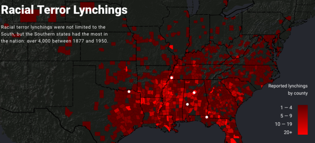
This map is flawed in multiple ways. The data focuses nearly completely on the southern states. The reality of the lynching during and after the Jim Crow did not just occur in the South; it is a disservice to those who were murdered to claim to have a comprehensive map of lynchings while excluding states north or west of Texas. Katherine Hepworth writes, “demonstrating how choices about representation, interaction, and annotation in their data visualizations either do harm in the sense described above or challenge dominant narratives.” The map does represent a terrible crime against a certain group, but it can be seen more as a tool to push an agenda. “Lynching in America is a promotional and advocacy tool for the Equal Justice Initiative, primarily created to visualize data within (and thereby promote) the report “Lynching in America,” which records lynchings of African Americans and frames lynching as a societal tool — enabled through mob violence and discourses of white superiority” (Kepworth) This demonstrates how ethics are essential when performing research and displaying data in such a way.
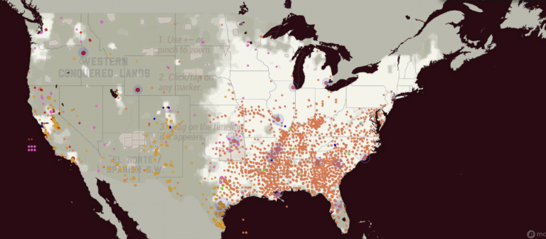
The second map depicts lynch crimes as much more a widespread human tragedy. This map from Monroe and Florence’s Work Today depicts lynching during the Jim Crow era in a more unbiased and human light. On the site, you can see individual names. The first map shows counties reporting the number of lynchings specifically against black Americans. The Monroe and Florence Work map today shows Chinese, Black, Latinx, Native, Italian, and other groups in their data. This map is a great example of what can be lost when looking at tragedies like lynching as nothing more than data. The human side of the event is forgotten. Stories are lost.
These maps made me think about how data visualizations are not static. Data and algorithms are from human experiences and sometimes suffering. Church and Hepworth write, “[H]umans are at the center of algorithms, not only as their creators but, in the case of data-driven algorithms, as the producers of the content they shape and present.”
The ethics of mapping is unique in how maps can leave out critical data and still represent data that can be used. Audiences for maps decide what data is shown. No map can show everything. As seen above, some maps are biased in what they choose to show, leading to a pushed idea. Those who subscribe to that idea have a partial picture of what Jim Crow-era lynching encompassed.
Mapping ethics also needs to be concerned with what is being displayed. Each dot on the Monroe and Florence Work Today is a person who lost their life in senseless, unjust violence. The map displays how this violence was not just in one region or against one group. The ethics of the Monroe and Florence map displays how some maps lack ethics and only exhibit one group.
- Hepworth, Katherine & Christopher Church. 2018. “Racism in the Machine: Visualization Ethics in Digital Humanities Projects.” Digital Humanities Quarterly, 7. ↩︎
- Monroe & Florence Work Today. 2016. “Map of White Supremacy Mob Violence.” PlainTalkHistory ↩︎
- Monroe & Florence Work Today. 2016. “Map of White Supremacy Mob Violence.” ↩︎
Riley Filipowicz Blog 8
The focus on lynchings in African American history, especially in the Southern US during Jim Crow, is crucial. But it almost simplifies racial violence to a certain extent. Lynchings were horrific and symbolic of white supremacy, but they’re just a small piece of a much larger puzzle. Racial oppression included many forms of abuse, not just public executions. Lynchings have become a symbol of racial hatred, shaping attitudes and policies.
While lynchings are often associated with the Southern United States during the Jim Crow era, it’s important to recognize that they weren’t only happening in this region. Lynchings occurred throughout the country, including in the North and West. They might have been less frequent but were almost more powerful. African Americans faced all sorts of racial violence in various parts of the nation. They showed that racial problems were not just subject to only happening in the South. Lynchings served as brutal displays of racial terror and domination.
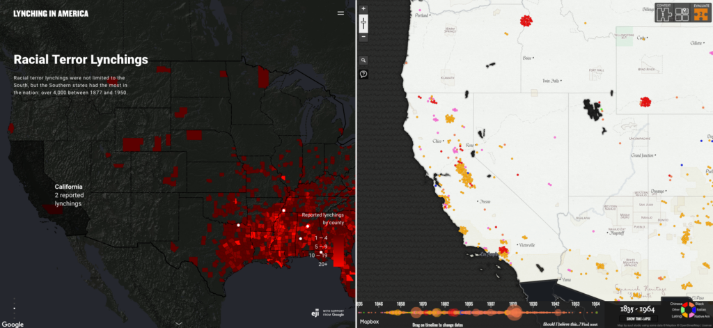
Comparing the two maps shows big differences, especially on the West Coast. In California, it shows two different maps. One of them shows only lynchings of African Americans, and the other depicts lynchings of all sorts of various races such as Italians, Latinos, and Native Americans. The second map shows widespread lynchings across California, reflecting white supremacy enforcement. However, the first map lacks clarity and suggests fewer lynchings in California actually happened. This is problematic as it downplays California’s history of racial violence, which goes against efforts like the Equal Justice Initiative’s aim to challenge black incarceration.
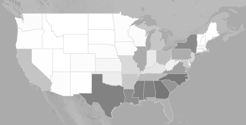
I took this screenshot from the article, Lynching In America. I placed the map in 1950, so it shows the percentage of the total US African American population. The South obviously has the highest percentage of African Americans, but the fact that there were even lynchings in areas outside of the South is super powerful and important. Recognizing that lynchings occurred beyond the South is important for understanding the total extent of racial violence in American history. Lynchings in regions outside the South, like the West and Midwest, challenge the common belief that racial terror was limited to a specific area. These incidents across diverse regions highlight the widespread nature of racism. Take California for example, the first image I included makes it seem like only two lynchings happened there. That is an incorrect depiction because the next map I included shows that lynchings in California were not rare, and were actually rather common.
Understanding where data and information come from and its context is crucial for accurate understanding. Without this understanding, there’s a risk of misinterpretation or drawing incorrect conclusions. For example, if you did not include all of the maps in the article, one might think lynchings were not that big of a problem in California. Prioritizing transparency and critical analysis of data origins helps readers understand the full picture.
Final Project: Stage 1
How did the end of World War 2 affect the geography and reconstruction of Cologne, Germany? What was rebuilt? What was not? How does the destruction alter the city to this day? More than 20,000 buildings received damage throughout the duration of the Second World War, and more than 10,000 buildings were destroyed.
I want to research how much the bombings and destruction have affected the city to this day. How has urban development been altered? Were there parts of the city that were never rebuilt? Are there parts of the city that received more attention for reconstruction? Are there parts of the city that were wiped away completely in exchange for something completely different? I would like to focus on the city’s change over time and overall development due to WW2.
Final Project: Stage 2
For my final project I have chosen to investigate the number of people who have moved on to high education in Omaha, Nebraska. A recent QGIS project I completed about mortgages and loaning companies made me interested in looking at the education levels of. those individuals and comparing the two maps. The scope of my project will be looking at Omaha from 1920 to 2020, in order to receive a wide, but manageable, set of data. The possible sources of data for my project will consist mostly of digital maps and online data. I will be doing research into the typical education of the 1920s and how that has obviously changed when approaching 2020. I will also take into consideration the gender gap and the financial burden of going to school.
My final project will be displayed in a story map format because I feel this is the best way to display the different maps while giving context around and about them. This project will not only show that higher interest rates where given out to communities with typically more of a minority population, as well as those individuals who live in more affluent neighborhoods received higher education from schools with better resources. I feel as though the comparison of these maps will paint a clear and concise point about the red lining that took place in Omaha 100 years ago, but as well as the discrimination and segregation of minority communities.
