Blog Post Week 9, Emma Reed

Geoff Cunfer in “Paster and Plows” provides context to the ecological history of North Dakota and compares it to the agricultural transformation that occurred in Kansas, highlighting how they are both similar and different through their timing because of unique. environmental factors. In both states, this transformation occurred at a fast pace, however in North Dakota it occurred later and more rapidly than in Kansas. The shift from cropland to pasteurized land in North Dakota can be explained through constraints from temperature, rainfall, and the quality of the soil. Even with federal incentives and high crop prices, the small surges in cropland expansion were not sustainable due to these outlined environmental limitations. Below is a map by Henry Gannett from 1903 which depicts the wheat per square mile across much of the midland plains region of the United States.

Table 2.3 shows the Great Plains land area in crops and grassland and by examining it we can begin to see some of the patterns Cunfer describes. In 1935 we see the peak of Cropland and the lowest level of Grassland. This can be explained through the stability of land use patterns in the Great Plains as the amount of rainfall, temperature, soil quality, and level of crop rotation and overplanting greatly impact the amount of land usable for crops. In the case of 1935, it seems as though the natural conditions were stable for crop use however by 1940, a drought occurred, causing the use of Grassland to increase.

Finally, the above image shows the percentage of total county area not plowed from 1880 to 1920. This provides a visualization of the idea of stability of land use as one can see the changes over time in the amount of Grassland in the Great Plains. Cunfer highlights the importance of understanding the agricultural and natural history of a place in order to show how the varying environmental factors shape the land-use patterns, such as he did in the case of North Dakota.

Works Cited:

“156. Wheat/Sq. Mile.” 156. Wheat/Sq. Mile. – David Rumsey Historical Map Collection, www.davidrumsey.com/luna/servlet/detail/RUMSEY~8~1~32209~1151551:156–Wheat-sq–mile-?sort=pub_list_no_initialsort%2Cpub_list_no_initialsort%2Cpub_list_no_initialsort%2Cpub_list_no_initialsort&qvq=w4s%3A%2Fwhat%2FAtlas%2BMap%2FStatistical%2BAtlas%2FAgriculture%2Fwhere%2FUnited%2BStates%3Bsort%3Apub_list_no_initialsort%2Cpub_list_no_initialsort%2Cpub_list_no_initialsort%2Cpub_list_no_initialsort%3Blc%3ARUMSEY~8~1&mi=28&trs=71. Accessed 10 Mar. 2024. 

Cunfer. Steppingintothemap, steppingintothemap.com/mappinghistory/wp-content/uploads/2018/01/S-Simon-Winchester-The-Map-that-Changed-the-World-11-26-121-162.-1.pdf. Accessed 10 Mar. 2024. 
Isabel Blackford Week 9 Blog Post

The development of grassland into farmland was not a fast nor simultaneous process and in reality took a little less than a century to happen. Even when development was nearly completed, one hundred percent of the land was never developed due to environmental limitations on the capacity of the land to be developed into farmland. Even when there were drivers of economic benefit to develop more land to make more money, the environment swiftly enforced it’s limitations which made it impossible to continue development successfully past a certain capacity. This was made very evident through the failure of crops during the Great Depression, but continued to check farmers in their efforts to grow their fortunes by going past natures limits (Cunfer, 2005). This progression of crops can first be seen by Henry Gannett’s map for the 1900 census that mapped out Wheat production in the United States.

In following years the percentage of grassland that was yet to be plowed was mapped out and the steady decrease of unplowed land can be seen until 1935 where there was the lowest amount of undeveloped grassland. In 1940 however, the percentage of grassland starts increasing yet again due to draught that was caused by over-farming in 1935 where there was the least amount of grassland untouched which maintained the local ecosystem.

This is further evident in the table in Cunfer’s On the great plains, where it can be seen numerically the percentage of land farmed peaks in 1935, and never peaks quite that high ever again due to the land no longer being profitable if it is over farmed. Throughout the decades peaks and dips can continue to be observed as nature enforces it natural boundaries regarding how much land can be used and developed.

References:

Cunfer, G. (2005). On the Great Plains: Agriculture and Environment. Texas A&M University Press. https://steppingintothemap.com/mappinghistory/wp-content/uploads/2018/01/Cunfer-On-the-Great-Plains.pdf

Gannett, H. (n.d.). 156. Wheat/sq. mile. David Rumsey Historical Map Collection. https://www.davidrumsey.com/luna/servlet/detail/RUMSEY~8~1~32209~1151551:156–Wheat-sq–mile-?sort=pub_list_no_initialsort%2Cpub_list_no_initialsort%2Cpub_list_no_initialsort%2Cpub_list_no_initialsort&qvq=w4s:/what%2FAtlas%2BMap%2FStatistical%2BAtlas%2FAgriculture%2Fwhere%2FUnited%2BStates;sort:pub_list_no_initialsort%2Cpub_list_no_initialsort%2Cpub_list_no_initialsort%2Cpub_list_no_initialsort;lc:RUMSEY~8~1&mi=28&trs=71

Riley Filipowicz Week 8

I think something that first popped into my head that heat maps would be useful would be for crime in certain areas. High rates of crimes could be really helpful for local law enforcement to patrol these areas more frequently. Unfortunately, another instance where these have come in to use is for sex trafficking. I have seen maps like these be used in Omaha during the College World Series because sex trafficking rates spike during that time.

I think heat maps could be really useful for me during my final project. If I focus on a specific demographic in a certain neighborhood in New York, a heat map could be beneficial. For instance, if I was choosing where a high percentage of Polish people live, a heat map could be very useful.

Heat maps and Voronoi Polygons- Marie Amelse

Aside from mortality data during an epidemic, can you think of any other situations where a heat map or Voronoi polygons would be useful ways to analyze spatial data? How might they be useful in this context of your final project (if at all)?

One things that comes to mind when I think about heat maps especially, is the production of Carbon Dioxide emission its relationship to large cities. I think it is a simple way to view CO2 emissions and why they are most concentrated. As for Voronoi polygons it could be useful in the context of nearest grocery stores, it would be interesting to see how often people use the closest grocery stores to them, but also in relation to food deserts and how far it could be that a person would need to travel to even one source of affordable, fresh food.

I do think that heat maps, more so than Voroni polygons might be useful for my final project to relate where there is higher rates of health insurnace, althought that might make it overwheleming to view if the entire map is more or less encompassed by the heat map.

Stage 1- Marie Amelse

How has the percent of Nebraskans who had health insurance changed over the past 50 years? Why does the rate of people who hold health insurance fluctuate over time?

Health insurance coverage has only become a real thing over the past 100 years or so. Even more over, since 2000 there have been several different well-documented reasons that people may or may not be insured – their job does or doesn’t offer it, if they are employed, if there is an economic recession, or the location in which they live. This question is going include what are the resources that have made it more possible to have access to healthcare, as well as what advantages come from have access to healthcare. Omaha specifically has a long history of hospitals from Creighton’s St. Joseph hospital to the now large campus’ of UNMC, Childrens, and varying CHI clinics and centers, and there is surely a connection of this and those who have health insurance.

John Snow – Mapping Disease – Practicum

I think these types of maps would be super interesting in regards to demographics of disease-ridden neighborhoods. These could be used when showing if a certain population, either by race and/or socio-economic status, are more likely to be affected by certain hazards to public health. These could be used for my final project by showing the number of buildings demolished to make way for the North Highway and the proximity to black neighborhoods, perhaps.

Payton Mlakar – Practicum Week 8 – Heatmaps and Voronoi Diagrams

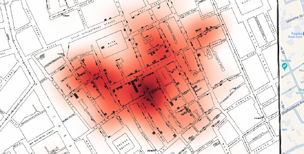
A heat map representation of Jon Snow’s map of the 1854 London cholera outbreak. Darker red areas indicate more deaths from cholera.| Mapping by Payton Mlakar, Mapping Data provided by Dr. Sundberg.
A Voronoi diagram on Jon Snow’s map of the 1854 London cholera outbreak. Red dots indicate a household with at least one cholera death. Yellow stars indicate water pumps. The numbers in the middle of each cell indicate the number of deaths from cholera inside each cell of the Voronoi diagram, Note the extremely high number of deaths (343) in the cell that contains the Broad Street Pump. | Mapping by Payton Mlakar, Mapping Data provided by Dr. Sundberg.

As demonstrated on the heat map and Voronoi diagram above, these mapping tools can effectively represent mortality data spatially. However, these mapping tools can also represent other types of data critical to fighting epidemic disease. One way in which Voronoi polygons and heat maps could be useful to analyze spatial data outside of mortality rates would be in mapping areas with high numbers of people with preexisting conditions or other susceptibility/risk factors for a disease. Part of any epidemic disease response is recognizing who is most at-risk of contracting and dying from the disease. Heat maps and Voronoi polygons can present this important information in an easy-to-use, visual and spatial representation. They can provide epidemiologists and other medical professionals with valuable information about areas which contain populations with increased rates of pre-existing conditions and other risk-factors. Heat maps can propose where these populations are located, while Voronoi polygons can demonstrate their ease-of-access and/or proximity to quality medical care. With this spatial information in hand, medical professionals managing epidemic response can identify where mortality from a disease may be higher before those high mortality rates actually become realized through rampant infection. With this knowledge, officials leading epidemic response can preemptively allocate additional treatment and prevention resources to these communities to prevent disastrous mortality rates in the most at-risk communities.

Another way in which Voronoi polygons and heat maps could useful to analyze spatial data outside of mortality rates would be to map infection rate “hotspots” and to perform contact tracing in these areas. For example, a heat map could demonstrate how a certain neighborhood has a very high infection rate and thus must enforce stay-at-home orders or other protocols to prevent further infections. Then, alongside this heat map, epidemiologists could use Voronoi polygons to contact-trace most infections. In their data collection and mapping they may create a Voronoi diagram which traces many infections to a popular grocery store within walking distance for most of the neighborhood. Or, the data could produce a Voronoi diagram that indicates a heavily-trafficked restaurant near the neighborhood had many people in attendance who eventually showed signs of infection.

I am not sure if heat maps could provide any utility to me in my final project; however, I will likely use Voronoi polygons in the project. Much of my project’s subject matter, that is, the settlement of mining boom towns in the Colorado Rocky Mountains during the 1800s, deals with local, “on-the-ground” patterns that are not often easily mapped. Voronoi polygons could be useful to demonstrate the most easily accessible mining boom towns in the Colorado Rocky Mountains by mapping the rate of use and proximity of major roadways, waterways, and trails to these towns. Voronoi diagrams could also be useful in mapping if and/or how the town settlers settled in in the Colorado Rockies largely determined which mines they worked in and what minerals and precious minerals they mined. Overall, I think Voronoi diagrams could provide me with an effective way represent local, “on-the-ground” spatial relationships and usage patterns in my final project.

Isabel Blackford Heat Maps and Thiessen Polygons

Though the maps below, the city of London in the 1850s is shown during a cholera outbreak and is mapped my John Snow in the neighborhood of Soho. This map would be the first of its kind to map out the spread of a disease coming from a particular source. This led Snow to be able to track down the index case of the outbreak and what initially brought cholera to infect a particular pump found to be to culprit of most of the cases in the area.

For example the map above exclusively maps out the number of deaths of cholera with no other measurements and only otherwise shows the streets of the city. In contrast the map below shows much more detail with the green dots showing where each water pump is and the red dot showing where each individual death is, which is much more specified than the heat map below that is much more broad.

To be even more specific the map below separates each of the pumps (stars) into a polygon where all the fatalities are shown by red dots and the exact number that died in each polygon is highlighted.

Another case where a heat map and/or Thiessen Polygons would be useful is when tracking environment effects on people’s health. A good example would be after the United States dropped an atomic bomb on Hiroshima, using a heat map to track the radiation exposure on people and using the Thiessen Polygons to measure how many specific cases there were that affected the population there. It could even be used to see how many births for a time period after had mutations due to the radiation exposure still there, or how the wildlife was affected as well.

Final Project Stage 1

Over time, what roles and forms has Forest Park in St. Louis, which was originally used for the 1904 World’s Fair, taken? How has the city invested in it, and how have people used it? What factors influenced those things?

I’d like to research Forest Park from when it was first built up until today, tracking the evolution of both the park itself and the surrounding areas. I’m interested mainly in how the park has been used, perceived, and curated, but am also open to considering how the park exists in the memory of those who live in the city. I grew up in St. Louis and heard a lot about the legacy of the World’s Fair, but not much about the park in between 1904 and today. Few of the original buildings are still there, but the park still functions as a sort of center for arts and culture, housing the art museum, history museum, the zoo, and the Muny, a large outdoor theater. At the same time, it’s a large nature space in the middle of the city, with water features and even hiking trails through more loosely maintained natural areas. I haven’t narrowed down what dynamics I’d like to focus on, specifically, but I think these questions will be a good starting point for my research.

Practicum 3: Building Vector Layers

I don’t think there’s anything on my map that would be too tricky to make a vector categorization for. The only thing that comes to mind is the river, which I think would be fine to do as a polygon on this scale. I also don’t see why you couldn’t use multiple kinds for one feature. For example, the river could be mapped as a polygon with a line over top of it that shows direction of flow or travel. Mapping topography could get tricky, but I’ve seen plenty of maps before that show topography with lines that indicate increments of elevation.

For a simple map like this, name is the only attribute really necessary, but when mapping data, it becomes important to include numerical values. You could also categorize things in more elaborate ways on maps with more points; these could be dates, the source of the data, or just subcategories to help keep things organized.

I didn’t notice anything new when going through the process of digitizing the map, at least not compared to when I was georeferencing it. Georeferencing made it much easier to visualize a lot of things all at once by comparing the old map to the modern one, but vectorizing seems to be stronger when it comes to ease of reading the map. You can zoom in indefinitely on vectorized features, for example, instead of having to deal with things getting more pixelated when you want a closer look. It benefits the viewer more than the mapmaker, in my opinion, but I also think it’s true that the process of digitizing this way makes you look at the map more carefully than you might otherwise, which could lead to noticing new things about it.

css.php