Gabe Murphy: Blog 7

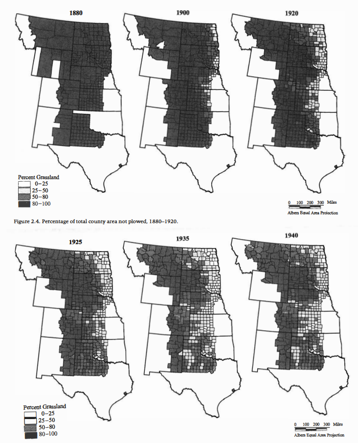
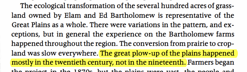
In the US today, there is little to no land that is not currently serving a purpose. By this, I mean that nearly every acre is allocated to something: farming, homes, parks, state parks, cities, and all in between. Even land that has seemingly no function, is usually placed within a conservation easement of some sort; therefore, serving a purpose. However, in the time of Elam Bartholomew this was not the case. The prairies served an endless abundance of farmland, once rightfully plowed. Areas they determined were bad for farming, were mowed or left for grazing/hay. This was common:

Geoff Cunfer, “Pasture and Plows,” On the Great Plains, 2005; 19

Across the entire Great Plains, this transformation of natural grasses to pastures and farming was occurring: in what one described as the “most important ecological action” (Cunfer 17). Most importantly, the farmers discovered the natural limits of nature: something I believe science takes advantage of today. From 1880 to 1920, you can see the slow and tedious process of turning grassland into agricultural land:

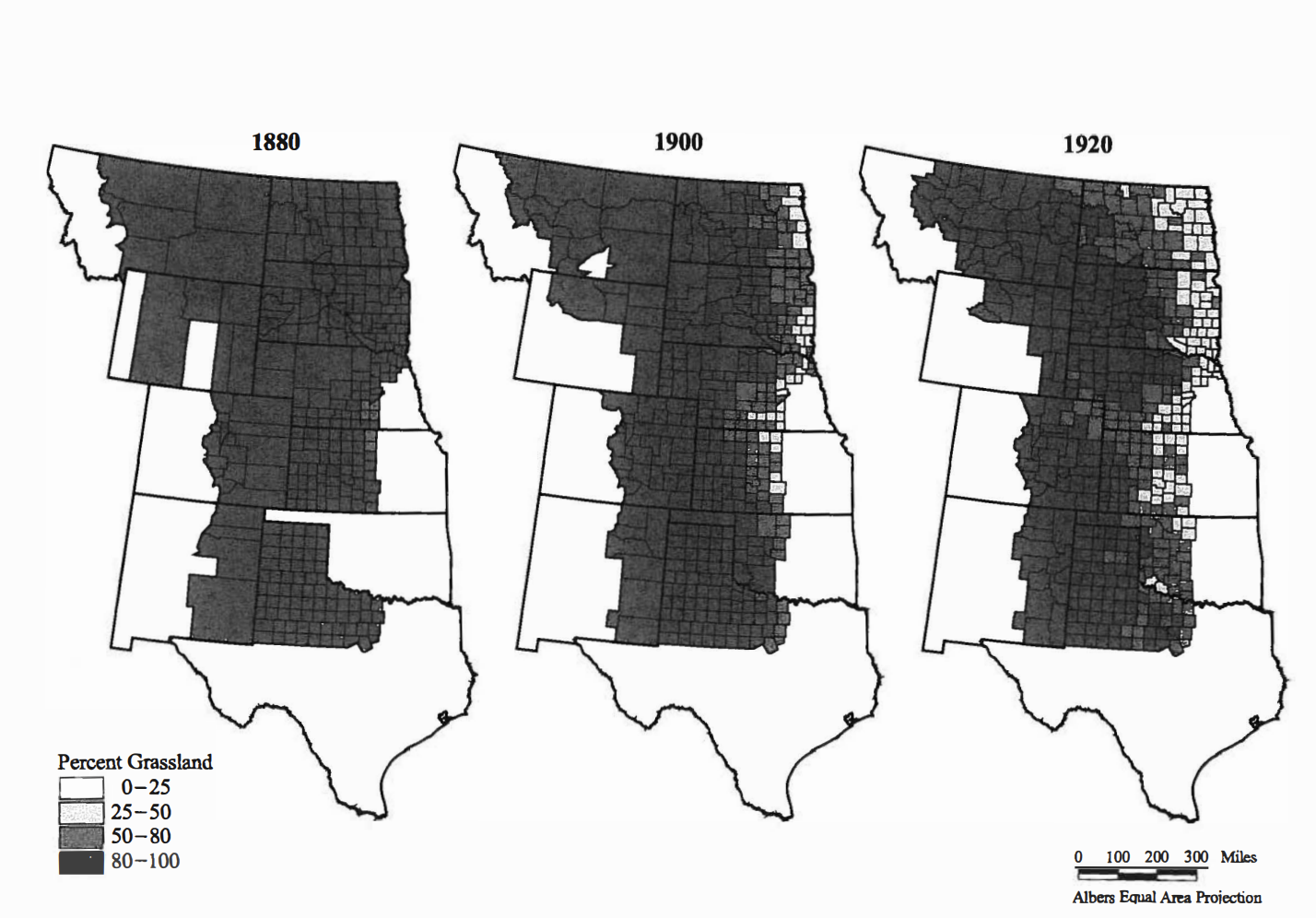
Figure 2.4. Percentage of total county area not plowed, 1880-1920.

The eastern regions were targeted first, with subtle differences in large 20 year increments. Due to increased farming, demand for land, improved technologies, and an improved economy, the next fifteen years created immense change.

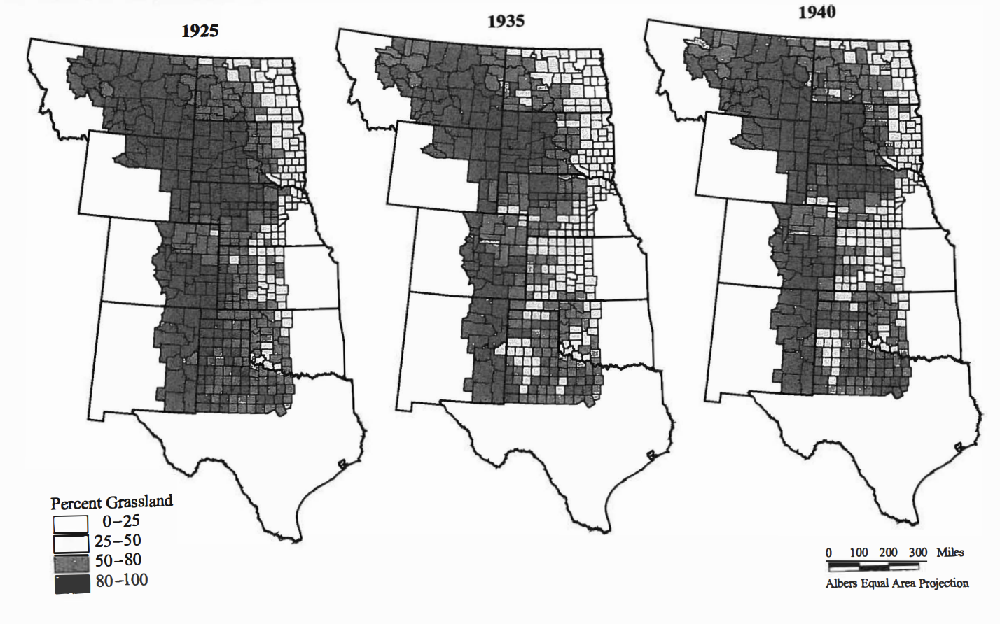
Figure 2.5. Percentage of total county area not plowed, 1925-1940.

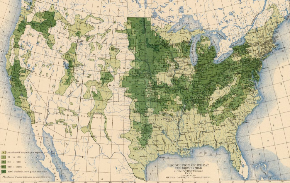
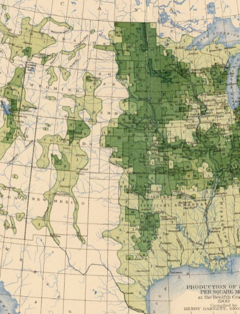
When viewing the 1935 map, the change is greatly shown. The dark black map from the 1880s is now ~⅓ white, denoting 0-25% grassland in these areas (in other words a ~75% decrease in grassland!). By 1940, the resistance/limit set by the land is shown as the grassland returns in some areas. The author uses a choropleth map to maintain his argument, contrasting white and black which allows for an easy interpretation and visual of the change occurring. Sharing a similar argument, the 1903 map of wheat/square mile shows that eastern land was developed first and the Great Plains remained largely untouched until the 20th century. 

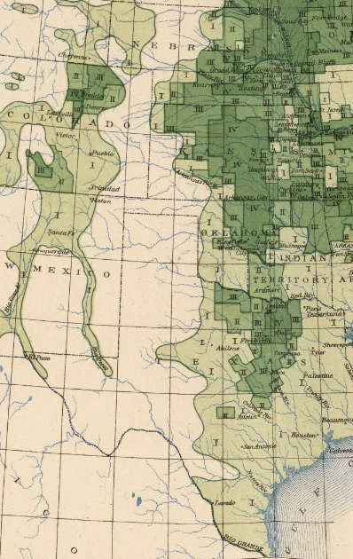
Henry Gannett, Wheat/sq. mile, 12th census of the US, 1903.

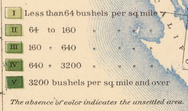
The dark green regions show the most bushels per mile2, while the white/unshaded regions represent the lowest amount of wheat production. Again, the mapmaker uses simple contrasting choropleths to show the argument. If this map were continued into the 1930s to 1940s, I presume it would show the same changes that Cunfers’ maps did–expansion and plowing of the Great Plains. The unshaded regions would become darker as the years passed and farming became more prevalent.

Wyatt Greco Blog 7: Mapping Ecological Disaster

Ecology is not static. Nature changes over time, and the interaction between humans and nature can drive change on a relatively rapid and large scale. Take the example of plowing grassland for agriculture, which Geoff Cunfer equates to “to clear-cutting a forest, but more absolute because the effort to maintain only a single species continues year after year” [1]. The map below implies the extent and magnitude of this changed ecology:

Henry Gannett, “Production of Wheat per Square Mile at the Twelfth Census,” U.S. Census Office, 1903.
Gannett, 1903.
Gannett, 1903.
Gannett, 1903.

The above map depicts production of wheat per square mile, based on the U.S. Census of 1900. Bushel per square mile is mapped regardless of political boundaries like county or state lines, thus highlighting the direct interaction between humans and nature. However, the map uses data from only one Census, thus presenting the economic activity of wheat production and land use as fixed in time. Compare this to figures from Cunfer’s book:

Cunfer, p. 31-32 [2].

To begin, Cunfer maps humanity’s ecological impact more explicitly by measuring percent of grassland rather than production of wheat. Further, Cunfer takes change over time into account and thus provides a more realistic view of human interaction with the environment. As Cunfer notes in his text, plowing and cultivation in the Great Plains took decades to develop, with the agricultural landscape always shifting due to factors like weather, settlement, and crop markets [3].

Ultimately, Cunfer’s map is both larger and smaller scale than Gannett’s. The final image from the 1900 map depicts the same general region (spanning from Texas to Montana) as Cunfer’s figures. Cunfer’s representation from 1900 showed that most counties were still above 80% grassland, but the Census map reveals that some agriculture and settlement had already begun in many of these same areas. In this sense, Cunfer does not capture the same kind of localized ecological impact as Gannett. However, Gannett’s large vectors of wheat production do not account for the nuances of land use. The amount of wheat producible by a square mile of land can depend on natural factors like climate or soil [4]. Thus, the percentage of grassland plowed by farming could vary considerably between regions that produce the same total amount of wheat. By honing in on the smaller-scale county level land use, Cunfer depicts nuance that goes unincluded by Gannett.

Citation 1-4: Geoff Cunfer, On the Great Plains: Agriculture and Environment, College Station: Texas A&M University Press, 2005.

Wyatt Greco: Practicum 6

In studying the health effects of pollution from a particular source (say, a power plant or factory), a heat map could be used to analyze the spatial distribution of individuals in an area affected by cancers, respiratory ailments, or other conditions (depending on the type of pollution theoretically being emitted). I have also seen heat maps used to spatially analyze weather conditions, like temperature or precipitation. Such maps allow an audience to analyze both gradual change in weather and hotspots for a particular phenomenon (lowest temperatures, highest winds, etc.). As for Voronoi polygons, one use could be in an analysis of public schools and commuter students. A Voronoi diagram could be created for the schools in a city, while the home addresses of students for each school could be mapped by additional (non-Voronoi) points. This would reveal if school of attendance is truly determined by proximity, or if other factors may be determining which schools the residents of a city elect to attend.

In the context of my final project, Voronoi polygons in particular could prove useful. I plan to map major industrial production over history in the Rust Belt, studying its effects on the surrounding population and economy. Perhaps I could do so by identifying major sites of production (factories, mines, etc.), and then making Voronoi polygons emanating from these points. That way, even if a site of production is near a state line, I could be more likely to capture the potential labor force and communities who are connected to that site.

Harrison-Practicum 1

For my geo-referenced project I used an image of Pompeii dated from 1832. The map details the archeological sight from what was currently found during the 1800s and 30s. The geo reference tool allows me to focus on a particular section of the map thus, allowing me to learn more and provide detail information on the area.

In terms of the course, large population centers are better mapped out with heat maps, strata maps, and anything requiring data.

Stage No. 1 – Research Question

How was Creighton impacted by the construction of the North Freeway? Did it positively or negatively impact our university?

Omaha underwent a number of dramatic alterations throughout the 1960’s, one of the most controvercial being the North Freeway project. This project impacted over 10,000 people by its demolition of approximately 850 homes, 75 businesses, and 25 religious community centers. Creighton University had front row seats to this process, even shaving off the Creighton University Medical College in 1969 for the construction of the 480 freeway. This is only one building when compared to the neighborhoods that originally flanked our university on the East and West, did the sudden disappearance of this community effect Creighton in any way?

How was the developement of Creighton University and the neighborhoods surrounding it impacted by the construction of the North Freeway? What can the progress of buildings constructed on campus and the land that became campuse tell us about Creighton? How many buildings that were part of Creighton got demolished for this massive project? How many houses right beside Creighton were demolished? What story will all of these factors combined create?

Leah R. Keith

Emma Reed, Stage 1

What are the spatial patterns of immigration influx into major cities over the past decade, and how do these patterns correlate with factors such as economic opportunities, cultural diversity, and policy frameworks?

Over the last few decades, we have witnessed increased global migration patterns, with major cities emerging as a primary destination for immigrants seeking economic, educational, or social opportunities. This has reshaped the demographic composition of urban areas. Understanding the spatial dynamics of immigration has become an important area of study. By examining the distribution of immigrant populations across major cities and their surrounding regions, we can dive into these patterns, such as economic opportunity, cultural diversity, and governmental policies. This is an attempt to not only map the spatial dimensions of immigration but also look at the multifaceted interactions between migrants and their new environments.

Harrison-Practicum 3

By far the counties with the most enslaved persons had large plantations filled with cotton and sugar. These plantations were found in the geographic region in the us referred to as the “Deep South.” The climate being hot and humid for most of the year makes the prefect conditions for the growth of cotton and sugar. The counties with the least enslaved persons were areas where wheat and corn was grown.

Sugar, cotton, and tobacco were important shipping products/crops for the south. However, one important thing to note is the confederacy was not able to trade well due the blockade imposed by the Union navy. As such, trade was often conducted by land or river passage ways-which is why the Mississippi River was crucial for the Union war effort.

Stage 1

To me, Strawberry Hill in Kansas City wasn’t just the place where Povatica came from, it was just home. I never lived in the neighborhood but was constantly visiting family members and getting well acquainted with the people and businesses that keep the area bumping. Only in recent years have I found out about my family’s rich connection to the area and the neighborhood’s Eastern European roots.

My research question looks into the effects of Eastern European immigration on Kansas City. How did Eastern European immigration impact the social, economic, and cultural development of the Kansas City area in the late 19th and early 20th centuries? I will look at the population density of certain Eastern European groups and how they relate to different variables like property value, average income, and employment that indicate community development.

Harrison Schaub-Practicum 4

1.) The practicing of lending in Philadelphia during 1937 had a racial bias to it. In 1937, typically houses within an affluent part of the city were given higher loans than people located within colored/poorer areas. This made it harder for colored and poor people to settle into nicer neighborhoods due to the unfair lending practices.

2.) The areas on the map with the highest interest rate are the areas colored green and blue located just to the north and southwest of the redlined area. These areas had more resources and had a larger white population. Thus, in 1937, the areas in green and blue were considered more of “value” to those who moved into Philadelphia.

3.) I would say that redlining did not cause “racism” to exist… However, preconceived and institutionalized racism was already alive and well in Philadelphia. These conditions served as the backdrop for the eventual redline areas we see on many maps of cities in the US from the 30s, 40s, and 50s.

4.)

Week 8: Heat Maps and Voronoi Polygons Practicum

Heat maps are very powerful and useful tools, this week we were able to create one to map the density of mortality data during an epidemic. Another situations in which a heat map could be useful would be mapping the average salaries of people in an area, or even using them to map the weather and the severity of it, much like we see on the news.

A voronoi polygon map can also be used for multiple different things. In class we saw that they were used for the mapping of states boundaries according to their capitals. Another use for voronoi polygons are the mapping of clusters of stars, analyzing different structures of plants, and mapping the amount of rainfall or snow a regions receives.

These tools will be very useful for my final project because I plan on expanding my knowledge of the 1980-1990s HIV/AIDS epidemic. I chose this topic for HIS 490 and loved doing the research and I had attempted creating a map of the data but I was unable to successfully create one that displayed what I wanted it to. I feel as though with this data I will be able to expand my knowledge, create a map, and find the data that I was unable to do before.

css.php