Gabe Murphy: Blog 3

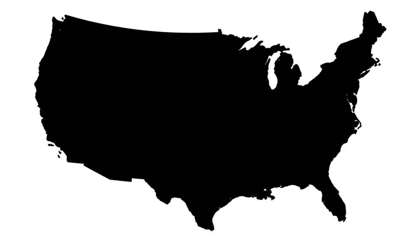
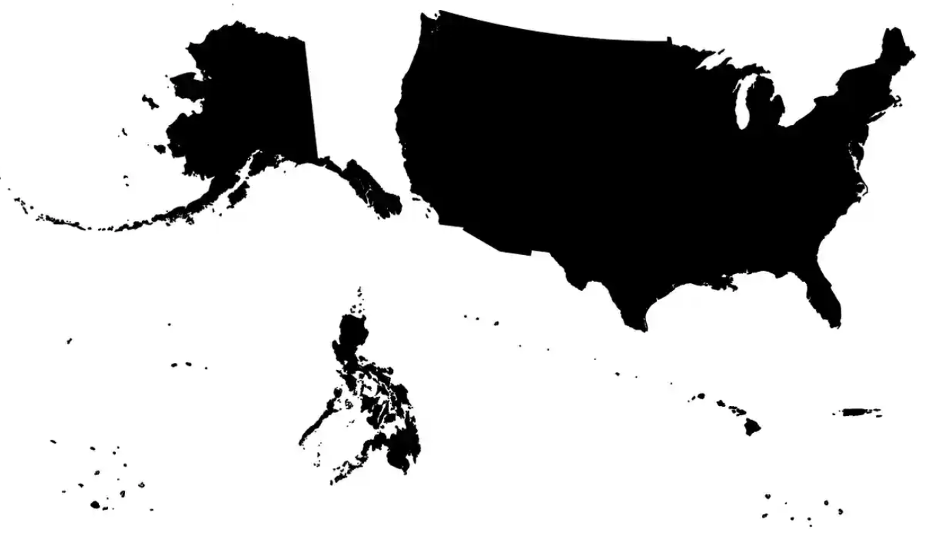
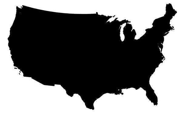
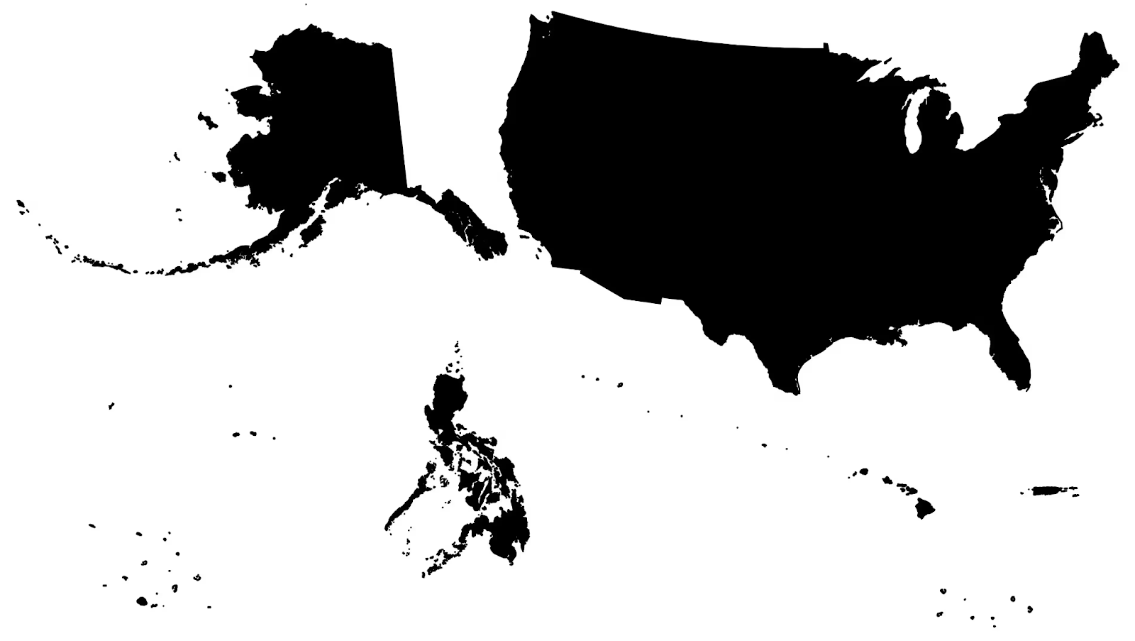
The prominent change from a typical map to a general outline was a great choice for the author attempting to convey his message about borders; a map often full of colors, topography, bathymetric elements, and other cartographic features is turned upon its head and into an all-black outline of an empire–one that many even within the United States do not know about. The process of simplifying these maps into contrasts between dark and light help Daniel Immerwahr to convey his message efficiently. Instead of taking away the focus of readers with colors, minor details, names, and other typical features of maps, Immerwahr turns all U.S. states and territories into black outlines on a white background. Comparing this to the “logo map”, as he calls it, a profounding effect is set for the viewer. The two maps referenced are placed below: 

Immerwahr, Daniel. “How the US Has Hidden Its Empire.” The Guardian, Guardian News and Media, 15 Feb. 2019, www.theguardian.com/news/2019/feb/15/the-us-hidden-empire-overseas-territories-united-states-guam-puerto-rico-american-samoa.

The top image is what Immerwahr refers to as the “logo map”–a traditional representation of what one thinks about when thinking about the United States. The lower image, full of dots and including two STATES Alaska and Hawaii, is the true representation of U.S. control on earth. I myself look at the lower image and struggle to name nearly any territory besides those granted the right to be called a state. But why exactly are these not typically portrayed in a map of the United States? Immerwahr argues for an issue that has loomed over the United States for centuries: racism. 

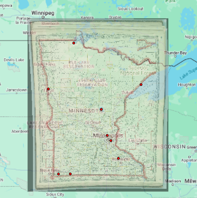
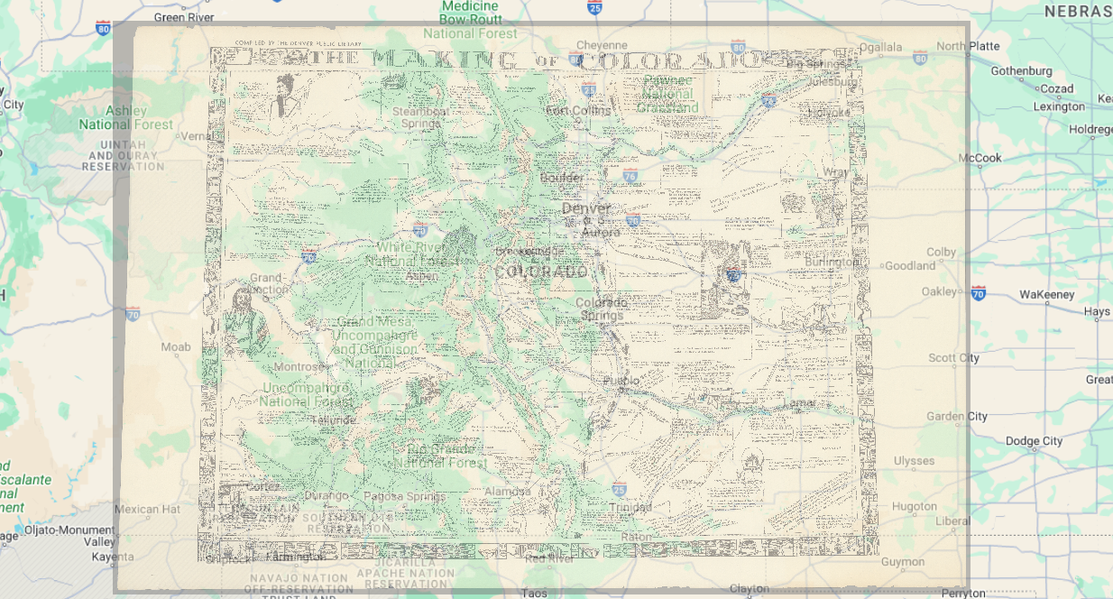
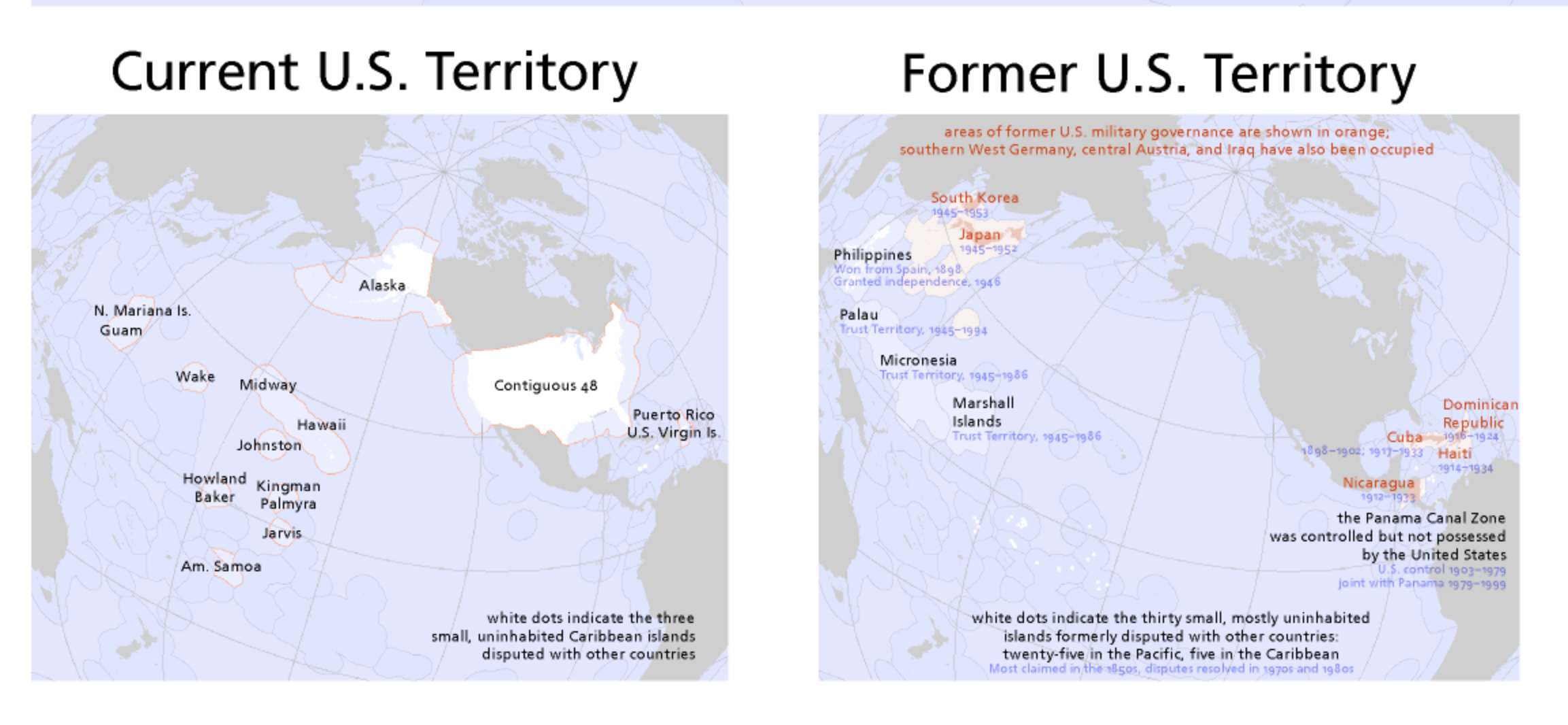
After finishing the article and comparing the two maps listed above, Bill Rankins cartography of the U.S. territories was a very interesting read. It contained numerous cartographic elements to help portray a more sophisticated picture of Immerwahrs claim of the United States being an empire. Shown below:

Rankin, Bill. “Radicalcartography.” Radicalcartography, www.radicalcartography.net/. Accessed 3 Feb. 2024. 

Rankin shows county lines, land boundaries, Indian Reservations, governmental control of land, and disputed areas of land between countries–a fascinating project. Names of territories, how they are governed, and their habitation are all included. Importantly, it puts purpose and places to the confusing black dots laid out by Immerwahrs conclusive map of U.S. territories (shown below).

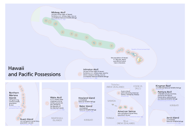
First reading and observing Immerwahrs foundation for the U.S. dominance of the world is later enhanced by Rankins further dive into each territory and its importance; or lack thereof. The absence of such territories from typical U.S. maps routes back to underlying issues of racism, and helps to maintain a feeling of connectedness for the mainland–a critical point for politics.

Georeferencing Nebraska

How might you use this georeferenced image to uncover new information about the history of the region you just mapped?

The map I used to reference with modern Nebraska is a map of the former postal routes within Nebraska. I feel like that could be useful to determine how the interstates/roads have changed throughout Nebraska, and how the postal service even has changed. This could also useful because Nebraska has a lot of ghost towns/towns that aren’t here anymore and I feel like this would be a cool way to find out where those old towns are at, especially in comparison to the old roads and major towns around. This map could also help to see how waterways within the state have changed (maybe track water disparities amongst impoverished/minoritized groups with dams and other technology?).

 What are some weaknesses to this approach? Are there inaccuracies? Do some places map better than others? Why?

I think a weakness to this approach is that it’s hard to get the points exactly centralized on where the cities/towns were previously. The waterways have also changed overtime and it’s hard to determine where some of these towns lie now in regards to the changing waterways. I mapped a lot of Omaha’s suburbs because I felt it was easier to map than the entire state overtime. I think that smaller areas would be better to georeference, as there’s less ground to cover (literally) and the mapping would be more accurate and precise.

Georeferencing in QGIS-Marie Amelse

How might you use this georeferenced image to uncover new information about the history of the region you just mapped?

While working on this image I found myself noticing two new things to think about. First, the movement of water, in the maps the rivers might look slightly different, but also how much the shapes of the lakes had changed. In some places like south central where there is a lot of lake small lakes this was especially evident. Another new piece of information I noticed was the changing of county lines, especially in the far north area of the state. Some lines moved, while other whole new counties had been formed in the 100+ years between the map’s creation. Using two exact points in time helps show a distinct comparison, compared to a map that shows gradual over time. I think that using just two points in time on a  map makes the map easier to digest as well.

 What are some weaknesses to this approach? Are there inaccuracies? Do some places map better than others? Why?

One of the first things that comes to mind is how much we have improved technologically since the creation of many older maps. Now, we have access to satellite images to create or cross-reference maps with. However, prior to only a few decades ago, you could not. As a result, a geographer might map something 5 miles off from where it is, if there was an error of some sort in their measuring. While this wasn’t an issue with my map, I can imagine that the older the map, the easier it could have been to make mistakes like this. The map that I chose covers a relatively large area so I felt that it might be easier to place a reference point in a place that is a few hundred years off from where the reference point that I placed on the Google map. Compared to a smaller map where it would be easier to find the exact point, especially on the older map.

Payton Mlakar: Georeferencing Historical Raster Data – The State of Colorado

The Making of Colorado by Julia M. Stimson georeferenced onto Google Maps. Georeferencing by Payton Mlakar.

The map I overlaid onto a present-day Google Maps view of Colorado seems to be primarily artistic in nature with geographic accuracy taking a backseat to the inclusion of historical anecdotes and images on the map to recount parts of Colorado’s history. This map’s primarily artistic and historic focus reveals how people viewed Colorado and remembered the state’s history around 1935, the year in which this map was published. Its lack of geographic accuracy as compared to Google Maps reveals how precise distance and geography were likely not seen as vital parts of Colorado’s history in comparison to chronicling milestones of the state’s history and highlighting the stories of historically important cities and people in Colorado. It seems that the history of Colorado in popular memory, at least in 1935, was based upon presenting great people, events, and stories in an appealing and flowing narrative. In this way, this map provides an excellent window into the popular historiography of Colorado when compared to a present-day map of the state.

One weakness of georeferencing is that some maps are difficult to read when overlaid on another map. The map I overlaid in this activity includes a substantial amount of text that is relatively small in size. When overlaid on another map, this small text because almost unreadable unless you zoom in an enormous amount. This text can also obscure features on other map layers even when the overlaid map is somewhat transparent.

There are some inaccuracies with georeferencing because of the distortion a map undergoes when it is georeferenced onto another map. Some elements are distorted in the process, altering the original structure of the map the mapmaker intended readers to see. This can hinder the study of a map as a window into the perception of the mapmaker on the mapped area.

Some places with relatively unchanging landmarks would map much better in a georeferencing system than areas with constantly changing features. Rivers, roads, and building, among other landmarks, have locations that can change significantly over time. Places that have undergone minimal change throughout the time between when the layered maps were produced are most conducive to georeferencing as inaccuracies and distortions can be minimized. However, georeferencing maps of regions that have undergone significant change can provide an excellent opportunity for comparing maps and analyzing how the physical terrain and the priorities of mapmakers have changed over time.

Emma Reed Blog Post 3

The article, How the US has Hidden its Empire, by Daniel Immerwahr examines maps of the United States at different points through history and how US opinions on foreign lands, identity, and power shaped them. Immerwahr begins to lay out his argument as he unfolds the history of the Pearl Harbor bombing and the intentional decisions that were behind sharing the news with the public. The United States purposefully left out the bombings that occurred in their territories of Guam, Midway, the Philippines, and Wake Island even though all of them, including Hawaii, were territories at this time. This exclusion is mirrored in how the United States and its territories are displayed through maps. He argues that this clearly shows that the US thought of Hawaii as “more American” than these other territories.

Maps are often used to shape the perception of imperialism in the public. Political Scientist Benedict Anderson describes this as the “logo map” (pictured above) meaning that if the United States had a logo it would only be the lower 48 states. However, this is not politically correct, even in the year of the Japanese bombings as it should include all territories such as Hawaii, Alaska, the Philippines, etc. The image below shows a comparison between the current US territories and its former territories.

This analysis allows us to understand the true interconnectedness of Japan’s attacks not just on Hawaii, but across American Pacific territories. By looking at what versions of maps were being produced during specific time periods, one can get an understanding of the geopolitical context the world was in at that point. This can still be seen today and an example of this is a standard world map. By placing Europe and “The West” in the center of the map, it is inadvertently promoting a euro-centric idea of the world. This explains how the argument Immerwahr is making still stands today.

Immerwahr, Daniel. “How the US Has Hidden Its Empire.” The Guardian, Guardian News and Media, 15 Feb. 2019, www.theguardian.com/news/2019/feb/15/the-us-hidden-empire-overseas-territories-united-states-guam-puerto-rico-american-samoa.

Rankin, Bill. “Radicalcartography.” Radicalcartography, radicalcartography.net/. Accessed 1 Feb. 2024.  

GIS Activity Week 3- Isabel Blackford

This georeferenced image could be used to uncover new information about the history of the region I just mapped by using the cities that correlate to modern day cities as landmarks to discover new things nearby. Although a state such as New Jersey that is highly populated with not much land left undiscovered, that does not mean more information cannot be found. An example like this was helpful in trying to find a gravesite of an ancestor of mine while doing genealogical research by using old maps to find the nearly deserted and forgotten graveyard. Another way a georeferenced image such as this could be found helpful is rediscovering shipwrecks that have been lost to time using old landmarks from the 1892 map to compare to those in Google Maps.

Some potential weaknesses to using this approach however lies in the fact that in the modern day we have much more exact technology than what was had in 1892. That means the proportions of the 1892 have points where they are not nearly as exact as the modern day Google Maps map. This leads to cities and landmarks not always being in the same spot over the years even if their geological area has not changed at all in the past one hundred years. The consequences to these discrepancies can lead to things/places being miles from what they are mapped to be which can be frustrating when attempting to find something that has been lost to time. Places that have geological landmarks tend to be easier to map out because those landmarks do not move and remain stagnant, acting as points of reference when creating maps of that area.

Gabe Murphy: GIS Activity – Georeferencing

Overlapping multiple layers of maps can be very beneficial: in this case, and many other examples, I believe it is best used to experience/note change over time. The layered map (sitting on top of the google map base) has Haleakala National Park of Hawaii labeled in red. Over 60 years later, it would be very easy to indicate either the expansion of such reserve or the decrease in size. I would hope the reserve has increased in size from the 1962 map as maintenance and preservation of biodiversity grows in importance. Second, as ice caps begin to melt and ocean levels rise, this map would provide great insight into this change as depths and contour lines of shoreline/reef structures are highlighted. This could help to examine change over time as climate conditions continue to shift. The red lines highlight, what I presume to be, the main highway that encompasses the island of Maui. There would be a great change in this system as infrastructure seems to be on an exponential expansion destroying everything in its path. 

As different maps undoubtedly have different scales, this scaling may throw off the true shape of the location the map focuses on. When this occurs, it may make it hard to accurately overlay two maps and ensure that one point on one lines up with one on the other. Further, as technology advances the accuracy of mapping does as well. When comparing a map from 60+ years ago, as I did, to a never-ending data mine (google maps), there will definitely be some differences in borders, town locations, streets, etc. In this case, my map was created by the US Army so I believe their technology at the time would have been the most advanced, possibly not even available to the public. However, maps today are certainly more accurate than the best of the 1960s. This may make it hard to georeference one map onto another–simply based on inaccuracies and changes. As seen in my example, there is a stretch of highway running over the ocean in the bottom-middle region of the island; when in reality this does not happen. There was simply no way to accurately depict the entire shoreline, and this stretch took the biggest hit. Using 7 control points was not enough to layer these maps together, I had to use nearly 20–a definite weakness of this approach. I am wondering if there is a way to trace a border and layer them together by that–I feel like that would be a much more accurate, but tedious, method. Overall, I am satisfied with how the georeference came out: but it is certainly not a 1:1 scale.

css.php