
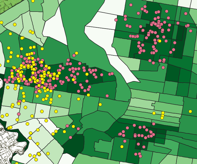
- I think looking at this map with the Berean (Red) and Metlife (Yellow) loans with Berean loaning out to black populations and MetLife more toward white populations. The green sectors are based off of percentage black population so with more Berean loans in darker sectors we can make this observation.
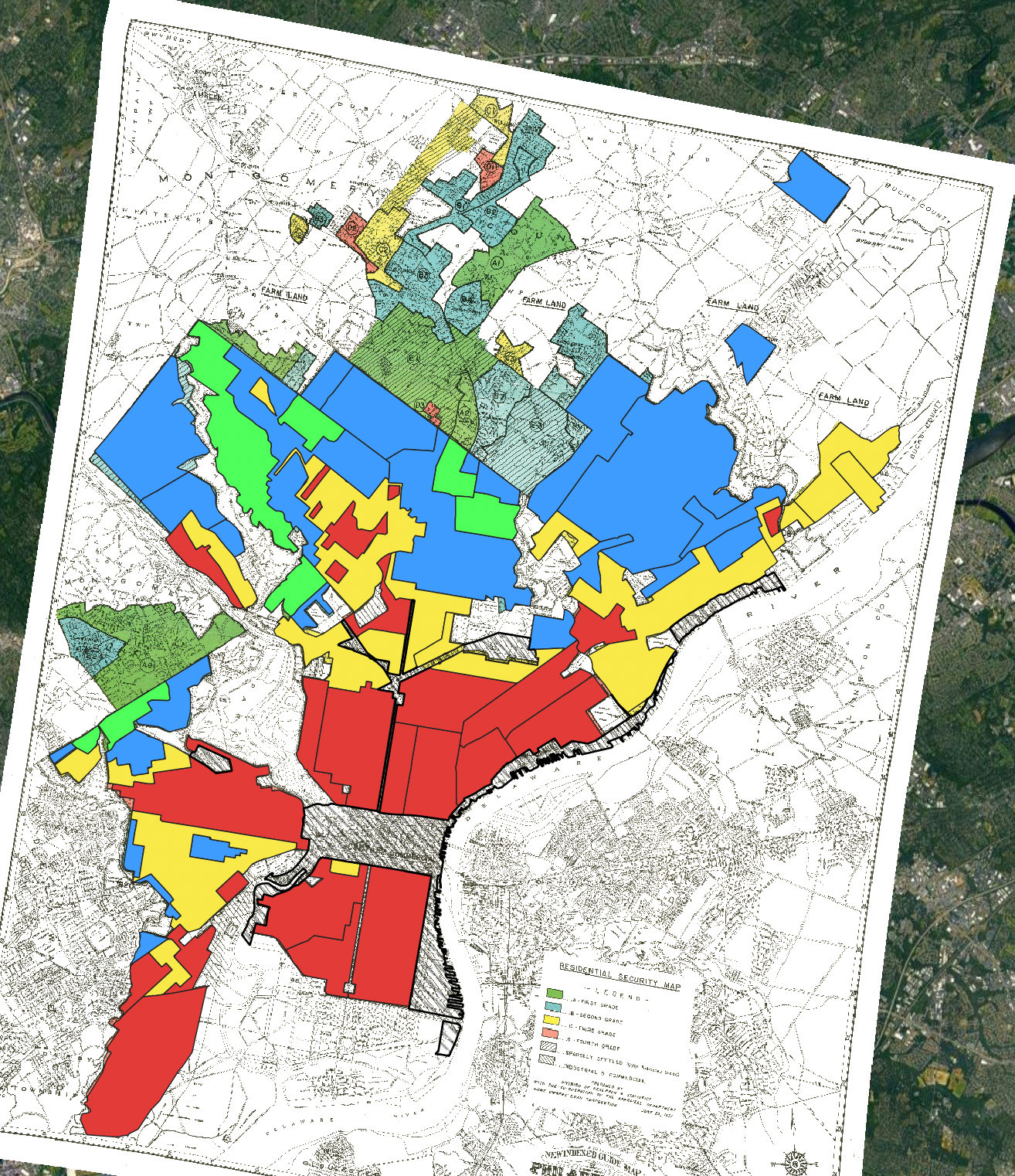
2. Regions that were identified as high-risk had the highest interest rates. On top of that areas that had the highest black populations also suffered the highest interest rates.
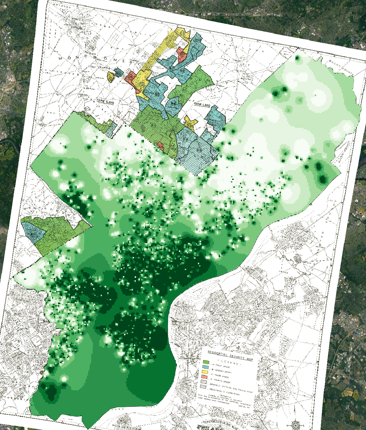
3. HOLC maps dictated mostly where Berean could give out loans being mostly in high-risk areas (red). These areas also had the highest percentages of black populations whereas the low-risk areas (blue and green) had the lowest percentages of black populations.
4. An additional data layer I would be interested to see is dwellings that have house covenants in the Philadelphia area. If there were areas with housing covenants I would expect them to be on the north side of Philadelphia away from the “high-risk” areas.
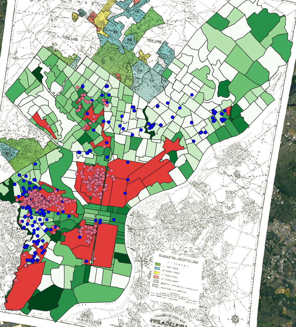
5. My map below consists of the Berean (pink) and Metlife (blue) loans, the 1950 census tract showing percentage of black population as well as the high risk areas determined by the HOLC map. I believe these three layers effectively show how the HOLC map determined where black and white populations lived in Philadelphia by showing the Metlife loans being away from high-risk areas and in areas with lower black populations as well as how Berean loans were almost restricted to these high risk areas in larger black communities.
Got it. Nice work!