Stage 6- Hank Salsbury review of Ella Callon’s story map

Ella’s story map looks over the history and development of St. Louis’ Forest Park and the significance of the 1904 World’s Fair held in Forest Park. I already knew a bit about the 1904 World’s Fair from Dr. Averett’s class on St. Louis but this piece revolving more around the history and layout of the park alone was incredibly interesting. The map shows a recreation of the original layout of the exhibits and stages of the 1904 World’s Fair that was themed around the hundredth anniversary of the Louisiana Purchase.

The story map does a great job of showing the reconstruction of the park and how it was transformed into the fairgrounds, as well as showing and explaining a lot of the main attractions of the fair. Along with detailed historical commentary, the visuals of the story map and the maps themselves were pleasing all following a red yellow, and cream theme. The entire presentation was easy on the idea and easy to read which was a massive plus.

I think it was smart how you waited to introduce the racial hierarchy theme of the fair to show that the fair was not some glittering festival, but something that attempted to glorify white, Western culture and paint other groups as primitive.

The one large thing I would toggle is the zoom of the map because without really interacting with the map the viewer wouldn’t be able to figure out what each building was. Once I zoomed in, again, I thought the map was amazing. I also think it would have helped if you did certain spotlights on buildings or exhibits to really magnify their role in the fair and maybe also add some personal accounts from fair goers to add to the uniqueness.

Overall I thought this was a really good project and I enjoyed learning about a city and an event that I tend to not think about.

Practicum 5- Philadelphia Red Lining

  1. I think looking at this map with the Berean (Red) and Metlife (Yellow) loans with Berean loaning out to black populations and MetLife more toward white populations. The green sectors are based off of percentage black population so with more Berean loans in darker sectors we can make this observation.

2. Regions that were identified as high-risk had the highest interest rates. On top of that areas that had the highest black populations also suffered the highest interest rates.

3. HOLC maps dictated mostly where Berean could give out loans being mostly in high-risk areas (red). These areas also had the highest percentages of black populations whereas the low-risk areas (blue and green) had the lowest percentages of black populations.

4. An additional data layer I would be interested to see is dwellings that have house covenants in the Philadelphia area. If there were areas with housing covenants I would expect them to be on the north side of Philadelphia away from the “high-risk” areas.

5. My map below consists of the Berean (pink) and Metlife (blue) loans, the 1950 census tract showing percentage of black population as well as the high risk areas determined by the HOLC map. I believe these three layers effectively show how the HOLC map determined where black and white populations lived in Philadelphia by showing the Metlife loans being away from high-risk areas and in areas with lower black populations as well as how Berean loans were almost restricted to these high risk areas in larger black communities.

Practicum 6

Thinking of the Sanborn fire maps I’ve been working with it could be useful to know how far fire hydrants are from buildings that could be susceptible to fires. So I think it could be done in a way where it shows buildings that are made out of wood or flammable materials and their distance from fire hydrants. It could highlight the need for hydrants in certain areas and could be farther away from areas with say stone or brick buildings. For me I thought of doing these with residential buildings and how many there are in relation to churches and other identified community centers to show the importance of these buildings as community anchors.

Dust Bowl ArcGIS Practicums

This practicum observed the change of the plains region’s cultivated land or more so the overworking of the the Great Plains that created conditions leading to the dustbowl.

1880 TotalCult/Area

The glaring observation of this first map is that Oklahoma shows no data. This is because as of 1880 Oklahoma had not been added to the union. However looking at states with data we can see that Kansas led the region in cultivated land being a large wheat producer.

1900 TotalCult/Area

As we move into 1900 we can see land cultivation start to creep westward into Colorado and parts of West Texas. We can also see that land that was already cultivated become even more used.

1940 TotalCult/Area

By 1940 we can see the over-cultivation of land had spread throughout the plains region and altered every state’s arable land area. We can also see more counties where they had been moderately cultivated, fall deeper into cultivation.

While the 1940s were around half a decade after the Dustbowl, we can see how there was a mass of over-cultivated land that deprived soil of hydration and protection allowing for drought to tear through torn-up farmland and blow the plains into a dust bowl.

Stage 4

As of right now this map shows some of the buildings most affected by the highway construction. I still need to add vector layers for all buildings in the Strawberry Hill neighborhood. I have done some around St. John’s Catholic Church and some around where the highway was built at the expense of homes, companies, and other buildings.

I plan to add all the other buildings, and layers for significant buildings, churches, and large businesses. the stylistics will look better but for now, for the general buildings layer orange was best for my eyes. Yellow indicates important buildings some with names but at the end, all “community centers” should have names.

https://storymaps.arcgis.com/stories/594fab4345f14a859296ca22d237ee3c

https://creighton.maps.arcgis.com/apps/mapviewer/index.html?webmap=599a1f96c1ba4bd283f19797038376cc

Stage 3 Hank Salsbury

“Annotated” Bibliography

Batschelet, Clarence Edmund. Fifteenth Census of the United States: 1930: Metropolitan Districts : Population and Area. United States, U.S. Government Printing Office, 1932.

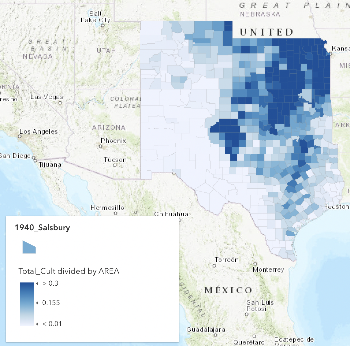
Fifteenth census of the US for numbers on Wyandotte County in the 30’s.

Harrington, Grant W.. Historic Spots: Or, Milestones in the Progress of Wyandotte County, Kansas. United States, Mission Press, 1935.

List of buildings and historical landmarkers in Wyandotte county that could serve as points for cultural hubs

Fourteenth Census of the United States Taken in the Year 1920: Population 1920: general report and analytical tables. United States, Norman Ross Publishing, 2000.

Another census just for a better understanding of change from 1920 to 1930

“Sacred Structures- Historic Churches in Kansas City, Kansas.” Wyandotte County Historical Museum, Unified Government of Wyandotte County , www.wycokck.org/Departments/Wyandotte-County-Historical-Museum. Accessed 28 Mar. 2024.

List of historic churches and schools in KCK that serve as cultural hubs for the foreign born ethnic groups

Sanborn Fire Insurance Map from Kansas City, Wyandotte County, Kansas, Image 1. Sanborn Map Company, Vol. 1, 1907. Map. Retrieved from the Library of Congress,

Reference map for the Strawberry Hill neighborhood

Sanborn Fire Insurance Map from Kansas City, Wyandotte County, Kansas, Image 55. Sanborn Map Company, Vol. 1, 1907. Map. Retrieved from the Library of Congress,

Reference map for the Strawberry Hill neighborhood

Strawberry Hill papers. Susan Greenbaum papers, RH MS 1474. University of Kansas. Kenneth Spencer Research Library.

Truesdell, Leon Edgar, and Edwards, Alba M.. Fifteenth Census of the United States: 1930. Population. United States, U.S. Government Printing Office, 1931.

Another census to look through population numbers for 1930 Wyandotte county

University of Kansas Division of Continuing Education, and Barbara Watkins. “The Kansas Immigrants II.” KU ScholarWorks, Division of Continuing Education, University of Kansas, 1 Jan. 1981, kuscholarworks.ku.edu/handle/1808/22306?show=full

Report that looks at the history and preservation of Strawberry Hill

Wyandotte County and Kansas City, Kansas: Historical and Biographical. Comprising a Condensed History of the State, a Careful History of Wyandotte County, and a Comprehensive History of the Growth of the Cities, Towns and Villages …. United States, Goodspeed Publishing Company, 1890.

History of Wyandotte County and KCK, and the growth of the communities that make up WC and KCK

Secondary sources

“About Strawberry Hill.” Strawberry Hill Neighborhood Association, Strawberry Hill Neighborhood Association, www.strawberryhillkck.org/aboutstrawberryhill. Accessed 29 Mar. 2024.

Strawberry Hill neighborhood history page.,

Cable, Ted T., and Wayne A. Maley. Driving across Kansas: A Guide to I-70. University Press of Kansas, 2017.

History and guide of I-70 which destroyed a good amount of Strawberry Hill

Copeland, Lara. Historic Photos of Kansas City. United States, Turner Publishing Company, 2006.

Driever, Steven L., and Danny M. Vaughn. “Flood Hazard in Kansas City since 1880.” Geographical Review, vol. 78, no. 1, 1988, pp. 1–19. JSTOR, https://doi.org/10.2307/214302. Accessed 3 Apr. 2024.

Flood history of Kansas City that forced the creation of the Hill neighborhood as a way to avoid flooding.

Elliott, Robin G. “The Eastern European Immigrant in American Literature: The View of the Host Culture, 1900-1930.” Polish American Studies, vol. 42, no. 2, 1985, pp. 25–45. JSTOR, http://www.jstor.org/stable/20148178. Accessed 1 Apr. 2024.

Hall, Scott T. “Fountain of Cities: An Examination of Urban Growth and Growth Management with a Regional Proposal for Greater Kansas City.” Kansas Journal of Law & Public Policy, vol. 13, no. 4, 2003-2004, pp. 619-644. HeinOnline, https://heinonline.org/HOL/P?h=hein.journals/kjpp13&i=701.

Manzo, Joseph Theodore. Strawberry Hill, an Ethnic Urban Neighborhood. N.p., University of Kansas, Geography, 1975.

Marinovich, James. On Strawberry Hill: Croatian-American Tales of Long Ago. United States, CreateSpace Independent Publishing Platform, 2013.

Shortridge, James R.. Kansas City and how it Grew, 1822-2011. United States, University Press of Kansas, 2012.

Roucek, Joseph S. “The Image of the Slav in U.S. History and in Immigration Policy.” The American Journal of Economics and Sociology, vol. 28, no. 1, 1969, pp. 29–48. JSTOR, http://www.jstor.org/stable/3485555. Accessed 3 Apr. 2024.

Mapping History and Ethics

From the start of this class, we have stressed and explored the subjectivity of maps. How maps can illustrate and communicate almost anything the cartographer would like to portray. Whether it be the beauty of a certain region, the demographic buildup of an area, or the rock layers beneath the ground itself, maps have the power to show almost anything. However, with this subjectivity can come bias and issues of misinformation or the skewing of certain messages or narratives for good and for bad.

In the instances of the maps of lynchings from the EJI and the Monroe & Florence Work Today websites, the messages are “skewed” to show the horrors of lynching in the United States. I say “skewed” only because today there is a journalistic or research norm to represent both sides, which in this situation would completely take away from the meaning of both projects. The projects are able to portray the gruesome, unjust practice of lynching in the Reconstruction and Jim Crow eras.

To start with the EJI map, I immediately was drawn to the focus on the South Eastern portion of the United States where an overwhelming majority of lynchings occurred in the US. The only issue I have with this illustration is that it dulls out the area outside the Southeast, almost making lynchings that occurred outside the US seem unimportant or separated from the issue. While the EJI map was useful its depth paled in comparison to the Monroe Today Map.

The Monroe and Florence Work Today Map is a broader collection of lynchings that correctly portrays the lynchings occurring outside of the Southeast. This map does not just focus on a certain region or area but is an incredibly detailed interactive map of lynch mob violence in the United States completely with names, charges, and details of each victim of mob violence. From a personal view, exploring this map is one of the few experiences that I have had in my research of United States history where I have been deeply moved. I have poured over countless stories of violence throughout United States history but with this map and being able to see the names and relationships of each victim almost made me sick to my stomach and I am thankful for it. If any map can evoke that much emotion it has clearly portrayed whatever message it set out to, in this case, showing the sheer amount of horrors committed by mob violence throughout the United States.

Church and Hepworth’s “Racism in the Machine: Visualization Ethics in Digital Humanities Projects” hits the nail on the head in finding the ethical dilemma and difference between the two maps. Church and Hepworth correctly identify that the maps are products of the associations that they are published from, one looking to focus more on violence in the Deep South among African Americans and another suggesting that mob violence affected far more than just the African American population.

The comparison of these maps along with Church and Hepsworth’s piece has made me realize the importance of symbology and focus on a project because, with the wrong illustration, a point can be either completely ignored or featured with certain effects. Mapping ethics should guide cartographers, including myself, to correctly visualize their maps to convey not only the message they would like to convey, but a correct message.

[PICTURES REFUSING TO UPLOAD WILL REVISIT IN MORNING]

Stage 2

The Wyandotte County and The Strawberry Hill area of Kansas City, Kansas is one of, if not, the most diverse neighborhoods in a metropolitan area in the country and I look to map how Eastern European immigrants built up and expanded this area for the better from the early 1900s to around the present day. I’m still determining where to put the parameters because it will mainly revolve around historic catholic churches of Kansas City, Kansas but at the largest point this map will look at Wyandotte County, KS. I will look to use both historical and online data sets to determine where these European groups lived and how their presence boosted the economy of the area and how these Eastern European neighborhoods grew over time, ultimately establishing the greater Kansas City, Kansas area. I’ve already found a list of churches and other businesses that I want to use as “hubs” for certain ethnic groups and center my research around how KCK expanded out from those centers. I want to make an interactive map that can be toggled through to show the change and expansion of the area over time. Not only would I like to map expansion over time but also track the average incomes and ethnic makeups of the county from 1900 to 2010. This project aims to show the important role that immigrants played in the foundation of Kansas City and also possibly show how far Wyandotte County and the Strawberry Hill community have regressed in the past decades. For personal reasons, I want to map this area because it is where my family started and I want to know more about my roots and be able to show my grandparents and great-grandparents the importance they played in building KC to what it is now.

css.php