
What truly makes this map special for me is how this topic very clearly mirrors my own which I can only assume is why Dr. Sundberg paired us together. Overall, it is very apparent and a lot of time and effort went into this map and Payton was very thorough when creating this map. This leads to my observation that this map seemed a little excessive in the amount of content it included, while it shows the author is well versed in the material it does seem a little like words were just strewn across the story map when it could be communicated more effectively. There was couple sections that I believe could have been cut out entirely since they did not really relate to the thesis and seemed to just be fun facts that did not need an entire section dedicated to it. Additionally in terms of the in-text portion there were a few grammar and punctuation errors that I noticed as well and there were a few times the wording that was used was confusing. I loved all the visuals of the story map which I believed made the map come together and more effectively show the audience what was being written about/ mapped out. The map included in the Leadville: The Early Years I wish would have a more dramatic difference in color to show the difference in population because although I am able to see the topographic lines meant to show the difference in population I am unable to visually see much outside of those lines since the colors do not seem to change.
Isabel Blackford Stage 5
Isabel Blackford Stage 4
https://storymaps.arcgis.com/stories/b9a83c83d4e74e5ca413e5d72ee6270c
Very rough draft, enjoy! Would love to have comments and opinions on what I plan on doing.
Isabel Blackford Stage 3
Annotated
- Gudde, Erwin G. 2009. California Gold Camps: A Geographical and Historical Dictionary of Camps, Towns, and Localities Where Gold Was Found and Mined; Wayside Stations and Trading Centers. Univ of California Press.
This source names all of the mining settlements that popped up during the California Gold Rush along with a quick summary of each town. This will prove helpful as I am using this source to map out all of the new mining settlements that came to be during the gold rush.
2. Phelps, Robert. “‘All Hands Have Gone Downtown’: Urban Places in Gold Rush California.” California History 79, no. 2 (2000): 113–40. https://doi.org/10.2307/25463690.
The article gives a description of gold rush towns allowing there to be a more accurate visualization. This source will be useful as it describes what urbanization is and how it is applied to the gold rush.
3. Mann, Ralph. “The Decade after the Gold Rush: Social Structure in Grass Valley and Nevada City, California, 1850-1860.” Pacific Historical Review 41, no. 4 (1972): 484–504. https://doi.org/10.2307/3638397.
This article details two cities and how they both flourished during the gold rush, and once the gold rush ended one was more successful than the other. This will be beneficial as in my story map I plan on comparing and contrasting two gold rush towns and why one was successful and why one is nothing more than a ghost town now.
4. Jolly, Michelle Elizabeth. Inventing the City: Gender and the Politics of Everyday Life in Gold-Rush San Francisco, 1848-1869, 1998.
This article talks about the gender imbalance in San Francisco and how that was attributed to the influx of men traveling to California in search of gold. This will prove helpful with my project as I will map show the gender imbalance in my map and through this article I will be able to prove that this is because of the influx of male settlers from the gold rush.
5. Zhang, Nan, and Maria Abascal. “Cultural Adaptation and Demographic Change: Evidence from Mexican-American Naming Patterns after the California Gold Rush.” Journal of Ethnic and Migration Studies 50, no. 1 (2024): 132–48. doi:10.1080/1369183X.2023.2259039.
This article analyses the native population of California before the gold rush and how the occurrence of the gold rush changed the actions of those who lived their prior to the massive influx of those looking to strike rich on gold. This will prove helpful as I analyze the data from before the gold rush to after it has concluded.
6. Epstein, Terrie. “The Pride and Pain of Chinese Immigration: Folk Rhymes from San Francisco’s Chinatown.” OAH Magazine of History 5, no. 2 (1990): 51–54. http://www.jstor.org/stable/25162737.
This article details the experience of Chinese immigrants during the gold rush and how discrimination led to a significant number returning to China. While mapping out the different demographics this article will help explain some of the migration patterns of Chinese immigrants and why living in California was difficult specifically for them.
7.Roth, Mitchel. “Cholera, Community, and Public Health in Gold Rush Sacramento and San Francisco.” Pacific Historical Review 66, no. 4 (1997): 527–51. https://doi.org/10.2307/3642236.
This article talks about how the cholera epidemic spread from the eastern half of the United States to the west coast during the gold rush. Disease especially ran rampant due to the gold rush towns because the towns were not built with sanitation in mind in terms of infrastructure. This will help for demonstrating how little preparation went into these towns when they sprung up.
8. Chan, Sucheng. “A People of Exceptional Character: Ethnic Diversity, Nativism, and Racism in the California Gold Rush.” California History 79, no. 2 (2000): 44–85. https://doi.org/10.2307/25463688.
This article points out the vast diversity that California has always had from the multitude of Native American tribes to what California is today. The demographic information in this article will be useful by providing a snapshot into how the diversification of California has changed over the course of time.
9. Wood, Warren C. “Fraud and the California State Census of 1852: Power and Demographic Distortion in Gold Rush California.” Southern California Quarterly 100, no. 1 (2018): 5–43. https://www.jstor.org/stable/26413484.
This article offers some information regarding census data that I will be using for this project and giving insight that not all the information can be guaranteed to be true. This allows the information to be taken with a grain a salt and to be looked at in a way that allows the data to be further analyzed.
10. Rohrbough, Malcolm. “No Boy’s Play: Migration and Settlement in Early Gold Rush California.” California History 79, no. 2 (2000): 25–43. https://doi.org/10.2307/25463687.
This article gives some insight on the migration to California during the gold rush and the events that led up to thousands moving across the country, and the world in hopes of finding gold. This will be helpful to explain why people were migrating, especially as I map out the increase in population over time.
Secondary sources
- Pio, Jason Gauthier History Staff. n.d. “January 2017 – History – U.S. Census Bureau.” https://www.census.gov/history/www/homepage_archive/2018/january_2018.html.
- “From Gold Rush to Golden State | Early California History: An Overview | Articles and Essays | California as I Saw It: First-Person Narratives of California’s Early Years, 1849-1900 | Digital Collections | Library of Congress.” n.d. The Library of Congress. https://www.loc.gov/collections/california-first-person-narratives/articles-and-essays/early-california-history/from-gold-rush-to-golden-state/.
- American Experience, PBS. 2017. “The California Gold Rush.” American Experience | PBS, October 11, 2017. https://www.pbs.org/wgbh/americanexperience/features/goldrush-california/.
- “Resource 6-1a: California Population by Ethnic Groups, 1790-1880.” n.d. https://explore.museumca.org/goldrush/curriculum/1stcalifornians/resourcesix.htm.
- “Tribes – Native Voices.” n.d. https://www.nlm.nih.gov/nativevoices/timeline/311.html.
- American Experience, PBS. 2017a. “The Gold Rush Impact on Native Tribes.” American Experience | PBS, September 18, 2017. https://www.pbs.org/wgbh/americanexperience/features/goldrush-value-land/.
- “The Growth of Cities in the Gold Rush Era.” n.d. Calisphere. https://calisphere.org/exhibitions/15/growth-of-cities-in-the-gold-rush-era/#:~:text=Cities%20up%20and%20down%20the,an%20impact%20on%20its%20geography.
- “San Francisco | History, Population, Climate, Map, & Facts.” 2024. Encyclopedia Britannica. April 2, 2024. https://www.britannica.com/place/San-Francisco-California/The-growth-of-the-metropolis.
- “Historical Impact of the California Gold Rush.” n.d. Norwich University – Online. https://online.norwich.edu/historical-impact-california-gold-rush.
- “———.” n.d. Norwich University. https://online.norwich.edu/historical-impact-california-gold-rush.
Isabel Blackford Week 11 Blog Post
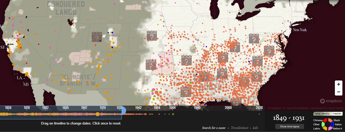
The crime of lynching is something, although brutal, very unique to American history. When analyzing the maps given for this blog, even the larger surface level details were surprising to learn. For example when I think of the word “lynching” I often only think of the context in relation to African American and White tensions after slavery and before the civil rights movement. However by making a quick glance at the White Supremacy Mob Violence Map, it was make clear very fast that lynching is much more than just a two race conflict, and can affect any race although in certain areas is can be more prevalent for particular races (i.e. Latinx in California/West Coast and African Americans in the Deep South). Although lynching can happen to any race, it always involves race and is what drives lynching to occur.
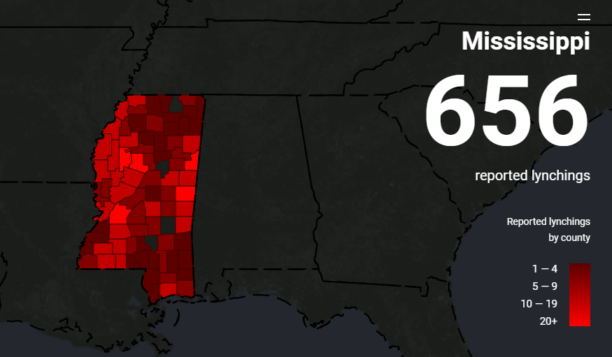
In particular when areas have a large number of lynching’s occurring, those actions become normalized in the population and in Mississippi alone between 1877 and 1950 there were 656 reported lynchings in the Racial Terror Lynching map. The county with the highest number of lynchings had 48 just in one county (Leflore County). However this map only counts the lynching of African Americans so the volume of lynching is presented much different than the map above and primarily focuses on the American South and ignoring states like California as pointed out in the Racism in the Machine: Visualization Ethics in Digital Humanities Projects article.
What happens when you map such a horrific act such as lynching, it can sometimes take away the magnitude and the gruesome nature of the action, making it easier to ignore the ethical implications that come with mapping such a topic. It turns a serious racially driven crime into a a shade of red which can ignore the lives that have been lost from lynching and normalizes the behavior to an extent. The maps are useful in the fact that they demonstrate the amount of lynching occurring but can place the blame on the geographical area instead of looking deeper into the problem. Additionally when mapping out such a significant thing, just using a choropleth map can take out the personification of the event and make it much less humanizing.
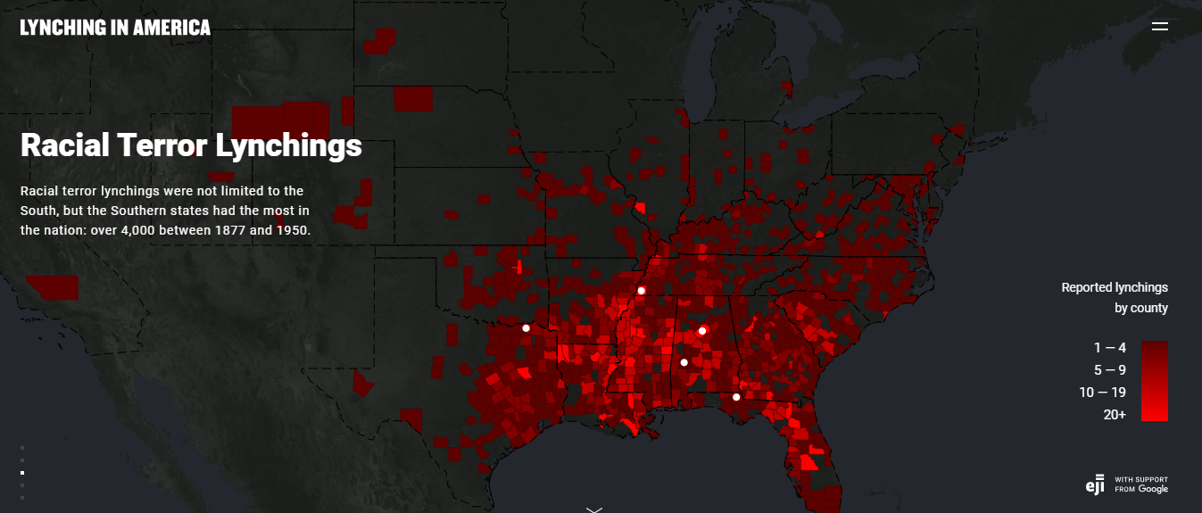
The different focuses of both the White Supremacy Mob Violence Map and the Racial Terror Lynching map illustrate two different issues when it comes to lynching and shows the two different definitions of what is classified as lynching. While the Racial Terror Lynching map demonstrates a more rigid definition with lynching involving a white supremacy mob that believes what they are doing is lawful and righteous, additionally knowing that they will get away with murder because what they are performing is a form of justice. The White Supremacy Mob Violence Map on the other hand, still believed that the murder they were performing by mob was serving justice to support white supremacy, but was included much more ethnic groups and had a much more homicidal intentionality and brutality surrounding the lynching, often mutilating the corpse of the victims. While neither is ethical it is important to note that there are differences in the definition of lynching and that can effect how it is mapped onto a map.
Works Cited:
Hepworth, Katherine, and Christopher Church. 2018. “DHQ: Digital Humanities Quarterly: Racism in the Machine: Visualization Ethics in Digital Humanities Projects.” 2018. https://digitalhumanities.org/dhq/vol/12/4/000408/000408.html.
“Explore the Map | Lynching in America.” n.d. https://lynchinginamerica.eji.org/explore.
“Monroe & Florence Work Today – Explore the Map.” n.d. Monroe & Florence Work Today. https://plaintalkhistory.com/monroeandflorencework/explore/.
Isabel Blackford Hurricane Katrina
Isabel Blackford Final Project Stage 2
Final Project Stage 2
`The historical question I plan on mapping out is how the Gold Rush affected the growth of towns in California and how some towns turned into booming metropolises and some turned into unincorporated ghost towns. I plan on focusing on the entire state of California from 1850 to the early 1900s. This I will do by plotting all the individual towns that came to be during the Gold Rush and then doing case studies on two particular towns (Sacramento and Dutch Flat) and studying why one was more successful than the other at maintaining its population and growing as a city. The sources I will use will be books, David Rumsey, DPLA, Calisphere and Library of Congress as places to find my sources. One exact source that I was able to find to map out all of the towns that popped up during the Gold Rush is called California Gold Camps. I will be creating a story map and this is because I am analyzing two different case study maps in addition to mapping out the larger picture of California. As it is a story map I will be able to tell the story of California before, during and after the Gold Rush and how it forever changed the landscape and demographics of California. Without the Gold Rush how California looks would be vastly different and I would like to tell that story and how some of the largest cities in the entire United States came to be. This project is a piece of scholarship through its collection of data that has never been digitalized through QGIS. Although there has been some work listing all of the towns that were founded because of the Gold Rush which I am using as a source, as far as I am aware of there has never been work that has demonstrated the growth and fall of these newfound settlements while also comparing the cities that succeeded to those who failed to thrive in the absence of the Gold Rush.
Isabel Blackford ArcGIS Online & Dustbowl
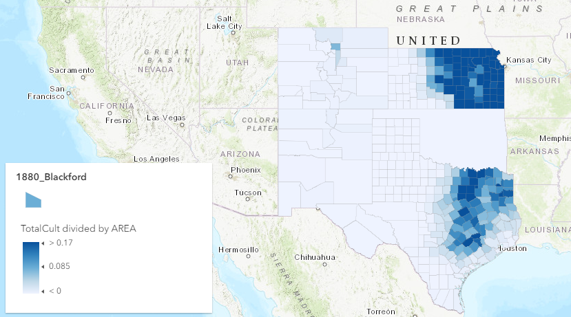
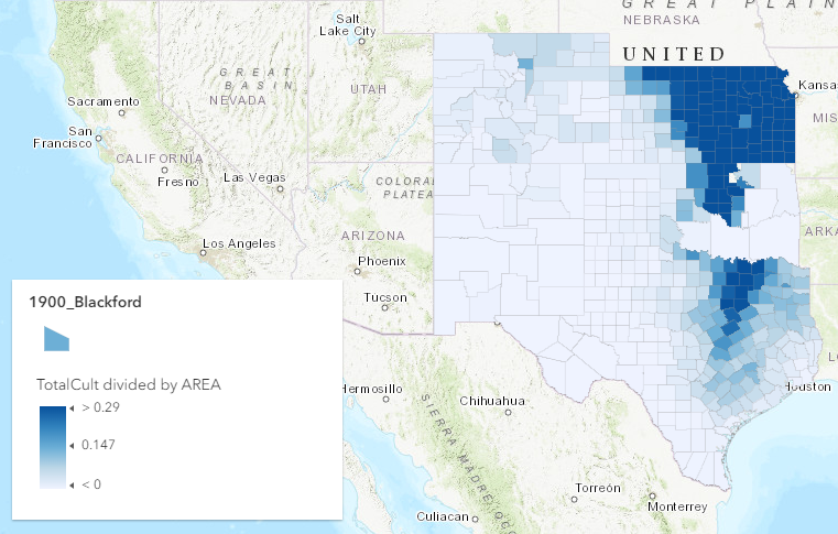
To demonstrate the change over time of land being cultivated the map above is in the first in a series of maps that demonstrates how the over-cultivation of land led to the environment pushing back on mankind through the Dust Bowl in the 1930s. After this environmental event, cultivation of the land was then pushed back to rates similar to that above. In the figure above it can be seen that areas in the eastern parts of Texas and Kansas that the percentage of land is much more concentrated compared to the western parts of the states which can be attributed to the country still expanding in a westward trend.
In figure 2 above, it can be seen that the land being cultivated is slowly creeping westward in comparison to figure 1. Additionally it can be seen that the areas that were already cultivated are becoming more concentrated with more of the land being used to cultivate more crops than in figure 1, twenty years earlier.
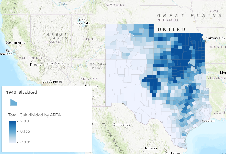
In the last figure, it can be seen that the land cultivated overall is much more vast and westward in comparison to figures 1 and 2. However, the areas that are cultivated are much less condensed than the previous two figures. This can be credited to the Dust Bowl that took placed five years before this data was taken and the farmers learning that certain land is more fertile than others, and no matter how fertile the land is, if you over cultivate the land it will be useless in the near future. Also in the 1940s, World War Two was looming overhead and the more crops that could be efficiently grown, the more crops that could be sent to support the war effort which may have been a factor to discover a way to cultivate the land in a way that allowed the farmers to use the land to the fullest extend without causing another Dust Bowl by reaching natures natural limits.
Isabel Blackford Week 9 Blog Post
The development of grassland into farmland was not a fast nor simultaneous process and in reality took a little less than a century to happen. Even when development was nearly completed, one hundred percent of the land was never developed due to environmental limitations on the capacity of the land to be developed into farmland. Even when there were drivers of economic benefit to develop more land to make more money, the environment swiftly enforced it’s limitations which made it impossible to continue development successfully past a certain capacity. This was made very evident through the failure of crops during the Great Depression, but continued to check farmers in their efforts to grow their fortunes by going past natures limits (Cunfer, 2005). This progression of crops can first be seen by Henry Gannett’s map for the 1900 census that mapped out Wheat production in the United States.

In following years the percentage of grassland that was yet to be plowed was mapped out and the steady decrease of unplowed land can be seen until 1935 where there was the lowest amount of undeveloped grassland. In 1940 however, the percentage of grassland starts increasing yet again due to draught that was caused by over-farming in 1935 where there was the least amount of grassland untouched which maintained the local ecosystem.

This is further evident in the table in Cunfer’s On the great plains, where it can be seen numerically the percentage of land farmed peaks in 1935, and never peaks quite that high ever again due to the land no longer being profitable if it is over farmed. Throughout the decades peaks and dips can continue to be observed as nature enforces it natural boundaries regarding how much land can be used and developed.

References:
Cunfer, G. (2005). On the Great Plains: Agriculture and Environment. Texas A&M University Press. https://steppingintothemap.com/mappinghistory/wp-content/uploads/2018/01/Cunfer-On-the-Great-Plains.pdf
Gannett, H. (n.d.). 156. Wheat/sq. mile. David Rumsey Historical Map Collection. https://www.davidrumsey.com/luna/servlet/detail/RUMSEY~8~1~32209~1151551:156–Wheat-sq–mile-?sort=pub_list_no_initialsort%2Cpub_list_no_initialsort%2Cpub_list_no_initialsort%2Cpub_list_no_initialsort&qvq=w4s:/what%2FAtlas%2BMap%2FStatistical%2BAtlas%2FAgriculture%2Fwhere%2FUnited%2BStates;sort:pub_list_no_initialsort%2Cpub_list_no_initialsort%2Cpub_list_no_initialsort%2Cpub_list_no_initialsort;lc:RUMSEY~8~1&mi=28&trs=71
Isabel Blackford Heat Maps and Thiessen Polygons
Though the maps below, the city of London in the 1850s is shown during a cholera outbreak and is mapped my John Snow in the neighborhood of Soho. This map would be the first of its kind to map out the spread of a disease coming from a particular source. This led Snow to be able to track down the index case of the outbreak and what initially brought cholera to infect a particular pump found to be to culprit of most of the cases in the area.

For example the map above exclusively maps out the number of deaths of cholera with no other measurements and only otherwise shows the streets of the city. In contrast the map below shows much more detail with the green dots showing where each water pump is and the red dot showing where each individual death is, which is much more specified than the heat map below that is much more broad.

To be even more specific the map below separates each of the pumps (stars) into a polygon where all the fatalities are shown by red dots and the exact number that died in each polygon is highlighted.

Another case where a heat map and/or Thiessen Polygons would be useful is when tracking environment effects on people’s health. A good example would be after the United States dropped an atomic bomb on Hiroshima, using a heat map to track the radiation exposure on people and using the Thiessen Polygons to measure how many specific cases there were that affected the population there. It could even be used to see how many births for a time period after had mutations due to the radiation exposure still there, or how the wildlife was affected as well.