Payton Mlakar – Final Project Stage 1

In my final project, I will seek to answer the following question: How rapid was population growth in mining boom towns built near newly discovered deposits of precious metals and minerals in Colorado’s Rocky Mountains in the 1800s? Did the type of mineral or precious metal mined near a mining boom town and a mining boom town’s ease-of-access by roads, trails, or waterways impact the rate of population increase they experienced?

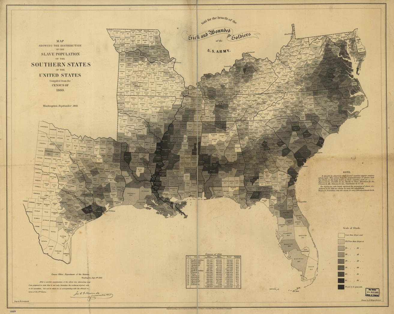
In the 1800s in Colorado, white settlers in the Rocky Mountains found deposits of gold, silver, lead, and other valuable metals that caused an influx of white settlers into what is now the Colorado Rocky Mountains. [1] This massive influx of immigrants and settlers hoping to strike it rich by mining precious metals and minerals in the Rockies created numerous mining boom towns whose population growth rates exploded. One of these boom towns, Leadville, grew so large that when the Territory of Colorado was applying for statehood in 1876 it was the second most populous city in the state. [2]

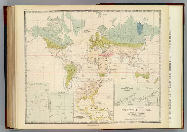
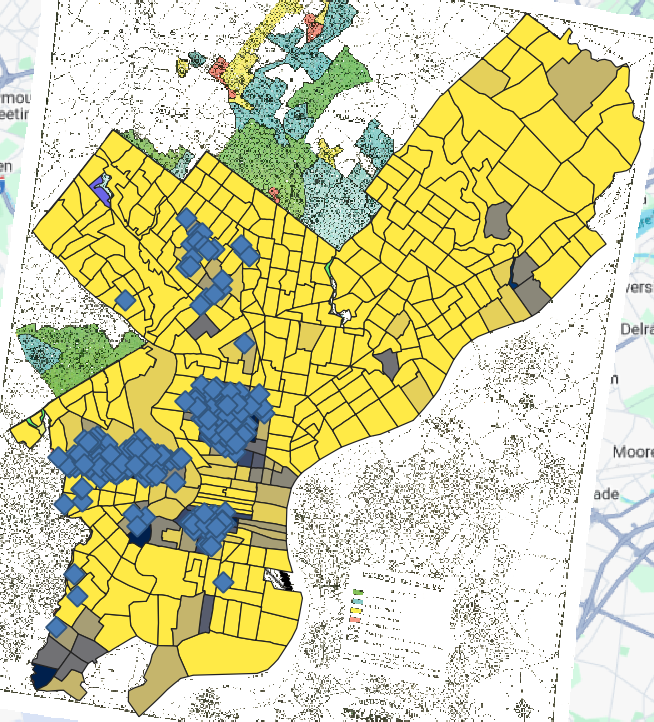
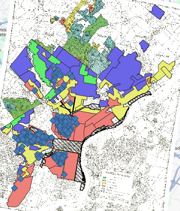
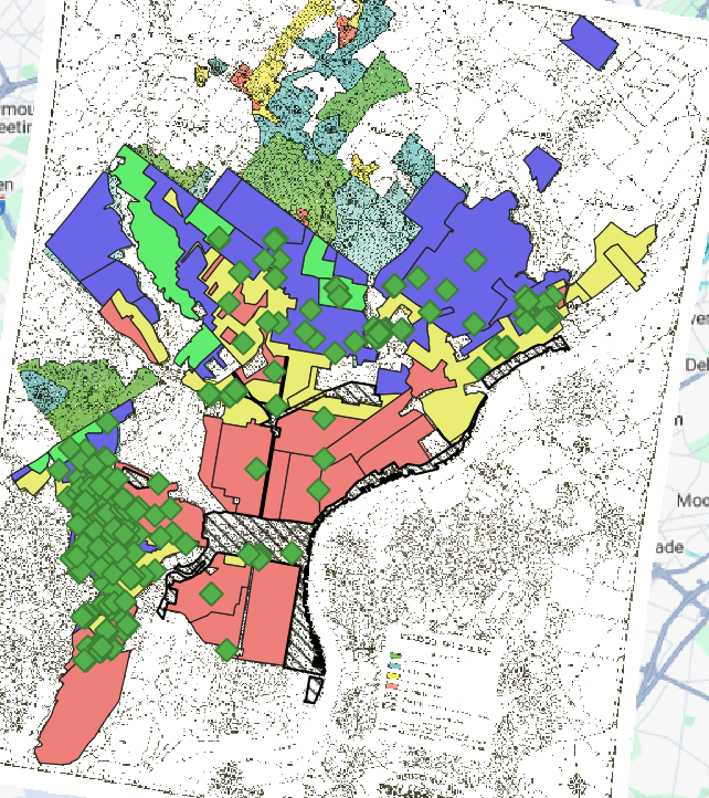
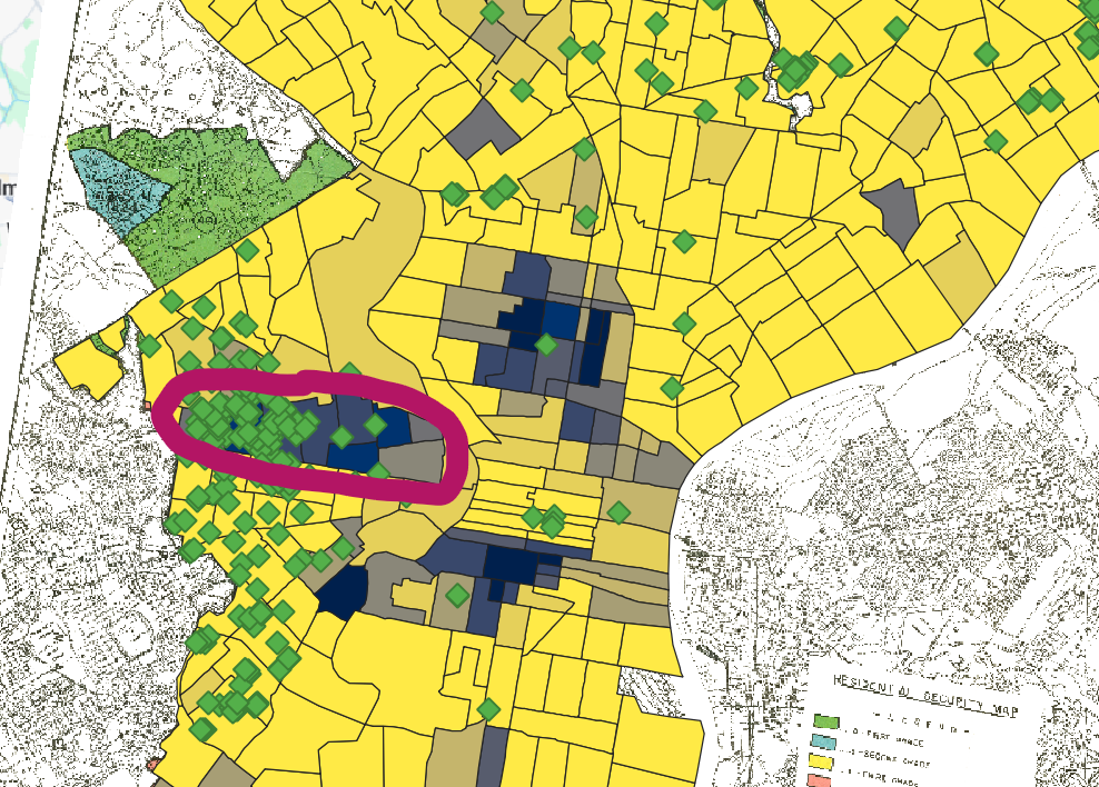
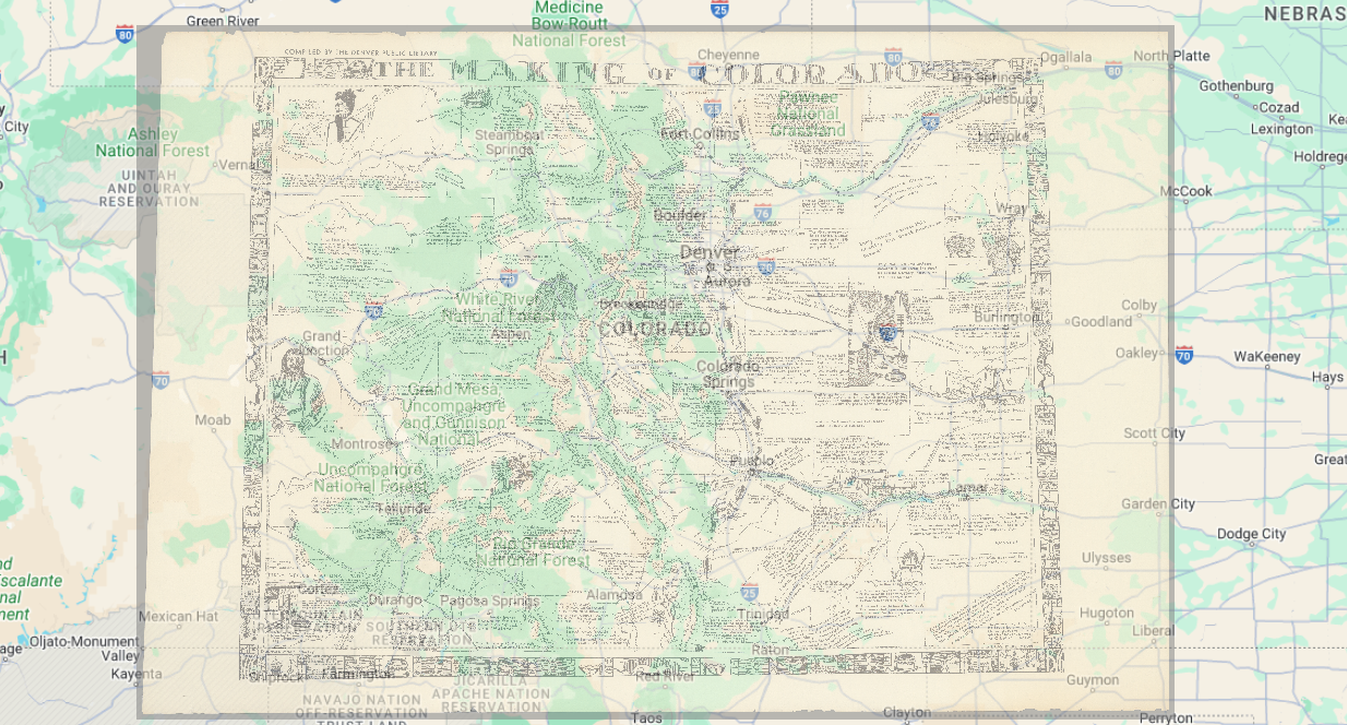
However, particularly in the 1800s, the Rocky Mountains were a challenging place to traverse. Peaks thousands of feet high rise above canyons that dip into the shadows of those frigid, treeless peaks. Roads in the Rockies today often take somewhat winding routes through canyons, valleys, and tunnels which remain difficult to traverse and maintain today. In the 1800s the road, trail, and waterway networks in the Rocky Mountains were certainly not as efficient or developed as they are today providing an extreme challenge to settlers hoping to penetrate into the mountainous interior of the state. For this reason, I want to investigate whether mining boom towns that were located near the eastern edge of the Rockies or in other easier-to-access locales attracted larger numbers of migrants and settlers which in turn increased their population growth. Additionally, I want to investigate whether the type of mineral or precious metal mined near these boom towns led more migrants and settlers to move to certain boom towns despite their potentially difficult-to-reach locations. To analyze this, I will investigate and map census records of the Territory and State of Colorado, mining districts and mineral and precious metal deposits in the state, road and navigable waterway network maps of Colorado in the 1800s, topographic maps of the Rocky Mountains, and possibly diaries or journals kept by settlers which I can use to analyze how they chose where to settle and the travel challenges they faced along the way.

Bibliography

[1] Colorado Geological Survey, “Metals,” Colorado Geological Survey, accessed Feb. 27, 2024, https://coloradogeologicalsurvey.org/minerals/metals/.

[2] Trevor Mark, “Was Leadville Almost the State Capital?” Herald Democrat (Leadville, CO), Nov. 8, 2017. https://www.leadvilleherald.com/news/article_0276a8c6-c4ba-11e7-a26a-4fa814987988.html

Blog Post – Mapping Disease in London and Across the Globe

When discussing John Snow’s revolutionary map of the 1854 cholera outbreak in London originating at the Broad Street pump in his book The Ghost Map: The Story of London’s Most Terrifying Epidemic — and How It Changed Science, Cities, and the Modern World, Steven Johnson states, “[T]he real innovation [of Snow’s map] lay in the data that generated that diagram, and in the investigation that compiled the data in the first place. Snow’s Broad Street map was a bird’s eye view, but it was drawn from true street-level knowledge.”[1] The dotted line that builds the Voronoi diagram on Snow’s map demonstrates the local collection of data that Snow and Henry Whitehead undertook that conglomerated which households got their water from the Broad Street Pump.

Note the dotted line outlined in red (my addition) that builds the Voronoi diagram on Snow’s map. | John Snow’s Cholera Map by John Snow, Courtesy Kora.Matrix.MSU.edu.

Without collecting this street-level data and representing it, as Steven Johnson notes, through a Voronoi diagram, Snow’s map does not effectively map the people’s everyday actions which almost always dictate disease transmission.[2]

In contrast to Snow’s map, Alexander Keith Johnston’s map titled The Geographical Distribution of Health and Disease in Connection chiefly with Natural Phenomena lacks much of this local data.

The Geographical Distribution of Health and Disease in Connection chiefly with Natural Phenomena by Alexander Keith Johnston, Courtesy DavidRumsey.com.

While Johnston clearly intended his map to cover global disease prevalence, his use of isarithmic mapping to represent regional disease prevalence reveals that he used little “street-level” data. The wide generalizations isarithmic mapping produces do efficiently map disease prevalence around the world, but they do so with little nuance.

Note the enormous area covering most of Africa characterized as “Leprosy Endemic.” While some diseases are represented within this area through labeling, note the lack of defined isobars that characterize these locales whose absence provide little sub-regional nuance. | The Geographical Distribution of Health and Disease in Connection chiefly with Natural Phenomena by Alexander Keith Johnston, Courtesy DavidRumsey.com.

While the small, local scale of John Snow’s map certainly facilitated local data collection, the lack of similar data in Johnston’s map dramatically decreases its utility. With its many transmission routes mapped across the seas, Johnston’s map seems to have a more artistic and historical purpose as opposed to Snow’s map’s more argumentative and scientific presentation.

Note the circled (my emphasis) transmission routes coupled with dates of transmission in some cases. | The Geographical Distribution of Health and Disease in Connection chiefly with Natural Phenomena by Alexander Keith Johnston, Courtesy DavidRumsey.com.
Note the lack of coloration and other decorum on this map, characteristics which emphasize its more utilitarian and argumentative purpose in comparison to Johnston’s map. | John Snow’s Cholera Map by John Snow, Courtesy Kora.Matrix.MSU.edu.

However, these maps are linked by the state of European epidemiology in the mid-1800s when both these maps were produced. Johnston delineates some disease regions by latitude. The commonly held European belief that “miasma,” or bad, stench-filled air caused disease may have inspired these stark delineations as many believed certain regions contained more “miasma,” and thus higher disease prevalence.

The Geographical Distribution of Health and Disease in Connection chiefly with Natural Phenomena by Alexander Keith Johnston, Courtesy DavidRumsey.com.

John Snow overlaid a Voronoi diagram and used a dot density map to disprove these theories and to reveal the source of the cholera outbreak he mapped was the Broad Street water pump. In this way, the scientific beliefs of their time unite these maps and set them apart from one another.

Bibliography

[1] Steven Johnson, The Ghost Map: The Story of London’s Most Terrifying Epidemic — and How It Changed Science, Cities, and the Modern World (New York: Riverhead Books, 2006), 197.

[2] Johnson, The Ghost Map, 195-196.

Practicum – Redlining and Interpolation – Payton Mlakar

Within the city of Philadelphia, the African-American owned mortgage company Berean almost exclusively provided mortgages to homebuyers in predominantly black neighborhoods in the city. Because of the nature of redlining and how the Home Owners Loan Corporation (HOLC) consistently rated predominantly black neighborhoods as “D – Hazardous,” most of the mortgages Berean provided were to homebuyers purchasing homes in areas carrying this mark from the HOLC with only a few outliers in neighborhoods marked “C – Definitely Declining.”

Blue Diamond: Home Mortgage Taken Out Through Berean | Percentage White: The more gray the neighborhood, the lower the percentage of white residents. The more yellow the neighborhood, the higher the percentage of white residents. | Map and Data Layering By Payton Mlakar; Original Map and Data Courtesy Dr. Sundberg
Blue Diamond: Home Mortgage Taken Out Through Berean | HOLC Zoning Map: Green: A – Best, Blue: B – Still Desirable, Yellow: C – Definitely Declining, Red: D – Hazardous | Map and Data Layering By Payton Mlakar; Original Map and Data Courtesy Dr. Sundberg

In contrast to the locations of Berean’s mortgages, most of the mortgages Metlife provided within the city of Philadelphia were in neighborhoods rated “A – Best,” “B – Still Desirable,” and “C – Definitely Declining.” However, there is a sizable amount of mortgages offered in the western part of the city in a zone marked as “Hazardous” by the HOLC.

Green Diamond: Home Mortgage Taken Out Through Metlife | HOLC Zoning Map: Green: A – Best, Blue: B – Still Desirable, Yellow: C – Definitely Declining, Red: D – Hazardous | Map and Data Layering By Payton Mlakar; Original Map and Data Courtesy Dr. Sundberg
Green Diamond: Home Mortgage Taken Out Through Metlife | Percentage White: The more gray the neighborhood, the lower the percentage of white residents. The more yellow the neighborhood, the higher the percentage of white residents. | Map and Data Layering By Payton Mlakar; Original Map and Data Courtesy Dr. Sundberg

The location of most of Metlife’s mortgages also coincides with neighborhoods that have a high percentage of white residents, outside of a few predominantly black neighborhoods in the western part of the city. These outliers are circled above.

Across the city of Philadelphia, the mortgages with the highest interest rates are located in predominantly black neighborhoods that the HOLC designated as “Hazardous” on their redlining maps of the city.

Left: Interest Rate of Home Mortgages – The darker the green the higher the mortgage rate. | Right: HOLC Zoning Map: Green: A – Best, Blue: B – Still Desirable, Yellow: C – Definitely Declining, Red: D – Hazardous | Map and Data Layering By Payton Mlakar; Original Map and Data Courtesy Dr. Sundberg
Percentage White: The more gray the neighborhood, the lower the percentage of white residents. The more yellow the neighborhood, the higher the percentage of white residents. | Map and Data Layering By Payton Mlakar; Original Map and Data Courtesy Dr. Sundberg

While I do not immediately see any indication in the data I have mapped that indicates the HOLC maps caused redlining in Philadelphia, there are two datasets that I believe, when mapped, would allow me to make that determination. The first dataset is the percentage of black residents in each neighborhood in Philadelphia prior to the publication and distribution of the HOLC map. With this dataset, I could compare where the black population of Philadelphia lived, before and after the publication of the HOLC maps of the city to see if the maps caused redlining in the city. Additionally, I would also want to map data on where racially restrictive covenants existed on deeds for homes in the Philadelphia area after the HOLC published their map of the city. I could analyze whether these covenants correlated with the HOLC zoning of the city providing me with further evidence as to whether the HOLC maps of Philadelphia caused redlining in the city.

As previously mentioned, an additional data layer showing where racially restrictive covenants existed in the city of Philadelphia would supply superb evidence of discriminatory housing policies and segregated development. Another data layer that could be useful to analyze evidence of segregated development would be to add a map layer that included data of when the first black family moved into a neighborhood and how long it took before widespread “white flight” took place and white residents in the neighborhood moved out. While this data would likely be difficult to find and conglomerate, I believe it could be exceptionally useful to analyze segregated development and discriminatory housing practices.

Below is my map that I believe is the most legible map that best demonstrates the most compelling visualization of redlining in Philadelphia with the data I used. It maps the percentage of the population in a neighborhood that was white with an semi-transparent, overlaid layer of interpolated mortgage rate data on top of this white population percentage layer. The markedly higher mortgage rates in predominantly black neighborhoods effectively communicates their “undesirability” and disinvestment as they are presented as “high risk” and “hazardous” areas.

Top (Opaque) Layer: Mortgage Rate – The darker gray the higher the mortgage rate. | Second (Yellow and Gray) Layer: The more gray the neighborhood, the lower the percentage of white residents. The more yellow the neighborhood, the higher the percentage of white residents. | Map and Data Layering By Payton Mlakar; Original Map and Data Courtesy Dr. Sundberg

Redlining: De Jure Yesterday, De Facto Today – Payton Mlakar

In her book Mapping Society, Laura Vaughan discusses how the “spatiality of redlining is even more problematic if we consider how it had the effect of setting in stone what might previously have been more fluid boundaries.”[1] Here, Vaughan highlights how racial, economic, or ethnic boundaries were codified into society much more thoroughly through intentional spatial segregation practices like redlining. When comparing redlining maps of Omaha, Nebraska from the 20th century to maps of census data from 2020, one can clearly see the social codification of what was once lawful segregation that remains a de facto spatial reality today.

In the 1937 map titled Map of Omaha and Vicinity, Omaha was broken into sections as a reference for mortgage companies to refer to when determining if offering home mortgages in neighborhoods around Omaha was going to be beneficial or “hazardous.”

Legend from Map of Omaha and Vicinity Courtesy DSL.Richmond.com

At the very center of the map, clearly shaded and marked as “hazardous” in red is North Omaha.

Redlined North Omaha from Map of Omaha and Vicinity Courtesy DSL.Richmond.com

The red coloration of this “hazardous” area not only gives the term “redlining” its name, but also connotes evil or danger to those reading this map.

As Vaughan mentions, “[A]lmost all black neighborhoods were classified as grade D, red. . .”[2] This meant that most of the people living in Northern Omaha in the red, “hazardous” zone were African Americans who suffered targeted discrimination in housing, economic opportunities, and education opportunities through the redlining of their neighborhoods.

The lasting de facto codification of the discrimination that characterizes redlining remains evident long after it became illegal on the map titled Race and Ethnicity Across The Nation created by CNN based on data from the 2020 U.S. Census. This map is a dot density map that uses different colors of dots to represent different racial or ethnic groups represented on the United State census.

Legend and Omaha Map Overview from Race and Ethnicity Across The Nation Courtesy CNN.com

If we zoom in on Omaha on this map we can see that most the dots represent people who identified themselves as “black” on the 2020 census live in North Omaha in areas strikingly similar to the boundaries of the redlining map mentioned above.

Predominantly Black Population of North Omaha according to the 2020 U.S. Census from Race and Ethnicity Across The Nation Courtesy CNN.com

This codification of this de facto segregation that persists today in the city of Omaha is evidence of the power of mapping on the “real world.” Redlining maps manufactured hard borders separating previously fluid communities that enabled mortgage companies, the government, others to institute urban segregation that persists today long after these actions have been made illegal.

Works Cited

[1] Vaughan, Laura, Mapping Society: The Spatial Dimensions of Social Cartography (London, University College London Press, 2018), 158.

[2] Vaughan, Laura, Mapping Society: The Spatial Dimensions of Social Cartography (London, University College London Press, 2018), 156.

Map Citations (In Order of Appearance):

Home Owner’s Loan Corporation, Map of Omaha and Vicinity, 1937, Mapping Inequality: Redlining in New Deal America, https://dsl.richmond.edu/panorama/redlining/map/NE/Omaha/areas#loc=14/41.2713/-95.9369, accessed February 16, 2024.

John Keefe, Daniel Wolfe and Sergio Hernandez, Race and Ethnicity Across The Nation, 2021, CNN, https://edition.cnn.com/interactive/2021/us/census-race-ethnicity-map/, accessed February 16, 2024.

Practicum – Choropleths and Historical Census Data – Payton Mlakar

Counties in the Confederacy that had high corn production rates seem to be patterned without respect for the distribution of enslaved individuals.

Blue Proportional Symbols: Corn Production Rates | Choropleth Base Map: Darker colors indicate a higher percentage of enslaved individuals in a county population | Choropleth and Proportional Symbol Layers by Payton Mlakar, Datasets and Base Map Courtesy Dr. Sundberg

While it is admittedly somewhat challenging to read the above map, if we compare it to this map below that depicts percentages of county populations that were enslaved:

Choropleth Base Map: Darker colors indicate a higher percentage of enslaved individuals in a county population | Choropleth by Payton Mlakar, Datasets and Base Map Courtesy Dr. Sundberg

We can see that corn production is not patterned after counties mostly populated by enslaved individuals. High-percentage slave and high-percentage free counties across the Confederacy produced large amounts of corn.

Counties in the Confederacy that produced large amounts of wheat were not counties with a high percentage of enslaved inhabitants. Instead, as demonstrated on the map below, the highest wheat producing counties did not have high percentages of enslaved inhabitants. Many such counties had almost no enslaved inhabitants, such as the high wheat producing counties in the Appalachian Mountains.

Green Proportional Symbols: Wheat Production Rates | Choropleth Base Map: Darker colors indicate a higher percentage of enslaved individuals in a county population | Choropleth and Proportional Symbol Layers by Payton Mlakar, Datasets and Base Map Courtesy Dr. Sundberg

Most of the highest corn producing counties were in areas with significantly fewer enslaved inhabitants compared to the Deep South where slaves generally made up a higher percentage of county populations.

Counties in the Confederacy that produced large amounts of tobacco were primarily located in western Kentucky, northwestern Tennessee, and eastern Virginia which all encompassed counties with relatively low percentages of the population living in slavery.

Purple Proportional Symbols: Tobacco Production Rates | Choropleth Base Map: Darker colors indicate a higher percentage of enslaved individuals in a county population | Choropleth and Proportional Symbol Layers by Payton Mlakar, Datasets and Base Map Courtesy Dr. Sundberg

The comparatively low percentages of enslaved people in counties with high tobacco production rates indicates that enslaved labor was not a critical part of tobacco cultivation and processing.

Almost all counties in the Confederacy with a high rate of cotton production also had some of the highest percentages of enslaved people in their populations. Counties along the Mississippi River and in central Alabama with particularly high percentages of their population consisting of enslaved people appear to have served as powerhouses of cotton production.

Blue Proportional Symbols: Cotton Production Rates | Choropleth Base Map: Darker colors indicate a higher percentage of enslaved individuals in a county population | Choropleth and Proportional Symbol Layers by Payton Mlakar, Datasets and Base Map Courtesy Dr. Sundberg

The immense production rates of cotton in counties with most of their population in slavery suggest slaves were used to cultivate and process cotton extensively in the Confederacy.

Counties with high production rates of sugar were primarily located in and around the Mississippi River Delta, an area with counties composed of high percentages of slaves.

Blue Proportional Symbols: Corn Production Rates | Choropleth Base Map: Darker colors indicate a higher percentage of enslaved individuals in a county population | Choropleth and Proportional Symbol Layers by Payton Mlakar, Datasets and Base Map Courtesy Dr. Sundberg

The relatively high percentage of enslaved inhabitants of the counties in and around the Mississippi River Delta, coupled with their extremely high sugar production rates, indicates that enslaved labor was likely a critical component of the cultivation and production of sugar.

All these maps of crop production rates and enslaved population percentages in the Confederacy tell us that cotton production using enslaved labor was the economic cornerstone of the Confederacy. The extensive cultivation of cotton across the Deep South, as well as the high percentages of enslaved inhabitants in the counties with the highest cotton production rates, indicates that the Confederacy put significant resources into ensuring the continued intensive cultivation of its “cash cow,” cotton.

Though not nearly as important to the Confederate economy as cotton due to the limited geographic regions in which it was cultivated, sugar was also likely an important cash crop for the Confederacy. Again, the extremely high production rates spatially coinciding with counties mostly populated with enslaved individuals indicate a significant commitment on the part of the Confederacy to continue to invest in commercial production of sugar with enslaved labor.

Payton Mlakar Blog Post 4 – Race Mapped Through Definitive Boundaries

In his essay “Maps and the Social Construction of Race,” Jeremy W. Crampton highlights how, after World War II, geographers, cartographers, and anthropologists “generally adopted a geographically continuous notion of human variation, rather than discrete, bordered territories” [1]. Both choropleth maps depicted below were produced prior to the end of World War II and depict race in “discrete, bordered territories” as opposed to geographic continuities.

Map Showing the Distribution of the Slave Population of the Southern States of the United States Drawn by E. Hergesheimer. Courtesy LOC.gov.
Races of the World and Where They Live by Malvina Hoffman. Courtesy DavidRumsey.com.

While choropleths make mapping data visually appealing and easy to digest, they fail to depict continuity and non-uniformity across the areas they map as they divide their data with imagined, human-imposed boundaries. The mapmakers of Map Showing the Distribution of the Slave Population of the Southern States of the United States even admit to this failing of the choropleth map in a note in the map’s right margin.

Notice how the mapmakers have pointed out the lack of nuance and continuity present on this map due to its use of counties as data dividers. | Map Showing the Distribution of the Slave Population of the Southern States of the United States Drawn by E. Hergesheimer. Courtesy LOC.gov.

By dividing the data depicted on the map into imaginary, human-imposed counties, this map fails to communicate urban/rural divides in the number of enslaved individuals within the counties that encompass both urban and rural areas. By shading entire counties without regard for the racial makeup of cities, towns, and sub-regions within counties and the geographic continuity that characterizes race, this map misleads readers into believing that enslaved individuals lived uniformly across these counties when they may have only inhabited specific areas or regions of these counties.

Map Showing the Distribution of the Slave Population of the Southern States of the United States Drawn by E. Hergesheimer. Courtesy LOC.gov.

The map Races of the World and Where They Live similarly weaponizes the choropleth and its flaws to explicitly propose the superiority of white Europeans over other races, something the statue above the map’s title makes abundantly clear.

Races of the World and Where They Live by Malvina Hoffman. Courtesy DavidRumsey.com.

Across this map, the mapmaker imposed “racial boundaries” onto the planet where she proposed definitive boundaries existed between races. In sharp contrast to the post-WWII, continuity-focused approach Crampton discussed, this map proposes that you can definitively define one’s race and place in the racial hierarchy based on where they or their ancestors were born.

Races of the World and Where They Live by Malvina Hoffman. Courtesy DavidRumsey.com.

Additionally, both these maps “color” their representations of Africans and the African Diaspora by depicting areas they predominantly inhabit in black, brown, or other dark colors.

Races of the World and Where They Live by Malvina Hoffman. Courtesy DavidRumsey.com.
The darker the shading, the higher the percentage of the county’s population that was enslaved. | Map Showing the Distribution of the Slave Population of the Southern States of the United States Drawn by E. Hergesheimer. Courtesy LOC.gov.

This furthers racist narratives about the “darkness” of Africa, Africans, and those of African descent as these maps portray them as being on the lowest level of the global racial hierarchy, while white Europeans and those of European descent are depicted in white or tan, reinforcing the proposal that they lie at the top of the global racial hierarchy as an enlightened race.

Note the white and tan coloration of areas predominantly populated by European and European-descended people. | Left: Map Showing the Distribution of the Slave Population of the Southern States of the United States Drawn by E. Hergesheimer. Courtesy LOC.gov. | Right: Races of the World and Where They Live by Malvina Hoffman. Courtesy DavidRumsey.com.

Works Cited:

[1] Crampton, Jeremy W., “Maps and the Social Construction of Race,” in The History of Cartography, Volume 6: Cartography in the Twentieth Century, ed. Mark Monmonier (Chicago: University of Chicago Press, 2015), 1237.

Map Citations (In order of appearance):

Hergesheimer, E., Map Showing the Distribution of the Slave Population of the Southern States of the United States, 1860, Library of Congress, https://www.loc.gov/resource/g3861e.cw0013200/?r=0.317,0.538,0.62,0.282,0, accessed February 10, 2024.

Hoffman, Malvina and Field Museum of Natural History, Races of the World and Where They Live, 1944, David Rumsey Map Collection, https://www.davidrumsey.com/luna/servlet/detail/RUMSEY~8~1~291599~90063129:Races-of-the-world-and-where-they-l sort=Pub_List_No_InitialSort%2CPub_Date%2CPub_List_No%2CSeries_No&qvq=q:race;sort:Pub_List_No_InitialSort%2CPub_Date%2CPub_List_No%2CSeries_No;lc:RUMSEY~8~1&mi=45&trs=216#, accessed February 10, 2024.

Payton Mlakar – Vectors on Colorado in QGIS

Across this map there a numerous drawings accompanied by captions that illustrate regional histories and notable features across Colorado. It is exceedingly difficult to assign vector categorizations to these components of the map that add depth. While I could add vectors like polygons or points to indicate where these images and their captions appear on this map, vector categorizations would fail to capture the abstract ideas, emotions, and opinions these images and descriptions communicate to the reader. Even quite transparent vectors could obstruct readers’ views of these features by altering their coloration and character.

One attribute I believe would have been appropriate to add to the line vectors I overlaid on three of Colorado’s largest rivers would be the watersheds that these rivers fall into and where they flow after leaving Colorado. Adding data like this to the line vectors on the rivers in this map could give readers a better understanding of how Colorado, and, more specifically, the Rocky Mountains, shape the rivers that flow throughout the United States. One attribute I believe would have been appropriate to add to the polygon vectors I overlaid on Larimer, Weld, and Boulder Counties is when each county was founded and if its borders on this map are the same as their borders today. This attribute data would give readers of this map, which is already focused on telling the history of Colorado as of 1935, an even better understanding of the history of Colorado’s counties and how/if they have changed since this map was produced.

One spatial relationship I noticed while digitizing elements of my map is how most towns and cities in Colorado have a large river running through them or immediately adjacent to them. While I have visited towns and cities across the state and personally witnessed the rivers that flow through them, I never really realized truly how many urban centers in the state centered on rivers. I primarily noticed this when I was overlaying line vectors over the Rio Grande, South Platte, and Arkansas Rivers. As I moved along these rivers overlaying vector data onto them, I began to realize how many towns and cities existed around and adjacent to these rivers. I have been familiar with the paths of these rivers for year, but I never truly realized just how central they were for the formation and development of towns and cities across the state. As a result of noticing this spatial relationship, I was able to see my historical map in a new way. I now understood why, despite the minimal topography this map depicts, rivers are clearly demarcated in every corner of the map, including even relatively small tributaries near the headwaters of rivers. As a map intended to tell the history of Colorado, I now see why the mapmaker included detailed depictions of the state’s rivers as they were critical components of the formation and development of most of the towns and cities littering the state.

Payton Mlakar – Blog Post 3: Mapping the American Empire?

In his article “How the US Has Hidden its Empire,” Daniel Immerwahr asserts that most Americans have a mental map of the United States that consists of the “Lower 48” states in one contiguous body. Immerwahr calls this the “Logo Map” of the United States that permeates popular culture and imprints onto the American psyche.[1]

The U.S. “Logo Map” by Daniel Immerwahr

The “Logo Map” serves as a mental reference map for Americans to quickly think about U.S. geography. Despite its ease of use, Immerwahr points out how the “Logo Map” of the United States is deeply flawed because it excludes a critical component of U.S. territorial possessions: U.S. territories. The “Logo Map” gives the misleading impression that “the US is a politically uniform space: a union, voluntarily entered into, of states standing on equal footing with one another.”[1] In this way, the “Logo Map” most Americans use to think about the United States is not at all reflective of the true extent of U.S. territorial possessions and the extent of the “American Empire.”

One expansive thematic map that attempts to remedy this glaring flaw of the “Logo Map” is The Territory of The United States: A Patchwork of Jurisdictions and Rights by Bill Rankin.

The Territory of The United States: A Patchwork of Jurisdictions and Rights by Bill Rankin

This map uses several colors, legends, and inset maps to emphasize the extent of U.S. territorial claims.

Legends (squared off in red) used on The Territory of The United States: A Patchwork of Jurisdictions and Rights by Bill Rankin. Note the use of several different colors and shades to demarcate political boundaries.
Inset Maps (squared off in red) used on The Territory of The United States: A Patchwork of Jurisdictions and Rights by Bill Rankin

While I understand why many Americans default to their mental snapshot of the “Logo Map,” I believe that if Americans began to map the United States similar to how Bill Rankin mapped the nation and its expansive territorial claims and varied political subdivisions, Americans would have a better understanding of the nature and composition of their own country. This shift in perception through mapping could even make many Americans view the United States as an empire. In his article, Daniel Immerwahr proposes that the “Logo Map” of the United States gives the impression the United States is not an empire with vast, world-spanning territories. However, a map that actually depicts all American possessions, no matter their location or political status gives readers a significantly different impression. The idea of the United States as an empire is an idea that Americans often overlook in our domestic national discourse due to how we engineer the propositions of U.S. maps to align with our conception of the “Logo Map.” By changing how we map the United States, we can dramatically change how we perceive and imagine the nation.

Works Cited:

[1] Daniel Immerwahr, “How the US Has Hidden Its Empire,” The Guardian, February 15, 2019, https://www.theguardian.com/news/2019/feb/15/the-us-hidden-empire-overseas-territories-united-states-guam-puerto-rico-american-samoa.

Map Citations (In order of appearance):

Daniel Immerwahr, Logo Map, 2019, The Guardian, https://www.theguardian.com/news/2019/feb/15/the-us-hidden-empire-overseas-territories-united-states-guam-puerto-rico-american-samoa, accessed February 3, 2024.

Bill Rankin, The Territory of The United States: A Patchwork of Jurisdictions and Rights, “Radical Cartography,” radicalcartography.net/us-territory_12m.png, accessed February 3, 2024.

Payton Mlakar: Georeferencing Historical Raster Data – The State of Colorado

The Making of Colorado by Julia M. Stimson georeferenced onto Google Maps. Georeferencing by Payton Mlakar.

The map I overlaid onto a present-day Google Maps view of Colorado seems to be primarily artistic in nature with geographic accuracy taking a backseat to the inclusion of historical anecdotes and images on the map to recount parts of Colorado’s history. This map’s primarily artistic and historic focus reveals how people viewed Colorado and remembered the state’s history around 1935, the year in which this map was published. Its lack of geographic accuracy as compared to Google Maps reveals how precise distance and geography were likely not seen as vital parts of Colorado’s history in comparison to chronicling milestones of the state’s history and highlighting the stories of historically important cities and people in Colorado. It seems that the history of Colorado in popular memory, at least in 1935, was based upon presenting great people, events, and stories in an appealing and flowing narrative. In this way, this map provides an excellent window into the popular historiography of Colorado when compared to a present-day map of the state.

One weakness of georeferencing is that some maps are difficult to read when overlaid on another map. The map I overlaid in this activity includes a substantial amount of text that is relatively small in size. When overlaid on another map, this small text because almost unreadable unless you zoom in an enormous amount. This text can also obscure features on other map layers even when the overlaid map is somewhat transparent.

There are some inaccuracies with georeferencing because of the distortion a map undergoes when it is georeferenced onto another map. Some elements are distorted in the process, altering the original structure of the map the mapmaker intended readers to see. This can hinder the study of a map as a window into the perception of the mapmaker on the mapped area.

Some places with relatively unchanging landmarks would map much better in a georeferencing system than areas with constantly changing features. Rivers, roads, and building, among other landmarks, have locations that can change significantly over time. Places that have undergone minimal change throughout the time between when the layered maps were produced are most conducive to georeferencing as inaccuracies and distortions can be minimized. However, georeferencing maps of regions that have undergone significant change can provide an excellent opportunity for comparing maps and analyzing how the physical terrain and the priorities of mapmakers have changed over time.

css.php