Andrew’s project on maps really caught my interest. History isn’t usually my thing, so learning about the Silk Road was a first for me. I had no idea it was used for trading food and spices. Though I’m a bit confused by Andrew’s point, I’ve definitely learned something new about what was traded along the Silk Road.
He talked a lot about the different types of food and spices that were traded and then provided a map that showed the route they took. He started off talking about turmeric and then showed where it started and the different cities it was brought to. He then moved to Cumin and also showed the map and route it took. As well as the different cities where it was traded. In the next one he talked about coriander and included the same information as the other ones. Cloves and cardamom were the next spices and he also included a map for them. I thought he did a really good job making it aesthetically pleasing. The use of bright colors with a clean concept made it more enjoyable to read through. Andrew also did a lot of great things explaining the different foods and spices.
One thing I thought he could have done better with these maps is to include the different routes in different colors. I think we could have really seen the difference in the different routes from changing colors. They obviously were all on the Silk Road so it was going to be very similar. By changing the color, we could have told the difference a little better. Another thing I thought Andrew could have done better is to describe why the routes might have been different for the various items. I know when I spoke to him about he said there was not as much information as he would have wanted so I completely understand because I had that same problem. Possibly taking a look at library resources could have helped improve the information, but I still thought it was good.
Italians in New York City – history of Italians in Queens neighborhoods – brooklynblvd. (n.d.). https://www.brooklynblvd.nyc/article/87/italians-in-new-york-city—history-of-italians-in-queens-neighborhoods
This source gives a little insight into an old Italian story from New York history.
F., F. (2023, June 27). Italians of New York City. Walks Tours Blog. https://www.takewalks.com/blog/italians-new-york-city
This source gives some background information on the history of Italians living in New York. It talks about the different neighborhoods they settled in.
A nice Italian neighborhood in Queens. We the Italians. (2015, April 8). https://www.wetheitalians.com/art-heritage-new-york/nice-italian-neighborhood-queens
This source will be useful because it gives a little insight into what life is like for Italians in New York City.
ZipAtlas.com. (n.d.). Cities with the highest percentage of Italian population in New York. Percentage of Italian Population in New York by City | Zip Atlas. https://zipatlas.com/us/ny/city-comparison/percentage-italian-population.htm#google_vignette
This source does a really great job of showing a map of where Italians live in the Northeast. Its useful because it can be compared to other maps of where Italians live.
Where do Italians live in Queens? (n.d.). https://www.studycountry.com/wiki/where-do-italians-live-in-queens
This source talks about different areas within Queens where Italians live. It also gives a little data about Italians in New York City.
F., F. (2023b, June 27). NYC’s Classic Italian neighborhoods. Walks Tours Blog. https://www.takewalks.com/blog/nyc-italian-neighborhoods
This source gives some information about specific Italian based neighborhoods in the city.
Locations. Italian Immigration to America. (n.d.). http://immigrationitalytoamerica.weebly.com/locations.html
This source gives a broader look into where Italians have settled in America. It does a good job of showing an actual map of where they are settling.
Immigrant settlement patterns in New York City. (n.d.-a). https://www.nyc.gov/assets/planning/download/pdf/data-maps/nyc-population/nny2013/chapter3.pdf
This source dives deep into the settlement patterns of immigrants in New York City.
Sansone Market. (2019, November 5). The history of Italian culture in Brooklyn. https://sansonemarketgardencity.com/the-history-of-italian-culture-in-brooklyn/
This is another useful source because it talks about Italians in Brooklyn. It’s important because Brooklyn has a high Italian population.
Bruno, A. (n.d.). The early Italians and Irish in New York City. La Gazzetta Italiana. https://www.lagazzettaitaliana.com/people/9412-the-early-italians-and-irish-in-new-york-city
This is a nice source because it compares a different culture in New York. It talks about Italians as well as the Irish who have settled in the city.
Map SF3 SB P-11: Population reporting Italian ancestry by … (n.d.-c). https://www.nyc.gov:443/assets/planning/download/pdf/data-maps/nyc-population/census2000/mpsfsb11.pdf
This is a great source. It is a choropleth map of New York City Italians.
Persons born in Italy by census tract, New York City, 1920. (n.d.-d). https://www.nyc.gov:443/assets/planning/download/pdf/data-maps/nyc-population/historical-population/1920_italy_fb.pdf
This source does a good showing foreign-born people in New York City. It could be used to actually show if most foreign people are settling in the same areas.
U.S. immigrant population by state and County. migrationpolicy.org. (2024, February 1). https://www.migrationpolicy.org/programs/data-hub/charts/us-immigrant-population-state-and-county
This source gives real data about the number of immigrants in certain areas of the city.
Mapping the melting pot: Where foreign born New Yorkers live. NYU Furman Center. (n.d.). https://furmancenter.org/thestoop/entry/mapping-the-melting-pot-where-foreign-born-new-yorkers-live
The focus on lynchings in African American history, especially in the Southern US during Jim Crow, is crucial. But it almost simplifies racial violence to a certain extent. Lynchings were horrific and symbolic of white supremacy, but they’re just a small piece of a much larger puzzle. Racial oppression included many forms of abuse, not just public executions. Lynchings have become a symbol of racial hatred, shaping attitudes and policies.
While lynchings are often associated with the Southern United States during the Jim Crow era, it’s important to recognize that they weren’t only happening in this region. Lynchings occurred throughout the country, including in the North and West. They might have been less frequent but were almost more powerful. African Americans faced all sorts of racial violence in various parts of the nation. They showed that racial problems were not just subject to only happening in the South. Lynchings served as brutal displays of racial terror and domination.
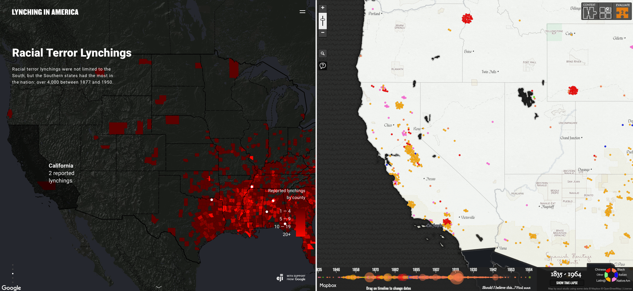
Comparing the two maps shows big differences, especially on the West Coast. In California, it shows two different maps. One of them shows only lynchings of African Americans, and the other depicts lynchings of all sorts of various races such as Italians, Latinos, and Native Americans. The second map shows widespread lynchings across California, reflecting white supremacy enforcement. However, the first map lacks clarity and suggests fewer lynchings in California actually happened. This is problematic as it downplays California’s history of racial violence, which goes against efforts like the Equal Justice Initiative’s aim to challenge black incarceration.
I took this screenshot from the article, Lynching In America. I placed the map in 1950, so it shows the percentage of the total US African American population. The South obviously has the highest percentage of African Americans, but the fact that there were even lynchings in areas outside of the South is super powerful and important. Recognizing that lynchings occurred beyond the South is important for understanding the total extent of racial violence in American history. Lynchings in regions outside the South, like the West and Midwest, challenge the common belief that racial terror was limited to a specific area. These incidents across diverse regions highlight the widespread nature of racism. Take California for example, the first image I included makes it seem like only two lynchings happened there. That is an incorrect depiction because the next map I included shows that lynchings in California were not rare, and were actually rather common.
Understanding where data and information come from and its context is crucial for accurate understanding. Without this understanding, there’s a risk of misinterpretation or drawing incorrect conclusions. For example, if you did not include all of the maps in the article, one might think lynchings were not that big of a problem in California. Prioritizing transparency and critical analysis of data origins helps readers understand the full picture.
The project will focus on Queens in New York City during the early 20th century, examining its role as a hub for Italian immigrants. The time frame will primarily cover the late 19th century to the early 20th century, coinciding with the peak of Italian immigration to the United States. Keeping the scope limited to Queens allows for a more in-depth analysis of the area’s significance in accommodating Italian immigrants and understanding the social dynamics within the borough during that time.
Various sources will be employed in the digital mapping project to provide a comprehensive understanding of Italian immigration to Queens. These may include digital maps showcasing demographic changes over time, online databases containing immigration records and census data, historical maps illustrating neighborhood development, and secondary sources such as academic papers, articles, and books documenting the experiences of Italian immigrants in New York City. For me personally, I will have to do some internet research to really narrow down my selection of sources.
The final project will be an interactive web map, offering users the opportunity to explore the distribution of Italian immigrants in Queens during the early 20th century. This format allows for the visualization of demographic changes, settlement patterns, and the establishment of Italian communities within the borough. An interactive web map is the best way to present the data as it enables users to engage with the information dynamically, gaining insights into the geographic spread and concentration of Italian immigrants in Queens.
This project adds value by providing a spatial analysis of Italian immigration to Queens, shedding light on the factors that influenced settlement patterns and the socio-cultural impact of migration on the borough. By mapping out the distribution of Italian immigrants and examining their interactions with other immigrant groups and the native population, the project enhances our understanding of the dynamics of urban immigration in early 20th-century New York City. Additionally, by employing digital mapping techniques, the project offers a representation of historical data, making it accessible to a wide audience and allowing other scholars to further research and explore the significance of New York City’s immigrant history.
The history of farming on the Great Plains shows tons of different successes and failures. By 1900, only the far eastern plains had over 25% of land plowed. Most farming occurred from 1870 to 1920. By 1920, a clear pattern emerged, with more cropland in the eastern plains. The western plains remained mostly for ranching due to arid conditions. Rainfall and temperature were key factors, in determining the areas that were suitable for farming or ranching.
If you take a look at this map you can see the areas that had the highest wheat grown per square mile. This map further shows that the Great Plains was the perfect spot to grow wheat. The temperature and rainfall were suitable for growing this crop. For example, areas such as Southwest America do not receive enough rainfall resulting in little agriculture there.
Examining the additional maps in “On the Great Plains” offers a different glimpse into the transformative nature of the region’s landscape over time. One notable trend that I caught wind of was from the maps showing the consolidation of areas dedicated to agriculture. This shift is because of the evolution in agricultural practices, where farmers are increasingly optimizing their land usage. I think this happened because of the relationship between technological advancements and farming efficiency. As technology continues to progress, farmers can harness more sophisticated tools and methods. That would obviously lead to increased productivity. Because of those improvements, the need for more land may diminish, as farmers can achieve higher amounts of production within more concentrated areas. This not only reflects the adaptability of agriculture to change with the times but also shows the potential for sustainable farming practices. The connection between technology, land use, and agricultural output is an interesting aspect of the changing dynamics of the Great Plains.
I think something that first popped into my head that heat maps would be useful would be for crime in certain areas. High rates of crimes could be really helpful for local law enforcement to patrol these areas more frequently. Unfortunately, another instance where these have come in to use is for sex trafficking. I have seen maps like these be used in Omaha during the College World Series because sex trafficking rates spike during that time.
I think heat maps could be really useful for me during my final project. If I focus on a specific demographic in a certain neighborhood in New York, a heat map could be beneficial. For instance, if I was choosing where a high percentage of Polish people live, a heat map could be very useful.