Isabel Blackford Vector Map

Some features of this map that would be difficult to assign a vector to would be the roads that litter the map. Not only are they difficult to see, they also are much more dense in the north end of the state making them hard to distinguish from other markings on the map. Additionally, the lines can be very fine making them no easy to see overall on the map. Another attribute that would have been appropriate to add in this dataset would be putting a line around the different counties that make up North, Central and South New Jersey to emphasize the different areas that make up these different geographical areas. Some spatial relationships that I spotted that I would not have otherwise was how much more densely populated North New Jersey is than South New Jersey. I was aware because of the proximity to New York that North New Jersey definitely has more but seeing the cities all being on the north end of the state really put into perspective how much less populated the southern third of the state is. Also the fact that this is still currently the case shows how even though is map is over one hundred years old it shows how even though times passes things stay the same for a lot of things.
Vector Mapping Colorado

1. Are there any features on your historical map that would have been difficult to assign a vector categorization (point, line, polygon)? Why?

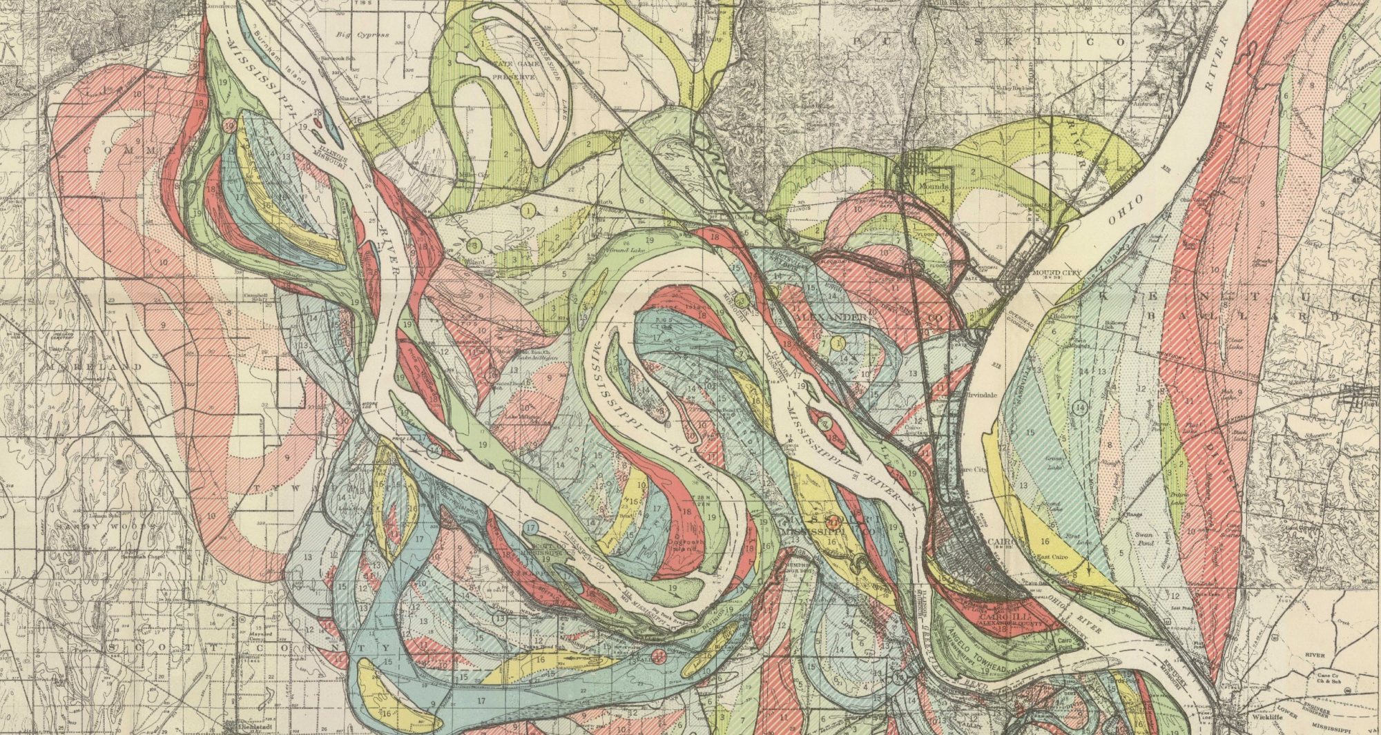
There are a few different features on the map that would potentially be hard to assign a vector on at least given the information present on the historical map I choose. One potential feature could be doing modern-day counties because they have changed and have been added. Something else that was a little difficult to map was the national parks which I decided to do on my map. The challenge with this is that town names have either changed names or become extinct. To do this, I had to do it based on other physical features such as rivers or lakes to do it. I also had to do it based on the relative location of other cities that are still around today. The issue with this is that some of the physical features found on the map or incorrect such as the exact location of mountain peaks. 

2. What other attributes (aside from name) do you think would have been appropriate to add to your vector dataset?

Other attributes that would have been appropriate to add are the rivers found on the map. A different attribute that would have been appropriate is the reservations found in Colorado. Another attribute that could have been added was the railroads found on the map. These are just a few but I’m sure there are other attributes on the map that could be assigned a vector.

3. Did you detect any spatial relationships when digitizing your map that you would not have otherwise? Did you see your historical map in a new way? If so, how?

I did detect a spatial relationship on the map. When I was mapping a major road on the map, I was able to see how many cities especially bigger cities were found on this road. For example, on the map, Fort Collins, Denver, Castle Rock, Colorado Springs, Pueblo, and Trinidad were all found on the road when I did the line vector. If I had to guess, many other cities and towns follow major roads or railroads on the map. This was one way I was able to see my historical map in a new way.

Building Vector Layers- Marie Amelse

Are there any features on your historical map that would have been difficult to assign a vector categorization (point, line, polygon)? Why?

In my experience with what I did, I don’t think anything on my chosen map would be impossible to use a vector category with, although I did attempt to put a line to make a river and that was quite difficult. I found myself having to make the line segments tiny in order to account for the curviness of the river and even then with my tiny lines I still was not able to perfectly trace the river.

What other attributes (aside from name) do you think would have been appropriate to add to your vector dataset?

I think that pointing out major highways would make sense. I think it is important to show how places, and their populations, are connected.

Did you detect any spatial relationships when digitizing your map that you would not have otherwise? Did you see your historical map in a new way? If so, how?

While working on this one thing that really stuck out to me was the shape of the countries. The ones around and near the Twin Cities were very irregularly shaped and as they became further they became more basic four sides rectangles or squares. It made me curious to know why it was that way.

Payton Mlakar – Vectors on Colorado in QGIS

Across this map there a numerous drawings accompanied by captions that illustrate regional histories and notable features across Colorado. It is exceedingly difficult to assign vector categorizations to these components of the map that add depth. While I could add vectors like polygons or points to indicate where these images and their captions appear on this map, vector categorizations would fail to capture the abstract ideas, emotions, and opinions these images and descriptions communicate to the reader. Even quite transparent vectors could obstruct readers’ views of these features by altering their coloration and character.

One attribute I believe would have been appropriate to add to the line vectors I overlaid on three of Colorado’s largest rivers would be the watersheds that these rivers fall into and where they flow after leaving Colorado. Adding data like this to the line vectors on the rivers in this map could give readers a better understanding of how Colorado, and, more specifically, the Rocky Mountains, shape the rivers that flow throughout the United States. One attribute I believe would have been appropriate to add to the polygon vectors I overlaid on Larimer, Weld, and Boulder Counties is when each county was founded and if its borders on this map are the same as their borders today. This attribute data would give readers of this map, which is already focused on telling the history of Colorado as of 1935, an even better understanding of the history of Colorado’s counties and how/if they have changed since this map was produced.

One spatial relationship I noticed while digitizing elements of my map is how most towns and cities in Colorado have a large river running through them or immediately adjacent to them. While I have visited towns and cities across the state and personally witnessed the rivers that flow through them, I never really realized truly how many urban centers in the state centered on rivers. I primarily noticed this when I was overlaying line vectors over the Rio Grande, South Platte, and Arkansas Rivers. As I moved along these rivers overlaying vector data onto them, I began to realize how many towns and cities existed around and adjacent to these rivers. I have been familiar with the paths of these rivers for year, but I never truly realized just how central they were for the formation and development of towns and cities across the state. As a result of noticing this spatial relationship, I was able to see my historical map in a new way. I now understood why, despite the minimal topography this map depicts, rivers are clearly demarcated in every corner of the map, including even relatively small tributaries near the headwaters of rivers. As a map intended to tell the history of Colorado, I now see why the mapmaker included detailed depictions of the state’s rivers as they were critical components of the formation and development of most of the towns and cities littering the state.

Emma Reed Vector Map

1. Are there any features on your historical map that would have been difficult to assign a vector categorization (point, line, polygon)? Why?

Mapping Central Rome was more difficult than Trastevere or the Vatican City because it was hard to determine where to start and end the feature. Within Central Rome, numerous neighborhoods such as the Monti or Prati neighborhoods could both be considered apart of the center of the city however they are not necessarily apart of the historical city center.

2. What other attributes (aside from name) do you think would have been appropriate to add to your vector dataset?

I think it would have been helpful to add a descriptor about roads as they can help identify different regions of the city.

3. Did you detect any spatial relationships when digitizing your map that you would not have otherwise? Did you see your historical map in a new way? If so, how?

One spatial relationship that stood out to me while making this map was the size difference between the center of Rome and the size of the Vatican City. Its crazy to think that an entire city can be bigger than a whole country.

Gabe Murphy: QGIS Activity – Vectors

  1. Are there any features on your historical map that would have been difficult to assign a vector categorization (point, line, polygon)? Why?

The point feature was relatively simple; there were numerous towns and landmarks marked and labeled on the map allowing for easy placement of points and categorization in the dataset. Similarly, major roads made it easy to place lines into the map as vectors (highlighted in yellow on the map is my example). Following the contours or topographic elevation changes would have also been an easy vector to do as these are thoroughly mapped throughout the island. While trying to create polygons though, I struggled to find areas to assign these vectors to. Besides elevation changes, roads, aqueduct systems, and town names, there is little to this map. And by little I mean almost NOTHING. This would make it hard to place a polygon vector around any of the towns; no borders are placed anywhere. Towns are represented as simple dots on the map, and nothing more. Further, placing a polygon vector around the forest systems would be an incredibly daunting task: the cuts and corners would take me hours to accurately depict. I settled for the volcanic crater, a small pond, and a lava field. Other than these areas, there are little other opportunities to place polygon vectors on. 

  1. What other attributes (aside from name) do you think would have been appropriate to add to your vector dataset? 

When marking towns, it may be beneficial to add population/economic focus/schools. If I were publishing a map trying to promote growth of an area or movement to a specific region, I would place these three variables at the top. Population is often a descriptive factor of towns, and jobs/schooling is critical for those looking to move into the area. In the point vectors, coordinates would also be a beneficial attribute. In terms of coastal regions, applying a safety level or flood warning may be beneficial during hurricane/storm season.

  1. Did you detect any spatial relationships when digitizing your map that you would not have otherwise? Did you see your historical map in a new way? If so, how?

While digitizing this map, the mountainous terrain really stuck out to me. On the North Shore, the left side of the map as shown above, contour lines stack up in a big jumble that help accentuate this terrain. I had never thought of this area as mountains, but I certainly can see it now. In terms of spatial relationships, placing point vectors on the towns helped me to piece together where towns were in comparison with one another; as traveling by road can sometimes be misleading, especially in areas which only have one access road. Though one of my favorite places, I have not explored the entire right side (as shown on the map) of the island; this activity helped me in some ways to do that. I could look at towns, beaches, bays, and other areas to create a picture in my mind of what I think the terrain looks like; however, I hope to get to truly experience it and see what it is like for myself!

Erin Buglewicz, Practicum 2: Georeferencing – Omaha

1. How might you use this georeferenced image to uncover new information about the history of the region you just mapped?

This map indicates how Omaha has changed over time. As many residents would likely agree (based on their complaints about construction), Omaha is constantly changing, and due to that, the city has a rich history. Although this only depicts a small fraction of Omaha, specifically the central part, it demonstrates how the community has changed in response to evolving needs and developed different plots of land. This area, in particular, has many schools, and while they are located in the same general spots, some, like Creighton, have expanded over time.

Creighton University has expanded significantly since the creation of the original map published in 1885.

2. What are some weaknesses to this approach? Are there inaccuracies? Do some places map better than others? Why?

Georeferencing is not always ideal, and it has some weaknesses. Places like Omaha may not be historically the same, which can lead to inaccuracies. As I pointed out earlier, some locations and buildings on the original map have expanded and developed. As a result, their locations on the historical map do not quite align perfectly with the modern-day Google map. On the other hand, some buildings or streets no longer exist in contemporary times. Therefore, when georeferencing, the control points can be slightly off and warp the map. However, some places do, in fact, map better than others. Reasons for this could include that a certain place hasn’t changed much over time or an area has historically had a significant population, resulting in more accurate mappings of the landscape.

Reference:

Bemis, Geo. P., Everts & Co., Adin Mann, George Smith. “Omaha Central.” 1885. David Rumsey Historical Map Collection. https://www.davidrumsey.com/luna/servlet/s/9d18o8.

Madeline King, Practicum 2 – Georeferenced Map (1876 Nebraska)

This georeferenced image can uncover new information because it serves as a marker for what has changed and what has stayed the same. For example, in this (year) map, many towns in eastern and southern Nebraska are outlined, some of them more prominently than others (namely Omaha, Plattsmouth, Grand Island, Kearney, and North Platte). On the google map, the changes that occur in these areas are indicative of larger trends in Nebraska and across the country. Omaha has become even more prominent than it used to be, but it has always been a hub for population and infrastructure. On the other hand, Plattsmouth, Nebraska is indicated even more than Omaha, however, today it is often considered a minor suburb. This change can demonstrate the unique history of Plattsmouth being a trade hub off of the Missouri River, but when trade through the Missouri river died down, the growth of the town and its prominence largely died out.

The weakness of this map, and perhaps other maps from this time frame, is how much of Nebraska (or other areas) is left unsurveyed. Georefrencing is good for areas that can be compared, but at least in this particular time of 1876 there is nothing to compare it to. Areas of this part of Nebraska have become notable. Cherry County which would not be established for another seven years is one of the largest and most diverse (land and nature wise) of Nebraska. Valentine, Nebraska which would not be established until 1884 adds a unique cultural marker to the area. Georeferencing is limited by having something to reference to. Places that have had recordings in previous mappings, particularly those of population dense areas may be easier to map (in georeferencing) than areas settled less or settled later. Using a map that contains unsurveyed areas or silences provide little to compare. Perhaps the lack of comparison can serve as a jumping off point to analyzing previously untold histories.

Bibliography:

WireBuilt Co. “Plattsmouth.” https://www.plattsmouth.org/index.php/living-in-plattsmouth/history-of-plattsmouth Accessed on Feb. 6, 2024.

Department of the Interior, General Land Office. “State of Nebraska.” 1876. David Rumsey Map Collection. https://www.davidrumsey.com/

Georefrencing Michael Lau

The two maps that I georeferenced were extremely similar. But had minute details that put them apart. The chains of islands south of mainland Japan is one of them, with the older map having the islands be a more circular shape rather than an oval one. This is disregarding my poor georeferencing.

This shows the history of mapping before and after satellite imaging. Where islands and other coastlines may or may not match up perfectly with modern maps. Otherwise, it is remarkable how close to the coastline the original 1937 map is. The Spelling is also interesting, with Tokyo being spelled as ‘Tokio’. Something that is very prevalent on the map.

This approach is good for a general sense of place and how it can change, especially if borders change or mapping techniques evolve. However, the specificity of the map is limited to how focused the map is. In addition to being difficult to read in some settings. Inaccuracies mount when One’s georeferencing isn’t as accurate as others. As seen in this work, the points where people put places change over time, and from cartographer to cartographer. For example, where is the middle of Tokyo? On the older map, it’s farther east than the modern one. Was that due to where the older downtown is? was it due to the sprawling suburbs? I don’t know, and that will introduce coordinate errors into the projection. This would be solved with smaller maps, but on a smaller scale things change a lot more than a geopolitical one.

Declan Dunham – QGIS Georeferencing Project

  1. How might you use this georeferenced image to uncover new information about
    the history of the region you just mapped?

Overall, I believe this map to be somewhat accurate compared to the Google Maps Version. Although a bit off, this georeferenced image allows me to better understand the context and important ideas of the 13 U.S. Colonies, specifically during American Revolution. It also allows me to see how the United States grew as an empire. To begin with, this georeferenced map highlights how important of land and territory were to the Colonists. One of the reasons for declaring independence was because of the colonists’ prohibition of settling west of Appalachians. By emphasizing the vast territory west of the Appalachians, we see the desires and hopes of the colonists to be sovereign.

  1. What are some weaknesses to this approach? Are there inaccuracies? Do some
    places map better than others? Why?

Some weakness to this approach is that pinpointing the exact locations may be inaccurate. As mentioned, in my georeferenced image, there are some points that are slightly off. Cities like Richmond, Philadelphia, and Boston are slightly off from their points on Google Maps. Also, the shorelines of the great lakes are not accurate. This could have occurred naturally or from the lack of exploration and technology. Overall, this map is great way to see change. Whether that be from change in technology or change in land, we are able to better understand our history as a civilization.

css.php