
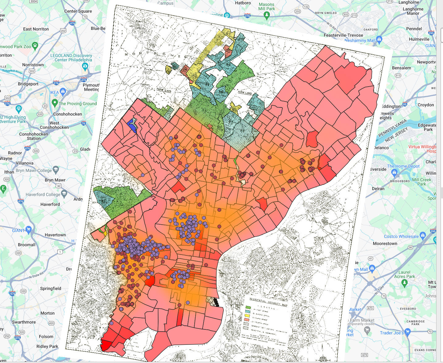
1. What patterns do you see between mortgage companies and locations that supplied lendees in Philadelphia?
Bereen was more highly concentrated in areas with higher mortgages than MetLife.
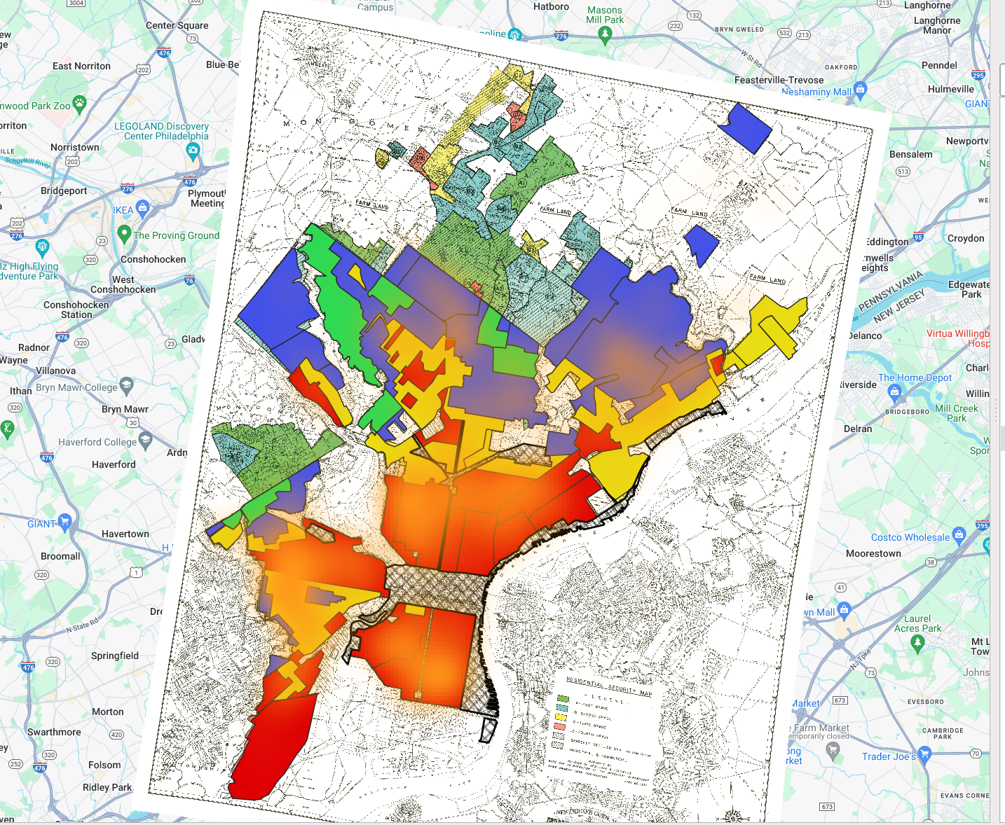
2. Which regions had the highest interest rates?
High-risk areas generally had higher interest rates, however, there are some areas outside of the high-risk reasons that also had higher interest rates.
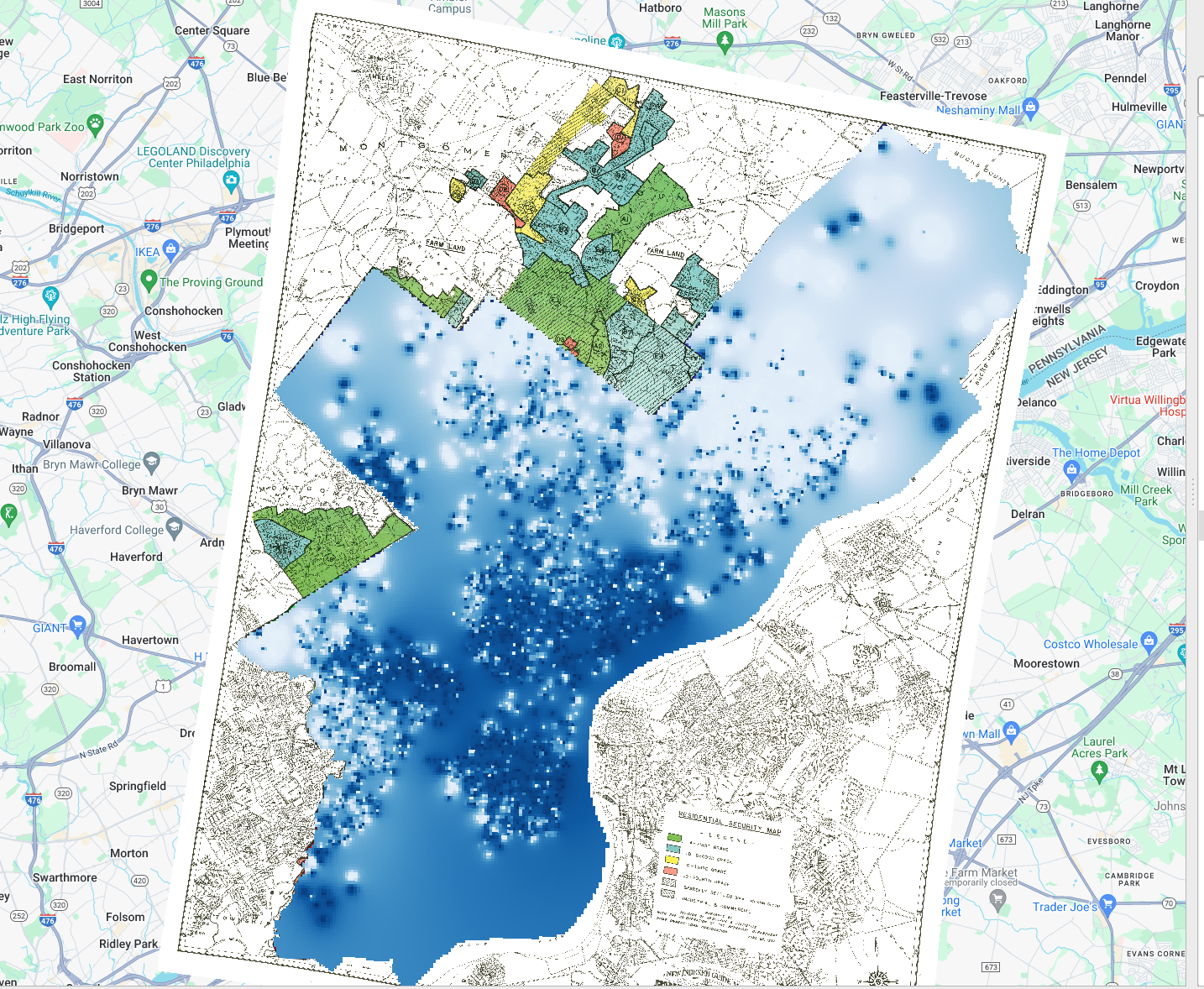
3. What indication do you see (if any) that HOLC maps caused redlining (as opposed to mapping preexisting discrimination). If none, what additional historical evidence do you think you might need to establish this relationship?
I see very few indications that HOLC maps caused redlining. I think it would be helpful to see census data predating this census as it could provide some additional clues.
4. What additional data layers do you think might supply evidence of discriminatory housing policy/segregated urban development that you don’t have access to in this exercise?
It might be helpful to have data on the value of the house or the household income of the house. This could provide context to the interest rate data and how it correlates to the redlining maps.
5. Create one clear, legible map that you think best demonstrates the most compelling visualization of redlining in Philadelphia.
Its a little hard to see but this is my best attempt at layering the two maps.
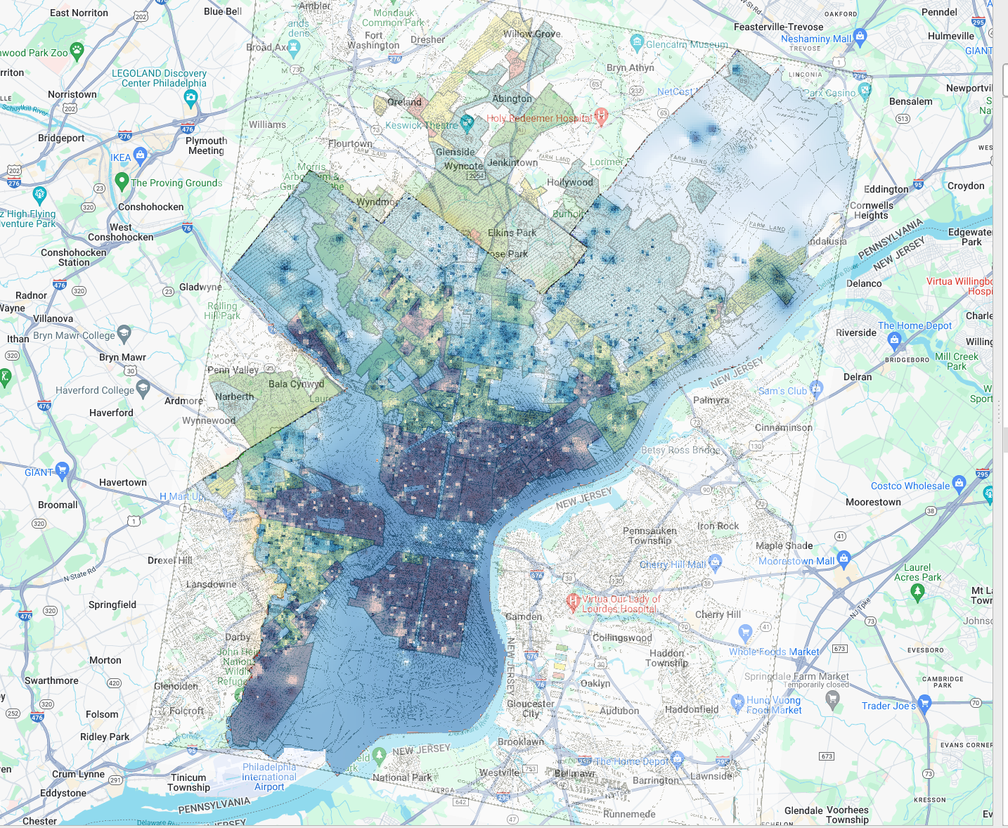
Nicely done. Very difficult to map everything, right? 🙂