
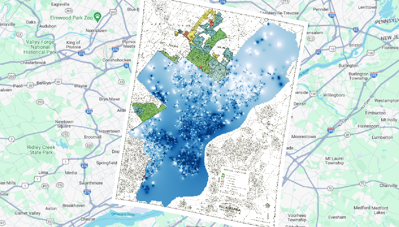
What patterns do you see between mortgage companies and locations that supplied lendees in Philadelphia?
Berean was definitely more concentrated in redlines areas as far as their mortgages were concerned than MetLife. MetLife seemed to be pretty all over.
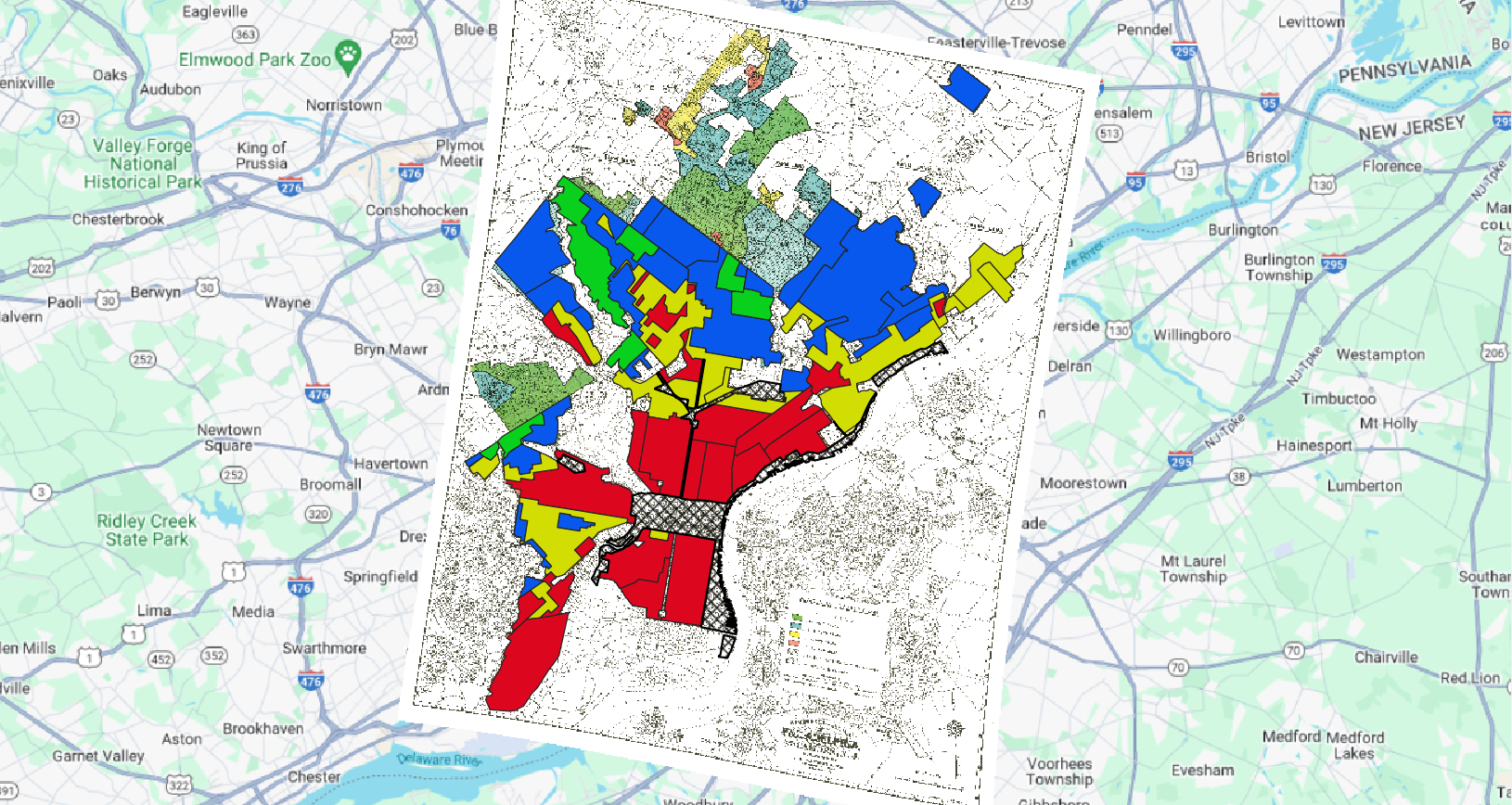
Which regions had the highest interest rates?
The high risk generally had the highest interest rates on average but there are quite a few with high interest rates in the blue areas as well, it also appears there is one in the green areas.
What indication do you see (if any) that HOLC maps caused redlining (as opposed to
mapping preexisting discrimination). If none, what additional historical evidence do you
think you might need to establish this relationship?
I see little to no indications that the redlining maps created redlining, it seems that this segregation was already present and the redlining just reinforced it. I think the mortgages show that. I think that census data predating 1950 would be helpful in determining this questions but as we know that’s incredibly difficult to digitize.
What additional data layers do you think might supply evidence of discriminatory housing
policy/segregated urban development that you don’t have access to in this exercise?
I think that housing value would be helpful as well as it can display how minorities may have been suppressed and further exploited by getting high interest rates for less valuable property.
Create one clear, legible map that you think best demonstrates the most compelling
visualization of redlining in Philadelphia.
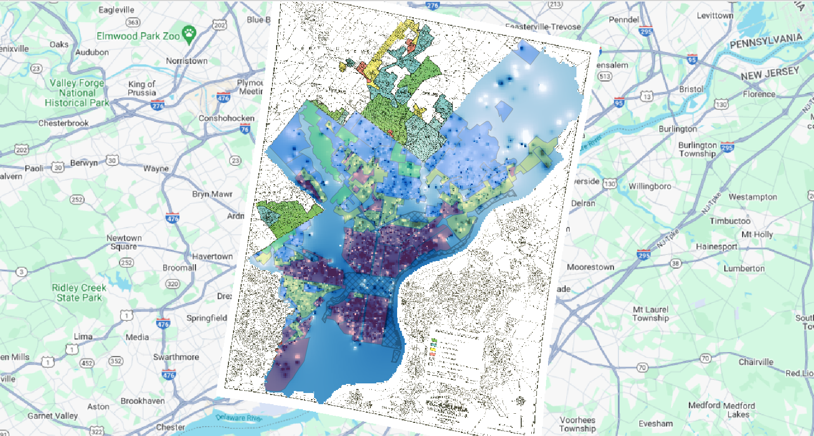
I know this map is a bit difficult to read but I had trouble turning transparency on the interpolation down so I threw the redlining map on top and turned down it’s transparency instead. This map displays the interest rates on homes over the redlining map.
Categorize Evan, otherwise, nicely done.