
Maps, in their greatest utility, are used to enhance separation. Separation of land. Separation of countries. Separation of people. They are used to show differing themes among specific geographic features. In the examples today, the maps are used to show separation of race–based on location.
Map Showing the Distribution of the Slave Population of the Southern …, www.loc.gov/resource/g3861e.cw0013200/?r=-0.189,0.02,1.249,0.704,0. Accessed 9 Feb. 2024.
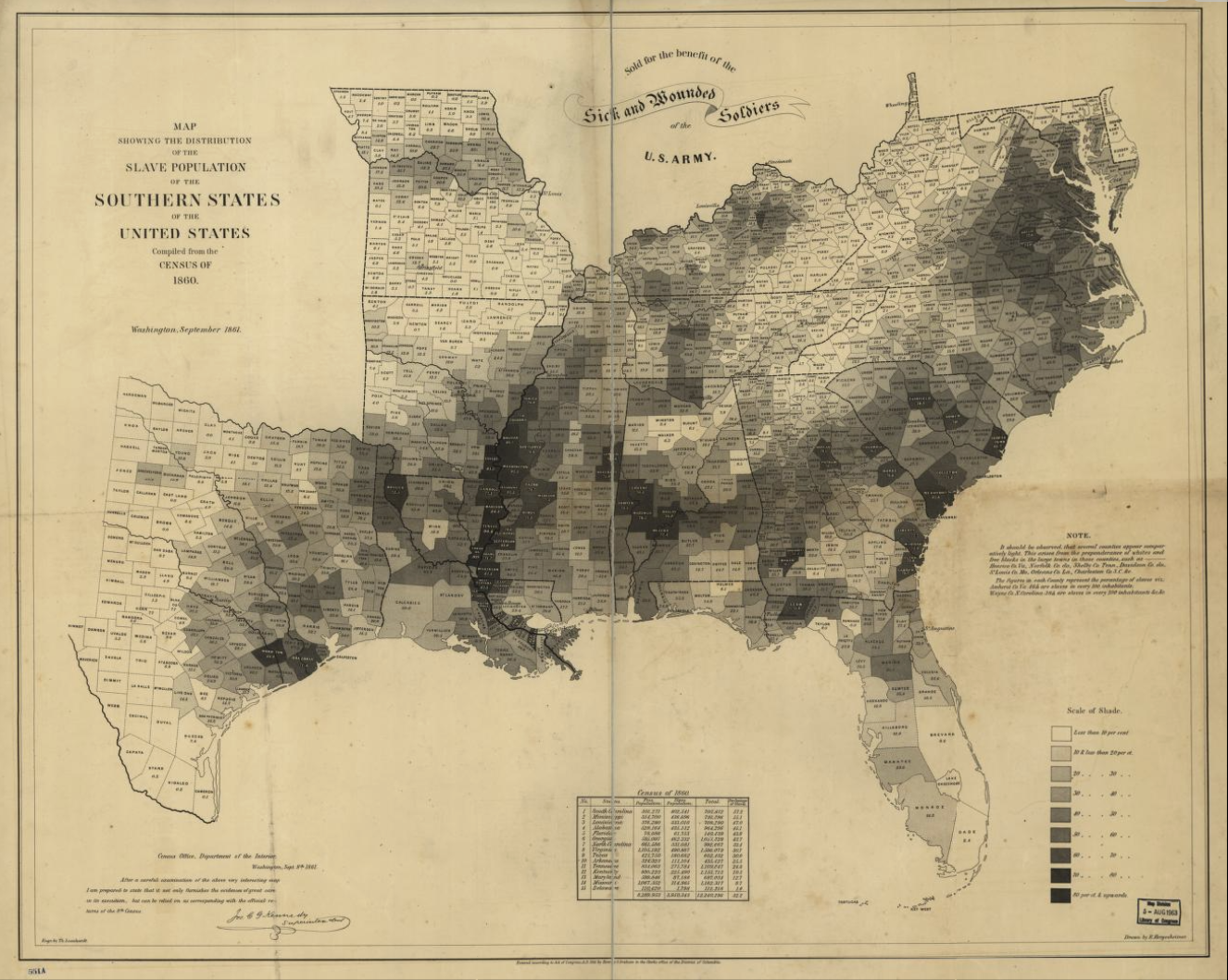
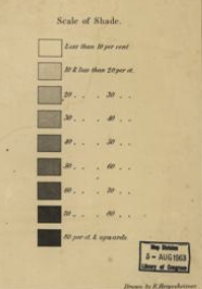
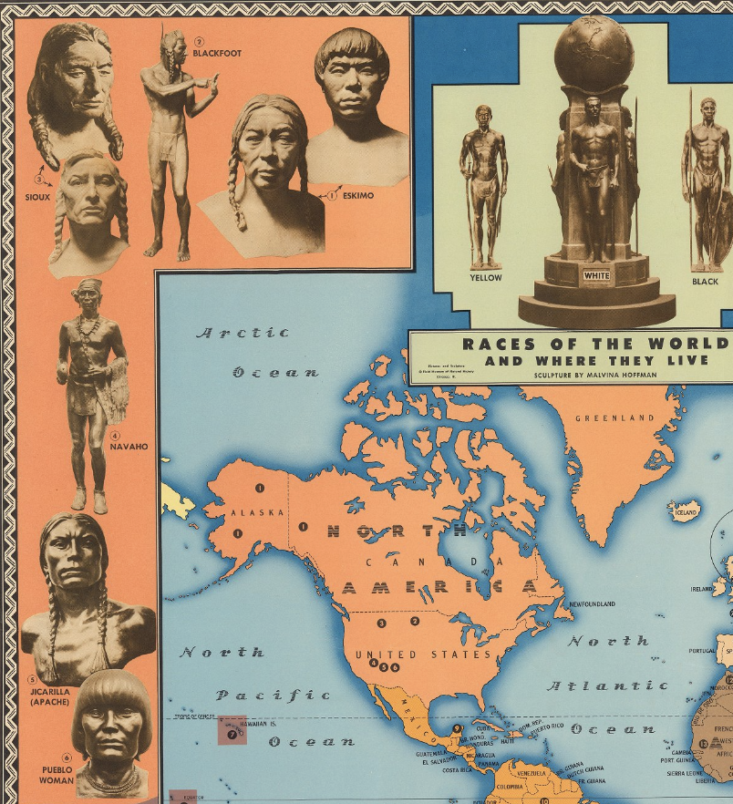
This first map created from data taken in 1860 divides 15 states and shades them according to slave populations within certain regions. The second picture attached shows the key for shading, the darkest areas are highest in slave population density and no shading is lowest. This helps visualize which regions slavery is highly accepted in (dark) and areas which have little to no slavery. Though mapping slave populations, I argue further that this map can help show where farmland was the best, or most profitable. Areas high in slave populations would likely correlate to good farming areas, and areas with little slavery either opposed such an act, or simply were areas in which profit margins were low. Similarly, the map by Malvina Hoffman separates race and territory, this time encompassing every country in the world. Hoffman color codes by region and wraps races with pictures around the entire map. An example is shown below:
Hoffman, Malvina. “Races of the World and Where They Live.” Races of the World and Where They Live – David Rumsey Historical Map Collection, www.davidrumsey.com/luna/servlet/detail/RUMSEY~8~1~291599~90063129:Races-of-the-world-and-where-they-l
North America, as well as Greenland, are represented in an orange hue, and the corresponding races to the area are placed within the orange border surrounding the map. But what are the points of such maps? Crampton answers this easily:

Crampton, “Maps and the Social Construction of Race” from the History of Cartography Project (2008), pg. 1234
The idea of separating based on race boils down to knowing what populations live where. If an area is high in African population, flawed researchers may go there and observe disease transmission (Tuskegee Syphilis Study), or not give them opportunities for loans (Redlining), they may be targeted for eugenic movements (IQ, race laws, immigration restrictions), and many other intense and immoral biases. One can not be judged by race or the area they live in, but maps such as these attempt to do so.
Nicely done. I really like that this blog has a thesis, and you follow it from beginning to end. “Maps, in their greatest utility, are used to enhance separation. Separation of land. Separation of countries. Separation of people. They are used to show differing themes among specific geographic features.” – I’m not sure this is accurate (we see maps that break down borders too), but this is nevertheless an intriguing idea!