
The Ghost Map reading, and the map itself, is a great story of mapping data and how silences can create an unwanted conclusion. It also shows the importance of picking the best symbology to illustrate the point the map is proposing. In this case, dot (vector) mapping was chosen–a radical new “technology” for the time. There were many struggles in trying to solve the mystery outbreak: how to map this, what to include, what to dismiss, how far out to map, and other questions.
Steven Johnson, The Ghost Map, 1-22; 193
This is an important point for us, as potential mapmakers, to take in. Too much detail detracts from the argument–creating an unreadable image that does little to argue a point. Similarly, too little information creates no argument at all. You must find the ideal balance to perfectly execute the proposition that a specific map is trying to make, with critically chosen silences and promotion of ideas/data that strengthen(s) such an argument. Interestingly, Snow set out with a new method of mapping:

Steven Johnson, The Ghost Map, 1-22; 196
Snow represented foot traffic within the map to mark how people actually spread, instead of simply marking the spatial relationship. Imagine a wall sitting right in front of you, 100 yards long, and unclimbable. From a birds eye view, you and the opposing side of the wall are a mere couple feet apart; however, it would take you much longer to actually get to that other side of the wall than it appeared. Snow attempted to mark this on a 2-D surface using Voronoi diagrams. This ended up providing direct evidence that the outbreak was due to waterborne pathogens, and he was awarded endlessly for this work. His map is shown below, with the specific Broad Street pump highlighted:

John Snow’s Cholera Map (detail) – for full map, see Snow, 1855
The black bars represent the number of deaths per address, and the dotted circle around the bars is the area where the Broad Street pump was the closest source of water. In the full version, as you move out from the pump, deaths from cholera become increasingly sparse. This all but proved the miasma theory wrong and provided direct evidence for why the cholera outbreak occurred.
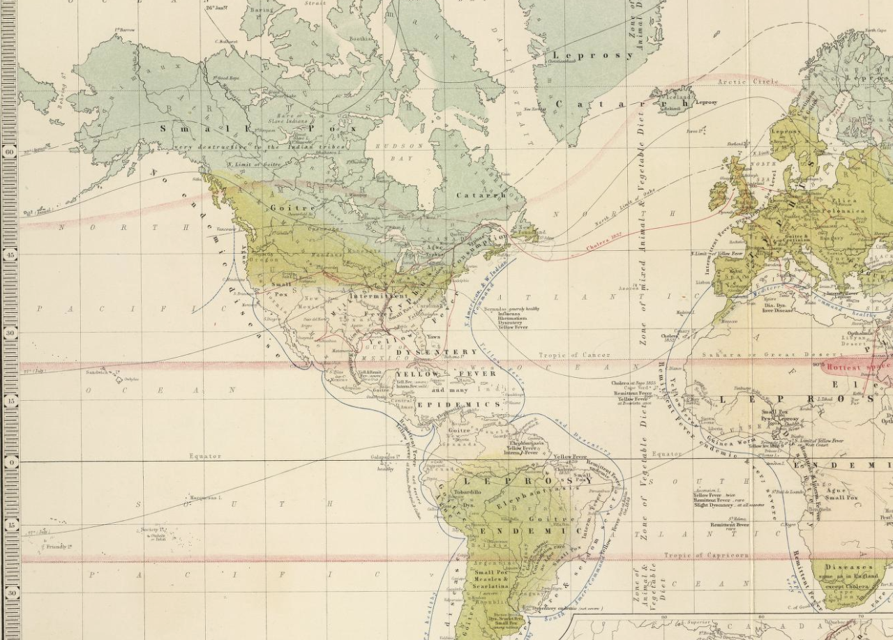
Alexander Johnston, Geographical Distribution of Health and Disease in Connection Chiefly with Natural Phenomena, 1856
Similarly to Snow’s map, this map notes the transmission and travel of cholera by time. Johnston instead uses dates to show time on the map, and the red lines move east to west. Instead of solving an evolving and local issue like Snow, this map marks the travel of the disease as a whole, encompassing the entire globe. By using red, the travel is easily noticed by the reader and Johnston does a great job at communicating his point. Seen with the two maps above are two methods/examples of how to mark time and travel on a map.
Excellent blog post. I love that you immediately focused on a lesson for your own future mapmaking. Clarity is key!