Erin Buglewicz, Stage 6: Review of Maddey King’s Final Project

This story map provided a detailed explanation of school access and race in Omaha. The project established the history of redlining and white flight, which created a form of unofficial segregation in schools, especially in North and South Omaha. It also explored how private schools enabled parents to avoid placing their children in integrated schools until it was declared unconstitutional in 1976. Finally, the story map delineated different eras in Omaha, such as when integration was ordered and some students were bussed to schools outside of their neighborhoods in an attempt to correct racial imbalance and also after mandatory integration ended in 1999.

This story map had many strengths. At the beginning, it acknowledged the limits of data collection, which is important to understand, and the timeline that was included allowed me to understand the different eras that the story map would discuss. Throughout, there was also a nice inclusion of brief videos that discussed topics such as the difficulties of desegregating after the Brown v. Board of Education decision as well as an explanation of Runyon v. McCrary. The maps themselves were generally clear and effective. Plus, in particular, it is important to note that the maps that referred to different races were made in an ethical manner by not using colors like white and black to represent them. 

Although effective, there are still some areas where the story map could be improved. For example, in the introduction, I did not find a clear thesis statement or a specific historical question that the story map addressed. Although the story map presents a strong argument for the intersection between race and schools in Omaha, it seems that a thesis statement that presents a claim about this topic is present in the conclusion. Another area of improvement is in the maps themselves. I think that a few of the maps could have been layered together to create a stronger argument. For instance, using the choropleth of race in Omaha with a map of top and bottom performing schools could have more effectively conveyed the argument that schools with worse performance rates are in areas with that have larger populations of African Americans. Moreover, it would also be helpful to see separate maps for elementary and high schools rather than have them included together.

Overall though, this was still an effective story map with well-supported claims.

Erin Buglewicz, Stage 3: Data Collection

Bibliography

Data Sources

“California Census Tract Boundaries.” [Feature Layer]. ArcGIS Online. June 15, 2014. https://services.arcgis.com/jDGuO8tYggdCCnUJ/arcgis/rest/services/CA_CT_boundaries/FeatureServer. This map displays the census tracts in California. This will be useful to reference when using census data to determine the boundaries of Hinkley’s census tract.

County of San Bernardino. “School Sites in San Bernardino County.” [Feature Layer]. ArcGIS Online. October 4, 2019. https://services.arcgis.com/aA3snZwJfFkVyDuP/arcgis/rest/services/SB_County_School_Sites/FeatureServer. This map shows schools located in San Bernardino County. This is important because there are no schools in the town of Hinkley. This map connects to other sources that I have found discussing the closure of the school in Hinkley and how that cause residents to leave.

Duranchacon, Henry. “Water Wells San Bernadino County.” [Feature Layer]. ArcGIS Online. December 20, 2020. https://services.arcgis.com/o6oETlrWetREI1A2/arcgis/rest/services/Water_Wells_San_Bernardino_County/FeatureServer. This map on ArcGIS Online displays wells and whether they contained hexavalent chromium at different points in time. Therefore, this data will be useful to map contaminated wells in Hinkley over time.

Izbicki, John A., Thomas D. Bullen, Peter Maclyn Martin, and Brian Schroth. “Delta Chromium-53/52 Isotopic Composition of Native and Contaminated Groundwater, Mojave Desert, USA.” Elsevier Ltd. January 2, 2012. https://www.researchgate.net/publication/253011745_delta53Cr_mixing_fractionation_and_exchange_in_contaminant_plumes. This article includes a simplified plume map of Hinkley, California. There are two separate plumes depicted, each showing different concentrations of chromium 6, as well as sampled wells within the plumes. This information will aid the mapping process and answer how factors like population are affected by water contamination.

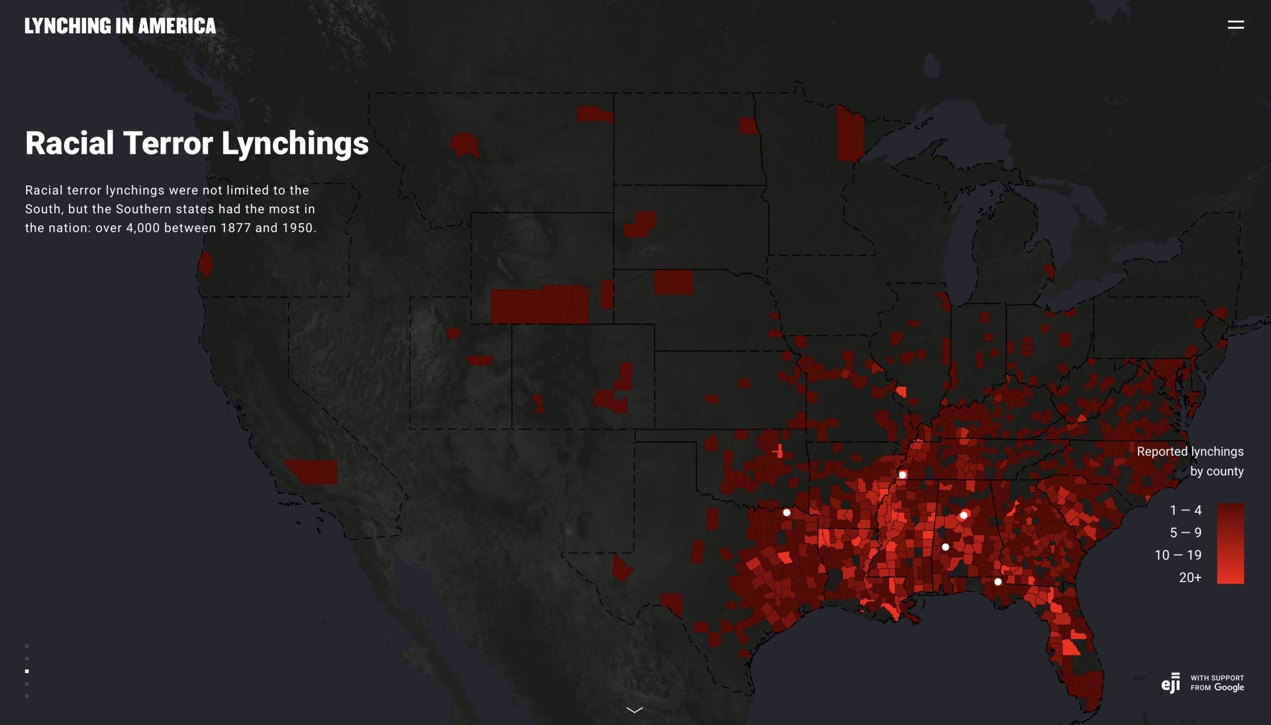
Izbicki, John A., and Whitney A. Seymour. “Analyses of Regulatory Water-Quality Data.” In “Natural and Anthropogenic Hexavalent Chromium, Cr(VI), in Groundwater Near a Mapped Plume, Hinkley, California.” U.S. Geological Survey. June 2023. https://pubs.usgs.gov/pp/1885/d/pp1885d.pdf. This source discusses contaminated water wells in Hinkley Valley, and it includes a series of plume maps that show how contaminated groundwater has spread between 2008 and 2015. This will be important for marking wells that were contaminated as a result of PG&E’s actions and showing how the contamination has spread over time.

Manson, Steven, Jonathan Schroeder, David Van Riper, Katherine Knowles, Tracy Kugler, Finn Roberts, and Steven Ruggles. IPUMS National Historical Geographic Information System: Version 18. [1990 census tract]. Minneapolis, MN: IPUMS. 2023. https://www.nhgis.org. This data shows the total population in Hinkley’s census tract (119) for the year 1990. This information will be used to note the population density in 1990, when the water contamination in the town was beginning to reveal itself.

Manson, Steven, Jonathan Schroeder, David Van Riper, Katherine Knowles, Tracy Kugler, Finn Roberts, and Steven Ruggles. IPUMS National Historical Geographic Information System: Version 18. [2000 census tract]. Minneapolis, MN: IPUMS. 2023. https://www.nhgis.org. This data shows the total population in Hinkley’s census tract (119) for the year 2000. This information will be used to examine how the population density has changed since 1990.

Manson, Steven, Jonathan Schroeder, David Van Riper, Katherine Knowles, Tracy Kugler, Finn Roberts, and Steven Ruggles. IPUMS National Historical Geographic Information System: Version 18. [2010 census tract]. Minneapolis, MN: IPUMS. 2023. https://www.nhgis.org. This data shows the total population in Hinkley’s census tract (119) for the year 2010. This information will be used to examine how the population density has changed since 1990.

Manson, Steven, Jonathan Schroeder, David Van Riper, Katherine Knowles, Tracy Kugler, Finn Roberts, and Steven Ruggles. IPUMS National Historical Geographic Information System: Version 18. [1990 property values by census tract]. Minneapolis, MN: IPUMS. 2023. https://www.nhgis.org. This data shows property values within Hinkley’s census tract in 1990. This will be useful to show changing trends in property values over time and how they have been impacted by water contamination.

Manson, Steven, Jonathan Schroeder, David Van Riper, Katherine Knowles, Tracy Kugler, Finn Roberts, and Steven Ruggles. IPUMS National Historical Geographic Information System: Version 18. [2000 property values by census tract]. Minneapolis, MN: IPUMS. 2023. https://www.nhgis.org. This data shows property values within Hinkley’s census tract in 2000. This will be useful to show changing trends in property values over time and how they have been impacted by water contamination.

Wood, Isaac A., and Chris R. Maxwell. “Conceptual Site Model for Groundwater Flow and the Occurrence of Chromium in Groundwater of the Western Area, Pacific Gas and Electric Company, Hinkley Compressor Station, Hinkley, California.” Pacific Gas and Electric Company. January 14, 2013. This report presents the results of an evaluation of recent and historical data on groundwater in Hinkley, and it concludes that wells within a few areas contain chromium that is naturally occurring and not associated with the plume that formed as a result of PG&E’s actions.

Secondary Sources

Banks, Sedina. “The ‘Erin Brockovich Effect’: How Media Shapes Toxics Policy.” Environmental Law and Policy Journal. Vo1. 26. University of California, Davis School of Law. May 2003. https://environs.law.ucdavis.edu/archives/26/2/erin-brockovitch-effect-how-media-shapes-toxics-policy. This article provides an overview of the case that Erin Brockovich helped to create against the Pacific Gas and Electric Company. This will offer good historical context and insight into the facts of the case, which is necessary to know to understand the mapping project.

“Chromium in Drinking Water.” United States Environmental Protection Agency. February 23, 2024. https://www.epa.gov/sdwa/chromium-drinking-water. This source explains what the maximum contaminant level (MCL) is for chromium 6 and the importance of this standard. This standard will inform the mapping project by determining which wells are above the MCL.

Esquivel, Paloma. “15 Years after ‘Erin Brockovich,’ Town Still Fearful of Polluted Water.” Los Angeles Times. April 13, 2015. https://www.latimes.com/local/california/la-me-hinkley-20150413-story.html. This article discusses how residents are still feeling the effects of contaminated water, long after the case against PG&E settled in 1996. According to the article, hundreds of residents have fled Hinkley and property values have decreased. This information will help answer my historical question directly.

Lamb, Mike. “Map of Hinkley Wells Released.” Victorville Daily Press. August 3, 2014. https://www.vvdailypress.com/story/news/local/2014/08/03/map-hinkley-wells-released/36742004007/. This source includes personal statements from Hinkley residents who have witnessed issues with buying and selling property. This will mainly be useful to create the story associated with the map and provide more in-depth details.

Hillard, Gloria. “Erin Brockovich Town Faces New Threat.” National Public Radio. November 22, 2012. https://www.npr.org/2012/11/22/165672549/erin-brockovitch-town-faces-new-threat. This news article from 2012 includes statements from Hinkley residents who have reported that the contaminated water has spread several miles from its location a decade ago, but PG&E argued that the plume is larger merely because they are conducting more testing. This article will contribute to the narrative of the mapping project because it explores how the plume has spread.

Morgan, John W. “Preliminary Assessment of Cancer Occurrence in the Hinkley Census Tract, 1996-2008.” The Criterion. California Cancer Registry. March 2011. https://www.waterboards.ca.gov/rwqcb6/water_issues/projects/pge/docs/hinkley/ccr_032011.pdf. This provides information on the number of cancer cases within Hinkley’s census tract over a period of years after the PG&E case was settled. This will inform the narrative of the mapping project by explaining how chromium 6 is linked to cancer.

“Reflections on Hexavalent Chromium: Health Hazards of an Industrial Heavyweight.” Environmental Health Perspectives. Vol. 108, no. 9, September 2000. https://ehp.niehs.nih.gov/doi/pdf/10.1289/ehp.108-a402. This source highlights the Erin Brockovich case while discussing hexavalent chromium. This will help to show the importance of this mapping project and inform viewers that the Brockovich case is just one instance of water contamination that has affected the lives of many.

Richard, Chris. “For Town Made Famous By ‘Erin Brockovich,” a Toxic Sequel?” The Christian Science Monitor. January 4, 2011. https://www.csmonitor.com/Environment/2011/0104/For-town-made-famous-by-Erin-Brockovich-a-toxic-sequel. This news article details how PG&E began buying and demolishing homes as early as the 1990s. This may help explain trends for property values in Hinkley.

Self, Brooke. “Contaminated Water Plume Expanding Near Hinkley School & Church.” Victorville Daily Press. June 26, 2013. https://www.vvdailypress.com/story/news/2013/06/26/contaminated-water-plume-expanding-near/37150700007/. This article contains a statement from a water board official who explains that groundwater containing chromium 6 is within a mile radius of the school, and it also briefly discusses PG&E’s “purchase program.” This information will help to explain property values in the area and the reason behind the school closing (see article by Steinberg), which resulted in many people leaving Hinkley.

Steinberg, Jim. “Hinkley School Closing: Not So Fast, Says Appeals Court.” San Bernadino Sun. July 17, 2015. https://www.sbsun.com/2015/07/17/hinkley-school-closing-not-so-fast-says-appeals-court/. This news article discusses the closure of the Hinkley Elementary/Middle School. As a result of this, many people left the town. This will help explain changes in population over time.

Erin Buglewicz, Blog Post 8: Mapping & Ethics

Monroe Work, a pioneer in the field of sociology, confidently asserted, “In the end facts will help eradicate prejudice and misunderstanding, for facts are the truth and the truth shall set us free” [1]. However, individuals and organizations often manipulate or misuse facts to promote their own views. For this reason, it is important to approach historical data visualization from an ethical standpoint, but although there are ways in which one can attempt to avoid bias, it is virtually impossible to eliminate entirely. This is especially true for maps because even seemingly minor elements like color, symbols, and interactivity can influence how viewers interpret data.

In “Racism in the Machine: Visualization Ethics in Digital Humanities Projects,” Katherine Hepworth and Christopher Church emphasized that to showcase data ethically, one must mitigate any harm to viewers and the subjects of a study as well as maximize the project’s ability to communicate information [2]. The authors then proposed an ethical visualization workflow that should be used when creating digital humanities projects, such as maps, to help eliminate bias and misrepresentations. The workflow introduces several steps that are part of one of three phases: pre-data collection, data curation and collection, and data visualizing and argumentation.

Ethical workflow proposed by Hepworth and Church.

By examining two mapping projects, Hepworth and Church were able to explain how researchers can apply this ethical approach to the creation and use of data visualizations. The first map that the authors analyzed was “Lynching in America: Racial Terror Lynchings,” created by the Equal Justice Initiative (EJI). This is a choropleth map showing the number of reported lynchings (of African Americans) across US counties between 1877 and 1950. 

“Lynching in America: Racial Terror Lynchings”

The map is visually striking. It uses a red color ramp to indicate the number of lynchings in each county, and against the dark background, this color indicates what it represents: bloodshed. Before even exploring the map and website, I was already well acquainted with EJI’s mission from previously reading Just Mercy and hearing the organization’s founder, Bryan Stevenson, speak in person at Creighton last year. Therefore, despite the map’s title suggesting otherwise, I was able to conclude that these lynchings only involved African Americans. When interpreting the map, it is important to know this background because it fuels EJI’s argument that historical violence and prejudice against blacks is at the foundation of their disproportionate representation within the current criminal justice system. Therefore, the map is merely a “promotional and advocacy tool” for EJI [2].

To most viewers, this map appears credible at first glance, especially as it is supported by Google, but on further inspection, it introduces some unethical implications. To begin with, it utilizes raw data, which is improper for a choropleth map. As Hepworth and Church noted, the number of lynchings in each county should be normalized against census population data [2]. This would eliminate any disproportionate representations of lynchings in each county. Moreover, this map also contains notable silences. As already mentioned, it solely focuses on African Americans who were lynched. The map is also limited by choices made during the data collection phase about what constitutes a “lynching.” The criteria chosen allowed EJI to create “a narrative around racial violence that excludes other minorities and other geographic locales” [2]. The map does, in fact, ignore much of the North and West, casting it in a dark color, and it primarily focuses the viewer’s attention on the South, which is bright red.

Hepworth and Church also examined “Map of White Supremacy’s Mob Violence,” a different map conveying similar but more nuanced data, which provided a better ethical visualization of racial lynching in the United States. This map, developed from research done by Monroe Work, has several key differences from the one produced by EJI that lend it greater credibility. To start, it is a complex and interactive dot density map, spanning from 1848 to 2021, which makes it relevant even in the contemporary era.

“Map of White Supremacy’s Mob Violence”

The aim of this map is arguably to “confront the user with the temporal and racial extent of white superiority-motivated lynchings, both qualities that are absent from the Racial Terrors Lynchings map” [2]. Thus, the scope of what this map covers is much larger, and it fills in gaps that the EJI did not cover. Most obviously, Work’s map includes the lynchings of several different races, not just African Americans. This demonstrates that racial violence was not limited to one group. 

Key for “Map of White Supremacy’s Mob Violence.”

These dots are much more widespread than lynchings represented on the EJI’s map, where they were mainly clustered in the South. Additionally, each dot represents a reported lynching, including the name, where available, of every person as well as the year the lynching occurred. This information is also accompanied by a link to sources that viewers can click on to discover more. In doing so, this incorporates a sense of humanity and greater credibility into the project that EJI’s map lacks.

Example of a lynching case included on “Map of White Supremacy’s Mob Violence.”

Therefore, this second map provides a better example of an ethical visualization of data. This difference is namely apparent in the two maps’ arguments and silences (or relative lack of), and this comparison demonstrates why Hepworth and Church’s proposed workflow is effective and practical.

References:

[1] Work, Monroe, and Florence Work. “Map of White Supremacy’s Mob Violence.” Plain Talk History. https://plaintalkhistory.com/monroeandflorencework/explore/map2/#4/37.85/-99.5/0/18.

[2] Hepworth, Katherine, and Christopher Church. “Racism in the Machine: Visualization Ethics in Digital Humanities Projects.” Digital Humanities Quarterly. Vol. 12, no. 4 (2018). http://digitalhumanities.org/dhq/vol/12/4/000408/000408.html.

[3] Equal Justice Initiative & Google. “Lynching in America: Racial Terror Lynchings.” https://lynchinginamerica.eji.org/explore.

Erin Buglewicz, Stage 2: Project Proposal

My final mapping project concerns developments in the small town of Hinkley, California, prior to and following the landmark case Anderson, et al. v. Pacific Gas and Electric, settled in 1996. Although it may evolve or slightly change as my research proceeds, the historical question I am hoping to address is how have factors such as population density and poverty levels in Hinkley been affected by contaminated drinking water? I will focus on mapping Hinkley with an emphasis on showing a correlation between the location of PG&E facilities and contaminated domestic wells or other drinking water sources. More specifically, this project will consider developments in population density and poverty levels spanning from the 1990s, right before the contamination came under the scrutiny of Erin Brockovich, to the 2010s.

To create my final mapping project, I will search for and employ different sources to find relevant data. Some possible sources that I may use include local newspapers, plume maps showing the spread of contaminated water in Hinkley’s groundwater sources, census data of the town between the 1990s and 2010s, legal documents concerning the case itself, and additional relevant information from sources like the California Water Boards. Additionally, I will also further explore ArcGIS Online to access base maps, which I may reference and use, particularly in terms of water contamination. I will also plan to research secondary sources, which will enable me to provide historical context to my maps. Some of these secondary sources may be reports and studies related to the water contamination in Hinkley, especially if they discuss socio-economic factors that contribute to how poverty levels have changed in the community over time.

For my final project, I plan to create a story map. Based on the nature of my project, this type of map would be effective for several reasons. A story map would enable me to introduce the topic of water contamination and the case involving Hinkley, CA. Because the storyline of the case against PG&E is vital to understand the historical context, it is essential that I incorporate the story alongside maps of the town that I will produce. Besides maps, this type of map project will also allow me to provide other visuals and video clips, if applicable, to enhance the story. Moreover, utilizing a story map will enable me to highlight important data and sites, such as PG&E’s facilities and contaminated water within Hinkley. After showing this, I will be able to clearly delineate my conclusion on how Hinkley has changed as well as why studying this case is relevant today.

This mapping project will ultimately serve as a case study for how contaminated drinking water affects communities. By exploring factors such as population density and poverty levels, both before and after Erin Brockovich helped to unearth the truth about the contamination, this project will display how the town of Hinkley has changed. This information will provide scholarly value because it can help inform contemporary discussions about environmental justice and policies as well as foster environmental advocacy, especially in terms of maintaining clean drinking water sources. This project will also have historical impact because it will delineate water contamination over a period of time and how the community has changed as a result. 

Erin Buglewicz, Practicum 7: Using ArcGIS Online to Map Land Cultivation

Map of land cultivation in 1880.
Map of land cultivation in 1900.
Map of land cultivation in 1940.

These maps depict change over time between 1880 and 1940, specifically showing a general spread of cultivation from east to west.

The first map, showing the land in 1880, has the least amount of cultivated land. At most, some counties were only 26-42% cultivated. The cultivated land is largely concentrated in eastern and central Kansas and eastern Texas, but those counties in Kansas have a higher percentage of cultivated land as indicated by the presence of the many dark orange counties.

The 1900 map shows a significant change because it has Oklahoma’s counties drawn and represented whereas on the 1880 map, they were absent. The land in Oklahoma now shows some cultivation at this point in time. The map’s legend notes another important change. This map has counties with the highest percentage of cultivation, between 44-66%. By 1900, Kansas had undergone greater cultivation and had the most highly cultivated counties in that range (shown in dark orange). This marked the time when farmers were finding the limits to how much land they could cultivate.

Overall, the 1940 map shows more widespread cultivation across the counties shown. It is easy to see the spread of cultivation from east to west since the map depicts an increase of cultivated land in Colorado, Texas, and Oklahoma. However, the darkest shade on the legend of the 1940 map only indicates 37-66% land cultivation, which shows that the limits were reached and farmers had to reduce how much land they cultivated to find a more sustainable equilibrium.

Erin Buglewicz, Practicum 6: Heat Maps & Voronoi Diagrams

Heat map representation of John Snow’s map of the 1854 cholera outbreak in London.
Voronoi diagram of John Snow’s map of the 1854 cholera outbreak in London.

Can you think of any other situations where a heat map or Thiessen polygons would be useful ways to analyze spatial data? 

The heat map and Voronoi diagram above provide good representations of deaths during the 1854 cholera outbreak in London. However, there are also other situations where these types of maps would be useful to analyze spatial data. For example, crime rates in a given area could be analyzed. Using a heat map, it would be possible to see if crime is more prevalent in certain neighborhoods, and with a Voronoi diagram, the distribution of those reported crimes could be analyzed in the context of the nearest police stations. By using those as points, the diagram may help determine if the presence of police stations deters crimes within a certain radius. Another instance in which heat maps or Voronoi diagrams could be useful would be to map a community’s access to resources like healthcare facilities and grocery stores. Heat maps could help to visualize the distributions of these places, and a Voronoi diagram could pinpoint grocery stores and healthcare facilities and compare the areas they serve in relation to population density to identify what regions may be lacking resources.

How might they be useful in this context of your final project (if at all)? 

For my final project, I think that heat maps and Voronoi diagrams could be useful. Assuming I am able to acquire the necessary data, I could use a heat map to show the intensity and spread of pollution in Hinkley’s groundwater. This information would help provide context for my questions about how property values and population density were affected by contaminated groundwater in the town. On that note, a heat map might also be helpful to depict either property values or population density, both before and after Erin Brockovich helped win the landmark case against PG&E. If I chose to also research those who were diagnosed with a serious ailment, such as cancer, a Voronoi diagram could help show the distribution of those individuals in relation to the nearest sources of groundwater. Like in the case of the Broad Street pump, this would likely demonstrate what water sources were polluted with hexavalent chromium.

Erin Buglewicz, Blog Post 7: Mapping Ecology

Beginning in the late 19th century and progressing mostly in the 20th century, the “plow-up” of the Great Plains was a slow but important ecological change that converted about a third of the prairie into cropland. However, nearly 70% of the land (265 million acres) was left relatively untouched or merely grazed by livestock and mowed for hay (Cunfer, 19). This information points to the underlying fact that nature significantly limited people who tried to change the plains.

From On the Great Plains: Agriculture and Environment.

Geographer Henry Gannett created a map of the continental United States, showing the production of wheat per square mile, using data from the census of 1900. The legend in the bottom left corner explains that areas in darker shades of green produce more bushels of wheat than lighter ones. Areas that are white were unsettled at that time. Overall, Gannett’s map is rooted in one time, specifically 1900.

Gannett’s Wheat/sq. mile map. From DavidRumsey.com.

However, in On the Great Plains: Agriculture and Environment, Geoff Cunfer shows a series of choropleth maps of the region, focusing on several significant years between 1880 and 1997. Instead of wheat production, these maps depict the percentage of each county’s total area that remained unplowed in that year, and together, they represent change over time. Darker shaded counties have a greater percentage of grassland remaining.

From On the Great Plains: Agriculture and Environment.

As previously noted, very little land was plowed in the 19th century as the process had just begun amidst the homesteading era. The 1920 map does show more plowed land, but the western plains were largely untouched due to environmental limitations for farming, such as rainfall, temperature, soil quality, and topography (Cunfer, 34). The arid conditions in the western plains were therefore more suitable to ranching than farming, which meant that more grassland remained there, than in places like central KS.

Figure 2.4 from On the Great Plains: Agriculture and Environment.

Figure 2.5 – which includes maps of 1925, 1935, and 1940 – shows the transition era, during which farmers reached the limits of what land could be plowed, peaking in 1935, and creating an equilibrium between pasture and cropland.

Figure 2.5 from On the Great Plains: Agriculture and Environment.

The 1940 map marked the start of stability, and the remaining two figures show relatively little change in the percentage of remaining grassland across the various counties. However, by 1997, there was a significant reduction in cropland because the Conservation Reserve Program was paying farmers to take land out of crop production (Cunfer, 35).

1997 map from Figure 2.7 from On the Great Plains: Agriculture and Environment.

Overall, both Gannett and Cunfer’s maps imply that nature was the major factor that limited how people used the land across the Great Plains.

References:

Cunfer, Geoff. “Pastures and Plows.” In On the Great Plains: Agriculture and Environment, 16-36. Texas A&M University Press, 2005.

Gannett, Henry. Production of Wheat Per Square Mile at the Twelfth Census 1900. U.S. Census Office, 1903. https://www.davidrumsey.com/luna/servlet/detail/RUMSEY~8~1~32209~1151551:156–Wheat-sq–mile-?sort=pub_list_no_initialsort%2Cpub_list_no_initialsort%2Cpub_list_no_initialsort%2Cpub_list_no_initialsort&qvq=w4s:/what%2FAtlas%2BMap%2FStatistical%2BAtlas%2FAgriculture%2Fwhere%2FUnited%2BStates;sort:pub_list_no_initialsort%2Cpub_list_no_initialsort%2Cpub_list_no_initialsort%2Cpub_list_no_initialsort;lc:RUMSEY~8~1&mi=28&trs=71.

css.php