Wyatt Greco’s “Deindustrialization and Demographics” of Michigan and West Virginia presents a convincing argument of the deindustrialization linked to an area’s core industry; In this case being the automobile, and coal industry. The time period he is studying is the 1940s to 80s and from 1980 to, 2020. During this time, Greco could link the deindustrialization of Michigan and West Virginia to the decline in population density. This is shown through the two maps he has created, with red being the decline in population as mines and factories are shut down. Greco concludes that while there is a correlation between deindustrialization and the decreasing population density, that is not the only factor that is at play here. Public policy and other economic factors have also led to the decrease in population density.
Greco’s maps are clear and to the point. They provide a good basis for his argument and show a great understanding of his topic. The instructions were clear and accurate, with the sources clearly labelled and cited. Greco provides a convincing argument on how deindustrialization has affected these areas.
Greco’s methodology is sound; however, he does not explain why he is using density rather than a percentage change in population. Maps are clear, with points of interest clearly labelled, but a legend would be nice to help the reader along with the assumption that density has increased, particularly if we are not interested in reading over the methodology.
Overall, Greco did a superb job in summarizing and presenting his argument. None of his claims are unsupported and his argument is presented eloquently and to the point.
Percentage of Land for Agriculture, by county, 1880Percentage of Land for Agriculture, by county, 1900Percentage of Land for Agriculture, by county, 1940
There is a higher concentration of farming in the Northeast in 1880-1900. With an almost insane 72% of land being cultivated in 1900. By the 1940, farming had become more widespread, with most regions that are not desert having at least 10% of their land dedicated to farming. North Texas has also developed substantially since 1900, I wonder if it has something to do with mechanized farming or something else.
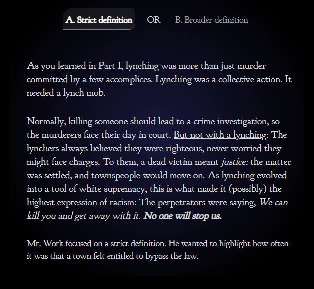
Mapping in itself is a form of data visualization, and is thus not representative of the real world. However, it is one of the most effective ways to help a person visualize the spatial scope of differing subjects. In this case, we are looking at the ethical implications of two different lynching maps. One by the Non-Profit organization, Lynching in America, and the other by Monroe Work, a 1900s sociologist, who recorded many different lynchings and their sites. Each has their own biases and differing views on what is important in the visualization of their data. In the end, however, they are still just representations of real events that happened to real people.
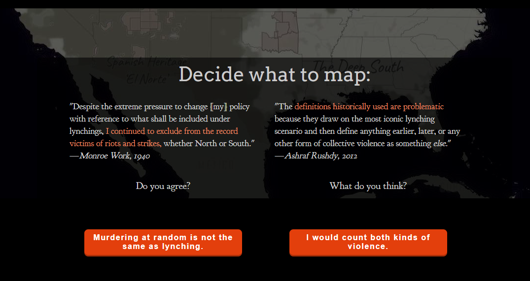
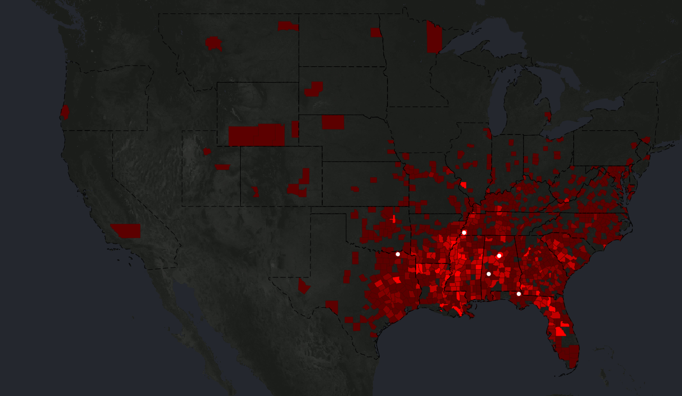
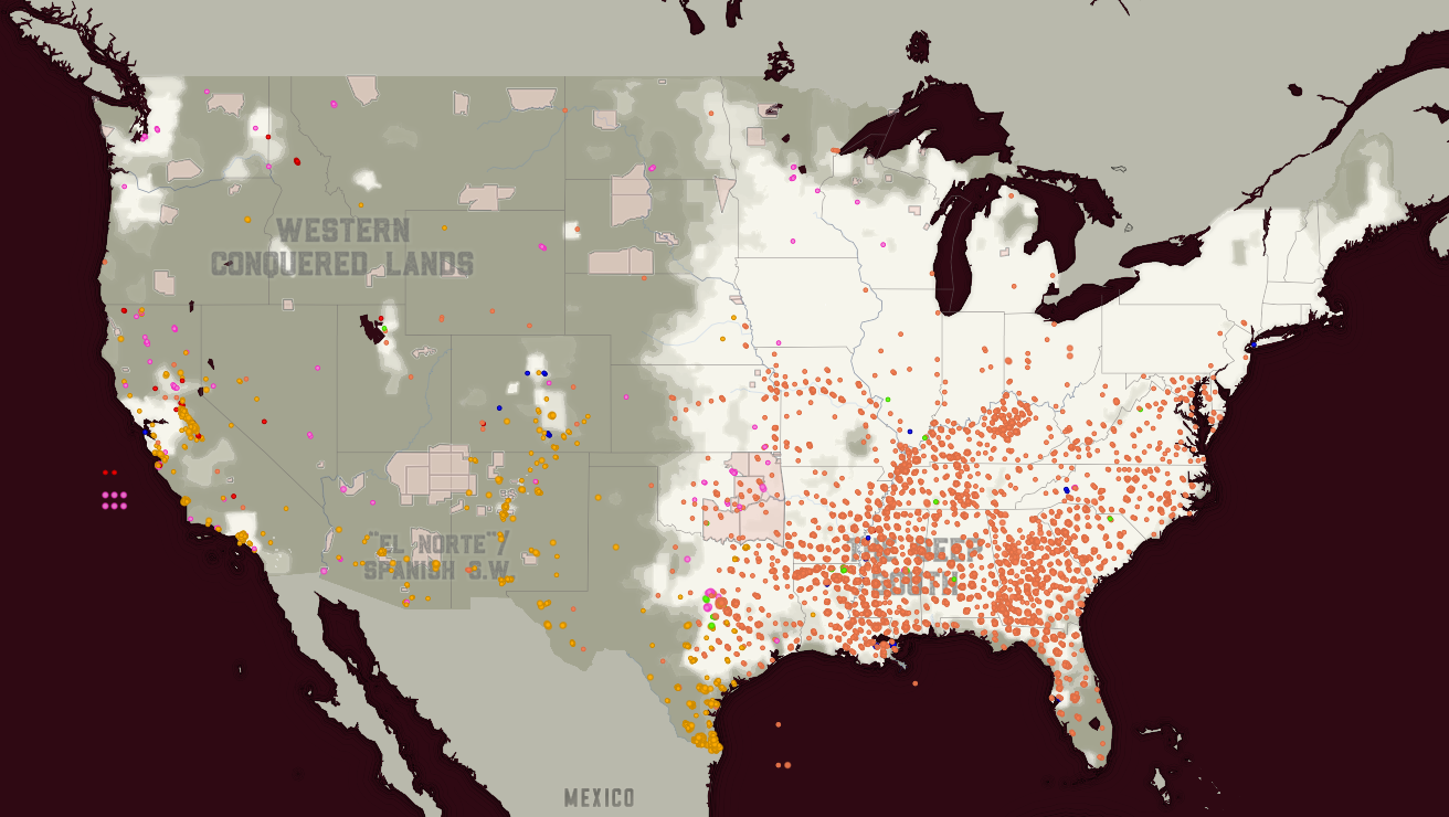
These maps differ drastically ethically. The Monroe Work map in fact gives you an option to map different definitions of lynching.
This drastically changes how these deaths are mapped, with there being more deaths due to collective violence than there was with a stricter definition of Lynching. This is best shown in the timelines of each definition. The stricter definition of lynching has less dots on the timeline, especially during the 1970s-2020.
Left is the strict definition of lynching, on the right is the less strict definition.
Now imagine if the first stricter definition was the only definition shown. It would thus seem to us that White supremacy and lynchings were stopped sometime in the 1970s and is now a historical event. Something consigned to the history books as a dark chapter of our history. Arguably this is the correct way to map this, as ethically we are following already established definitions and guidelines to portray the most accurate data possible. However, what about when these underlying definitions and guidelines are dated or obsolete in terms of modern sensibilities? It is thus up to the cartographer and data analyst to decipher a workable solution to this problem, leading to less “empirically” accurate data visualization, and arguably the manipulation of the data portrayed. An interesting point on this timeline is the Jan 6th riots of 2021, where tragically, Brian Sicknick was killed by rioters and rebels. One could argue whether this riot was a lynching or a protest that went wrong, but in any case someone died from a group incited violence. It may not be a traditional story of lynching, but the similarities are startling and disturbing. Is it thus ethically dubious to show related events on these maps? Katherine Hepsworth and Christopher Church think not, in their journal article “Racism in the Machine: Visualization Ethics in Digital Humanities Projects”, they speak about how the data visualizations made by humans and anything man-made are fundamentally flawed due to their inherent biases formed by those who created them.
They compare the work done by Monroe Work to the work done by EJI and google, with their chloropleth map of “Lynching in America” (LiA). The use of color is remarkable with is symbolism, America covered in darkness with splattering of blood-red chloropleth counties. Evocative of the abuse of black men by white mobs, it’s visually stunning, but is sorely lacking in specifity and crucial information. The major exception that the makers of this map decided to do was to exclude all other populations other than the black population from their data visualization.
Population lynched from 1877 to 1950Population lynched from 1848 to 2020, different colors indicate race.
In addition, the information given by LiA, is too broad and incomplete. There are only four names that are posted in over 4000 lynchings, whereas the Monroe Work map has every dot labelled with a person if possible. Ethically you may argue that a broader visualization is more helpful to understand the scale of the problem, however, when compared to the dot map of Work, the LiA map seems sensationalized and heavy-handed. This arguably strengthens its message, but it does not feel like the most objective or best way to present this information. Specificity and, in this case, personalization would help get across the message better. Church and Hepworth, have made an ethical framework to help make ethical maps.
Personally, I think that there is no such thing as ethical data visualization, as no matted how well we do, we will miss something that will exclude a certain group or people. At best, we can try to include everyone and everything possible without diluting the message. But in any case, our own biases will determine what gets cut.
Hepworth, Katherine, and Christopher Church. “Racism in the Machine: Visualization Ethics in Digital Humanities Projects.” Digital Humanities Quarterly, vol. 012, no. 4, Feb. 2019.
The scope of the project (how wide and area and how much time will your map/mapping product consider?) Make sure to keep the scope of the project manageable.
I will be tracking population change in census tracts as asbestos became more regulated in the 1960s to 1990s. This will track national migrations of people away from asbestos industry cities.
What are some of the possible sources (i.e. digital maps, online data, historical data, secondary sources) that will be employed in your digital mapping product?
I will be referencing the USGS for sites of asbestos mines, as well as the National Census in 1960, 70, 80, and 90. For other primary sources, I will be referencing both state, county, and federal laws related to asbestos.
What type of final project will you create/present? An interactive web map? A story map? Why is this the best way to present your question/data/answer?
This will be a story map tracking the progress of deeming a material to be unsafe. The best way to answer these questions will likely be looking at the vicinity of people to the asbestos mines. The story map is thus a story of deindustrialization, based on health concerns rather than practical or economic value.
A clear explanation of the value of this project as a piece of scholarship
The value of this project is to also track migration patterns based on the health of the industry. As industry deals in more and more volatile chemicals, we need to be able to predict the migration patterns if we start to regulate and ban these chemicals. Asbestos is just the best known example due to its prolonged use and usefulness.
156. Wheat/ sq Mile is an informative US census map from 1846-1914 covering the number of bushels of wheat being harvested in each region. This is shown in the gradient of green, with the largest wheat producing regions producing over 3200 bushels of wheat per sq mile.
The map was made for policymakers and for the public, but its overall goal is to introduce where it was possible to grow wheat abundantly and thus have an excess of food for the nation. This, of course, comes at the expense of grassland, which is what the book “On the Great Plains” argues, with the varying temperature and weather affecting the expansion of plowed land.
“Rain, or lack of it, is the driving factor in Great Plains land use…”
Cunfer, 29
In fact, according to Cunfer we have very rarely plowed more than 30% of the grassland area in during the 19th and 20th century.
Most of the grassland that is counted in this table is used for cattle and other livestock. This can be used to how the relative disparity between livestock raising to an agricultural yield, as livestock is worth more due to the number of resources that they take up. In this case, in terms of land.
How we map things often shapes the policy decisions that affect everyone’s lives. From where we build interstate highways to where we introduce new agricultural programs. Thus, as with all data presentation, we must do so ethically. Providing a fair representation of the real world, is providing a truth that we can make use of. Interpreting and omitting truths is unfortunately part of data representation. Not everyone can have a voice, without it being too caught up in the hundreds of other voices being presented. This map of the prairies, omits many different things, like the availability of water in the region, rail lines which haul off cattle and wheat. But perhaps this is the best representation of the data, providing the largest voice to the dataset that they think is important. And in anycase, policy makers would and should be consulting other pieces of data to make their decisions.
There were 562 total deaths, with each triangle on the map being a death.
Anything with vicinity as an important part of its spatial relationship would have Voronoi’s be a good fit for its representation. Important locations like hospitals or firefighter stations could make good Voronoi diagrams with their proximity to populations. As for heatmaps, they can determine the density of points in a place. Things like population density or its migration patterns over time may be a good fit.
My project is tracking disease very similarly to the wells, as such it should be a very useful for the project
Asbestos is a long fiber like mineral that was used for its fire-resistant properties. It was used in a wide variety of industries, from shipbuilding to paint. Entire towns were formed to mine it, like Val-des-Sources, formerly known as Asbestos, Quebec. This mineral was widespread in absolutely anything that needed to be fire or heat-resistant. Unfortunately, with the degradation of the material, short microscopic fibers would be released into the air, which, when inhaled, may puncture the lungs or cause infection. This degradation may also be planned, such as when you are manufacturing with it. During the 1970s, the United States government started to put regulations on the use of Asbestos and its products. 10 years after the fact is when Asbestosis, the condition where you inhale asbestos, typically starts occurring.
To what extent did the United States’, public policy on asbestos, curb its spread throughout the country in 1980? How was this contraction in usage affect the mining towns for asbestos? What communities were affected by asbestos products the most? I aim to cover the continental United States, with a few forays into the contraction of the Canadian Asbestos industry. I will be focusing on Asbestiosis diagnosis, the price of asbestos during the time, asbestos use in industry (with location, if possible), and the regulatory practices of the time. This data will be replicated using 1970 data if possible and 1990 as well, to track the change in data as public policy changes.