
Mapping in itself is a form of data visualization, and is thus not representative of the real world. However, it is one of the most effective ways to help a person visualize the spatial scope of differing subjects. In this case, we are looking at the ethical implications of two different lynching maps. One by the Non-Profit organization, Lynching in America, and the other by Monroe Work, a 1900s sociologist, who recorded many different lynchings and their sites. Each has their own biases and differing views on what is important in the visualization of their data. In the end, however, they are still just representations of real events that happened to real people.
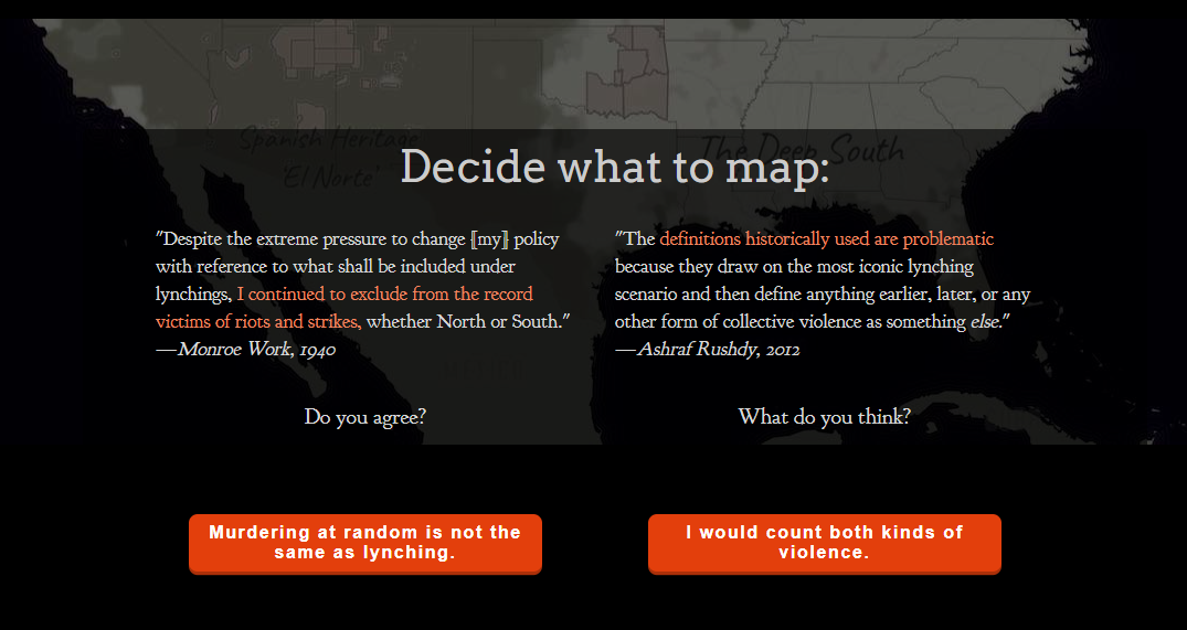
These maps differ drastically ethically. The Monroe Work map in fact gives you an option to map different definitions of lynching.
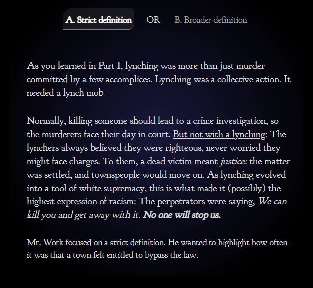

This drastically changes how these deaths are mapped, with there being more deaths due to collective violence than there was with a stricter definition of Lynching. This is best shown in the timelines of each definition. The stricter definition of lynching has less dots on the timeline, especially during the 1970s-2020.


Now imagine if the first stricter definition was the only definition shown. It would thus seem to us that White supremacy and lynchings were stopped sometime in the 1970s and is now a historical event. Something consigned to the history books as a dark chapter of our history. Arguably this is the correct way to map this, as ethically we are following already established definitions and guidelines to portray the most accurate data possible. However, what about when these underlying definitions and guidelines are dated or obsolete in terms of modern sensibilities? It is thus up to the cartographer and data analyst to decipher a workable solution to this problem, leading to less “empirically” accurate data visualization, and arguably the manipulation of the data portrayed. An interesting point on this timeline is the Jan 6th riots of 2021, where tragically, Brian Sicknick was killed by rioters and rebels. One could argue whether this riot was a lynching or a protest that went wrong, but in any case someone died from a group incited violence. It may not be a traditional story of lynching, but the similarities are startling and disturbing. Is it thus ethically dubious to show related events on these maps? Katherine Hepsworth and Christopher Church think not, in their journal article “Racism in the Machine: Visualization Ethics in Digital Humanities Projects”, they speak about how the data visualizations made by humans and anything man-made are fundamentally flawed due to their inherent biases formed by those who created them.
They compare the work done by Monroe Work to the work done by EJI and google, with their chloropleth map of “Lynching in America” (LiA). The use of color is remarkable with is symbolism, America covered in darkness with splattering of blood-red chloropleth counties. Evocative of the abuse of black men by white mobs, it’s visually stunning, but is sorely lacking in specifity and crucial information. The major exception that the makers of this map decided to do was to exclude all other populations other than the black population from their data visualization.
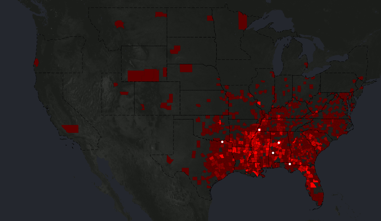
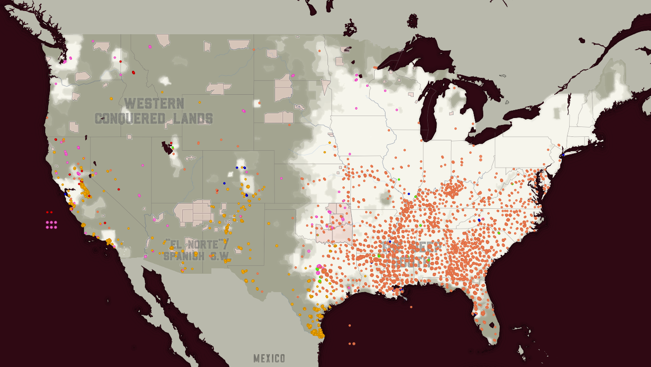
In addition, the information given by LiA, is too broad and incomplete. There are only four names that are posted in over 4000 lynchings, whereas the Monroe Work map has every dot labelled with a person if possible. Ethically you may argue that a broader visualization is more helpful to understand the scale of the problem, however, when compared to the dot map of Work, the LiA map seems sensationalized and heavy-handed. This arguably strengthens its message, but it does not feel like the most objective or best way to present this information. Specificity and, in this case, personalization would help get across the message better. Church and Hepworth, have made an ethical framework to help make ethical maps.
Personally, I think that there is no such thing as ethical data visualization, as no matted how well we do, we will miss something that will exclude a certain group or people. At best, we can try to include everyone and everything possible without diluting the message. But in any case, our own biases will determine what gets cut.
Bibliography
Explore The Map | Lynching In America. https://lynchinginamerica.eji.org/explore. Accessed 27 Mar. 2024.
Hepworth, Katherine, and Christopher Church. “Racism in the Machine: Visualization Ethics in Digital Humanities Projects.” Digital Humanities Quarterly, vol. 012, no. 4, Feb. 2019.
studio, auut. “Monroe & Florence Work Today – Explore the Map of Lynchings.” Monroe & Florence Work Today, https://plaintalkhistory.com/monroeandflorencework/explore/. Accessed 27 Mar. 2024.
A wonderful map and a brilliant encapsulation of the argument in Hepworth and Church – What happens when we frame something as resonant as lynching as “something consigned to the history books as a dark chapter of our history” – perhaps this is a recipe for inaction in the present. Your conclusion is among the strongest I’ve seen this semester. Excellent.