Week 11 – Mapping Ethics

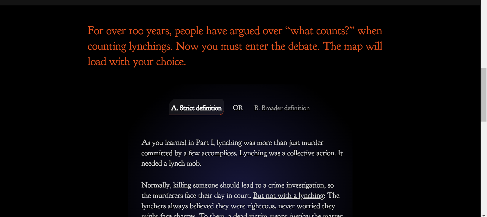
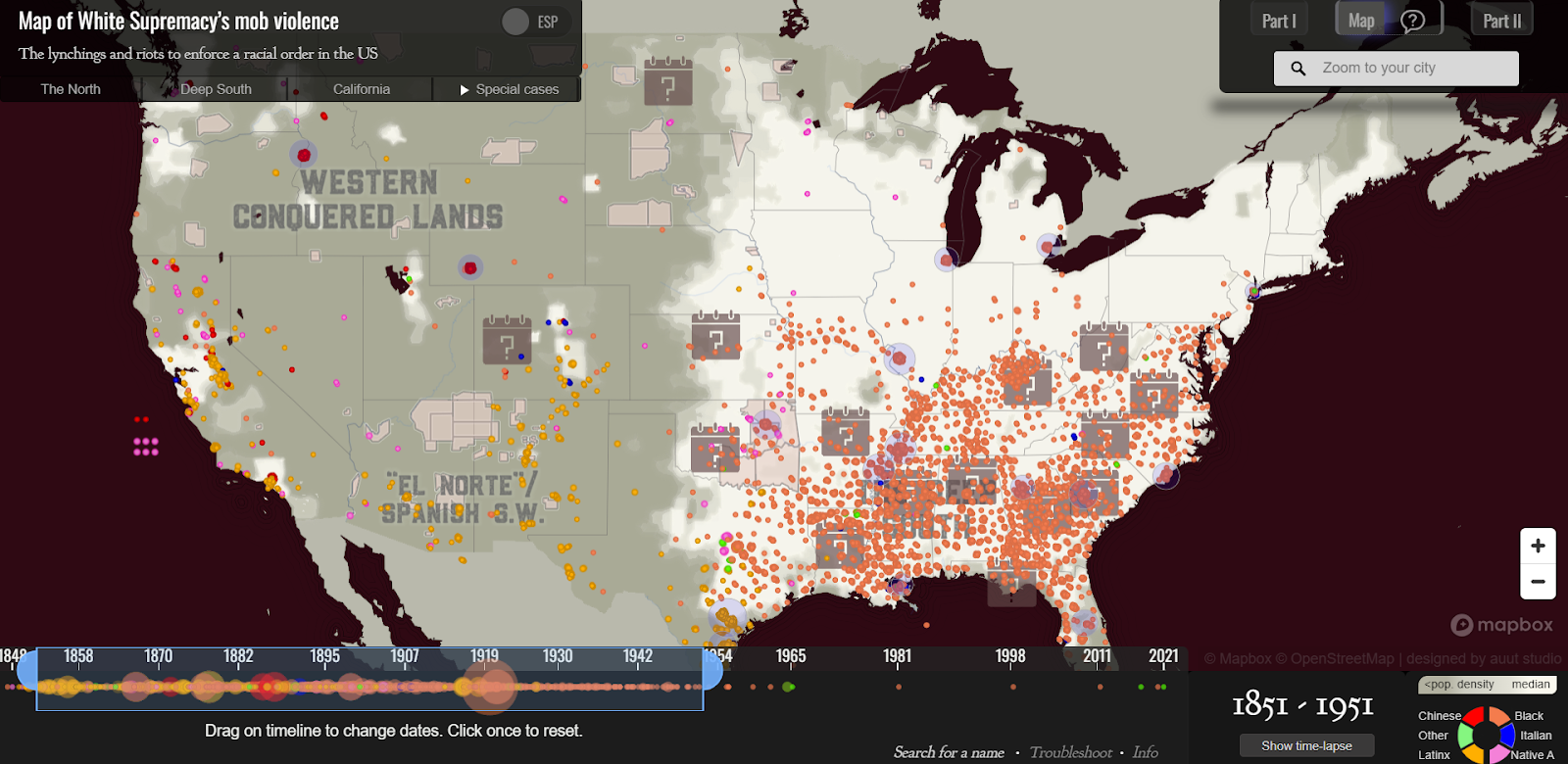
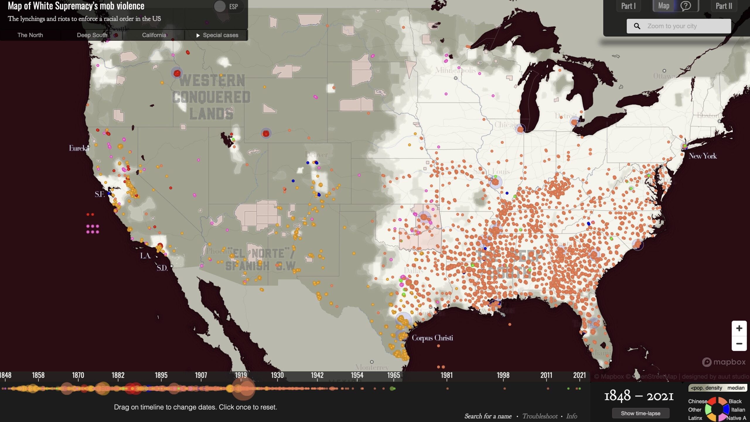
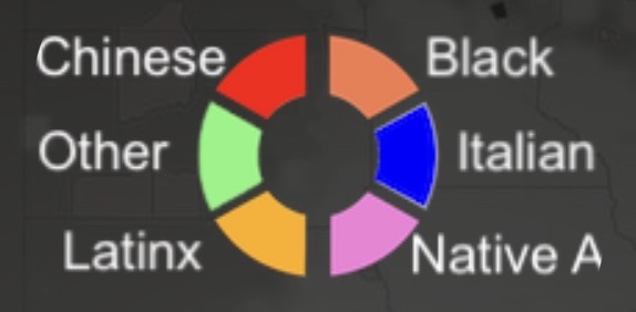
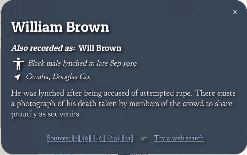
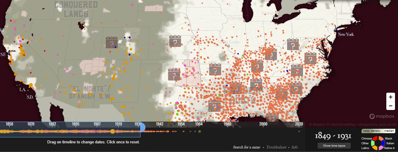
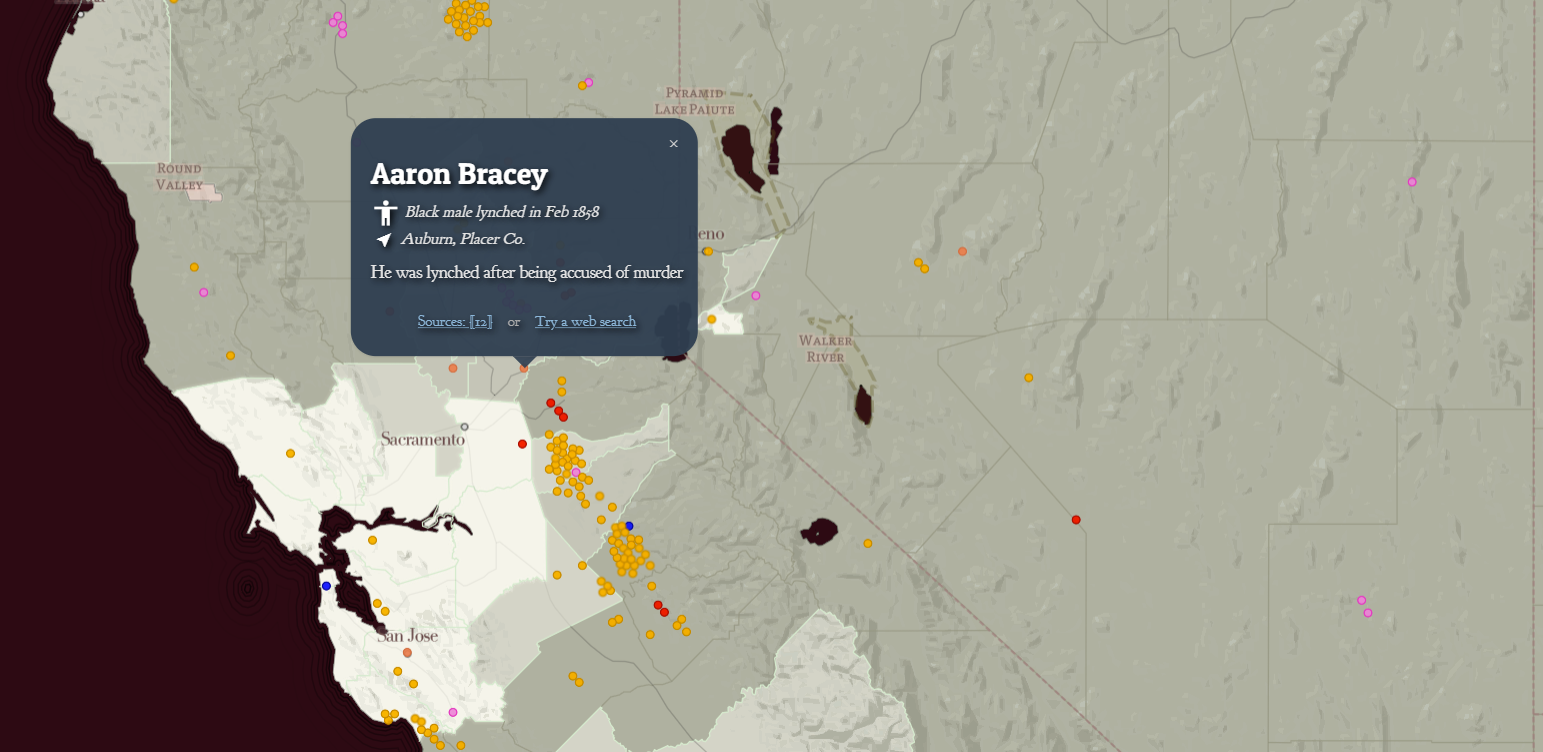
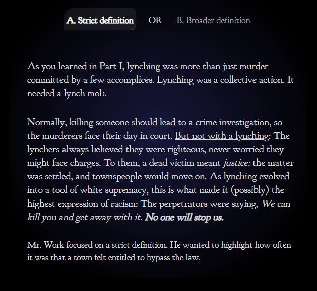
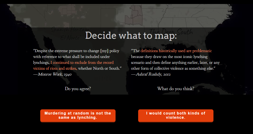
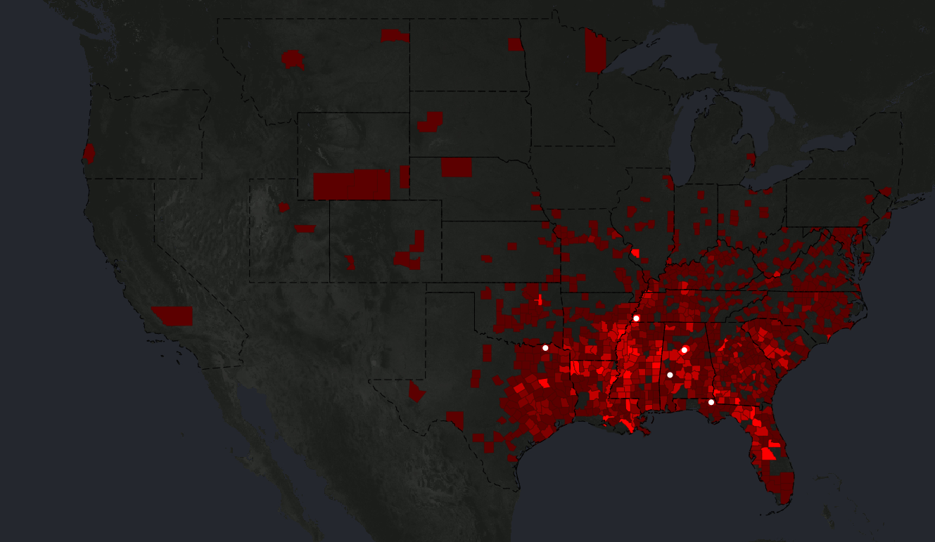
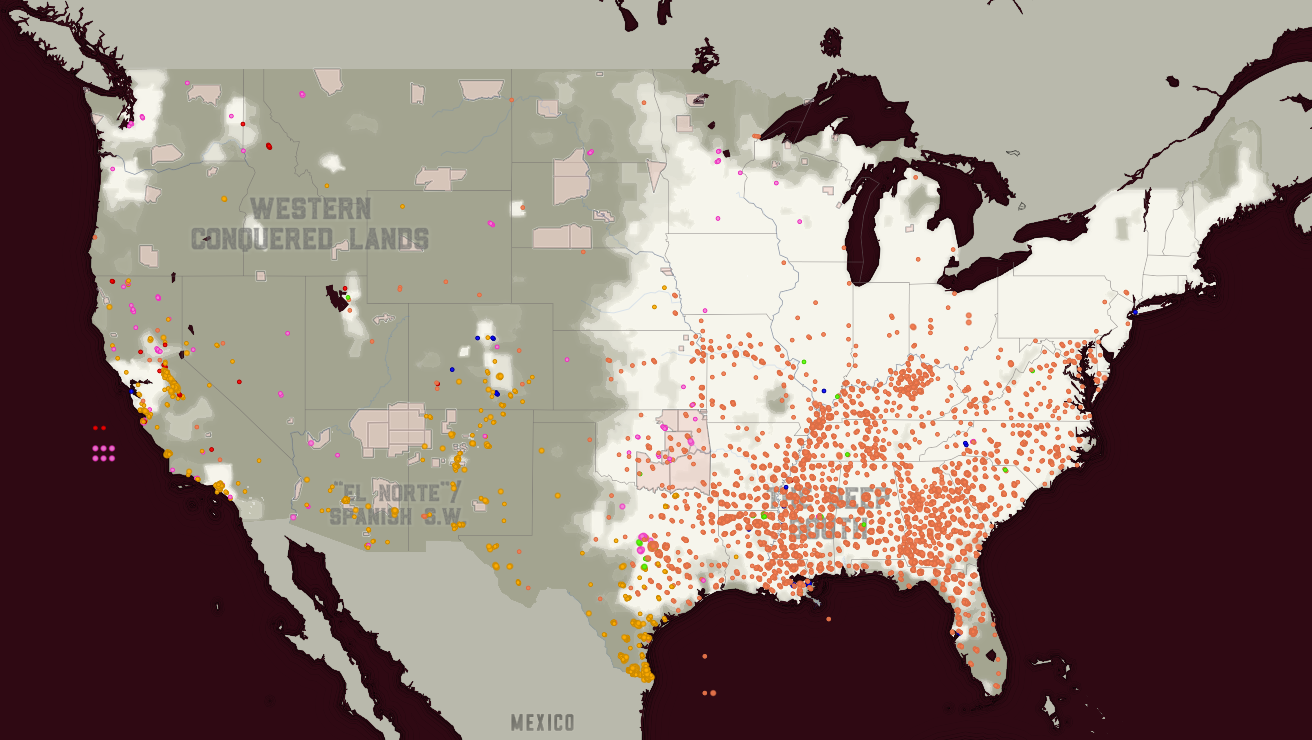
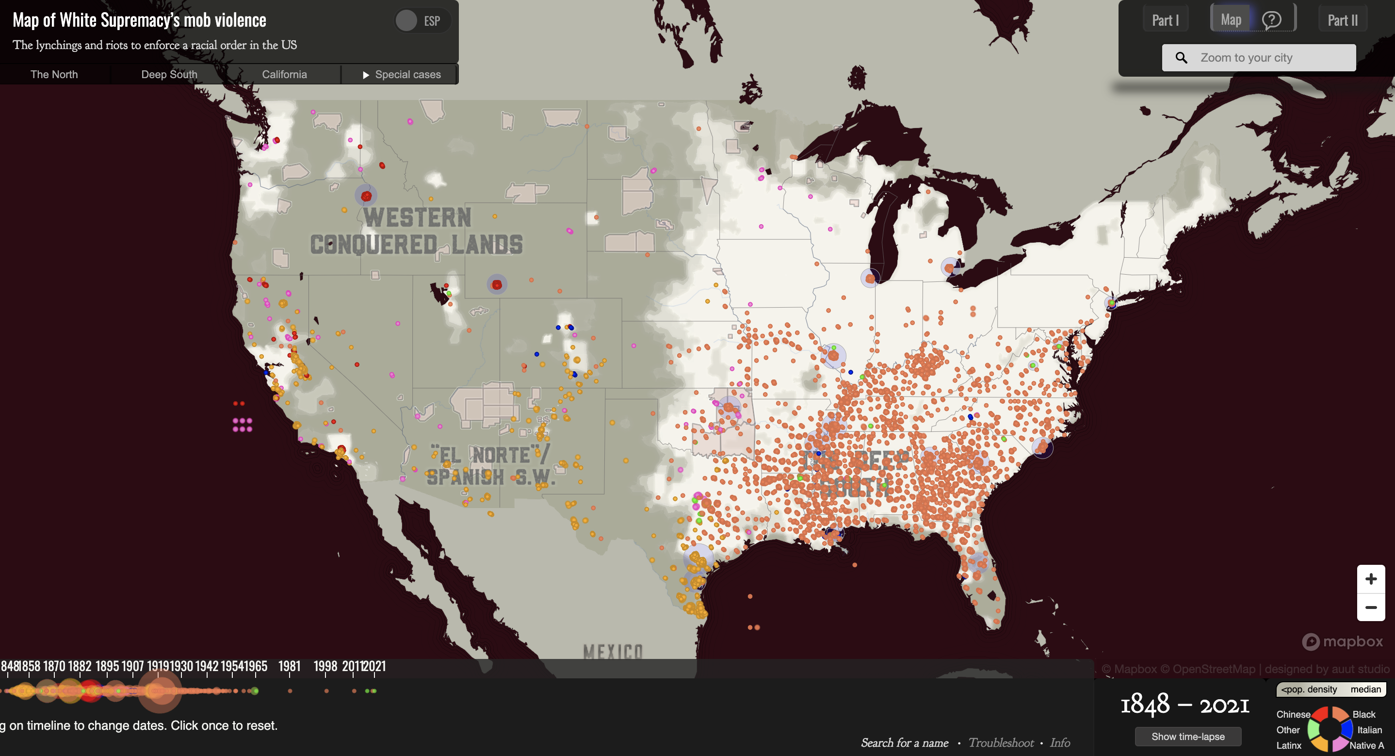
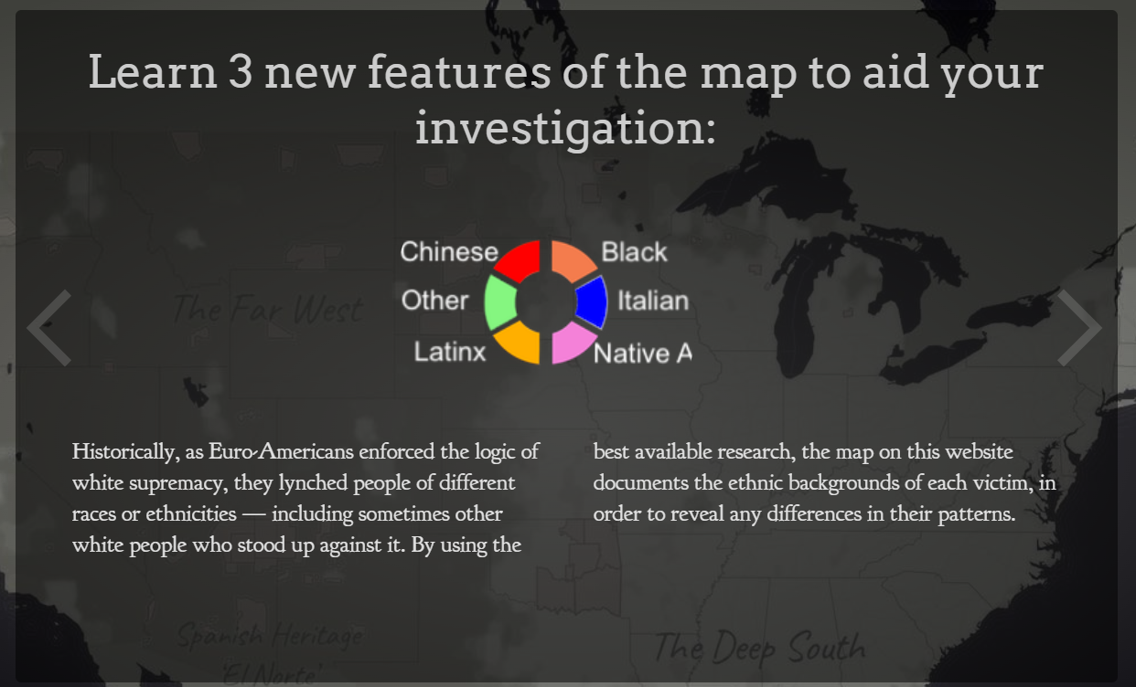
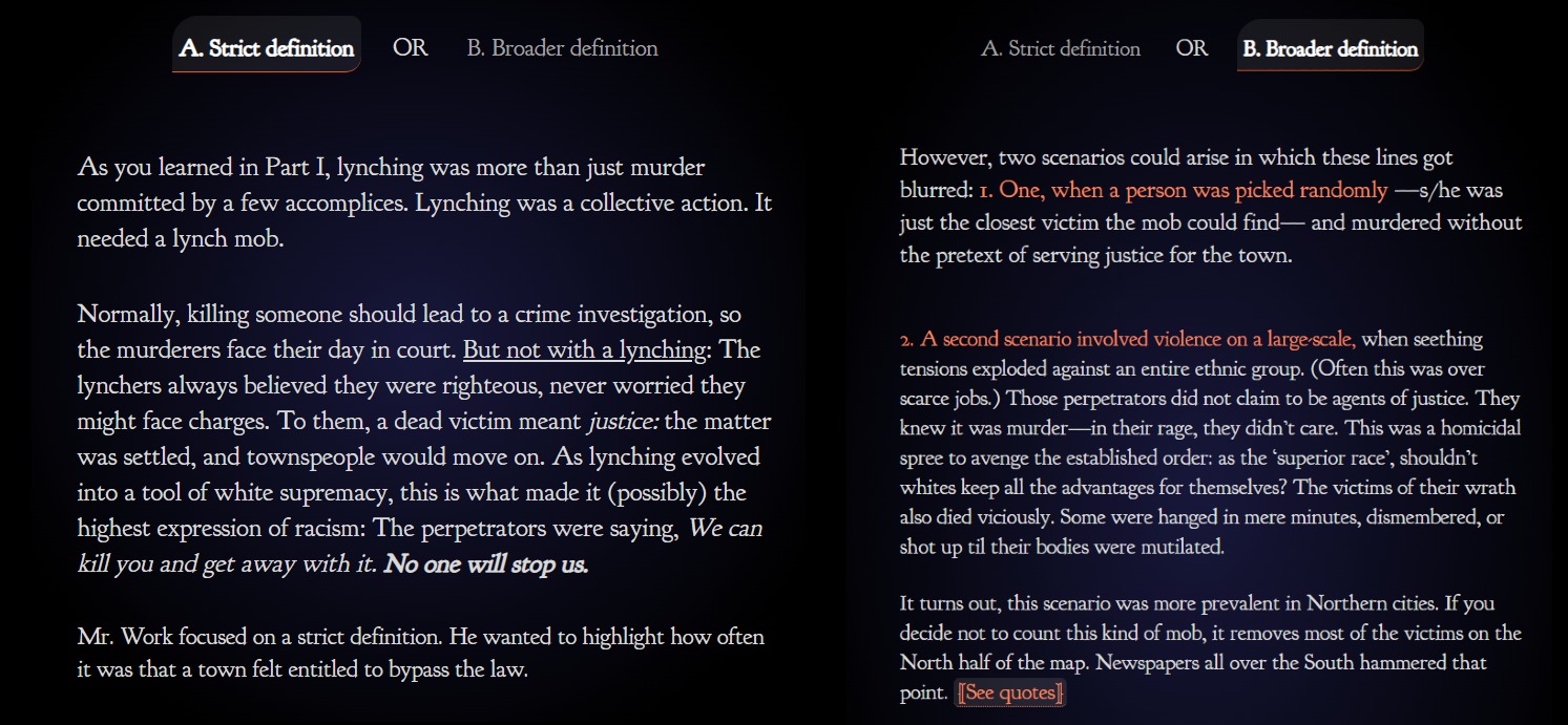
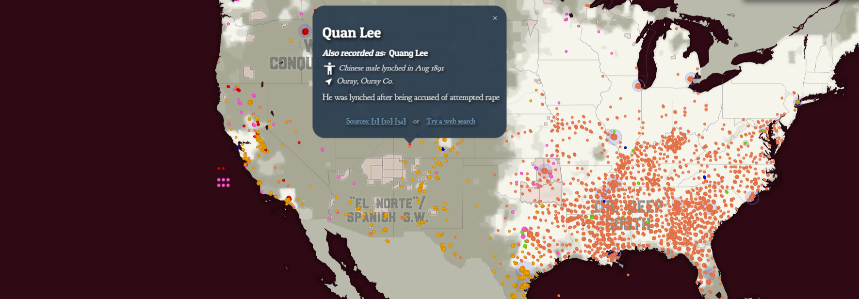
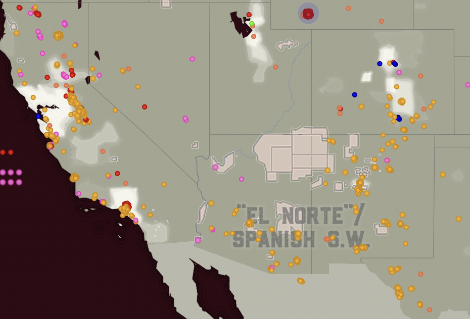
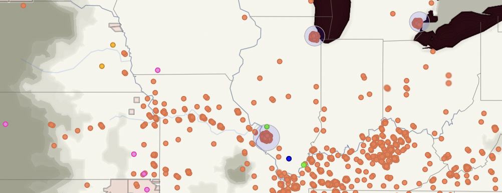
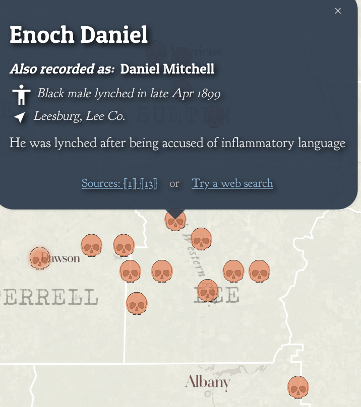
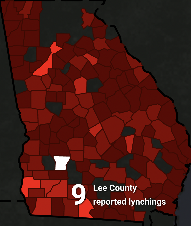
Even before reading the ethics and analysis article, I agreed that the White Supremacy Mob Violence map was a better visual representation of the dynamics at play, although there were a lot of reasons for that that didn’t occur to me. When I looked it over, one of the main things I noticed was the level of detail. The White Supremacy Mob Violence map begins with an introduction to the concept of lynchings, the structures that motivated racial violence, and the varying methods that have been used to collect and map data about it. It also invites the reader to think critically about the map and ask questions about the data. Once you’re looking at the map itself, you can change the visualization to focus on different time periods and places, as well as click on individual points to read more about them. This provides a level of detail that doesn’t sacrifice the map’s impact on a wider scale; even when you are all the way zoomed out and haven’t selected a specific time period, you can make out the general patterns of where and to whom racial violence occurred. The concentration of black victims in the south and latinx victims in the southwest, for example, is obvious without seeming universal.

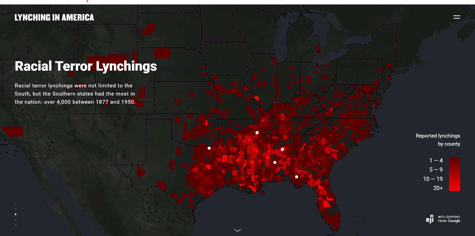
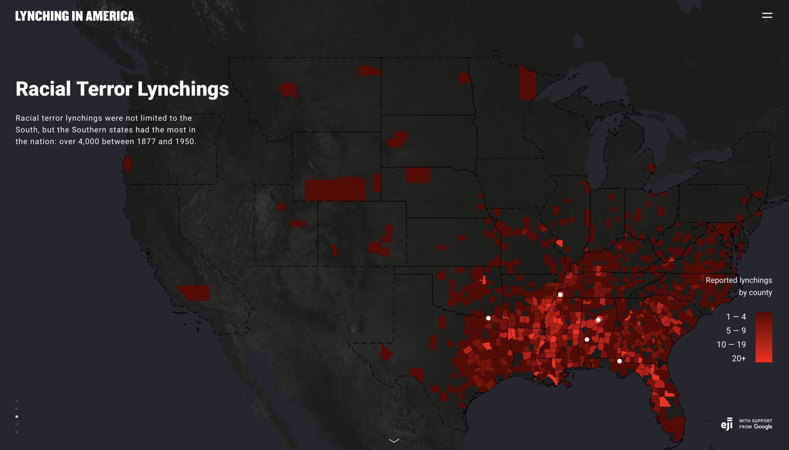
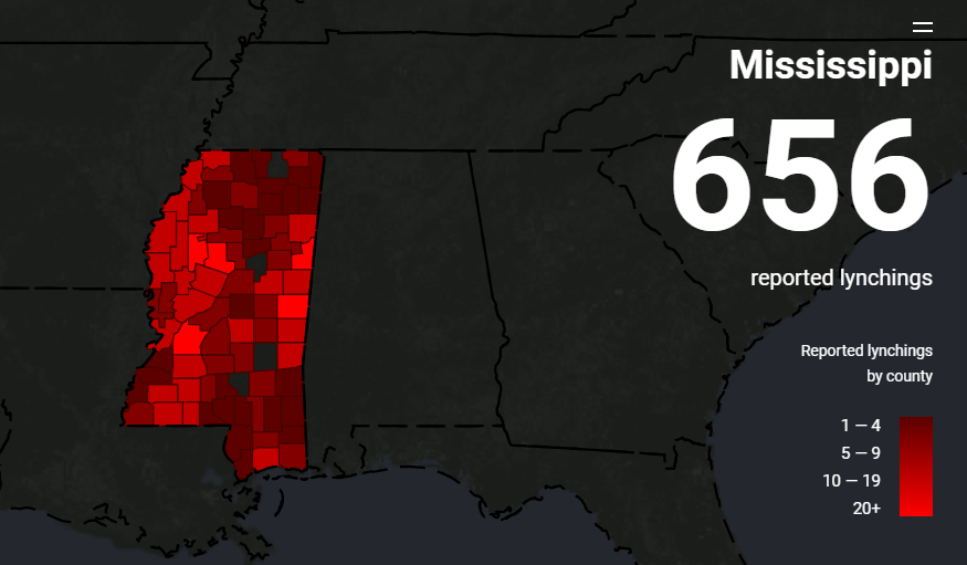
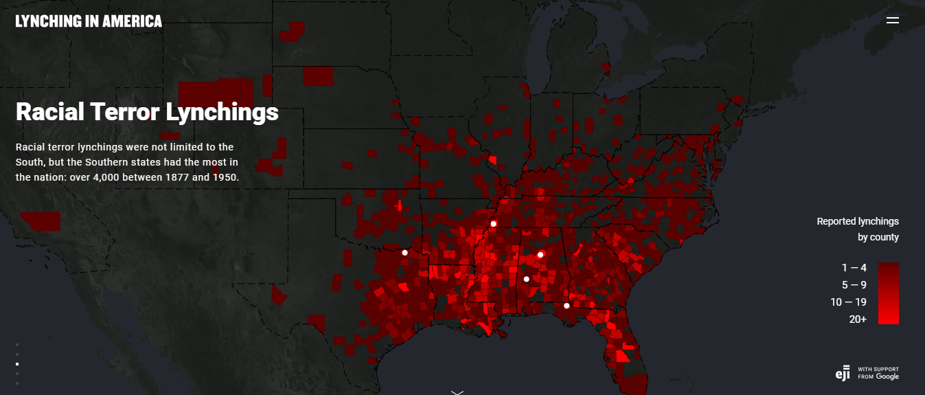
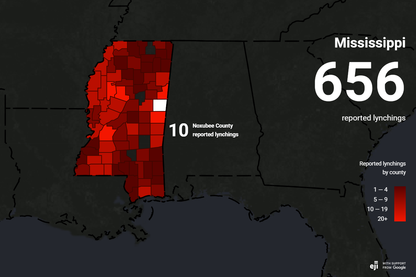
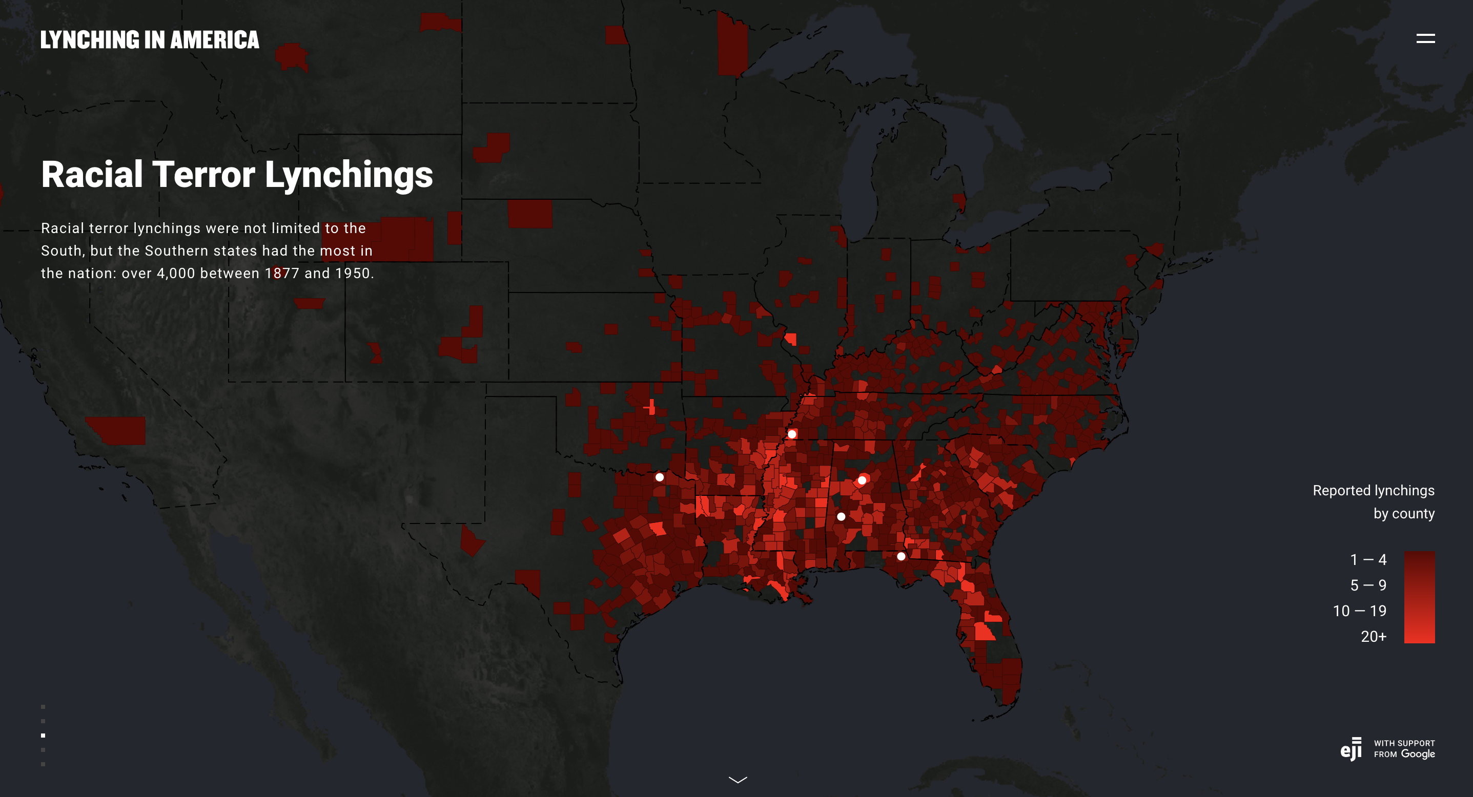
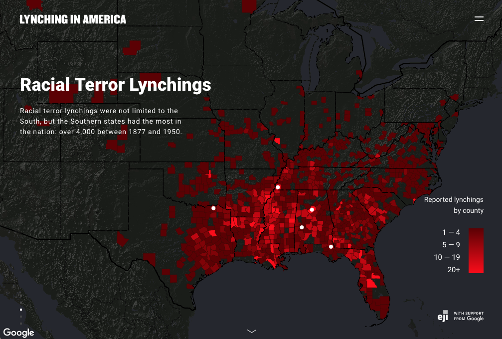
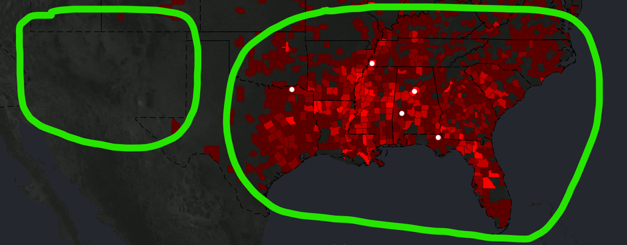
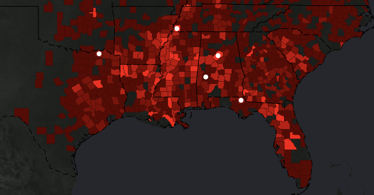
While I agree with the article’s analysis that the color choices in the Racial Terror Lynching map make it seem like lynching was almost exclusive to the South, I do think they’re effective in other ways. The red stands out very well against the dark background and suggests the right tone of alarm or violence for the subject matter. This map is also not completely without detailed accounts. It utilizes short, engaging multimedia presentations to provide detail on a few representative cases. I think that method does the job alright, even if it’s not as good as the level of detail on the other map. The main problems with this one were those discussed in the article: it focuses too much on the South, isn’t very up-front with its methods or scope, and doesn’t use normalized data.

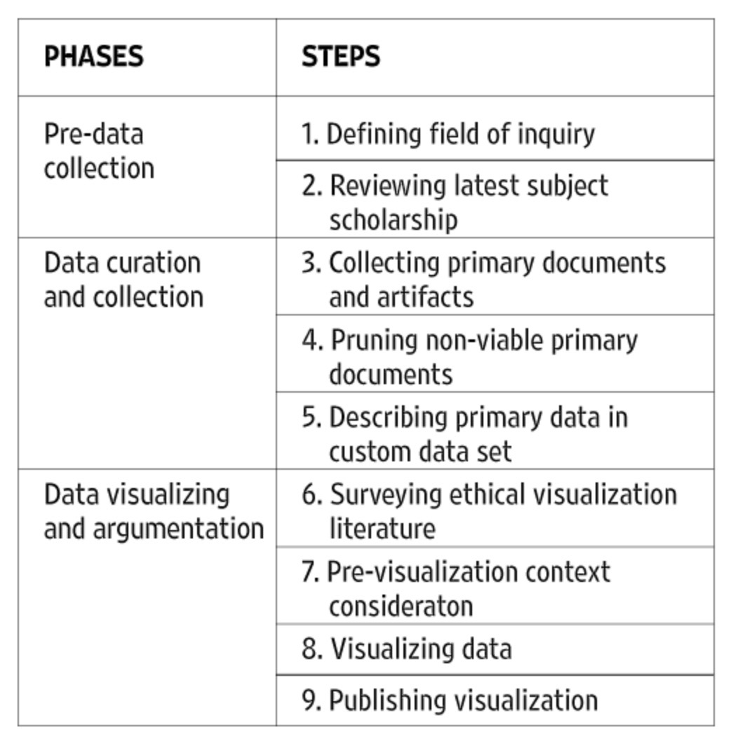
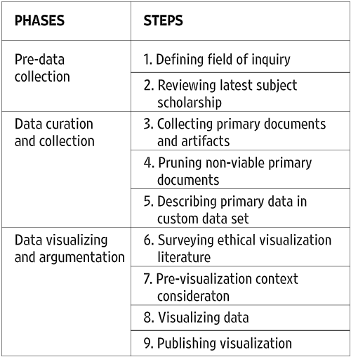
I like the method outlined in the article on visualization ethics. It makes sure ethics are considered at every step of the process and decreases the likelihood of the end product being misleading. I also agree that interdisciplinarity is a valuable way to make sure that a project is both ethical and effective. The one thing I wasn’t a fan of was the idea that the humanities need their own, new visualization methods because the existing ones are tied to colonial contexts. Yes, the article acknowledges that it’s often better to use data visualization methods people are familiar with, and yes, most of them were developed in a western colonial environment, but I don’t think charts and graphs themselves are a problem; they only become a problem when you choose the wrong type of chart for a specific topic or dataset, thus skewing the reader’s perception of what you’re trying to visualize. Traditional graphs work just fine for the humanities. Any gaps can be filled in by good captions or other accompanying text. The major strength of digital visualizations over printed ones, in this case, is the ability to incorporate those more detailed explanations into the map itself using pop-ups or links rather than having to put them on a separate page. they can live in the map, grounding them more strongly in physical space, and then dispensary when you go back to a larger scale.

In my final project, I don’t think I’ll have to consider the ethical concerns outlined in the article as much as I might if I were covering a different subject or using a different focus. The area I’m mapping is a single city park, albeit a big one, and I’m focusing on buildings and development rather than specific people or events. I’m not actually working with any datasets. I like the idea of including specific, personal stories in my map, much like in the White Supremacy Mob Violence project, but I’m not sure how feasible that is for a project of this scale. I’m not sure if I necessarily need to, with my focus being on the broader space and the ideology behind it. I think it’d probably be a good idea to include at least one personal account of one of the native people who was being exhibited at the fair in order to add in a sense of agency and make the story more impactful, but I’m not yet sure how to incorporate that.

I will need to pay careful attention to transparency in my methods, though. The historical maps I’m working from are sometimes incomplete, illegible, or missing context, which makes it hard to know for sure how to categorize every building without doing a level of research that isn’t feasible for a project of this scale. My main ethical consideration will be noting when I’m making assumptions about the purpose of a building.

Mapping Ethics Blog post- Marie Amelse

When reading and exploring the Equal Justice Initiative and then the Monroe & Florence Work Today websites they at first seem to be relaying the same message, with varying different minor details and framings, however “Racism in the Machine” Hepworth and Church do a great job on contrasting these two different visualizations and representations of racial violence from the dawn of the civil war onward. At first they do not seem that different from each other, but after digesting both and especially after also reading from Hepworths and Church’s analysis, you can see how stark the differences really are. In the end they presented and even chose data in different ways even when seemingly portraying the same idea.

Monroe & Florence Work were especially aware of sourcing and defining their data, and it is clear the current website also shares this sentiment. The Work’s were very deliberate in searching for the validity of lynchings, as a result this website is honest in communicating that their database is likely underreporting the incidents of lynching. The Work Today website also includes education information on different definitions of lynching.

Here, this window shows an option to show both a “Strict definition” and a “Broader definition”. Even within their website there is transparency that the same message end up looking very different based on definitions the statistics revolve around.

On the other hand the Equal Justice Initiative ( EJI) is not as clear on the definitions of what the graphs and statistics show. Although it is clear that the numbers focus on the deep south. Below is one of the main slides on the Lynching in America webpage. Interestingly in span of time which spanned over 70 years there was only “2 reported” lynchings in California and “1 reported” lynchings in Michigan. This contrasts with the data from the Work website which reports 26 for both states in that same time range under the “Broader definition”.

Above, is the Lynching map shown on the EJI website. As Hepworth and Church, the EJI has a strong emphasis on the deep south, almost portraying racism as clustered and almost solely being perpetrated in the South. Below is is a 100 year span from the Work website, which presents the continental US all together, and while the mob violence is concentrated in the South, it is shown to be an issue that is present throughout the U.S.

Another thing that was a variable that Hepworth and Church presented was even who these different data bases considered who lynchings could be perpetrated against. The Work Today website made it clear it was a racially motivated crime that could be committed by white mobs against any racial minority, EJI on the other hand sole focused on lynchings against African Americans. Can this mitigate historical violence against Native Americans, Asian-Americans, or other racial minorities? In this case it is especially important to take into account the larger goals of who creates these data sets. EJI, for instance is focused on fighting mass incarceration, and especially fight the inequality against Black Americans within the criminal justice system. The publisher of the Monroe & Florence Work Today website is #PlainTalkHistory, whose focus is to tell the multicultural and multiracial history of the US that can too oftenly be ignored in popular US history lessons. Knowing these things on the creators can add more context to the maps and messages they create.

Erin Buglewicz, Blog Post 8: Mapping & Ethics

Monroe Work, a pioneer in the field of sociology, confidently asserted, “In the end facts will help eradicate prejudice and misunderstanding, for facts are the truth and the truth shall set us free” [1]. However, individuals and organizations often manipulate or misuse facts to promote their own views. For this reason, it is important to approach historical data visualization from an ethical standpoint, but although there are ways in which one can attempt to avoid bias, it is virtually impossible to eliminate entirely. This is especially true for maps because even seemingly minor elements like color, symbols, and interactivity can influence how viewers interpret data.

In “Racism in the Machine: Visualization Ethics in Digital Humanities Projects,” Katherine Hepworth and Christopher Church emphasized that to showcase data ethically, one must mitigate any harm to viewers and the subjects of a study as well as maximize the project’s ability to communicate information [2]. The authors then proposed an ethical visualization workflow that should be used when creating digital humanities projects, such as maps, to help eliminate bias and misrepresentations. The workflow introduces several steps that are part of one of three phases: pre-data collection, data curation and collection, and data visualizing and argumentation.

Ethical workflow proposed by Hepworth and Church.

By examining two mapping projects, Hepworth and Church were able to explain how researchers can apply this ethical approach to the creation and use of data visualizations. The first map that the authors analyzed was “Lynching in America: Racial Terror Lynchings,” created by the Equal Justice Initiative (EJI). This is a choropleth map showing the number of reported lynchings (of African Americans) across US counties between 1877 and 1950. 

“Lynching in America: Racial Terror Lynchings”

The map is visually striking. It uses a red color ramp to indicate the number of lynchings in each county, and against the dark background, this color indicates what it represents: bloodshed. Before even exploring the map and website, I was already well acquainted with EJI’s mission from previously reading Just Mercy and hearing the organization’s founder, Bryan Stevenson, speak in person at Creighton last year. Therefore, despite the map’s title suggesting otherwise, I was able to conclude that these lynchings only involved African Americans. When interpreting the map, it is important to know this background because it fuels EJI’s argument that historical violence and prejudice against blacks is at the foundation of their disproportionate representation within the current criminal justice system. Therefore, the map is merely a “promotional and advocacy tool” for EJI [2].

To most viewers, this map appears credible at first glance, especially as it is supported by Google, but on further inspection, it introduces some unethical implications. To begin with, it utilizes raw data, which is improper for a choropleth map. As Hepworth and Church noted, the number of lynchings in each county should be normalized against census population data [2]. This would eliminate any disproportionate representations of lynchings in each county. Moreover, this map also contains notable silences. As already mentioned, it solely focuses on African Americans who were lynched. The map is also limited by choices made during the data collection phase about what constitutes a “lynching.” The criteria chosen allowed EJI to create “a narrative around racial violence that excludes other minorities and other geographic locales” [2]. The map does, in fact, ignore much of the North and West, casting it in a dark color, and it primarily focuses the viewer’s attention on the South, which is bright red.

Hepworth and Church also examined “Map of White Supremacy’s Mob Violence,” a different map conveying similar but more nuanced data, which provided a better ethical visualization of racial lynching in the United States. This map, developed from research done by Monroe Work, has several key differences from the one produced by EJI that lend it greater credibility. To start, it is a complex and interactive dot density map, spanning from 1848 to 2021, which makes it relevant even in the contemporary era.

“Map of White Supremacy’s Mob Violence”

The aim of this map is arguably to “confront the user with the temporal and racial extent of white superiority-motivated lynchings, both qualities that are absent from the Racial Terrors Lynchings map” [2]. Thus, the scope of what this map covers is much larger, and it fills in gaps that the EJI did not cover. Most obviously, Work’s map includes the lynchings of several different races, not just African Americans. This demonstrates that racial violence was not limited to one group. 

Key for “Map of White Supremacy’s Mob Violence.”

These dots are much more widespread than lynchings represented on the EJI’s map, where they were mainly clustered in the South. Additionally, each dot represents a reported lynching, including the name, where available, of every person as well as the year the lynching occurred. This information is also accompanied by a link to sources that viewers can click on to discover more. In doing so, this incorporates a sense of humanity and greater credibility into the project that EJI’s map lacks.

Example of a lynching case included on “Map of White Supremacy’s Mob Violence.”

Therefore, this second map provides a better example of an ethical visualization of data. This difference is namely apparent in the two maps’ arguments and silences (or relative lack of), and this comparison demonstrates why Hepworth and Church’s proposed workflow is effective and practical.

References:

[1] Work, Monroe, and Florence Work. “Map of White Supremacy’s Mob Violence.” Plain Talk History. https://plaintalkhistory.com/monroeandflorencework/explore/map2/#4/37.85/-99.5/0/18.

[2] Hepworth, Katherine, and Christopher Church. “Racism in the Machine: Visualization Ethics in Digital Humanities Projects.” Digital Humanities Quarterly. Vol. 12, no. 4 (2018). http://digitalhumanities.org/dhq/vol/12/4/000408/000408.html.

[3] Equal Justice Initiative & Google. “Lynching in America: Racial Terror Lynchings.” https://lynchinginamerica.eji.org/explore.

Isabel Blackford Week 11 Blog Post

The crime of lynching is something, although brutal, very unique to American history. When analyzing the maps given for this blog, even the larger surface level details were surprising to learn. For example when I think of the word “lynching” I often only think of the context in relation to African American and White tensions after slavery and before the civil rights movement. However by making a quick glance at the White Supremacy Mob Violence Map, it was make clear very fast that lynching is much more than just a two race conflict, and can affect any race although in certain areas is can be more prevalent for particular races (i.e. Latinx in California/West Coast and African Americans in the Deep South). Although lynching can happen to any race, it always involves race and is what drives lynching to occur.

In particular when areas have a large number of lynching’s occurring, those actions become normalized in the population and in Mississippi alone between 1877 and 1950 there were 656 reported lynchings in the Racial Terror Lynching map. The county with the highest number of lynchings had 48 just in one county (Leflore County). However this map only counts the lynching of African Americans so the volume of lynching is presented much different than the map above and primarily focuses on the American South and ignoring states like California as pointed out in the Racism in the Machine: Visualization Ethics in Digital Humanities Projects article.

What happens when you map such a horrific act such as lynching, it can sometimes take away the magnitude and the gruesome nature of the action, making it easier to ignore the ethical implications that come with mapping such a topic. It turns a serious racially driven crime into a a shade of red which can ignore the lives that have been lost from lynching and normalizes the behavior to an extent. The maps are useful in the fact that they demonstrate the amount of lynching occurring but can place the blame on the geographical area instead of looking deeper into the problem. Additionally when mapping out such a significant thing, just using a choropleth map can take out the personification of the event and make it much less humanizing.

The different focuses of both the White Supremacy Mob Violence Map and the Racial Terror Lynching map illustrate two different issues when it comes to lynching and shows the two different definitions of what is classified as lynching. While the Racial Terror Lynching map demonstrates a more rigid definition with lynching involving a white supremacy mob that believes what they are doing is lawful and righteous, additionally knowing that they will get away with murder because what they are performing is a form of justice. The White Supremacy Mob Violence Map on the other hand, still believed that the murder they were performing by mob was serving justice to support white supremacy, but was included much more ethnic groups and had a much more homicidal intentionality and brutality surrounding the lynching, often mutilating the corpse of the victims. While neither is ethical it is important to note that there are differences in the definition of lynching and that can effect how it is mapped onto a map.

Works Cited:

Hepworth, Katherine, and Christopher Church. 2018. “DHQ: Digital Humanities Quarterly: Racism in the Machine: Visualization Ethics in                    Digital Humanities Projects.” 2018. https://digitalhumanities.org/dhq/vol/12/4/000408/000408.html.

“Explore the Map | Lynching in America.” n.d. https://lynchinginamerica.eji.org/explore.

“Monroe & Florence Work Today – Explore the Map.” n.d. Monroe & Florence Work Today. https://plaintalkhistory.com/monroeandflorencework/explore/.

Wyatt Greco: The Ethics of Mapping in History

Statistics is a common course for undergraduate, and often high school, students. Effective statistics courses, like those I have taken at Creighton, will emphasize critical analysis of data visualizations. For example: some data may not fit clearly into certain types of graphs; some samples may be too small or narrow to answer the hypotheses being tested; while still other methods may be swayed by unstated bias. Maps are somewhat unique in that they are a form of data visualization that are often not treated as such in society and culture at large. Before taking Mapping History, I admit that I tended to view maps as blanketly authoritative. We grow up seeing a map of the nation and/or world in the back of the elementary school classroom and implicitly learn to take such depictions at face value. However, maps are ultimately a means to visualize a data-based argument. Given that cartography already carries a cultural authority of definitiveness, map-makers need be especially transparent and intentional about data collection and data depiction [1].

Intentionality goes beyond expected (though of course important) efforts to verify the accuracy of historical sources and identify any biases present therein [2]. Valid sources can be excluded or included based on one’s arguments or definitions, as highlighted by Hepworth and Church in their analysis of two visualizations of lynching in the United States [3]. Before a cartographic visualization is even accessible, the Monroe Work Today study compels the audience to pause and consider the effect of pre-conceptions on data collection and, by extension, the ultimate visualization and argument:

“Monroe and Florence Work Today,” Plain Talk History, website, accessed March 27, 2024, https://plaintalkhistory.com/monroeandflorencework/explore/.

While the “Lynching in America” map by the Equal Justice Initiative and Google is accessible alongside multiple other resources, the assumptions or interests of the cartographers are not made readily apparent. Indeed, without the background provided by Hepworth and Church, I may not even have realized that EJI is actually using the historical and geographic argument to further the “organization’s present-day advocacy work regarding the inequitable mass incarceration of black Americans” [4].

“Lynching in America,” Equal Justice Initiative and Google, website, accessed March 27, 2024.

Regarding the mapping products themselves, the Monroe Work Today map once again prioritizes transparency of data. Unlike EJI, which maps lynching using county-level aggregation visualized with a choropleth, Monroe Work Today depicts each individual lynching as a point. Hovering on an EJI choropleth polygon reveals the number of lynchings which occurred in that county, but selecting a point on the Monroe Work Today map will prompt a description of the victim accompanied by links to sources and further reading.

“Lynching in America,” Equal Justice Initiative.
“Monroe and Florence Work Today,” Plain Talk History.

Hepworth and Church argue that the Monroe Work Today map, with its broader definition and individual points, paints a “more inclusive picture of white supremacist violence” [5]. The Monroe Work Today project is transparent about the data behind the cartography, and it presents that data in a way that acknowledges the individual humanity of lynching victims [6]. I agree with Hepworth and Church that the Monroe Work Today map is the preferred example of ethical mapping [7]. Maps should consider both those reading the map and those who are being mapped. While the EJI illustrates the horror of lynching in the aggregate, it does not readily include the audience in the data collection or analysis process. Moreover, as Hepworth and Church point out, presenting this sensitive and painful data in the aggregate can unintentionally dehumanize the subject [8].

Data collection and data depiction are inherent to all mapping, even with seemingly straightforward political maps which purport to show governmental boundaries (these rely on surveying, national claims to territory, etc.). As such, the most ethical maps are those which acknowledge data as a powerful, yet originally unshaped, tool. Cartographers should be transparent about data so that their work is open to full critique and replication. Any potential bias or interest that could affect data collection should be stated outright. Finally, the visualization of data should strive to be accessible to the audience, to do right by the subjects, and to be aware of the larger social and human context which might be impacted by the results of the project.

Research does not occur in a vacuum. Just as a scientist studying gene editing or artificial intelligence should consider the implications for human life, so should works of history and cartography consider that the narratives they create or support can have real influence on politics and culture. Historical study should of course be as objective as possible, but the way that objectivity is presented can make a difference. Visualizers must strive to be more than just transparent and accurate. They should also be aware that political actors lean on history to justify policy, and that the relationships between individuals and groups in the United States draw heavily upon the past. Moreover, they should be sensitive to the real stories, lives, and legacies with which they work.

Citation:

1 – 8: Katherine Hepworth and Christopher Church, “Racism in the Machine: Visualization Ethics in Digital Humanities Projects,” Digital Humanities Quarterly 12, no. 4 (2018).

Ethical Mapping Blog Post 8 Michael Lau

Mapping in itself is a form of data visualization, and is thus not representative of the real world. However, it is one of the most effective ways to help a person visualize the spatial scope of differing subjects. In this case, we are looking at the ethical implications of two different lynching maps. One by the Non-Profit organization, Lynching in America, and the other by Monroe Work, a 1900s sociologist, who recorded many different lynchings and their sites. Each has their own biases and differing views on what is important in the visualization of their data. In the end, however, they are still just representations of real events that happened to real people.

These maps differ drastically ethically. The Monroe Work map in fact gives you an option to map different definitions of lynching.

This drastically changes how these deaths are mapped, with there being more deaths due to collective violence than there was with a stricter definition of Lynching. This is best shown in the timelines of each definition. The stricter definition of lynching has less dots on the timeline, especially during the 1970s-2020.

Left is the strict definition of lynching, on the right is the less strict definition.

Now imagine if the first stricter definition was the only definition shown. It would thus seem to us that White supremacy and lynchings were stopped sometime in the 1970s and is now a historical event. Something consigned to the history books as a dark chapter of our history. Arguably this is the correct way to map this, as ethically we are following already established definitions and guidelines to portray the most accurate data possible. However, what about when these underlying definitions and guidelines are dated or obsolete in terms of modern sensibilities? It is thus up to the cartographer and data analyst to decipher a workable solution to this problem, leading to less “empirically” accurate data visualization, and arguably the manipulation of the data portrayed. An interesting point on this timeline is the Jan 6th riots of 2021, where tragically, Brian Sicknick was killed by rioters and rebels. One could argue whether this riot was a lynching or a protest that went wrong, but in any case someone died from a group incited violence. It may not be a traditional story of lynching, but the similarities are startling and disturbing. Is it thus ethically dubious to show related events on these maps? Katherine Hepsworth and Christopher Church think not, in their journal article “Racism in the Machine: Visualization Ethics in Digital Humanities Projects”, they speak about how the data visualizations made by humans and anything man-made are fundamentally flawed due to their inherent biases formed by those who created them.

They compare the work done by Monroe Work to the work done by EJI and google, with their chloropleth map of “Lynching in America” (LiA). The use of color is remarkable with is symbolism, America covered in darkness with splattering of blood-red chloropleth counties. Evocative of the abuse of black men by white mobs, it’s visually stunning, but is sorely lacking in specifity and crucial information. The major exception that the makers of this map decided to do was to exclude all other populations other than the black population from their data visualization.

Population lynched from 1877 to 1950
Population lynched from 1848 to 2020, different colors indicate race.

In addition, the information given by LiA, is too broad and incomplete. There are only four names that are posted in over 4000 lynchings, whereas the Monroe Work map has every dot labelled with a person if possible. Ethically you may argue that a broader visualization is more helpful to understand the scale of the problem, however, when compared to the dot map of Work, the LiA map seems sensationalized and heavy-handed. This arguably strengthens its message, but it does not feel like the most objective or best way to present this information. Specificity and, in this case, personalization would help get across the message better. Church and Hepworth, have made an ethical framework to help make ethical maps.

Personally, I think that there is no such thing as ethical data visualization, as no matted how well we do, we will miss something that will exclude a certain group or people. At best, we can try to include everyone and everything possible without diluting the message. But in any case, our own biases will determine what gets cut.

Bibliography

Explore The Map | Lynching In America. https://lynchinginamerica.eji.org/explore. Accessed 27 Mar. 2024.

Hepworth, Katherine, and Christopher Church. “Racism in the Machine: Visualization Ethics in Digital Humanities Projects.” Digital Humanities Quarterly, vol. 012, no. 4, Feb. 2019.

studio, auut. “Monroe & Florence Work Today – Explore the Map of Lynchings.” Monroe & Florence Work Today, https://plaintalkhistory.com/monroeandflorencework/explore/. Accessed 27 Mar. 2024.

Andrew Merfeld Blog 8

The article starts out by explaining the AI chatbot created by Microsoft. At first, the AI chatbot was working well, until the Chatbot got into an algorithm that made it post inflammatory and racist content. In my opinion, the reason that this is at the beginning of the article is to show that algorithms are not neutral, and they actually reflect on how humans act. In today’s day and age, we are lucky enough to have AI technology that can help in many aspects of life, but we can also see the bad things that are still happening today like racial discrimination and inflammatory language being used by real humans. The only way for the chatbot to be put into that algorithm is by seeing and analyzing these sayings and words used by real humans in real-time, showing there is still a lot of racial discrimination going on today. 

Going into the “Lynching in America” map, the thing that stood out to me the most was the use of the color scheme. This is a very frightening topic, and I think the use of grayscale and bright reds exemplified the seriousness of the issue. Likewise, the interactiveness of the map is something that stood out to me. I like being able to visualize and interact with some of the states and counties that are depicted on the map. When looking at the map as a whole, however, you can see there is “a sea of red” along the Mississippi, Alabama, and Arkansas borders that all touch. I think that this has to do with different ideals, laws, and regulations from county to county. As you get further away from these areas — except for a portion of Florida — you don’t see as many bright red counties. Another thing I think could play a role in this, is the idea “If I see someone doing it (lynchings), it’s okay for me to do so as well” and I think the border lines of Mississippi, Alabama, and Arkansas truly show that. 

Like the “Lynching in America” map, it displays recorded lynchings in the states, most predominantly in the southern states. However, the map also shows the lynchings that were taking place elsewhere. The second map, I think, focuses more on the widespread lynchings, rather than trying to use a color scheme to horrify the lynchings just in the south. In one of my other classes, we talked about lynchings, carnivals, parades, etc… that took place outside of the Southern Region (Like Omaha) and I found that very interesting because I never knew that these things were taking place essentially all over the United States. That’s what I think the Monroe map is showing, is more of the widespread severity, as compared to the southern severity, and trying to make it more severe with the use of the greyscale and bright red color scheme.

Madeline King, Blog Post 10 – Maxims vs Consequences

The reading, “Racism in the Machine: Visualization Ethics in Digital Humanities Projects,” by Katherine Hepworth and Christopher Church began its discussion by introducing the problem of neutrality in digital projects. While many things have the perception of neutrality, their structures, choices, and backgrounds come from long-imposed structures of oppression, like racism. Attempting to create a neutral project (especially one generated by AI), will inevitably result in the same problematic structures current society is created on becoming visible and a prominent aspect of those projects. Digital Projects need an argument, or at least some critical intention.

A chart of Hepworth and Church’s outline

Within the argument or critical intention of a digital project, it is important to approach it with a plan of action. Hepworth and Church’s paper proposes a multi-step plan, to best ethically create a digital project. This plan had three phases (pre-data collection, data curation and collection, and data visualizing and argumentation). Between the three phases outlined, Hepworth and Church propose nine steps (defining the field of inquiry, reviewing the latest subject scholarship, collecting primary documents and artifacts, pruning non-viable primary documents, describing primary data in a custom data set, surveying ethical visualization literature, pre-visualizing context consideration, visualizing data, and publishing data).

Of the steps and phases that Hepworth and Church lay, I believe that surveying and pre-visualizing is one of the most important ethical considerations. The inclusion of a test audience or test projects draws a distinction between maxim-based, or deontological ethics, and consequential ethics. While I believe that deontological ethics has some merit, I also believe that the consequential aspect of digital projects is the more important consideration. The saying “the road to hell is paved with good intentions” is important here. One’s purpose for creating a project could be neutral or positive, but its actual consequence is negative. Take the AI Twitter Chatbot for example. The maxim behind the creation of this bot was to create a fun experiment (an ethically neutral to the positive distinction), however, the consequence was a racist chatbot (an ethically negative distinction). Bluntly, in consideration of publishing a widespread digital project, intention does not matter (at least not to the same extent as consequence).

The examination of maxims and consequences can be evaluated in the two digital humanities projects that were outlined in the reading, “Lynching in America: Racial Terror Lynchings” and “White Supremacy Mob Violence.”

A screen grab of the current “Racial Terror Lynchings” Project

The intention of “Lynching in America; Racial Terror Lynchings” was to be part of a larger group’s work on prison reform. However, the consequences of this project do not ethically reflect the noble maxim of the project. The first problem, as outlined by Hepworth and Church, is that it initially made little consideration for lynchings that occurred outside of the Deep South. When it did consider these lynchings, it still only considered African American lynchings. The consequence of this project is that it becomes less of an argument and more of an assertion. The assertion is that African Americans were the sole victims of lynching and that this act of terror was a predominantly geographic problem.

Without clearly presenting the evidence, or presenting any other information on lynchings that occurred against non-African American individuals, the project does not allow the viewer to think for themself, and draw a conclusion outside of the assertion made. Instead, the project asserts its own (incorrect) conclusions to the reader, a conclusion that is backed by its purpose as a tool for prison reform. The issue with the argument of this project is not that it is a weak one, terror lynchings on a racial basis are a well-backed historical event (especially those committed against African Americans). The issue is also not that the cause of the project is bad. The issue is that there is no argument at all, instead the project is an assertion that gives in inaccurate understanding of lynchings.

A screen grab of the “White Supremacy’s Mob Violence” map

A picture of some of the interactive features of the “White Supremacy Mob Violence Project”

Provided as an alternative to the “Lynching in America” project, the “White Supremacy Mob Violence Project” provides a more ethical example of its consequence. The first striking difference between the two is how much more interactive this project is. Throughout the project, the reader is provided with choices. They can choose whether they consider something murder or not. They can choose whether or not they want to see the sources of information. The reader is provided definitions and examples to inform these choices. Within the actual map, each instance of lynching is given information. A person’s name, or at least identifying features is given (as well as the known reason for the lynching). The race of the person lynched is also given (a stark contrast from the information presented in the first project). The consequences of this project are an argument, not an assertion. With the information given to the viewer of the project, the project argues for the reader to evaluate. Looking at the races of people lynched, the reasons for the lynchings, and the dispersal of the lynching, the reader is left with the argument that these were racially influenced hate crimes.

Both projects have noble maxims. The first project intends to call to mind the problems with the modern prison system, especially the problems faced by African American men. The second project intends to highlight America’s historic problem with white supremacy’s mob violence. However, it is the consequences that distinguish to two ethically. The consequence of the first project draws an asserted conclusion that leaves out information and can be seen as misleading to an audience on the historical violence that occurred. The consequence of the second project is an informed viewer who can consider a strong argument on the racial motivations behind lynchings.

Bibliography

EJI and Google. “Lynching in America: Racial Terror Lynchings.” https://lynchinginamerica.eji.org/explore

Hepworth, Katherine and Christopher Church. “Racism in the Machine: Visualization Ethics in Digital Humanities Projects.” Digital Humanities Quarterly. Vo. 12, no. 4 (2018).

Monroe and Florence Work. “White Supremacy Mob Violence.” https://new.express.adobe.com/webpage/nKAyaWTMZtLxS/

The Ethics of “Mapping History”

Before opening the article “Racism in the Machine: Visualization Ethics in Digital Humanities” I took a peak at the maps depicting lynching in the United States discussed in the article. Even without the background the article provided me, many of the ethical issues of the Equal Justice Initiative’s (EJI) map were readily apparent to me. I found the map quite limited in the information and context it could provide as a visualization technique.

Lynching In America by EJI and Google, Image Courtesy LynchingInAmerica.eji.org

As mentioned in the article, the EJI’s map focused almost solely on the South.[1] It did this to the point that I found it difficult and somewhat frustrating that the map could only really provide me information about that region. Also, the fact that states that did not register lynchings of African Americans were not represented with their political borders on the map, while those that did register lynchings of African Americans were highlighted in contrast with the dark background made understanding a relatively complete picture of lynching in the United States impossible via this map, and thus the map more frustrating to use.

Notice the contrast between Arizona and New Mexico and their lack of political borders due to the absence of lynchings against African Americans in those states. However, this visualization is misleading as there were numerous lynchings in both states, particularly against Latinos. | Lynching In America by EJI and Google, Image Courtesy LynchingInAmerica.eji.org

All this felt misleading or limiting for this data visualization. As a reader, I want to understand these lynchings in context, context that the map’s focuses on political boundaries in the South and presenting solely lynchings of African Americans severely limits.[2]

When I opened the map from Monroe & Florence Work Today, I was absolutely stunned by its ability to provide me with much of the context the EJI’s map lacked. The notification and explanation screens displayed before I could access the map not only got me to think about what this map visualized, but also what it did not visualize.

One such notification/explanation screen | Monroe and Florence Work Today, Courtesy PlainTalkHistory.com

The most effective way this project gets its readers to think about how lynchings in the United States are visualized is through the choice it gives readers between depicting lynchings according to a “narrow definition” and lynchings according to a “broad definition.”

Monroe and Florence Work Today, Courtesy PlainTalkHistory.com

In all honesty, no other digital mapping project I have seen has made me think as long and hard about data visualization as this seemingly simple, two-option question. As Hepworth and Church pointed out in their article discussing ethics in the digital humanities by comparing the EJI and Monroe & Florence Work Today maps, the Monroe & Florence Work map places it emphasis on humanizing the victims of lynchings and not simply depicting them as data points. The map does this by plotting each lynching victim as a single point on the map which, when clicked, gives information and references discussing who the person was and why they were lynched.

Monroe and Florence Work Today, Courtesy PlainTalkHistory.com

The choice the Monroe and Florence Work map provide readers of what lynching data to depict I discussed above also help to avoid depersonalizing the victims of lynchings as mere datapoints. It instead makes readers think about the context in which these victims were killed. It makes readers think about the social dynamics of these killings and what it must have been like for those subjected to such atrocities.

Analyzing these maps has reminded me of how data and date visualizations are not neutral in any way, shape, or form. Data and algorithms can never be fully divorced from humans. As Church and and Hepworth state in their article, “[H]umans are at the center of algorithms, not only as their creators, but, in the case of data-driven algorithms, as the producers of the content they shape and present.”[3]

Data and data visualizations occupy a unique ethical landscape. While the ethics of a written piece may become quite obvious with a thorough read, it may take much more to uncover whether data you observe have been ethically collected, produced, and represented. Raw data, with its cold, seemingly authoritative, numbers and figures give off the explicit impression of impartial authority. However, methods of data collection, who collected the data, who funded the data collection, and the purpose of the collection of the data can all result implicit which can often remain invisible until thoroughly inspecting or investigating a dataset.

Data visualization also has a similarly authoritative nature. When you look at a picture, map, infographic, or other visualization its graphics can often captivate you and provide you with what appears to be an authoritative and unquestionable narrative as sources and methods and put into the background while the story of the data is pushed to the front.

All this makes me recognize the importance of providing transparency in any mapping projects and data visualizations I create. By being upfront with my data sources and the processes by which I conglomerated, prioritized, and ultimately visualized data in my projects will allow readers to be more critical of my work, seeing it not as monolithically authoritative, but instead as a piece of a larger puzzle of the historical reality. It is also important that I acknowledge what my maps and data visualizations omit and why I chose to (or subconsciously) omitted those datapoints or features. All these steps promote the ethical use, display, and dissemination of digital humanities projects like the one I will create for my final project in this class.

Bibliography

[1] Katherine Hepworth and Christopher Church, “Racism in the Machine: Visualization Ethics in Digital Humanities Projects,” DHQ: Digital Humanities Quarterly 12, no. 4 (2018), 3.

[2] Hepworth and Church, “Racism in the Machine,” 3.

[3] Hepworth and Church, “Racism in the Machine,” 1-2.

Map Citations in Order of Appearance:

Equal Justice Initiative and Google, Lynching In America: Racial Terror Lynchings, Lynching In America, https://lynchinginamerica.eji.org/explore.

Plain Talk History, Map of White Supremacy’s History of Lynchings/Map of White Supremacy’s Mob Violence, Plain Talk History, https://plaintalkhistory.com/monroeandflorencework/explore/.

Ethical Implications of Mapping History – Emily Gaddy

Growing up in what is colloquially called the “Dirty South,” there is an expectation of stupidity and racism associated with Southerners, especially those from the Dirty South. There is the misconception that we tote around shirts with “THE SOUTH WILL RISE AGAIN” in bold letters amidst the backdrop of the Confederate flag. Our accents are seen as hillbilly (especially in Appalachia) and there is no regard to the rich culture and there is no mention of black Southerners unless it is in regards to slavery or acts of racial violence. These stereotypes are not only rooted in racism, but also classism (often ignored in the United States). Only recently, with Georgia (my home state) becoming a swing state, are there more talks around political disenfranchisement in terms of voter suppression and the realization that a lot of Southern voices have been stifled by the (often) loud, far-right populations of those states. I credit Stacey Abrams for finally opening the floor up to conversations about modern-day voter suppression of black voices.

In digital mapping, there is a reliance on human-made algorithms and the whims of the mapmaker themself. The article we read used the example of the Twitter-made, AI, Taytweets, which used people’s Tweets to learn how to communicate less like AI and more like an actual person. Of course, humans are not infallible, and the computer coders that create AI are not neutral, so, as the articles states:

And that:

“Racism in the Machine: Visualization Ethics in Digital Humanities Projects”

It makes sense that misconceptions and stereotypes about differing geopolitical states would be prevalent in mapping and geographical history projects. The maps we used for this blog post show the same subjects, but in contrasting ways.

(Lynching in America, EJI and Google).

This map, made with a partnership with Google and EJI (the Equal Justice Initiative), focuses almost entirely on the state of racial violence in the Deep South. We’ve spoken in class about how maps tell stories and this one recirculates the stereotype of racial violence and racism being an act mostly committed in the South. While a majority of black lynchings did take place in the South, it is also important to note that that is because a higher concentration of Black people lived in the South than the North.

Visualizing data that exclusively focuses on the African-American experience in the Southern United States provides an important argument about the nature of Jim Crow racism. However, purporting such data to be an inclusive representation constitutes a harm in the sense that it perpetuates common narratives of racial violence as a southern exception to an otherwise inclusive nation.

“Racism in the Machine”

This shapes the systematic oppression and structure of white supremacy as being something linear- of power birthed from the top and trickled down to the bottom percent of people within white hegemony. White supremacy is not, pun intended, black and white. Racial violence, while extremely horrific is not the full story of white supremacists and their maltreatment and persecution of other racial and ethnic groups. Racial violence is usually the escalation of decades of whites being able to get-by with “smaller” crimes and abuses:

The conflation of lynching with the full extent of racialized violence in United States history obscures the historic depth and breadth of the oppression of people of color. A black individual was far more likely to suffer public humiliation, assault, rape, and murder than a public lynching.

“Racism in the Machine.”

I understand the reason why the mapmakers chose lynching, however, it is a physical and tangible manifestation of racial violence. The stories of black people being raped or abused are far too commonplace, so therefore there are few records documenting the crimes. However, white supremacy thrives not just on murderers and extremist groups like the Aryan Brotherhood, but on the complacency and the actions of everyday white people, who use “not me” statements and ignore the white supremacists tendencies that are conditioned into the white American populous through years of American historical propaganda and nationalism, regardless of geographic region or state. I lived in Southwest Missouri for a bit and I was surprised by how prevalent the Klan was there. I knew someone whose grandfather was a founding member of the Klan in Southwest Missouri. One day when I was cleaning out a closet in their home, I found their grandfather’s bloodstained Klans robes. It was terrifying- to see the ghostly manifestation of the United States racist terrorism in person.

The other map, made by Monroe Work, showcases more nuances in white supremacy, showing it is not burdened by state borders and that the white nationalists do not simply punch-down on African-Americans, but other racial groups and even some white ethnic groups (referencing Italians).

(White Supremacy Mob Violence).

This map depicts a number of lynchings within Westward Expansion, California, and the Midwest.

I wanted to use my county from home as an example for why Work’s map does a better job than the EJI map.

Here is Lee County, GA on Work’s Map:

Here is Lee Ct. on the EJI map:

There is no mention of the names of those who were murdered, nor is there a reference to sources in the EJI map. Work’s map not only provides the reasoning behind the hate crimes, but also their sources to add supplementary materials to their storytelling.

I think within digital humanities, one has to be careful how their story is portrayed to an audience. As an English major as well as a history major, I have learned a lot in creative writing classes that whilst a story I write means one thing to me, once it is published it takes on different meanings depending on the audience. If I wasn’t a Southerner or if I didn’t read the article, I cannot help but wonder if I would understand the focus on the American South as a hotspot for racism in the EJI map. I think this is something to be mindful of when mapping minorities or the trauma of others. Data should come from multiple sources and nuance should be added if possible and applicable to the subject matter. I understand that the EJI map is political- it is meant to shock and it is meant to be minimal. They are demanding collective action as fast as possible, but (and not to go all Foucauldian again) ignore the non-linear construction of power under white supremacy. This is dangerous, white supremacy has seeped into the minds of not just white people, but minoritized groups as well, who foster hatred for other racial groups and/or even their own. This allows racism to fly under the radar. Lynching is just a stark example of what happens when this racism goes unchecked and festers before it becomes infected and is only cured through egregious acts of violence.

Monroe Work Today’s Map of White Supremacy Mob Violence is an exemplar of ethical visualization, not because it is free of two centuries of baggage and biases, but because it acknowledges them, while also acknowledging the potential pitfalls of the very endeavor of transforming human beings into visualized historical data.

“Racism in the Machine.”

Stories, especially those that are not are own, are hard to tell. It is important to acknowledge biases and provide the resources for audiences to reach out and interact with stories from members of the community that the mapmaker is trying to tell. People are not unerring, but there is something to be learned from accountability and the avoidance of knee-jerk reactions of “not me!” or “I don’t see color!” Only then can conversations begin to take place and the fostering of learning can begin. Readers should also, then, question the sources of information and the potential argument presented from visualizing history. It would be impossible for a historian to show every facet of history in their map, but one should question if those silences are intentional.

css.php