
Before opening the article “Racism in the Machine: Visualization Ethics in Digital Humanities” I took a peak at the maps depicting lynching in the United States discussed in the article. Even without the background the article provided me, many of the ethical issues of the Equal Justice Initiative’s (EJI) map were readily apparent to me. I found the map quite limited in the information and context it could provide as a visualization technique.
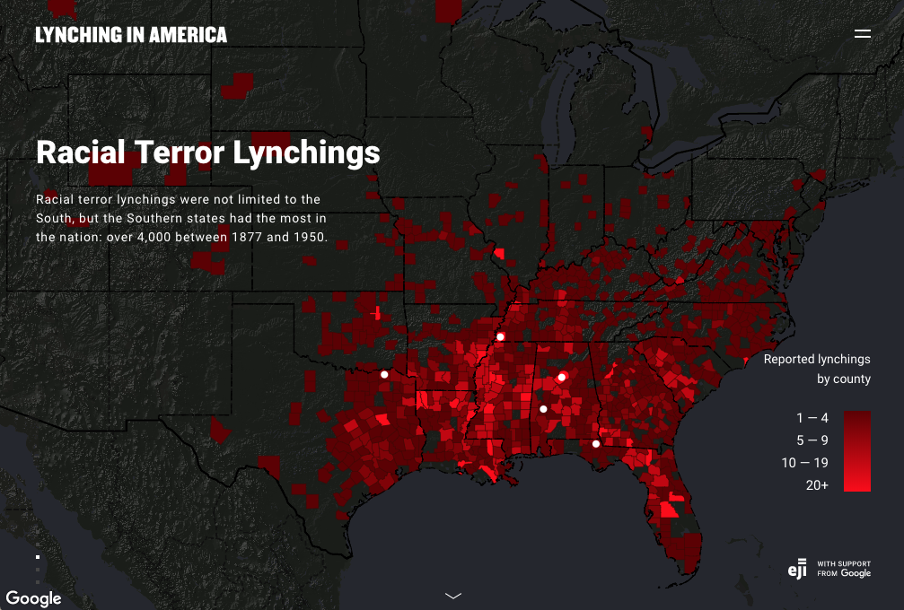
As mentioned in the article, the EJI’s map focused almost solely on the South.[1] It did this to the point that I found it difficult and somewhat frustrating that the map could only really provide me information about that region. Also, the fact that states that did not register lynchings of African Americans were not represented with their political borders on the map, while those that did register lynchings of African Americans were highlighted in contrast with the dark background made understanding a relatively complete picture of lynching in the United States impossible via this map, and thus the map more frustrating to use.
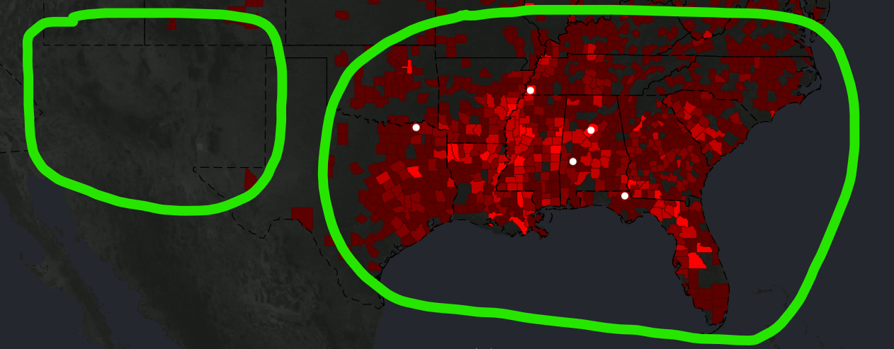
All this felt misleading or limiting for this data visualization. As a reader, I want to understand these lynchings in context, context that the map’s focuses on political boundaries in the South and presenting solely lynchings of African Americans severely limits.[2]
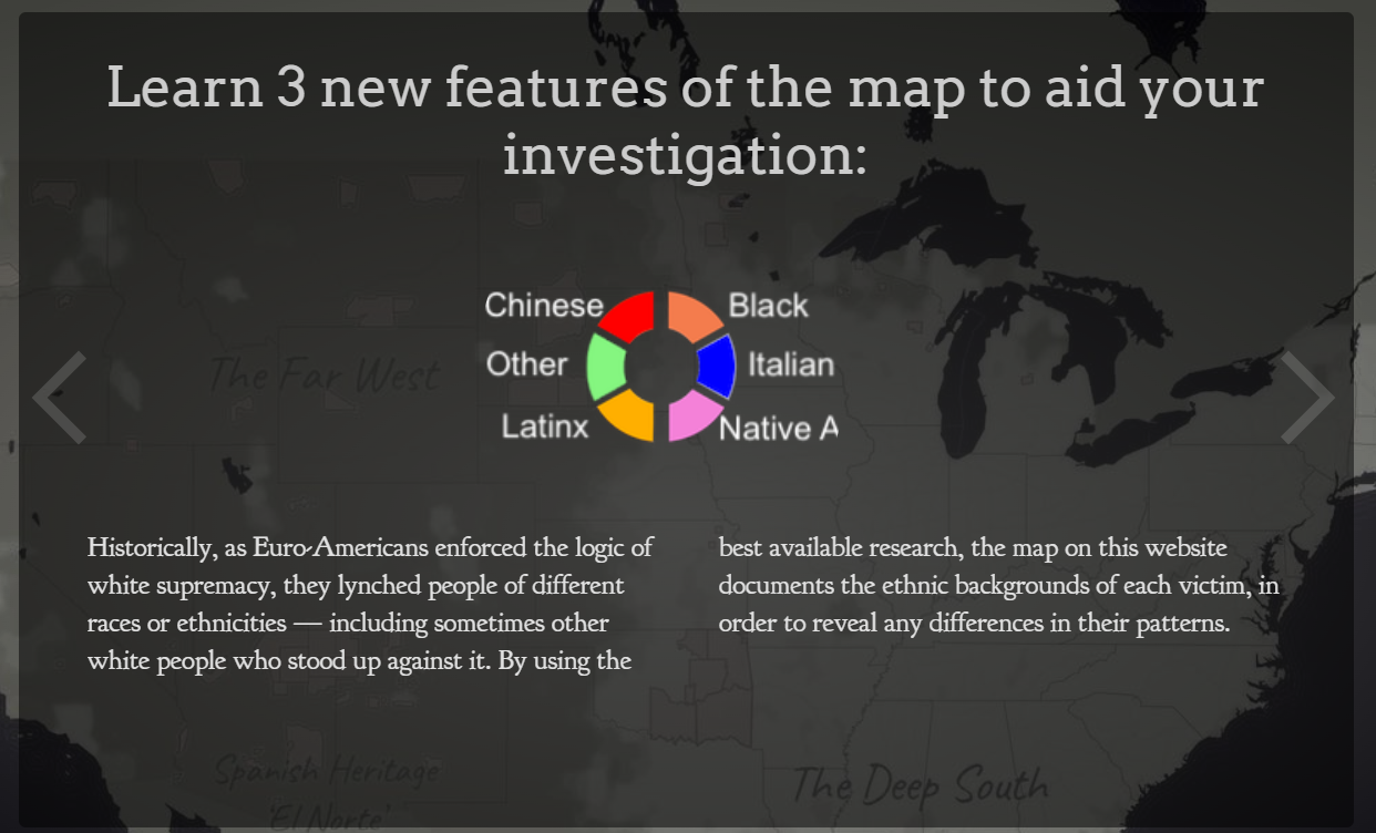
When I opened the map from Monroe & Florence Work Today, I was absolutely stunned by its ability to provide me with much of the context the EJI’s map lacked. The notification and explanation screens displayed before I could access the map not only got me to think about what this map visualized, but also what it did not visualize.
The most effective way this project gets its readers to think about how lynchings in the United States are visualized is through the choice it gives readers between depicting lynchings according to a “narrow definition” and lynchings according to a “broad definition.”
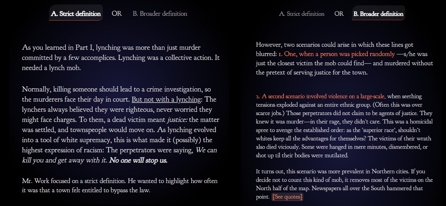
In all honesty, no other digital mapping project I have seen has made me think as long and hard about data visualization as this seemingly simple, two-option question. As Hepworth and Church pointed out in their article discussing ethics in the digital humanities by comparing the EJI and Monroe & Florence Work Today maps, the Monroe & Florence Work map places it emphasis on humanizing the victims of lynchings and not simply depicting them as data points. The map does this by plotting each lynching victim as a single point on the map which, when clicked, gives information and references discussing who the person was and why they were lynched.
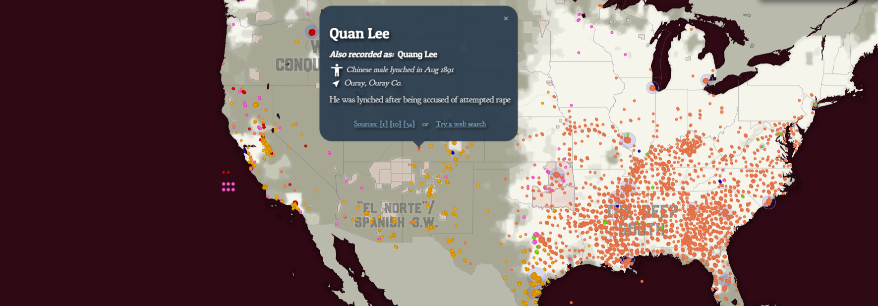
The choice the Monroe and Florence Work map provide readers of what lynching data to depict I discussed above also help to avoid depersonalizing the victims of lynchings as mere datapoints. It instead makes readers think about the context in which these victims were killed. It makes readers think about the social dynamics of these killings and what it must have been like for those subjected to such atrocities.
Analyzing these maps has reminded me of how data and date visualizations are not neutral in any way, shape, or form. Data and algorithms can never be fully divorced from humans. As Church and and Hepworth state in their article, “[H]umans are at the center of algorithms, not only as their creators, but, in the case of data-driven algorithms, as the producers of the content they shape and present.”[3]
Data and data visualizations occupy a unique ethical landscape. While the ethics of a written piece may become quite obvious with a thorough read, it may take much more to uncover whether data you observe have been ethically collected, produced, and represented. Raw data, with its cold, seemingly authoritative, numbers and figures give off the explicit impression of impartial authority. However, methods of data collection, who collected the data, who funded the data collection, and the purpose of the collection of the data can all result implicit which can often remain invisible until thoroughly inspecting or investigating a dataset.
Data visualization also has a similarly authoritative nature. When you look at a picture, map, infographic, or other visualization its graphics can often captivate you and provide you with what appears to be an authoritative and unquestionable narrative as sources and methods and put into the background while the story of the data is pushed to the front.
All this makes me recognize the importance of providing transparency in any mapping projects and data visualizations I create. By being upfront with my data sources and the processes by which I conglomerated, prioritized, and ultimately visualized data in my projects will allow readers to be more critical of my work, seeing it not as monolithically authoritative, but instead as a piece of a larger puzzle of the historical reality. It is also important that I acknowledge what my maps and data visualizations omit and why I chose to (or subconsciously) omitted those datapoints or features. All these steps promote the ethical use, display, and dissemination of digital humanities projects like the one I will create for my final project in this class.
Bibliography
[1] Katherine Hepworth and Christopher Church, “Racism in the Machine: Visualization Ethics in Digital Humanities Projects,” DHQ: Digital Humanities Quarterly 12, no. 4 (2018), 3.
[2] Hepworth and Church, “Racism in the Machine,” 3.
[3] Hepworth and Church, “Racism in the Machine,” 1-2.
Map Citations in Order of Appearance:
Equal Justice Initiative and Google, Lynching In America: Racial Terror Lynchings, Lynching In America, https://lynchinginamerica.eji.org/explore.
Plain Talk History, Map of White Supremacy’s History of Lynchings/Map of White Supremacy’s Mob Violence, Plain Talk History, https://plaintalkhistory.com/monroeandflorencework/explore/.
A tour de force blog in a long line of excellent blogs Payton – this makes outstanding use the material and I love your focus on context and the way we choose to represent the human story can be affected by something even as simple as symbology.