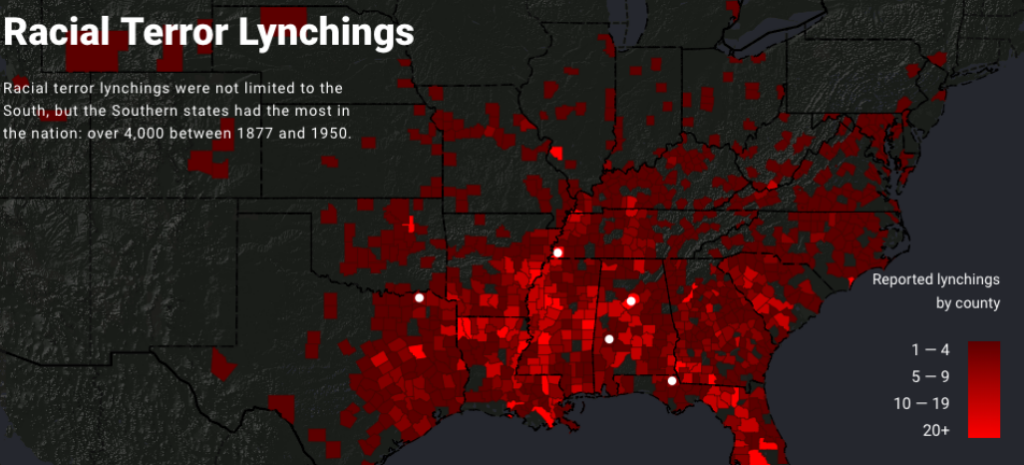
The actual injustices carried out during the Jim Crow of American history can never be fully mapped or measured. Some groups, like the Equal Justice Initiative, have attempted to use raw data to display lynchings as a statistic. People who were murdered in a heinous way become points on a map.

This map is flawed in multiple ways. The data focuses nearly completely on the southern states. The reality of the lynching during and after the Jim Crow did not just occur in the South; it is a disservice to those who were murdered to claim to have a comprehensive map of lynchings while excluding states north or west of Texas. Katherine Hepworth writes, “demonstrating how choices about representation, interaction, and annotation in their data visualizations either do harm in the sense described above or challenge dominant narratives.” The map does represent a terrible crime against a certain group, but it can be seen more as a tool to push an agenda. “Lynching in America is a promotional and advocacy tool for the Equal Justice Initiative, primarily created to visualize data within (and thereby promote) the report “Lynching in America,” which records lynchings of African Americans and frames lynching as a societal tool — enabled through mob violence and discourses of white superiority” (Kepworth) This demonstrates how ethics are essential when performing research and displaying data in such a way.

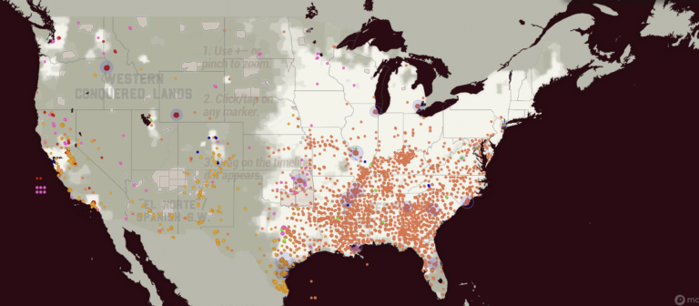
The second map depicts lynch crimes as much more a widespread human tragedy. This map from Monroe and Florence’s Work Today depicts lynching during the Jim Crow era in a more unbiased and human light. On the site, you can see individual names. The first map shows counties reporting the number of lynchings specifically against black Americans. The Monroe and Florence Work map today shows Chinese, Black, Latinx, Native, Italian, and other groups in their data. This map is a great example of what can be lost when looking at tragedies like lynching as nothing more than data. The human side of the event is forgotten. Stories are lost.
These maps made me think about how data visualizations are not static. Data and algorithms are from human experiences and sometimes suffering. Church and Hepworth write, “[H]umans are at the center of algorithms, not only as their creators but, in the case of data-driven algorithms, as the producers of the content they shape and present.”
The ethics of mapping is unique in how maps can leave out critical data and still represent data that can be used. Audiences for maps decide what data is shown. No map can show everything. As seen above, some maps are biased in what they choose to show, leading to a pushed idea. Those who subscribe to that idea have a partial picture of what Jim Crow-era lynching encompassed.
Mapping ethics also needs to be concerned with what is being displayed. Each dot on the Monroe and Florence Work Today is a person who lost their life in senseless, unjust violence. The map displays how this violence was not just in one region or against one group. The ethics of the Monroe and Florence map displays how some maps lack ethics and only exhibit one group.
- Hepworth, Katherine & Christopher Church. 2018. “Racism in the Machine: Visualization Ethics in Digital Humanities Projects.” Digital Humanities Quarterly, 7. ↩︎
- Monroe & Florence Work Today. 2016. “Map of White Supremacy Mob Violence.” PlainTalkHistory ↩︎
- Monroe & Florence Work Today. 2016. “Map of White Supremacy Mob Violence.” ↩︎


Wonderful reflection Sam, and especially like the you conclude with the ethical implications (although you didn’t explicitly include the terms) “silences” we use with maps. Great job!