
Stage 4
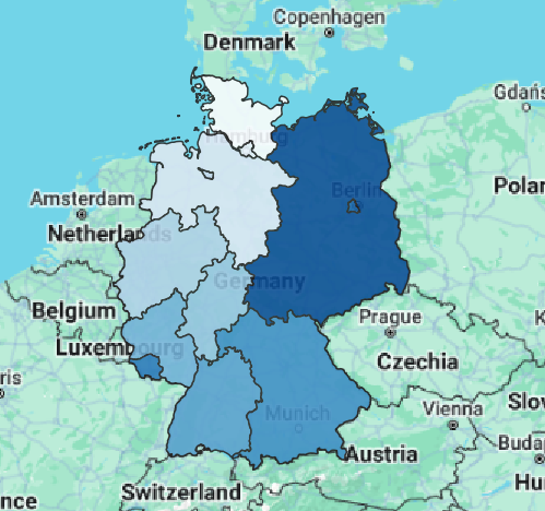
At this point in my project, i have added together data from 1970 to 1987. I have not added in the census from after 1970, but once I have, there will be comparisons between before and after the fall of the Berlin Wall, reflected by the population changes between German states.
Stage 3
Here are scholarly sources for my project
- Over-All Report (European War). United States Strategic Bombing Survey, 1945.
- Kido, E. “Population Movements in Germany after the Collapse of the Third Reich.” Jstage, https://www.jstage.jst.go.jp/article/kokusaiseiji1957/1988/89/1988_89_57/_article/-char/en.
- Guianne, Timothy. “Population and the Economy in Germany, 1800-1990.” Yale University, 1998.
- Mauri, A. (2019, April). East German Perspectives: The Berlin Wall and its Evolution as Cultural Heritage. Princeton University. https://tortoise.princeton.edu/2019/05/09/east-german-perspectives-the-berlin-wall-and-its-evolution-as-cultural-heritage/
- Decressin , J. (1994, June 1). Internal migration in West Germany and implications for East-West salary convergence. Springer Link. https://pubmed.ncbi.nlm.nih.gov/12319451/
- Adebahr, H. (1969). Internal Migration and Regional Wage Levels. An Analysis of Internal Migrations in the Federal Republic of Germany 1957-1967. Journal of Contextual Economics, 89(5), 557–578.
- Klüsener, S. (2014). The East-West Gradient in Spatial Population Development Within Germany. Historical Methods: A Journal of Quantitative and Interdisciplinary History, 47(4), 167–179.\
- Gnest, H. (2008). The development of supralocal spatial planning in the Federal Republic of Germany from 1975 to the present day. SSOAR. https://www.ssoar.info/ssoar/
- Goldstein, J. (2014, September). A geographic analysis of fertility decline in Prussia. JSTOR. https://www.demogr.mpg.de/papers/working/wp-2010-012.pdf
- Global Census Archive. East View. (2024, April 10). https://www.eastview.com/resources/gca-pubs/
Here are sources for data/secondary resources
- Cologne, Germany metro area population 1950-2024. MacroTrends. (n.d.). https://www.macrotrends.net/global-metrics/cities/204358/cologne/population
- O’Neill, A. (2024, February 2). Population of east and West Germany 1950-2016. Statista. https://www.statista.com/statistics/1054199/population-of-east-and-west-germany/
- Global Census Archive. East View. (2024a, April 10). https://www.eastview.com/resources/gca-pubs/
- Population by nationality and sex. Federal Statistical Office. (2023a, June 20). https://www.destatis.de/EN/Themes/Society-Environment/Population/Current-Population/Tables/lrbev02a.html
- BBC. (2019, November 5). Fall of berlin wall: How 1989 reshaped the modern world. BBC News. https://www.bbc.com/news/world-europe-50013048
- Breuer, R. (n.d.). Germany before and after reunification – DW – 10/03/2020. dw.com. https://www.dw.com/en/germany-before-and-after-reunification/g-55082387
- The fall of the wall and German reunification. deutschland.de. (2018, September 27). https://www.deutschland.de/en/topic/politics/germany-europe/the-fall-of-the-wall-and-german-reunification
- Council on Foreign Relations. (n.d.). After the Berlin Wall: Europe’s struggle to overcome its divisions. Council on Foreign Relations. https://www.cfr.org/article/after-berlin-wall-europes-struggle-overcome-its-divisions
- Gramlich, J. (2019, October 18). How the attitudes of West and East Germans compare, 30 years after fall of Berlin Wall. Pew Research Center. https://www.pewresearch.org/short-reads/2019/10/18/how-the-attitudes-of-west-and-east-germans-compare-30-years-after-fall-of-berlin-wall/
- Chapple, A. (2020, July 18). Berlin: After the war, before the wall. RadioFreeEurope/RadioLiberty. https://www.rferl.org/a/berlin-a-city-of-rubble-after-the-war-and-before-the-wall/30733579.html
Heat Map Practicum
Heat maps can be an excellent way to understand concentrations in given areas. The military could also use heat maps. Understanding where fighting is concentrated could alter the course of a mission or how resources are spent. Knowing that something is going on versus seeing where it is happening are two different ways of combating a problem. Heatmaps allow readers to understand more than surface-level activity and information on a map.
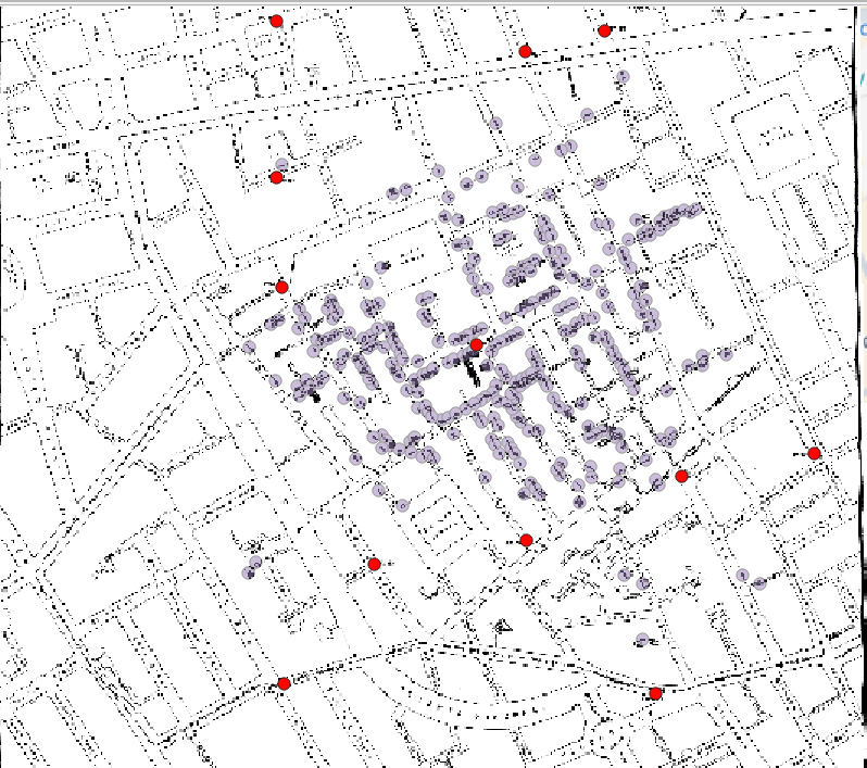
Georeferencing Practicum
For this project, I do not think there is much new information to be uncovered by comparing the map of Missouri from the 1960s to the map used for Google Earth today. Some things that are interesting to compare are the changes in infrastructure in the form of highways and roads compared to how they were nearly 60 years ago. The interconnectedness of cities, both big and small, is on display when comparing these two maps. It is also interesting to see some new cities pop up on the more recent map. And to see some cities from the 1960s not being named anymore or being completely absorbed by larger cities or even changing counties.
The weakness in this approach to mapping changes historically is that a fair amount of information is missed. Just looking at the overlayed map makes for a game of “Where’s Waldo?”. Not all changes are directly explained, leading to a loss of information for the reader and them not understanding the actual changes that have taken place over the course of 60 years. A way to make this approach better would be to make the map more interactive and display all major changes in each county as the reader hovered over it. That way, changes are more evident, and information is not lost needlessly.
Stage 2
This research project will cover the entire country of Germany. I will look into population statistics of both the East and West during the years 1986-1992. This research will be displayed in a storymap to demonstrate the radical change in population after the massive event that was the collapse of the Berlin Wall. Possible sources for the information would be the German census from the respective years. Other sources would be various micro censuses conducted in each region of Germany due to there not being a massive in Germany after 1970 until the year 2011. Another primary and secondary source would be the University of East London and other sources that discuss internal migration in Germany during the 20th century.
Stage 1
My final project will encompass the entirety of Germany. My scale will be the years 1986-1992. I will focus on the population change in East and West Germany before and after the fall of the Berlin Wall in 1989.
My research question is as follows: How was the population of East and West Germany impacted by the collapse of the Berlin Wall? I want to answer this question because I am fascinated with the aftermath of communist failure and how many people sought to find citizenship in the capitalist world once they were free to do so.
Stage 2
I will encompass the entire area of Cologne, Germany. I want to observe the emigration of citizens out of the city due to bombings by the Allies throughout World War Two. Cologne saw most residents leave or be killed by the end of the war, and I would like to map this using an interactive story map. Due to the nature of the data before 1945, I will need to piece together multiple sources to get an accurate picture of the change in population in relation to events and geography. I have found multiple sources that detail population density after 1950 and some German sources that have information regarding the city’s population during the 1940s. This project aims to give an accurate representation of the effects of World War II on the city and how the city eventually recovered and thrived.
Ethics of Mapping History
The actual injustices carried out during the Jim Crow of American history can never be fully mapped or measured. Some groups, like the Equal Justice Initiative, have attempted to use raw data to display lynchings as a statistic. People who were murdered in a heinous way become points on a map.
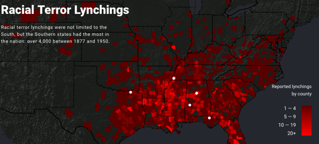
This map is flawed in multiple ways. The data focuses nearly completely on the southern states. The reality of the lynching during and after the Jim Crow did not just occur in the South; it is a disservice to those who were murdered to claim to have a comprehensive map of lynchings while excluding states north or west of Texas. Katherine Hepworth writes, “demonstrating how choices about representation, interaction, and annotation in their data visualizations either do harm in the sense described above or challenge dominant narratives.” The map does represent a terrible crime against a certain group, but it can be seen more as a tool to push an agenda. “Lynching in America is a promotional and advocacy tool for the Equal Justice Initiative, primarily created to visualize data within (and thereby promote) the report “Lynching in America,” which records lynchings of African Americans and frames lynching as a societal tool — enabled through mob violence and discourses of white superiority” (Kepworth) This demonstrates how ethics are essential when performing research and displaying data in such a way.
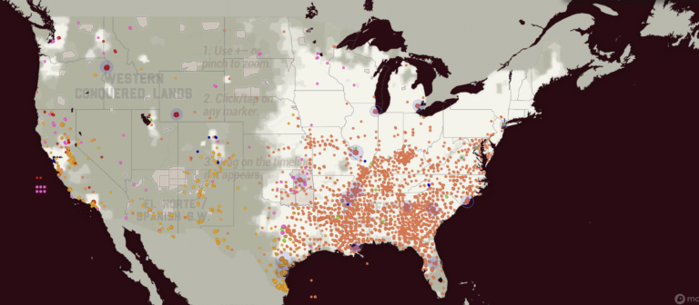
The second map depicts lynch crimes as much more a widespread human tragedy. This map from Monroe and Florence’s Work Today depicts lynching during the Jim Crow era in a more unbiased and human light. On the site, you can see individual names. The first map shows counties reporting the number of lynchings specifically against black Americans. The Monroe and Florence Work map today shows Chinese, Black, Latinx, Native, Italian, and other groups in their data. This map is a great example of what can be lost when looking at tragedies like lynching as nothing more than data. The human side of the event is forgotten. Stories are lost.
These maps made me think about how data visualizations are not static. Data and algorithms are from human experiences and sometimes suffering. Church and Hepworth write, “[H]umans are at the center of algorithms, not only as their creators but, in the case of data-driven algorithms, as the producers of the content they shape and present.”
The ethics of mapping is unique in how maps can leave out critical data and still represent data that can be used. Audiences for maps decide what data is shown. No map can show everything. As seen above, some maps are biased in what they choose to show, leading to a pushed idea. Those who subscribe to that idea have a partial picture of what Jim Crow-era lynching encompassed.
Mapping ethics also needs to be concerned with what is being displayed. Each dot on the Monroe and Florence Work Today is a person who lost their life in senseless, unjust violence. The map displays how this violence was not just in one region or against one group. The ethics of the Monroe and Florence map displays how some maps lack ethics and only exhibit one group.
- Hepworth, Katherine & Christopher Church. 2018. “Racism in the Machine: Visualization Ethics in Digital Humanities Projects.” Digital Humanities Quarterly, 7. ↩︎
- Monroe & Florence Work Today. 2016. “Map of White Supremacy Mob Violence.” PlainTalkHistory ↩︎
- Monroe & Florence Work Today. 2016. “Map of White Supremacy Mob Violence.” ↩︎
Final Project: Stage 1
How did the end of World War 2 affect the geography and reconstruction of Cologne, Germany? What was rebuilt? What was not? How does the destruction alter the city to this day? More than 20,000 buildings received damage throughout the duration of the Second World War, and more than 10,000 buildings were destroyed.
I want to research how much the bombings and destruction have affected the city to this day. How has urban development been altered? Were there parts of the city that were never rebuilt? Are there parts of the city that received more attention for reconstruction? Are there parts of the city that were wiped away completely in exchange for something completely different? I would like to focus on the city’s change over time and overall development due to WW2.