This project details the population growth in California that resulted from the California Gold Rush in the mid-to-late 1800s. The project begins by exploring two case studies of mining towns established during the California Gold Rush, contrasting the different fates of Nevada City and Bodie. The project then explores population growth and contraction before, during, and after the gold rush. In its final section, the project describes Chinese migration, settlement, and discrimination in California during and after the gold rush. The crux of this project’s argument is that the California Gold Rush transformed California from a sparsely-populated, rural region, to a state full of bustling metropolises and thriving industry. This growth was sustained by California’s connection to the East Coast via the Trans-Continental Railroad which Chinese immigrants built while facing constant discrimination.
The greatest strength of this project’s maps are their readability. Each map in this project has superb color contrast, color gradients, and easy-to-see vector features. Their readability makes these maps easy-to-use and appealing to the reader. Anywhere they were included in the project they added to my understanding of the project’s themes and supported the project’s historical argument. One map I found particularly useful and informative was the “Heat map of Gold Rush settlements.” This map helped me visualize where gold rush settlements were and how the epicenter of the gold rush coincided with areas with the greatest population growth and contraction.
One facet of this project that could be improved is using GIS maps in the sections on Nevada City and Bodie to highlight where these two mining towns were in relation to other mining settlements in California. Contrasting the stories of Nevada City and Bodie is a superb part of this project that does a great job of introducing readers to the California Gold Rush. However, these two case studies could benefit from having their own respective maps that highlight where these two towns are located in California. These maps could even include popups that could provide population graphs and other helpful information. Another improvement that could make the maps in this project even more readable would be to include a legend on them, particularly the choropleths. Including a legend on these maps would ensure the reader understands each map and its argument accurately.
Overall, this was an excellent and informative project that clearly drew on class instruction on mapping conventions, best practices, and GIS methods.
Attached above is a download link to Stage 3 of my Final Project, the annotated bibliography. The data sources and secondary sources are conglomerated together into one alphabetized bibliography in the downloadable document.
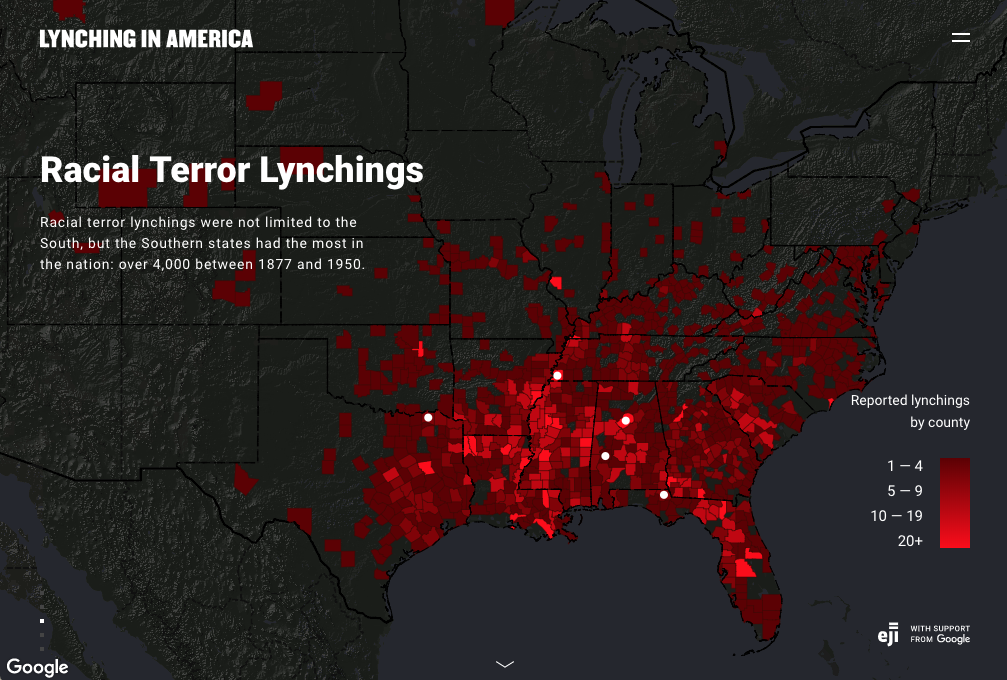
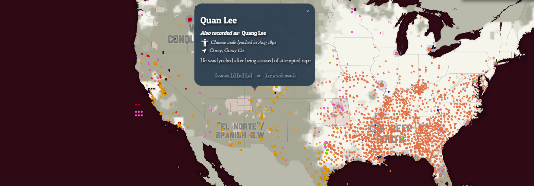
Before opening the article “Racism in the Machine: Visualization Ethics in Digital Humanities” I took a peak at the maps depicting lynching in the United States discussed in the article. Even without the background the article provided me, many of the ethical issues of the Equal Justice Initiative’s (EJI) map were readily apparent to me. I found the map quite limited in the information and context it could provide as a visualization technique.
Lynching In America by EJI and Google, Image Courtesy LynchingInAmerica.eji.org
As mentioned in the article, the EJI’s map focused almost solely on the South.[1] It did this to the point that I found it difficult and somewhat frustrating that the map could only really provide me information about that region. Also, the fact that states that did not register lynchings of African Americans were not represented with their political borders on the map, while those that did register lynchings of African Americans were highlighted in contrast with the dark background made understanding a relatively complete picture of lynching in the United States impossible via this map, and thus the map more frustrating to use.
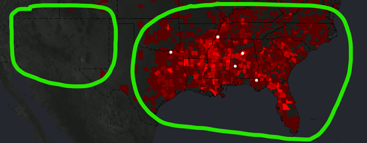
Notice the contrast between Arizona and New Mexico and their lack of political borders due to the absence of lynchings against African Americans in those states. However, this visualization is misleading as there were numerous lynchings in both states, particularly against Latinos. | Lynching In America by EJI and Google, Image Courtesy LynchingInAmerica.eji.org
All this felt misleading or limiting for this data visualization. As a reader, I want to understand these lynchings in context, context that the map’s focuses on political boundaries in the South and presenting solely lynchings of African Americans severely limits.[2]
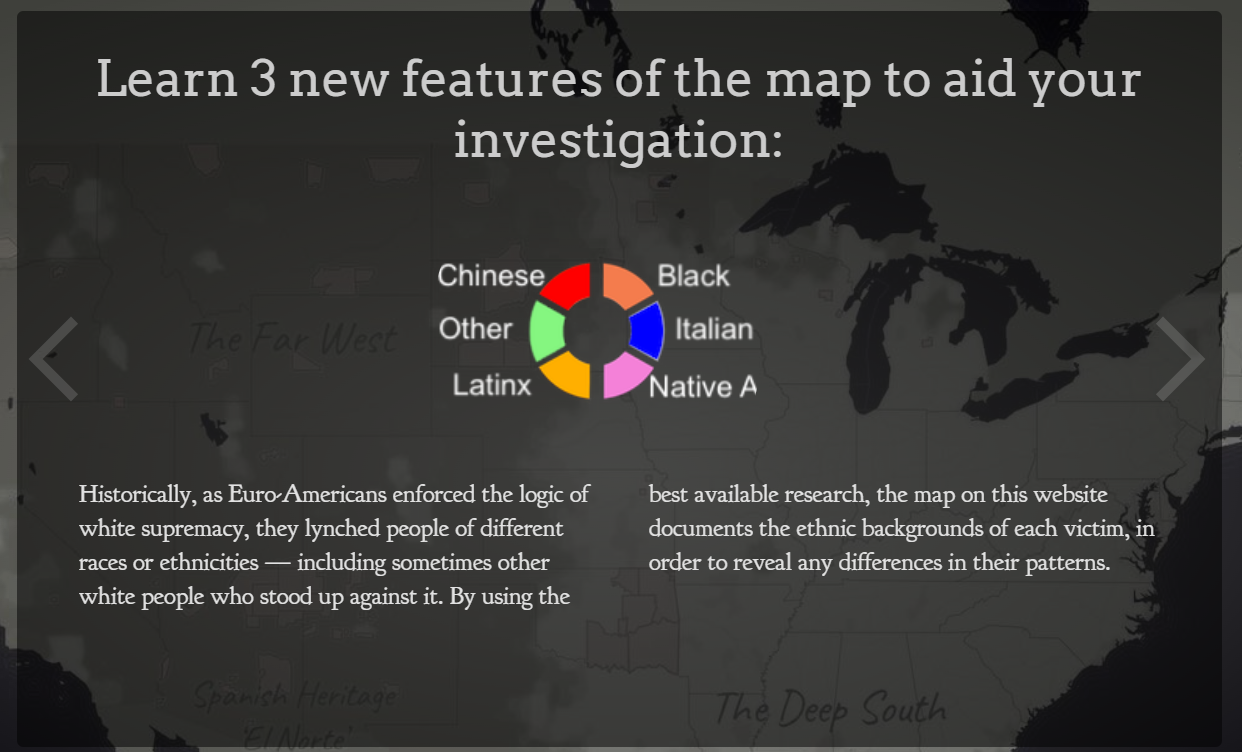
When I opened the map from Monroe & Florence Work Today, I was absolutely stunned by its ability to provide me with much of the context the EJI’s map lacked. The notification and explanation screens displayed before I could access the map not only got me to think about what this map visualized, but also what it did not visualize.
One such notification/explanation screen | Monroe and Florence Work Today, Courtesy PlainTalkHistory.com
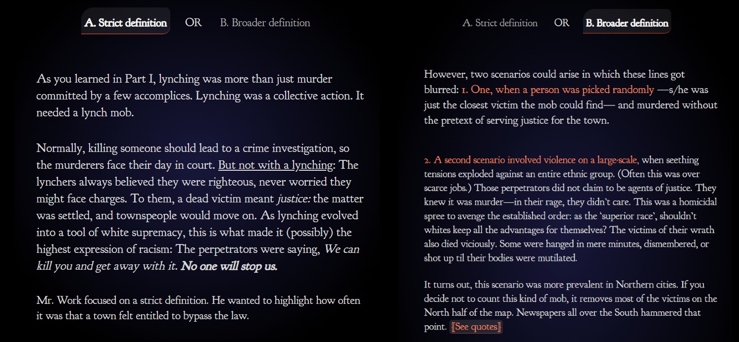
The most effective way this project gets its readers to think about how lynchings in the United States are visualized is through the choice it gives readers between depicting lynchings according to a “narrow definition” and lynchings according to a “broad definition.”
Monroe and Florence Work Today, Courtesy PlainTalkHistory.com
In all honesty, no other digital mapping project I have seen has made me think as long and hard about data visualization as this seemingly simple, two-option question. As Hepworth and Church pointed out in their article discussing ethics in the digital humanities by comparing the EJI and Monroe & Florence Work Today maps, the Monroe & Florence Work map places it emphasis on humanizing the victims of lynchings and not simply depicting them as data points. The map does this by plotting each lynching victim as a single point on the map which, when clicked, gives information and references discussing who the person was and why they were lynched.
Monroe and Florence Work Today, Courtesy PlainTalkHistory.com
The choice the Monroe and Florence Work map provide readers of what lynching data to depict I discussed above also help to avoid depersonalizing the victims of lynchings as mere datapoints. It instead makes readers think about the context in which these victims were killed. It makes readers think about the social dynamics of these killings and what it must have been like for those subjected to such atrocities.
Analyzing these maps has reminded me of how data and date visualizations are not neutral in any way, shape, or form. Data and algorithms can never be fully divorced from humans. As Church and and Hepworth state in their article, “[H]umans are at the center of algorithms, not only as their creators, but, in the case of data-driven algorithms, as the producers of the content they shape and present.”[3]
Data and data visualizations occupy a unique ethical landscape. While the ethics of a written piece may become quite obvious with a thorough read, it may take much more to uncover whether data you observe have been ethically collected, produced, and represented. Raw data, with its cold, seemingly authoritative, numbers and figures give off the explicit impression of impartial authority. However, methods of data collection, who collected the data, who funded the data collection, and the purpose of the collection of the data can all result implicit which can often remain invisible until thoroughly inspecting or investigating a dataset.
Data visualization also has a similarly authoritative nature. When you look at a picture, map, infographic, or other visualization its graphics can often captivate you and provide you with what appears to be an authoritative and unquestionable narrative as sources and methods and put into the background while the story of the data is pushed to the front.
All this makes me recognize the importance of providing transparency in any mapping projects and data visualizations I create. By being upfront with my data sources and the processes by which I conglomerated, prioritized, and ultimately visualized data in my projects will allow readers to be more critical of my work, seeing it not as monolithically authoritative, but instead as a piece of a larger puzzle of the historical reality. It is also important that I acknowledge what my maps and data visualizations omit and why I chose to (or subconsciously) omitted those datapoints or features. All these steps promote the ethical use, display, and dissemination of digital humanities projects like the one I will create for my final project in this class.
Bibliography
[1] Katherine Hepworth and Christopher Church, “Racism in the Machine: Visualization Ethics in Digital Humanities Projects,” DHQ: Digital Humanities Quarterly 12, no. 4 (2018), 3.
[2] Hepworth and Church, “Racism in the Machine,” 3.
[3] Hepworth and Church, “Racism in the Machine,” 1-2.
Map Citations in Order of Appearance:
Equal Justice Initiative and Google, Lynching In America: Racial Terror Lynchings, Lynching In America, https://lynchinginamerica.eji.org/explore.
Plain Talk History, Map of White Supremacy’s History of Lynchings/Map of White Supremacy’s Mob Violence, Plain Talk History, https://plaintalkhistory.com/monroeandflorencework/explore/.
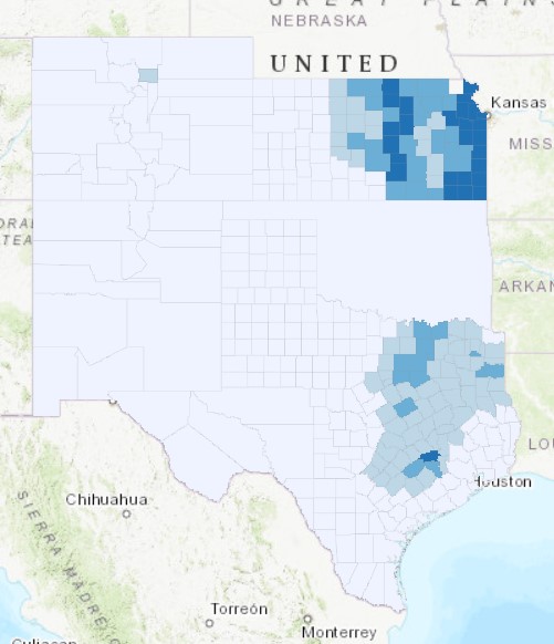
1880 Map of Percent of Land Cultivated in Counties on the Southern Great Plains | Mapping by Payton Mlakar, Mapping Data provided by Dr. Sundberg from Geoff Cunfer
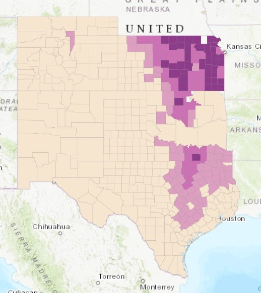
1900 Map of Percent of Land Cultivated in Counties on the Southern Great Plains | Mapping by Payton Mlakar, Mapping Data provided by Dr. Sundberg from Geoff Cunfer
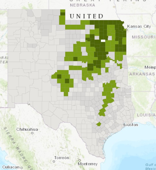
1940 Map of Percent of Land Cultivated in Counties on the Southern Great Plains | Mapping by Payton Mlakar, Mapping Data provided by Dr. Sundberg from Geoff Cunfer
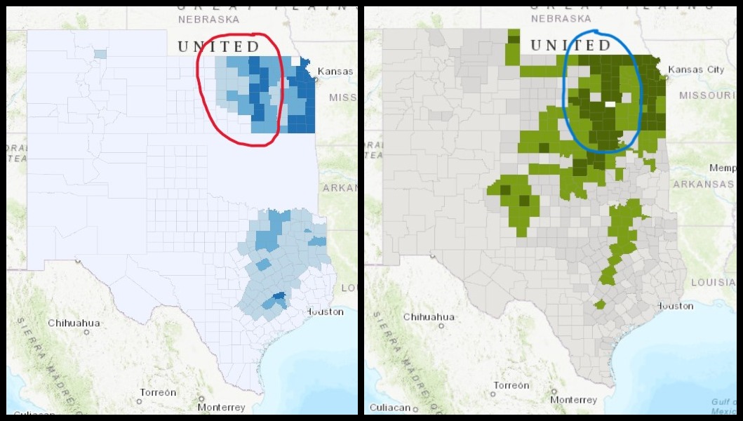
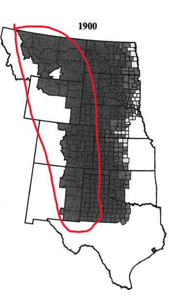
One key change that I noticed on these three maps is the continued westward expansion of more extensive farming and cultivation. For example, in Kansas, between 1880 and 1940, counties in central Kansas went from having little of their land cultivated, to having a large percentage of it in use for intensive farming. This makes sense as throughout this time, as Geoff Cunfer pointed out in his book On the Great Plains: Agriculture and Environment, more extensive cultivation of the Great Plains expanded west as white farmers established farms further west and began to plow and cultivate the land.
Left: 1880 Map of Percent of Land Cultivated in Counties on the Southern Great Plains | Right: 1940 Map of Percent of Land Cultivated in Counties on the Southern Great Plains | Both Maps: Mapping by Payton Mlakar, Mapping Data provided by Dr. Sundberg from Geoff Cunfer
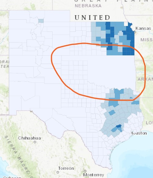
Another important change across these three maps is the explosion of cultivated land in Oklahoma. In 1880, farmers were only cultivating a very low percentage of land in Oklahoma. In 1900 a significant percentage of land in north-central Oklahoma was being cultivated, while in 1940 large percentages of land were under cultivation all across the state. I would attribute this to increases in white settlement in Oklahoma between 1880 and 1940. The United States Government forced many Native American tribes to migrate to what is now Oklahoma as they expelled them from their tribal lands further east. As more land came to be bought up and cultivated by other white settlers on the Great Plains, many white settlers likely turned to settling and cultivating land in Oklahoma in and around lands inhabited by forcibly relocated Native American tribes.
1880 Map of Percent of Land Cultivated in Counties on the Southern Great Plains | Mapping by Payton Mlakar, Mapping Data provided by Dr. Sundberg from Geoff Cunfer
1900 Map of Percent of Land Cultivated in Counties on the Southern Great Plains | Mapping by Payton Mlakar, Mapping Data provided by Dr. Sundberg from Geoff Cunfer
1940 Map of Percent of Land Cultivated in Counties on the Southern Great Plains | Mapping by Payton Mlakar, Mapping Data provided by Dr. Sundberg from Geoff Cunfer
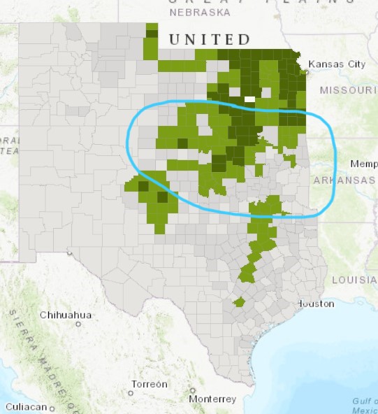
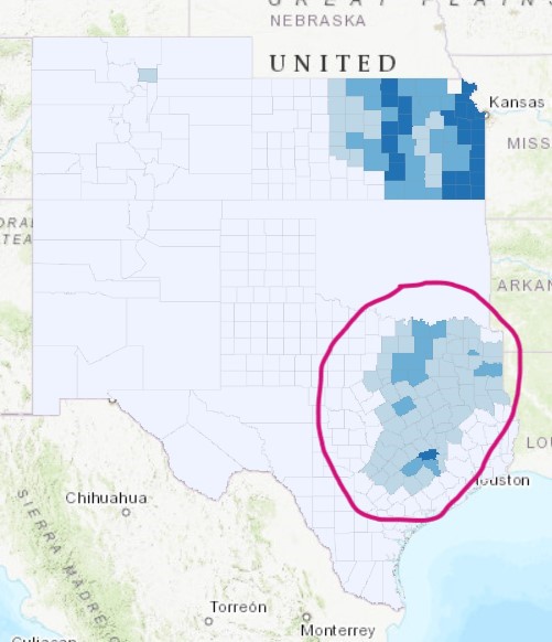
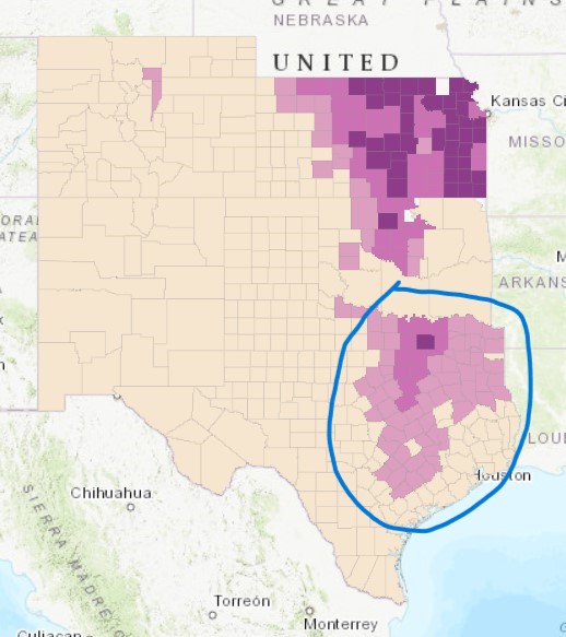
A third important change I noticed across the time period these three maps represent is the dramatic reduction in the percent of land cultivated in many counties in northeastern Texas. In 1880 and 1900 there was a relatively large number of counties in northeastern Texas that had a substantial percentage of their land under cultivation. However, by 1940 much of this land was apparently no longer cultivated, with only a single band of counties with high percentages of cultivation across northeastern and central Texas remaining. I believe this was likely due to farmers plowing and cultivating past the what those areas of Texas could support agriculturally, something Geoff Cunfer pointed out occurred in his case study of Rooks County, Kansas and across most of the Great Plains. As a result of pushing just past the natural boundaries of the northeastern Texas, most farmers had to reduce the amount of land they cultivated substantially. On the other hand, farmers in the band of counties crossing northeastern and central Texas found they could expand the amount of land they cultivated as it was within the natural capacity of their area.
1880 Map of Percent of Land Cultivated in Counties on the Southern Great Plains | Mapping by Payton Mlakar, Mapping Data provided by Dr. Sundberg from Geoff Cunfer
1900 Map of Percent of Land Cultivated in Counties on the Southern Great Plains | Mapping by Payton Mlakar, Mapping Data provided by Dr. Sundberg from Geoff Cunfer
1940 Map of Percent of Land Cultivated in Counties on the Southern Great Plains | Mapping by Payton Mlakar, Mapping Data provided by Dr. Sundberg from Geoff Cunfer
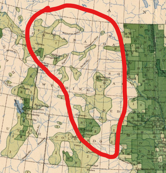
My final project will focus on the Colorado Silver Boom in the Colorado Rockies from around 1879-1893. I will primarily focus on mapping case studies of two cities whose populations and prestige exploded during the Colorado Silver Boom: Leadville and Aspen. Both these cities experienced a population explosion and a massive influx of investment in infrastructure, housing, mining, and services between 1879-1893. The discovery of deposits of lead minerals with large amounts of silver in them at Leadville in 1879 kickstarted the Colorado Silver Boom, while the discovery and exploitation of similar deposits near Aspen saved the failed mining town from becoming abandoned. I hope to determine whether a city’s proximity to profitable prospecting opportunities or proximity to railroads played a larger role in influencing where prospectors settled in the Colorado Rocky Mountains during the Colorado Silver Boom through this project. I will accomplish this goal by mapping the growth of these cities and their proximity to railroads between 1879-1893, as well as their proximity to profitable silver deposits,.
Some of the possible sources that I will employ in my digital mapping project will be U.S. Census data to see population growth in Leadville and Aspen between 1879 and 1893. I will also use secondary sources, such as Aspen and the Railroads by W. Clark Whitehorn, detailing the history of Aspen and Leadville to understand the growth of these cities and their proximity to railroads and profitable silver deposits. I will also use primary sources, such as the USGS’s 1886 monograph Geology and Mining Industry of Leadville, Colorado with Atlas by Samuel Franklin Emmons, to understand perceptions and assessments of mineral exploitation, transportation, and population growth in and around Aspen and Leadville. I will also explore the online repository of digital maps on ArcGIS to find historic geologic, railroad, and/or population maps to use in my final project.
At this point in my project, I believe an interactive web map or other form of an interactive map would best represent my project and my argument. Mountains and mountainous terrain are easily mapped with topographic methods. However, it is difficult to articulate on a flat map how truly challenging living, working, and traveling in a mountainous area is, particularly without many of the modern amenities we have today. With an interactive map, I could make interactive “exhibits” for different parts of Leadville, Aspen, and the surrounding railroads, mountains, mines, and trails. The images and descriptions in these exhibits could give readers a better understanding of what life was like for miners and settlers in the Colorado Rocky Mountains and how they made the decisions they did.
“The West” and its settlement by Euro-Americans has been a persistent focus of the American historical mythos. As a result, narratives of “The West” consistently capture the imagination of countless Americans. While these narratives can be quite engaging, they often obscure the true reality of life and survival in “The West.” In an easily digestible and attractive mapping product, such as an online interactive map, I believe I could capture the imagination of many Americans with a story of “The West” that avoids the pitfalls of inaccuracy and over-dramatization many popular histories and stories of “The West” contain.
In his book On The Great Plains: Agriculture and Environment, Geoff Cunfer discusses how environmental factors were the primary determinants of land use on the Great Plains of the United States.
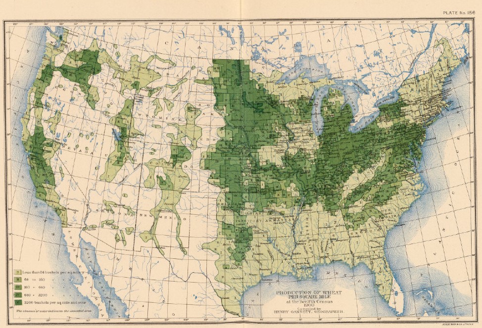
Production of Wheat per Square Mile at the Twelfth Census, 1900. Courtesy DavidRumsey.com.
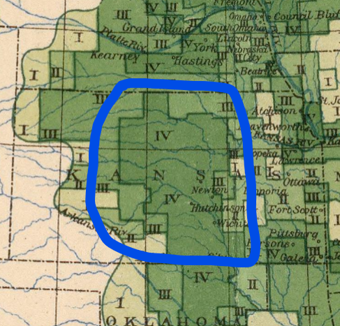
Cunfer uses several maps depicting the land use of counties across the Great Plains. His map of the percentages of unplowed grassland across the Great Plains in 1900 closely mirrors the map from the U.S. Census Office published in 1903. The highest wheat producing areas on the Great Plains in the Census Office map mirror the counties in Central Kansas, Eastern/Central Nebraska, and the eastern edges of the Dakotas where large swathes of land was plowed across most counties.
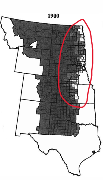
Fig. 2.4 Percentage of Total County Area Not Plowed, 1880-1920. From On The Great Plains: Agriculture and Environment by Geoff Cunfer.
Production of Wheat per Square Mile at the Twelfth Census, 1900. Courtesy DavidRumsey.com.
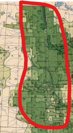
In his analysis, Cunfer focuses on Rooks County, Kansas. Cunfer discusses how by 1900, Euro-American farmers had plowed substantial portions of Rooks County Central Kansas as white settlement increased while settlers took advantage of a climate that enabled widespread grain cultivation.[1] This is apparent in both Cunfer’s and the U.S. Census Office’s maps. Cunfer’s map shows that somewhere between 20-50% of the land the counties of Central Kansas around the turn of the 20th century was plowed for grain cultivation with 50-80% left as pastureland.
Fig. 2.4 Percentage of Total County Area Not Plowed, 1880-1920. From On The Great Plains: Agriculture and Environment by Geoff Cunfer.
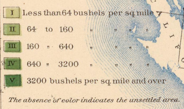
The U.S. Census Office’s map depicting the same area just three years later makes a similar argument. It shows how in 1903, farmers in much of Central Kansas produced up to 3,200 bushels of wheat per square mile. With such high levels of productivity, the climate and soil must have been widely arable and conducive to wheat production, leading to more extensive plowing to cultivate more land.
Production of Wheat per Square Mile at the Twelfth Census, 1900. Courtesy DavidRumsey.com.
Cunfer points out how rainfall and the rarity of crop-destroying frosts in contrast to croplands further north on the prairie enabled such high agricultural productivity with extensive plowing in Central Kansas.[2]
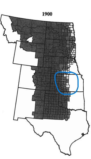
The importance of environmental factors to grain cultivation on the American prairie is evident in Cunfer and the U.S. Census Bureau’s maps. Lands further west on the prairie were much drier than lands further east. This severely limited the ability of farmers to successfully cultivate crops, such as wheat, as lands further west were simply too dry. As a result, this land was largely left unplowed with the original prairie being used as pastureland for livestock.
Fig. 2.4 Percentage of Total County Area Not Plowed, 1880-1920. From On The Great Plains: Agriculture and Environment by Geoff Cunfer.
Production of Wheat per Square Mile at the Twelfth Census, 1900. Courtesy DavidRumsey.com.
Both these maps reflect Cunfer’s argument that environmental factors largely determined agricultural cultivation and productivity in the Great Plains as drier areas produced lower crop yields and had more pastureland.
Whenever one maps anything there are always omissions and biases, either implicit or explicit, in the mapping product. The relatively small scale of both maps discussed above forces omissions of vital topography, homesteads, and Native American lands that all characterize the Great Plains and color the mapped area. In my final project, I will have to make omissions on the map I produce as one cannot depict every single thing in a mapped area within the limits of one or more maps. That herculean task is simply impossible. However, I must be attentive to and acknowledge the omissions and biases in the map of mining boom towns in the Colorado Rocky Mountains I will produce for my final project. I must acknowledge whether the omissions and biases in my maps are implicit or explicit on my part and how I can minimize them or appropriately acknowledge their presence and the limitations of mapping as a medium to convey information and propose arguments. I must remember that the map I will make for my final project is a proposal and argument and that as with any reasonable proposal or argument it must not be deceitful or misleading. Maps play a uniquely authoritative role in how people view the world as they claim to depict the world “as it really is.” As a result, I must constantly reanalyze the map I make for my final project from the perspective of a viewer who is seeing my map for the first time. I must ask myself if what I am proposing through my map would be untrue, deceitful, or easily misunderstood and misconstrued by viewers, providing them with a false or inappropriately biased perception of the Colorado Rockies and the people that lived there. Of particular relevance to my final project is the settlement of Native American lands in the Rocky Mountains by white Euro-Americans. Unlike the maps of the Great Plains discussed earlier in this post, I want to make sure that I find a way to at least acknowledge Native American inhabitants of the Rockies and their role in white settlement and mining in the Colorado Rocky Mountains. To me, it is unacceptably misleading to omit recognizing the active Native American historical presence in and around the Rocky Mountains, or else I may appear to present the unethical and false proposal in my map that prior to white settlement, land in the Colorado Rockies was “empty” and “unused” by humans.
Bibliography
[1] Geoff Cunfer, On The Great Plains: Agriculture and Environment, (College Station, TX: Texas A&M University Press , 2005), 27.
[2] Cunfer, On The Great Plains, 22, 29.
Map Citations In Order of Appearance
U.S. Census Office, Production of Wheat per Square Mile at the Twelfth Census, 1900, 1903, David Rumsey Map Collection, https://www.davidrumsey.com/luna/servlet/s/6kl0p8, accessed March 10, 2024.
Geoff Cunfer, Fig. 2.4 Percentage of Total County Area Not Plowed, 1880-1920, 2005, from On The Great Plains: Agriculture and Environment.
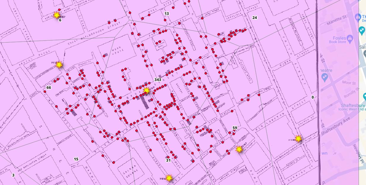
A heat map representation of Jon Snow’s map of the 1854 London cholera outbreak. Darker red areas indicate more deaths from cholera.| Mapping by Payton Mlakar, Mapping Data provided by Dr. Sundberg.A Voronoi diagram on Jon Snow’s map of the 1854 London cholera outbreak. Red dots indicate a household with at least one cholera death. Yellow stars indicate water pumps. The numbers in the middle of each cell indicate the number of deaths from cholera inside each cell of the Voronoi diagram, Note the extremely high number of deaths (343) in the cell that contains the Broad Street Pump. | Mapping by Payton Mlakar, Mapping Data provided by Dr. Sundberg.
As demonstrated on the heat map and Voronoi diagram above, these mapping tools can effectively represent mortality data spatially. However, these mapping tools can also represent other types of data critical to fighting epidemic disease. One way in which Voronoi polygons and heat maps could be useful to analyze spatial data outside of mortality rates would be in mapping areas with high numbers of people with preexisting conditions or other susceptibility/risk factors for a disease. Part of any epidemic disease response is recognizing who is most at-risk of contracting and dying from the disease. Heat maps and Voronoi polygons can present this important information in an easy-to-use, visual and spatial representation. They can provide epidemiologists and other medical professionals with valuable information about areas which contain populations with increased rates of pre-existing conditions and other risk-factors. Heat maps can propose where these populations are located, while Voronoi polygons can demonstrate their ease-of-access and/or proximity to quality medical care. With this spatial information in hand, medical professionals managing epidemic response can identify where mortality from a disease may be higher before those high mortality rates actually become realized through rampant infection. With this knowledge, officials leading epidemic response can preemptively allocate additional treatment and prevention resources to these communities to prevent disastrous mortality rates in the most at-risk communities.
Another way in which Voronoi polygons and heat maps could useful to analyze spatial data outside of mortality rates would be to map infection rate “hotspots” and to perform contact tracing in these areas. For example, a heat map could demonstrate how a certain neighborhood has a very high infection rate and thus must enforce stay-at-home orders or other protocols to prevent further infections. Then, alongside this heat map, epidemiologists could use Voronoi polygons to contact-trace most infections. In their data collection and mapping they may create a Voronoi diagram which traces many infections to a popular grocery store within walking distance for most of the neighborhood. Or, the data could produce a Voronoi diagram that indicates a heavily-trafficked restaurant near the neighborhood had many people in attendance who eventually showed signs of infection.
I am not sure if heat maps could provide any utility to me in my final project; however, I will likely use Voronoi polygons in the project. Much of my project’s subject matter, that is, the settlement of mining boom towns in the Colorado Rocky Mountains during the 1800s, deals with local, “on-the-ground” patterns that are not often easily mapped. Voronoi polygons could be useful to demonstrate the most easily accessible mining boom towns in the Colorado Rocky Mountains by mapping the rate of use and proximity of major roadways, waterways, and trails to these towns. Voronoi diagrams could also be useful in mapping if and/or how the town settlers settled in in the Colorado Rockies largely determined which mines they worked in and what minerals and precious minerals they mined. Overall, I think Voronoi diagrams could provide me with an effective way represent local, “on-the-ground” spatial relationships and usage patterns in my final project.