
- What patterns do you see between mortgage companies and locations that supplied lendees in Philadelphia?

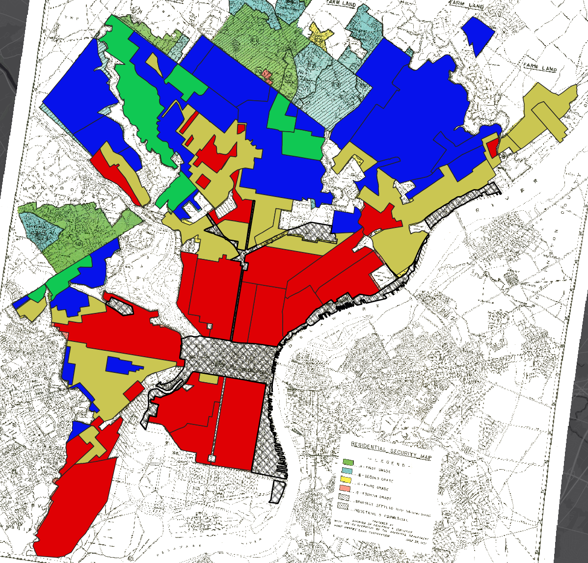
Shown here is a map of Philadelphia redlining, overlayed with mortgages provided by Berean (African-American owned; shown in teal dots) and MetLife (not; shown in Pink dots). The redlining map behind correlates as such: green=best region for loans, blue=still desirable, yellow=definitely declining, and red=hazardous. The hatched regions are business/industrial. Interestingly, a lot of loans are noted in the red and yellow areas–which one would hypothesize banks to steer clear from. Berean certainly favors the red areas, which is not surprising as African-Americans were marginalized in the loaning business. Therefore, an African-American business would have to step in to support their own community. In the blue/green areas, good for loaning, there are almost exclusively MetLife mortgages–yet these mortgages are still few and far between. MetLife has the majority of mortgages in the red/yellow areas, which is shocking. Why would a business lend to areas that are considered hazardous for exactly that? This is investigated further through many raster layers.
- Which regions had the highest interest rates?

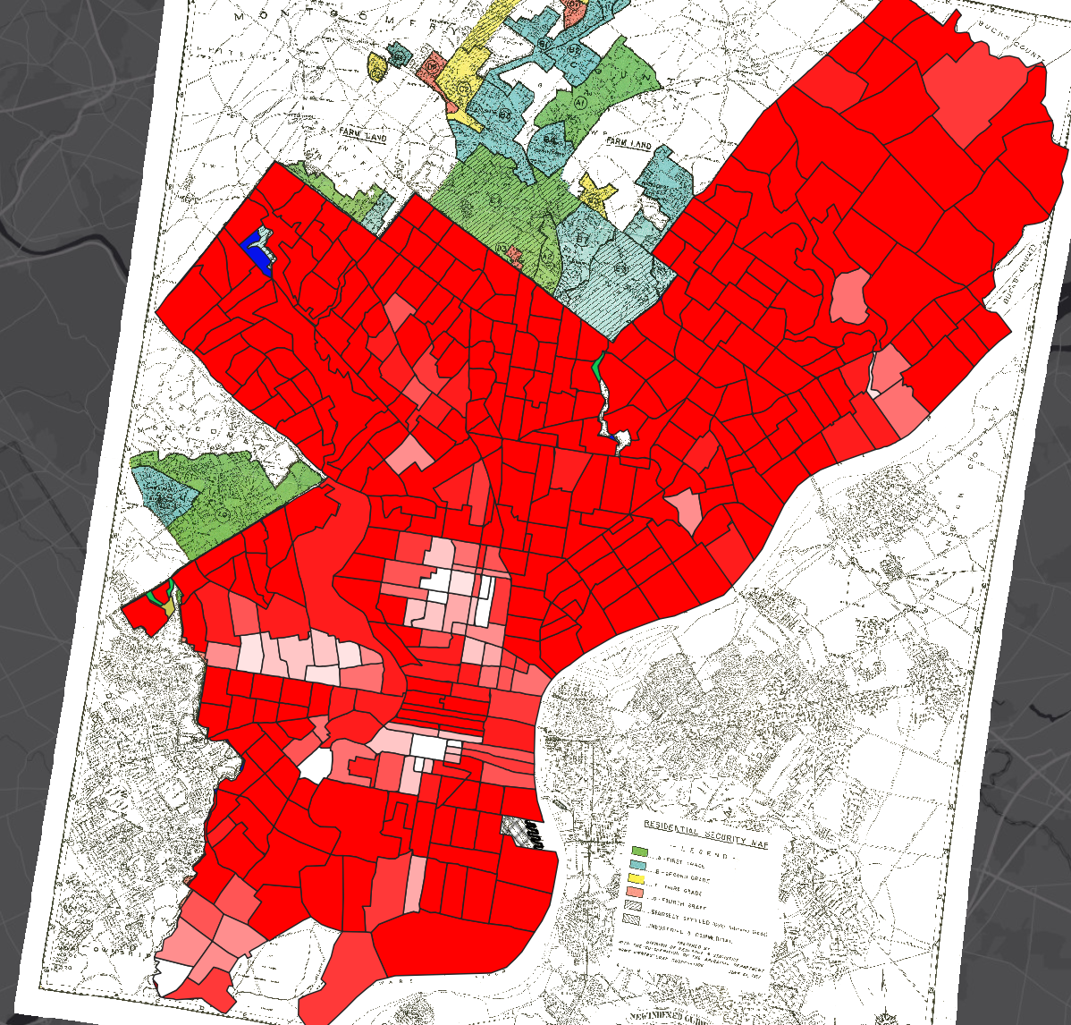
Overlaying the two maps above, a direct correlation is able to be seen. The interpolated map on the right notes interest rates: red is highest while yellow is the lowest. The map on the right is the HOLC map: which is described in the question above. Obviously, there are some outlier areas, but for a trend as a whole the highest interest rates are in the areas deemed D/C or risky for lending companies. In a business sense, this makes complete sense. If you are taking a risk, you are not going to give them the same benefits that good lenders would get. However, the “bad” areas are heavily racialized and for this it tended to be majority African-Americans receiving this negative penalty. Yellow (lowest interest rates) is found in green or blue regions of the HOLC map, and red (highest interest rates) are found in the yellow and red regions of the HOLC map. This only made it harder for underprivileged populations to pay off their loans, further lowering their status and perception in the community.
- What indication do you see (if any) that HOLC maps caused redlining (as opposed to mapping preexisting discrimination). If none, what additional historical evidence do you think you might need to establish this relationship?
Personally, I would need more information to be able to establish and conclude that these maps created redlining. I do not feel as if there is enough supporting data to rightfully come to a conclusion, no matter of my internal feelings for the subject. The HOLC maps certainly created borders within cities that furthered unequal sharing of opportunities, but I do not have data to back up the point of redlining. Businesses are less likely to go into areas that are risky; that is just the fact of the matter. Would you be willing to take your family into areas with less access to education, churches, grocery stores, safety, etc.? (rhetorical question) I presume not. I would need many more years of tract data to see how these maps influenced racial separation and population within the HOLC areas, and then I would feel comfortable making a conclusion. If from 1937 (the year of HOLC mapping) forward, the racial composition shifted more towards minority populations being in the C and D areas and economic/living conditions declined, then I would conclude that HOLC maps caused redlining. If however, I look at maps from before 1937 up to ~1950s and the racial composition/separation and economic/living conditions of the area appears unchanged, I would not feel comfortable coming to that conclusion. Instead, it would make me feel as though the HOLC only mapped pre-existing discrimination and a different root cause would need to be focused on. I would need even more data to then support HOLC and redlining. Correlation does not always mean causation–an important factor everyone should not when trying to come to a conclusion.
- What additional data layers do you think might supply evidence of discriminatory housing policy/segregated urban development that you don’t have access to in this exercise?
As noted in the answer above, I would like to see data of economic outputs, education centers, crime rates, etc. of all areas of the HOLC map. If the numbers are true and support the HOLC map, then I do not feel as though it is true discrimination. If however, the HOLC areas tend to simply mark minority racial population/composition as bad, and it does not correlate to the data above, then the policy is DEFINITELY discriminatory.
This map shows the percentage of white population in 1950. Nearly the entire map is dark red, 90+ percent white. The areas lower in white density do in fact represent SOME areas that are marked red on the HOLC map, but certainly not all areas. There is some correlation with race, but I need much more data to come to a representative conclusion that race is the main factor. Again, I would like to look at living conditions and most importantly economic output/status of the boundaries. Similar to today, if you have a bad credit score then loans are harder to get and you get a higher interest rate. Is that discrimination? No, it is business and estimated risk. If the economic status of the D areas truly is bad, then that risk is higher for loaning companies and interest rates will tend to be higher.
- Create one clear, legible map that you think best demonstrates the most compelling visualization of redlining in Philadelphia.
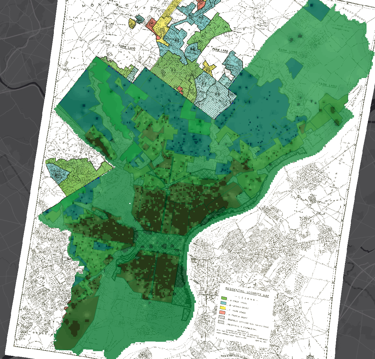
In this map, I changed the interpolation transparency and color so that the HOLC map background could be seen through the interest rate interpolation data. The darkest areas of green have the highest interest rates, lighter areas have lower interest rates. The HOLC map regions are still able to be seen so that you can correlate interest rates and areas deemed “bad” for loaning companies. It tends to fit exactly as expected: areas in red have the highest loans.
Nicely done!