
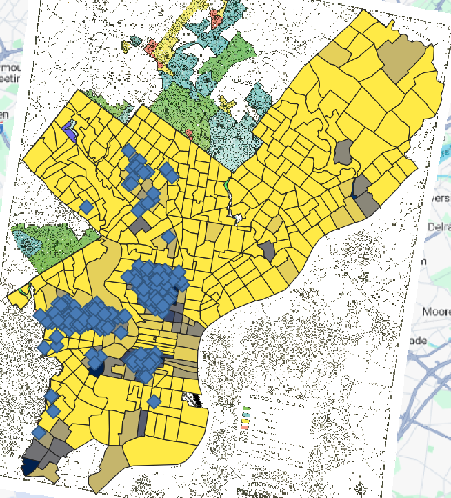
Within the city of Philadelphia, the African-American owned mortgage company Berean almost exclusively provided mortgages to homebuyers in predominantly black neighborhoods in the city. Because of the nature of redlining and how the Home Owners Loan Corporation (HOLC) consistently rated predominantly black neighborhoods as “D – Hazardous,” most of the mortgages Berean provided were to homebuyers purchasing homes in areas carrying this mark from the HOLC with only a few outliers in neighborhoods marked “C – Definitely Declining.”
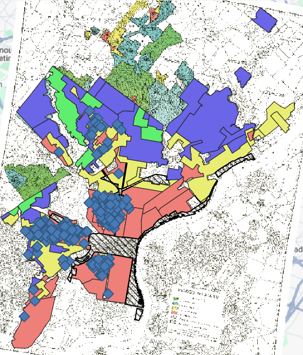
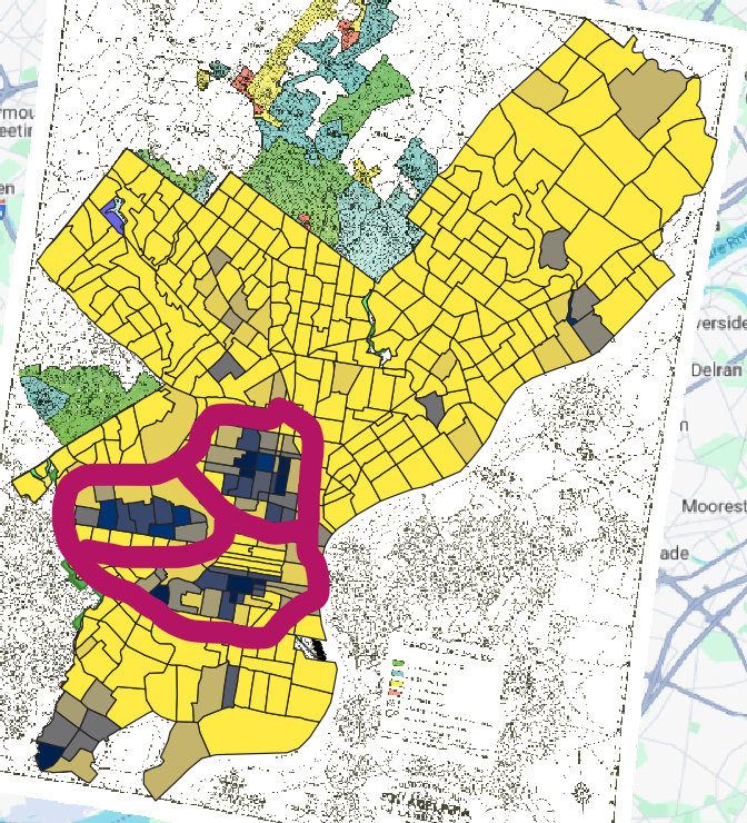
In contrast to the locations of Berean’s mortgages, most of the mortgages Metlife provided within the city of Philadelphia were in neighborhoods rated “A – Best,” “B – Still Desirable,” and “C – Definitely Declining.” However, there is a sizable amount of mortgages offered in the western part of the city in a zone marked as “Hazardous” by the HOLC.
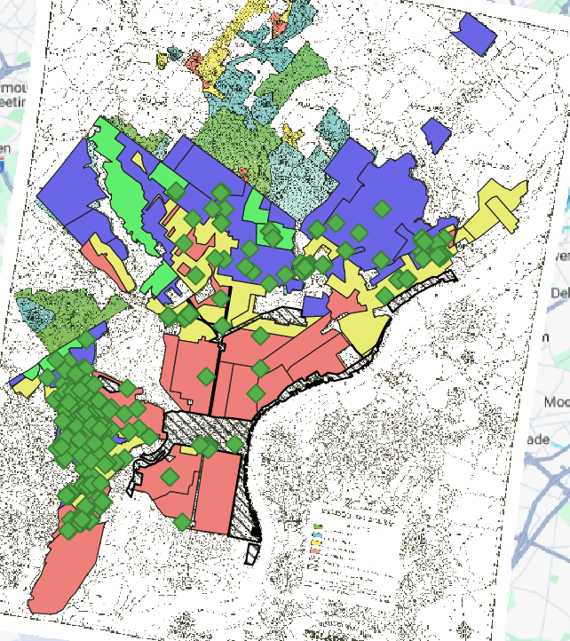
The location of most of Metlife’s mortgages also coincides with neighborhoods that have a high percentage of white residents, outside of a few predominantly black neighborhoods in the western part of the city. These outliers are circled above.
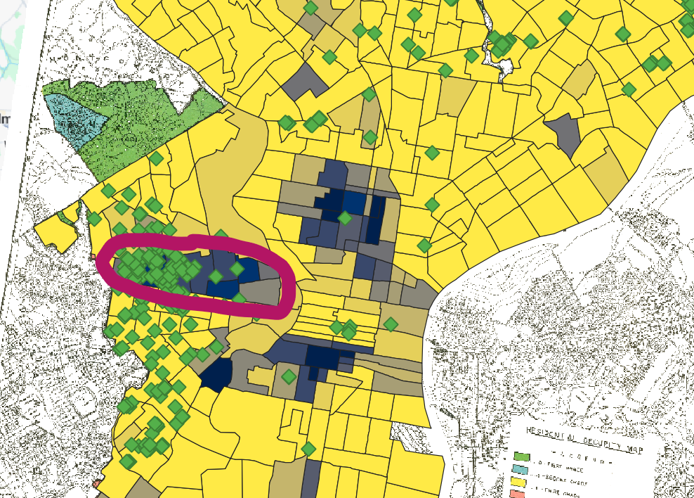
Across the city of Philadelphia, the mortgages with the highest interest rates are located in predominantly black neighborhoods that the HOLC designated as “Hazardous” on their redlining maps of the city.

While I do not immediately see any indication in the data I have mapped that indicates the HOLC maps caused redlining in Philadelphia, there are two datasets that I believe, when mapped, would allow me to make that determination. The first dataset is the percentage of black residents in each neighborhood in Philadelphia prior to the publication and distribution of the HOLC map. With this dataset, I could compare where the black population of Philadelphia lived, before and after the publication of the HOLC maps of the city to see if the maps caused redlining in the city. Additionally, I would also want to map data on where racially restrictive covenants existed on deeds for homes in the Philadelphia area after the HOLC published their map of the city. I could analyze whether these covenants correlated with the HOLC zoning of the city providing me with further evidence as to whether the HOLC maps of Philadelphia caused redlining in the city.
As previously mentioned, an additional data layer showing where racially restrictive covenants existed in the city of Philadelphia would supply superb evidence of discriminatory housing policies and segregated development. Another data layer that could be useful to analyze evidence of segregated development would be to add a map layer that included data of when the first black family moved into a neighborhood and how long it took before widespread “white flight” took place and white residents in the neighborhood moved out. While this data would likely be difficult to find and conglomerate, I believe it could be exceptionally useful to analyze segregated development and discriminatory housing practices.
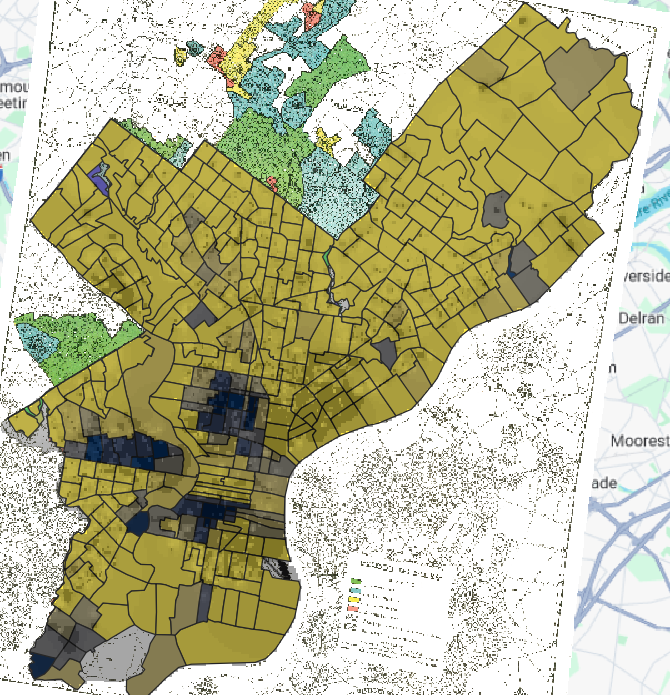
Below is my map that I believe is the most legible map that best demonstrates the most compelling visualization of redlining in Philadelphia with the data I used. It maps the percentage of the population in a neighborhood that was white with an semi-transparent, overlaid layer of interpolated mortgage rate data on top of this white population percentage layer. The markedly higher mortgage rates in predominantly black neighborhoods effectively communicates their “undesirability” and disinvestment as they are presented as “high risk” and “hazardous” areas.
Nicely done – I agree, a map of covenants would be VERY helpful. The problem is, there’s no central archive for them. They are riders attached to individual deeds. UNO is currently trying to collect and map them for Omaha (and other cities have their own initiatives, but its incredible expensive and time consuming work.