Blog Post Feb 19 Evan Murphy

The Vaughan reading was interesting to me because of the nature of the large questions it attempts to answer, especially the first map in the book. This map of Imola by Leonardo da Vinci stands as the first map in the book due to the accuracy of measurement that went into in to ensure it was accurate, although the center is arbitrarily set. Although I love da Vinci and his works all around, I chose this map for a different reason. Precision of measurement is what maps needed within urban areas to enforce a sense of otherness.

Vaughan Page 3

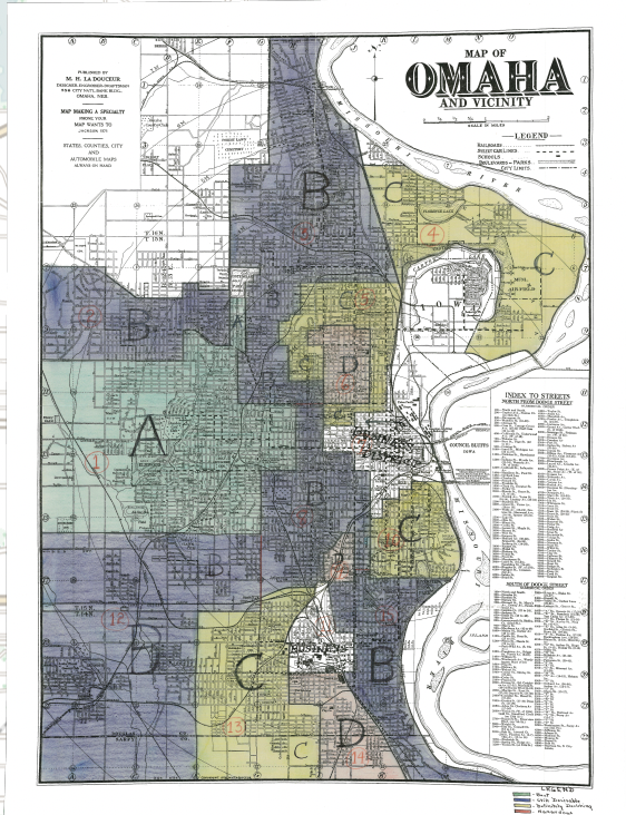
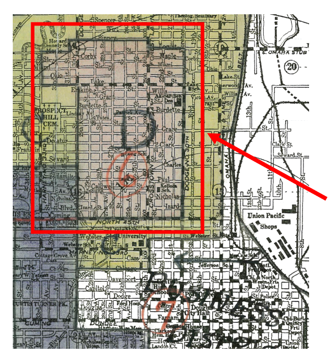
Below is a portion of the HOLC Security map or redlining map of Omaha that I found particularly interesting. As I mentioned above a strict understanding and measurement of a place is necessary to divide an area and create segregated and separated cities. However despite the extreme measurement that goes into a map like the HOLC Security maps, so much of the division is entirely arbitrary. Most of the other divisions on the map fall within city blocks and do not divide them in half, however parts of this map follow the boundaries of the highway rather than the city blocks which makes things very confusing. The justification that comes to mind for me when thinking about this is that the ASARCO plant is not sitting along a border with this scheme but map be if the divisions followed city blocks. Overall the divisions make little sense and appear to have been done in a haphazard way.

HOLC Residential Security Map of Omaha

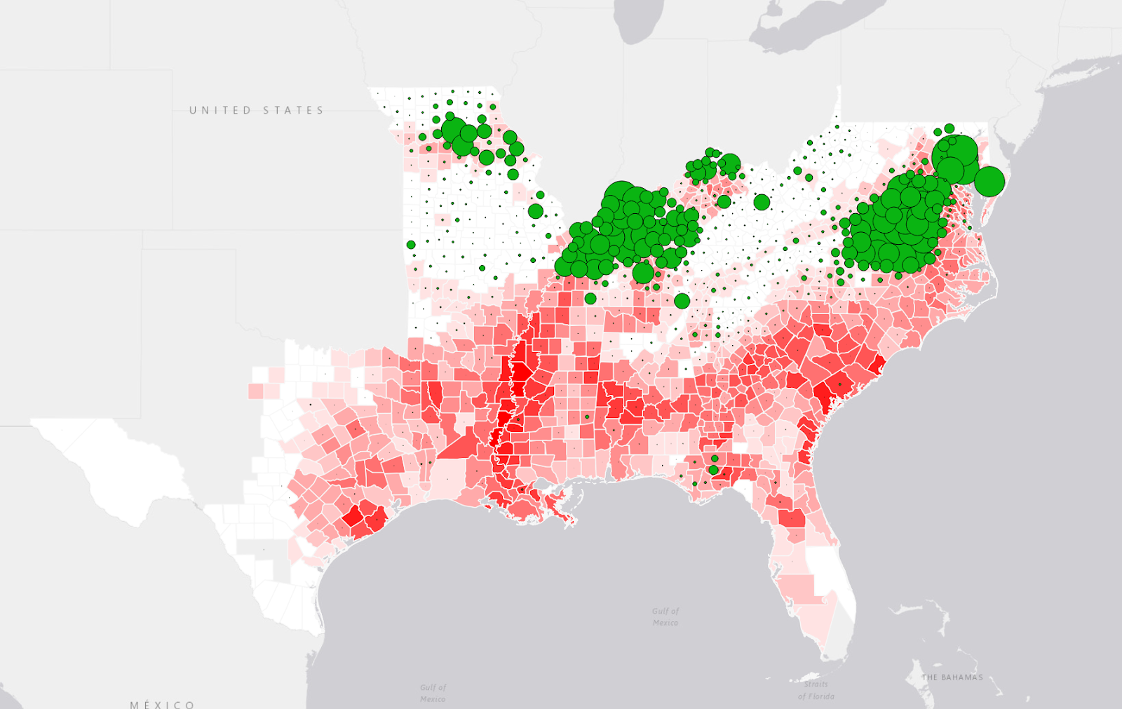
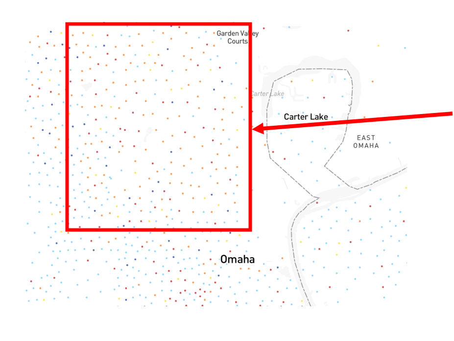
Displays of division are very interesting on maps as they are clear and easy to read. For the CNN map I figured it would make the most sense to look at a place I am familiar with so I went with Kansas City. Like Omaha, KC had some redlining issues that still lead to a certain level of separation today. It appears that there has been some reduction of separation in the city but it is still present and the visible white absence in the city is notable as well. The recovery from segregation in KC is also interesting due to the extension over the state lines. The concentration of white people in the Overland Park and Olathe area is also impressive. The accuracy that da Vinci’s map showcased is present in these maps and is what maps maps powerful in the first place.

Race and Ethnicity across the nation, Keefe, Wolfe and Hernandez

Sam Ellerbeck Blog Post 5: Redlining

The 1936 Residential Security Map of Omaha [1] drew distinct borders around parts of the city, creating a tool for banks and lenders to analyze potential risks in extending loans in particular areas of town. This map attempted to make the argument that one’s socioeconomic status is almost completely dependent on race, and in doing so, it perpetuated racialized structural inequalities.

Residential Security Map of Omaha, 1936. From HOLC. [1]

The map itself labels areas of western Omaha as the “best” or “desirable” areas for extending loans to. North and South Omaha, on the other hand, are given descriptions of “declining” and “hazardous.” These notations effectively marked particular areas of the city of Omaha not only as cautious for loan distributions by banks, but also as impoverished peoples and locations.

Legend that labels particular areas of Omaha. From HOLC. [1]

These labels, unfortunately, were based primarily on assumptions about certain racial and ethnic groups. The areas that constitute “declining” or “hazardous” regions on the map are made up of a predominantly minority population. Therefore, this Residential Security Map created narratives that minorities, such as black or hispanic populations, are a greater risk for banks, even if that wasn’t necessarily true. In the book Mapping Society, the author notes that financial risk was assumed based on a person’s location and racial makeup of that location. For instance, someone living in North Omaha may be assumed to be financially risky on the basis that they live in a heavily minority region, regardless if the person “did not at all represent a financial risk.” [3]

Map showing race and ethnicity in Omaha. White is blue, black is orange, and hispanic is red. From CNN. [2]

In making these racialized assumptions, the Residential Security Map of Omaha (and many other maps across the United States) created inequalities which today’s society still witnesses the effects of. Individuals in redlined areas had reduced autonomy in the selection of available lenders, and they frequently were offered higher interest rates than individuals in A/B areas were [3]. Consequentially, this created a large socioeconomic disparity that perpetuates racialized marginalization.

[1] HOLC. 1936. “Residential Security Map of Omaha.” Mapping Inequality. https://dsl.richmond.edu/panorama/redlining/map/NE/Omaha/areas#loc=11/41.2827/-95.804.
[2] Keefe, K., D. Wolfe, and S. Hernandez. 2021. “Race and ethnicity across the nation.” CNN. https://edition.cnn.com/interactive/2021/us/census-race-ethnicity-map/.
[3] Vaughan, L. 2018. Mapping Society. UCL Press, pp. 153-167.

Riley Filipowicz Choropleths

Corn

Cotton

Sugar

Tobacco

Wheat

Slavery

  1. I think slavery was most used in areas that had high production of tobacco and cotton. I think the choropleth map of slavery details that well. Now obviously slavery was used for all the other crops as well, just not as much. While corn was grown in areas with slavery, it wasn’t as strongly associated with plantations. Wheat production, more common in the Northern states, had less reliance on slavery. Similarly, sugar production in areas like Louisiana and Florida involved significant slave labor.
  2. The areas of these crops were very important for the confederacy. The production of these crops was huge for the economy of the slave states. You can tell the further south you get, the more slavery is prevalent. That shows just how important slavery was as well. A lot of the slaves and crops are located along the Mississippi river showing how important the river was as well. I think that’s why it was the Union’s goal to attack these areas because you would be able to crucify the confederacy’s economy.

Gabe Murphy: Blog 5

Similar to last week’s maps, the maps and readings assigned for this week highlight the segregation and separation of individuals based upon race. The redlining discussed in the reading and shown on the HOLC Residential Security Map of Omaha only furthered the divide as decreased lending lead to even higher costs of operation for businesses, a lack of power/voice in the community, and the lack of opportunity in many things: church, economy, school, anything that would have helped them raise their grading. This was an intentional divide, used to further separate blacks from their surroundings in a method of systemic racism. As stated in Vaughan pages 155-156,

Vaughan – “Nationalities, Race, and Religion” in Mapping Society (2018) pgs 155-156

And this is still noticeable in many communities today. For that, we must take a look at a current map noting race and ethnicity using dot vectors to map populations. The Newark area is highlighted below:

Race and ethnicity across the nation, John Keefe, Daniel Wolfe and Sergio Hernandez, CNN. 2021

Whites are represented in blue, Blacks in orange, Hispanics in red, Asians in dark blue, Hawaiian/Pacific islander in purple, Indian/Alaskan in green, and everyone else in yellow. Taking a quick glance at the map above, which uses dot vectors to note population/race data to show differences, the physical separation of races within the city’s borders is easily seen. Blacks and Hispanics live amongst each other, but whites are hardly found in the area. This was the goal. Using loans, and redlining maps, races could be separated within the city in a legal and methodical way. Taking a closer look at Omaha, it is easy to see how it was done.

HOLC, Residential Security Map, Omaha, 1936

A snippet from the HOLC marking areas in Omaha is shown above. A is the best place to loan, B is desirable, C is declining, and D is hazardous. White areas represent business districts: which were left out because residential areas are what this map, and racial method, concerned. As seen, the ‘D’ areas are noted in red, which is where the term redlining came from. Though supposedly using industry factors as sale/rental demand, age/type of buildings, economic status, schools/church/business centers, nearly all Black communities were shown in red: D status, hazardous loaning. Looking back at the current racial map Newark and surrounding areas, this method succeeded. Whites have been granted spatial separation from other races that would have been considered detrimental in the 1930s, when redlining was gaining its ground.

Isabel Blackford Week 7 Blog Post

Racial segregation is something that not only happened in the past in the United States but continues to be seen in modern America. In the past the racial/ethic segregation was much more pronounced in its separation, however it can still be seen much more subtlety in the present day. In the past it was very clearly mapped in cases like in Chicago during the 1890s the Hulls-House Maps were published which demonstrates how different blocks of the city were home to immigrants of different nationalities (Vaughan, 162). While some call the immigrants living in a separate area a ghetto, it can be argued that immigrants are attracted to live next to those who are similar to themselves to find a sense of belonging in a new country (Vaughan, 162). While it can be debated whether or not the living arrangements were because of the city’s xenophobic planning, or because immigrants were trying to live next to people like themselves, it can clearly be seen that regardless of the reason people of the same nationality tended to group together.

However there are different examples in the United States where segregation is much more pronounced and emphasized through redlining. Although on the surface of the map it never outright mentions a certain race is placed into a particular area, the zoned areas that are deemed Definitely Declining (C) and Hazardous (D) are also areas the house primarily African American populations (Bednareck). In particular D zones that were labeled as Hazardous are zones that African Americans were redlined to and could only get loans for housing in those areas which made it hard for them to live anywhere but these areas creating segregation (Bednareck). The racial segregation is much more present in this map because the areas are label by descripting their conditions and the worst conditions African Americans were financially stuck because banks would not give them loans for any other zone, creating a purposeful segregation.

Lastly, a map of New York City during the modern day shows that racial groups still group together, reflective of the first map of Chicago. Today we can hope that the grouping is more demonstrative of an ethnic enclave than a racial segregation and is a common feature in many cities today “stem[ing] from a natural preference to mix with people like oneself” (Vaughan, 130). This is demonstrated in the current day map of New York City where racial groups are seen to group together and this can potentially come from the past of redlining where groups were forced into certain areas by banks but might have never left those areas as they became ancestral homes to these groups.

References:

Bednareck, Janet. “Mapping Inequality: Redlining in New Deal America.” Digital Scholarship Lab. Accessed February 17, 2024. https://dsl.richmond.edu/panorama/redlining/map/NE/Omaha/areas#loc=11/41.2471/-96.0627.

Keefe, John, Daniel Wolfe, and Sergio Hernandez. “Map: Race and Ethnicity across the US.” CNN, August 12, 2021. https://edition.cnn.com/interactive/2021/us/census-race-ethnicity-map/.

Vaughan, Laura. Mapping society: The spatial dimensions of social cartography. UCL Press, 2018.

Riley Filipowicz Blog Post 5

The map detailing different conditions of San Francisco’s Chinatown in the 1880s. It shows the locations of various activities, particularly focusing on vices. Chinese Prostitution is found in more visible areas, possibly to attract passing traffic, while White Prostitution, which was considered especially horrifying due to reported opium addiction among women involved, is concentrated on wider and presumably more accessible streets. The map also marks White’ businesses or dwellings on the edges of the area.

The map’s use of color intentionally emphasizes problematic aspects of the community. A closer look reveals that the tan-colored mass of buildings represents a complex network of businesses. For example, one street block has White Prostitution buildings on Sacramento Street and an tons of retail establishments on Dupont Street to its south.

The purpose of this map was a success. It detailed Chinatown’s buildings and inhabitants. It played a significant role in fueling racist challenges to the existing pattern of living in Chinatown. Ultimately, it contributed to the support for authorities in implementing public health regulations aimed at cleaning up the streets and alleys of Chinatown. The map was used almost like propaganda for the people living in these areas. The map, by highlighting perceived issues, played a role in construing everyone else’s opinion about the people in these areas.

I think it’s crazy that even maps today kind of are used to encourage people to live in certain areas. This is a map of Omaha, where the highlighted green is considered the best place to live. Two completely different cities and two completely different times, but both use maps to sway the inhabitants of the city. When my family moved to Omaha we built a house in Elkhorn, which is highlighted green. Wherever I was in Omaha I felt weird saying I was from West Omaha because there’s a certain narrative that people from there are rich and snobby. This even continued when I attended Creighton.

The area where my family moved is mostly an all-white area. I am very fortunate that my family moved here and it makes me wonder if they did some research on the best places to live in Omaha. It seems like any time there are new living developments, they’re being built out west, even if they have to continue moving further and further out west. It seems like they are trying to stay away from areas like North and South Omaha.

Blog Post 5 – Declan Dunham

In Laura Vaughan ‘s, Mapping Society, we are presented with the idea of urbanism and how mapping can represent and highlight the divisions in a city. Vaughan discusses how mapping urbanism has represented forms of segregation through groupings. Vaughan writes, “…this role that the city can play in distancing individual behaviour, in allowing for multiple identities to coexist, serves as a counterpoint to the typical framing of social segmentation as problematical”1 . Vaughan argues that self-segregagtion stems from the belief that a person has a natural inclination to be with a group like oneself.

Vaughan also shares how mapping segregation represents economic conditions of areas. By comparing an Omaha census map to the Residential Security Map of 1936, we can see this representation. In the residential security map, areas of Omaha are divided into economic zones. As you can see, there are areas labeled hazardous for economic development. Vaughan writes, “They considered factors such as intensity of the sale and rental demand; percentage of home ownership; age and type of building; economic stability of area; social status of the population; sufficiency of public utilities, accessibility of schools, churches and business centres; transportation methods; topography of the area” 2. The use of these maps created a negative impact on the areas economy. This map prevented any economic advancement and allowed for increased segregation of cities across America.

John Keefe, Daniel Wolfe and Sergio Hernandez, Race and Ethnicity Across The Nation, 2021, CNN
Home Owner’s Loan Corporation, Map of Omaha and Vicinity, 1937

In the map of Race and Ethnicity Across The Nation created by CNN, you will notice that a majority of the African American population is located in North Omaha, while the area of West Omaha is heavily Caucasian. In the Residential Security Map of 1936, the area North Omaha is labeled “Hazardous” and is given a rating of D, while the West Omaha area is labeled “Best” with the rating of A. According to Janet Bednareck, “As Omaha’s Near North Side moved further north, east, and west, African Americans seeking homes met strong resistance”3 .

The Residential Security Map highlights the use of redlining which was a frequent practice in Urban America. This type of map creates a restriction of economic development in African American and other minority communities which continues today.

  1. Vaughan, Laura, Mapping Society: The Spatial Dimensions of Social Cartography (London, University College London Press, 2018), 129 ↩︎
  2. Vaughan, Laura, Mapping Society: The Spatial Dimensions of Social Cartography (London, University College London Press, 2018), 156 ↩︎
  3. Home Owner’s Loan Corporation, Map of Omaha and Vicinity, 1937, Mapping Inequality: Redlining in New Deal America, Janet Bednareck ↩︎

Emma Reed, Blog Post Week 7

The section “Redlining, Apartheid, and the Persistence of Segregation” by Vaughan explores the complexity of segregation through the lens of a socio-spatial entity. Vaughan emphasizes that “while maps will typically capture a single aspect, such as race or nationality, it is clear that economics, politics and urban space itself will all have a role to play in shaping how an individual, as part of a group, will be able to overcome their place in the city.” (Vaughan 159). This clearly shows how over the years, different external factors, such as the government or economic factors, have come into play and affected redlining and segregation. This is an explanation as to why segregation is still a endured phenomenon. Let’s look at this through the example of Omaha, Nebraska.

The map above is a Home Owners’ Loan Corporation redlining map of Omaha from 1937. Many of these maps from HOLCs were made of discriminatory practices as they labeled neighborhoods as desirable or undesirable. The legend above shows that areas labeled in red were deemed “hazardous” and it is also known that the same area in Omaha is a predominantly black neighborhood.

Shifting our focus then to today, the map above shows the population according to density and group, with the legend located at the top. If we compare what we learned about historic redlining and segregation from the 1937 map of Omaha to this map, we can clearly see its lasting effects. Northern Omaha is still home to a predominantly black population proving that redlining is a concurring problem in today’s world. Issues today are still feeding this problem such as low government funding in these areas, and environmental issues such as the close approximation of landfills, powerplants, or factories to these neighborhoods, leading to a continued cycle of segregation.

“Map: Race and Ethnicity across the US.” CNN, Cable News Network, edition.cnn.com/interactive/2021/us/census-race-ethnicity-map/. Accessed 17 Feb. 2024. 

“Mapping Inequality.” Digital Scholarship Lab, dsl.richmond.edu/panorama/redlining/map/NE/Omaha/context#loc=14/41.1773/-95.8907. Accessed 17 Feb. 2024. 

Vaughan. Mapping Society, 2018, discovery.ucl.ac.uk/10056449/2/Mapping-Society.pdf. 

Gabe Murphy: QGIS Activity – Census Data

The maps above go in order of: enslaved population density, corn production, wheat production, tobacco production, cotton production, and sugar production. 

  1. How would you describe the spatial relationship between slavery and counties with high production of:

a. Corn: in this map, corn is found nearly everywhere. It is rather hard to even see county lines, or the base layer underneath. Areas high in slaves are also high in corn production. However, areas with little to no slavery are also seen with high outputs of corn. Where they are used, there is high production. Where they aren’t, there is also high (but lower) production. In this case, enslaved populations help, but do not limit, the farming of corn.

b. Wheat: wheat is found in the northern/northeast region of this map. In relation to slave density, it overlaps more with low slave density than with high slave density. The white/pink/light red sections of the map (lower slave densities) have a lot of wheat production, while the southern and darkest red sections (highest slave density) tend to not have a whole lot of wheat production. In this case again, slaves help a large part to increase wheat production, but the land with highest density of slaves is not allocated for wheat.

c. Tobacco: in the map dotted with green, tobacco is seen to have two main hubs of production: north/northeast regions. These areas are in the middle ground of slave density–not the highest but still relatively large numbers of slaves. Tobacco is hardly seen in areas with low slave density (white sections of the map), so the spatial relationship is such: found in the middle numbers of slave density, pinkish/light red areas.

d. Cotton: this map was the most interesting. When looking at the slave density map without any overlay of cash crap, there is a shape formed by the dark red areas–nearly a wave-like figure from west to east. Then mapping the cotton production, the dots follow this shape nearly to a T. In areas with high slave density, cotton production soars. Areas with low slave density, cotton is few and far between. This cash crop has the highest spatial correlation with slave density. 

e. Sugar: this crop only has one major hub–shown in yellow in the boot of Louisiana. This area is again high in slave density, so it shows that there is a large reliance on slaves for sugar production. However, it is not as widespread as cotton is. This may be due to soil conditions, climate, etc. Sugar is not found in every area with high slave density, but the area it is in does indeed have a high slave density. This makes it hard to spatially relate as an entire map–it is more geographically related to modern day borders of Louisiana. Though hard to spatially relate to high slave density, it is easy to spatially relate to NOT being in counties with low slave density. There is hardly any sugar found in counties with white shading–in fact, I only see one. 

  1. How might you determine the relative importance of these crops for the confederacy?

The main confederate point of seceding was that they wanted legal slavery. Using the slave density of counties, while overlaying it with the density of cash crops, a correlation is found. The darkest red spots are the highest density of slaves, while white is the lowest density. The crops that are found in the dark red areas of the map would likely relate to the most important crops for the confederacy. High density of say, cotton, in the areas with high slave population density would mean that cotton was an important cash crop for the confederate economy; conversely, wheat is hardly represented in the dark red areas of the map, showing that the confederacy would not have relied as heavily on this crop for economic/trade value. Using this for the rest of the crops, simply observe and find correlations. If crops are found high in density in the dark red sections of the map (high slave population density), then this crop was likely important for confederate farmers/economy. If found in the white or light red regions (low slave density), it would have little (or much smaller) importance to the confederacy.

Redlining: De Jure Yesterday, De Facto Today – Payton Mlakar

In her book Mapping Society, Laura Vaughan discusses how the “spatiality of redlining is even more problematic if we consider how it had the effect of setting in stone what might previously have been more fluid boundaries.”[1] Here, Vaughan highlights how racial, economic, or ethnic boundaries were codified into society much more thoroughly through intentional spatial segregation practices like redlining. When comparing redlining maps of Omaha, Nebraska from the 20th century to maps of census data from 2020, one can clearly see the social codification of what was once lawful segregation that remains a de facto spatial reality today.

In the 1937 map titled Map of Omaha and Vicinity, Omaha was broken into sections as a reference for mortgage companies to refer to when determining if offering home mortgages in neighborhoods around Omaha was going to be beneficial or “hazardous.”

Legend from Map of Omaha and Vicinity Courtesy DSL.Richmond.com

At the very center of the map, clearly shaded and marked as “hazardous” in red is North Omaha.

Redlined North Omaha from Map of Omaha and Vicinity Courtesy DSL.Richmond.com

The red coloration of this “hazardous” area not only gives the term “redlining” its name, but also connotes evil or danger to those reading this map.

As Vaughan mentions, “[A]lmost all black neighborhoods were classified as grade D, red. . .”[2] This meant that most of the people living in Northern Omaha in the red, “hazardous” zone were African Americans who suffered targeted discrimination in housing, economic opportunities, and education opportunities through the redlining of their neighborhoods.

The lasting de facto codification of the discrimination that characterizes redlining remains evident long after it became illegal on the map titled Race and Ethnicity Across The Nation created by CNN based on data from the 2020 U.S. Census. This map is a dot density map that uses different colors of dots to represent different racial or ethnic groups represented on the United State census.

Legend and Omaha Map Overview from Race and Ethnicity Across The Nation Courtesy CNN.com

If we zoom in on Omaha on this map we can see that most the dots represent people who identified themselves as “black” on the 2020 census live in North Omaha in areas strikingly similar to the boundaries of the redlining map mentioned above.

Predominantly Black Population of North Omaha according to the 2020 U.S. Census from Race and Ethnicity Across The Nation Courtesy CNN.com

This codification of this de facto segregation that persists today in the city of Omaha is evidence of the power of mapping on the “real world.” Redlining maps manufactured hard borders separating previously fluid communities that enabled mortgage companies, the government, others to institute urban segregation that persists today long after these actions have been made illegal.

Works Cited

[1] Vaughan, Laura, Mapping Society: The Spatial Dimensions of Social Cartography (London, University College London Press, 2018), 158.

[2] Vaughan, Laura, Mapping Society: The Spatial Dimensions of Social Cartography (London, University College London Press, 2018), 156.

Map Citations (In Order of Appearance):

Home Owner’s Loan Corporation, Map of Omaha and Vicinity, 1937, Mapping Inequality: Redlining in New Deal America, https://dsl.richmond.edu/panorama/redlining/map/NE/Omaha/areas#loc=14/41.2713/-95.9369, accessed February 16, 2024.

John Keefe, Daniel Wolfe and Sergio Hernandez, Race and Ethnicity Across The Nation, 2021, CNN, https://edition.cnn.com/interactive/2021/us/census-race-ethnicity-map/, accessed February 16, 2024.

css.php