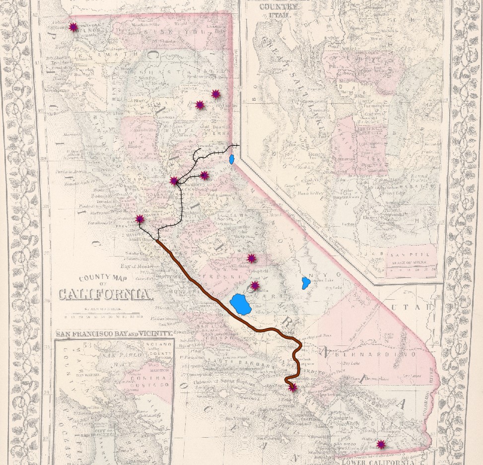
The historical map I vectorized includes certain topographical features, including some peaks and mountain ranges. These are identified with names and images on the map, but lack clearly defined edges. Elevation gain is often gradual and uneven, so pinpointing exact borders to create a “mountain range” vector categorization could prove challenging. Compared to the surveyed county lines and crisply defined lake edges, the high regions of California lack the clear outlines necessary for easily drawing polygon vectors.
One useful attribute to add would have been ID numbers. This project called for only three vector layers, each with a relatively small number of features. However, adding ID numbers aids in organization and clarity when working with spreadsheet data. This becomes especially important for larger datasets (including hundreds or even thousands of individual features). In the case of my specific dataset, attributes like date or population could have been appropriate. For the features in my cities and towns layer (point vectors), I could add date of founding to provide insight into change over time. Adding population count (using data from the U.S. census most contemporary to the map’s creation) could provide insight into the population distribution of the state. Were I to create a new vector layer to identify whole counties, the population attribute could also be applied.
One relationship that stood out to me, as a Californian, is the difference in area between Lake Tulare and Lake Tahoe. Lake Tulare no longer exists, and I grew up traveling to Tahoe and imagining it as a large body of water. Vectorizing the lakes helped me to better visualize the true difference in size between them. Also enlightening are the line vectors identifying railroads and wagon roads. On the original map, these transit routes are often faded and hard to draw out with the eye. Adding bold vectors allows for easier visualization of the transportation networks of California in 1868. Highlighting features with vectors draws the attention of the audience, and presents the historical map in a new way that emphasizes key features. By adding vectors, I was better able to organize my thoughts and reflections on the historical map. I did not add totally new information, so much as drew out key features hidden within the complex historical map to facilitate their study.
1. Are there any features on your historical map that would have been difficult to assign a vector categorization (point, line, polygon)? Why?
On the right side of the map, the Missouri River is depicted, but it is on the edge and varies in thickness. Therefore, I do not think that assigning any vector categorization to it would be easy. Another feature that may be difficult to reproduce on a vector map would be the railroads. On the map, they are very fine and intricate. The railroad lines intersect with each other, too. For these reasons, it would likely be difficult to assign a vector to them that would be both clear and effective.
2. What other attributes (aside from name) do you think would have been appropriate to add to your vector dataset?
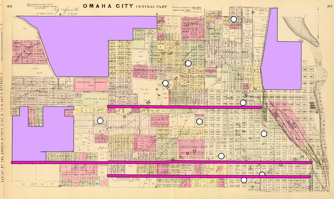
There are many other attributes that could have been appropriate to add to this vector dataset. For example, I chose to assign polygons to empty lots. However, to make this more useful, the square footage and size of the lots may be attributes that should be considered. I also plotted buildings with points, but I think it would be important to indicate what type of building each one is, such as a school or church, and what year the building was established to show the growth and expansion of Omaha over time. Finally, I think that for all the vector categories which I chose to include (lots, buildings, and roads), the coordinates of these locations would be appropriate to add.
3. Did you detect any spatial relationships when digitizing your map that you would not have otherwise? Did you see your historical map in a new way? If so, how?
By digitizing this map, I became more aware of how many buildings there were because I had to zoom in and assign them a point. In doing so, they were easier to see on the map, and I noticed that there seemed to be less buildings near the empty, undeveloped lots. This makes sense as the city was still expanding at this time. Although I did not digitize them on the map, I also noticed the railroads more because they were near the more developed areas where I was plotting buildings and roads. As a result, this process just underscored the idea that in 1885, when this map was produced, Omaha was still developing, and this map shows some of the first foundations of the city.
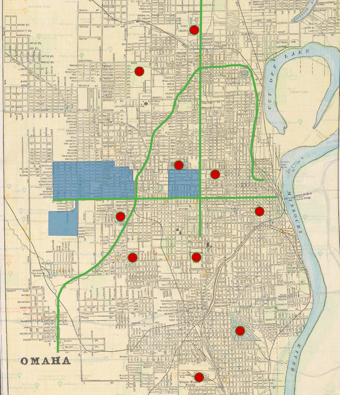
I think a feature on the map that would have been difficult to assign a vector categorization is any body of water. The Missouri River and especially Carter lake were not entirely accurate in their depiction on the map, and so assigning a polygon to these features would reflect inaccurate in comparison to other more recent maps. Also, vector categories would have been difficult to assign to specific buildings for this map. Really, only roads, railways, and parks are shown on this map. Trying to pinpoint the exact location of a building would have been difficult, as the only thing to refer to in terms of location are street corners.
One attribute that I think would be appropriate would be information as to whether each point I placed still exists today or if it didn’t exist when this map was created. Many of the point locations on this map had been present at the time and are still present today, but there were some points that I placed on current locations in which I am not totally sure if they even existed when this map was made. I think that this information would be helpful in offering more context to a viewer of this vectored map. Another attribute I would add would be on the polygons that I created. I decided to use the polygon feature to map out sizable neighborhoods in the Omaha area. Insightful attributes that could be added would consist of things like resident demographics, population size, or even average home price. All these things would allow an audience to be more knowledgable about each particular neighborhood.
One spatial relationship that I observed when digitizing this map was how thorough the railway system was across the entire city of Omaha. I used a line to digitize one of the railways, and I was very surprised at how long just that one route spanned. Also, many of the railways converge near the old Union Stock Yards in the south part of town. It made me view this historical map almost as a tool that displays the usefulness of transportation systems for commercial or economic purposes in Omaha, which is something that I had not considered about the map before this activity.
Are there any features on your historical map that would have been difficult to assign a vector categorization (point, line, polygon)? Why?
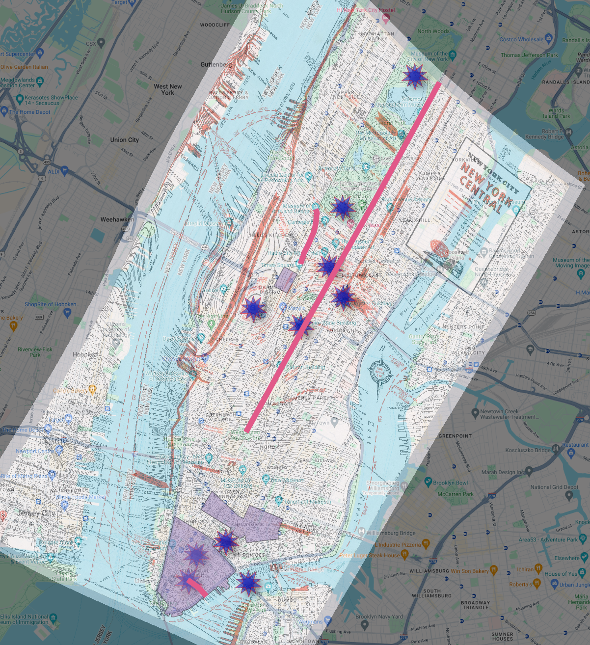
I think some of the areas like Madison Square Garden, and the Rockefeller Center could have been hard to vector categorize as polygons. Both of those places are very popular areas in New York City, but both of them are very small areas, and they could have been hard to see with how large the map of New York City I chose is. Also, the area on the Google Maps and the area on the historical map were warped a little bit, so it would have been hard to find the correct area.
What other attributes (aside from name) do you think would have been appropriate to add to your vector dataset?
I think another attribute I could have added would be the Boroughs that are scattered around New York City. The areas of the Bronx, Harlem, Manhattan, Brooklyn, Queens and Staten Island were places that I thought about after I had already vector categorized The Financial District, Chinatown, and Times Square.
Did you detect any spatial relationships when digitizing your map that you would not have otherwise? Did you see your historical map in a new way? If so, how?
I noticed that 5th Avenue, which is right next to Central Park, towards the top of the map, was the exact same on both maps. When thinking about which streets to add lines to, I noticed that, so that was pretty surprising.
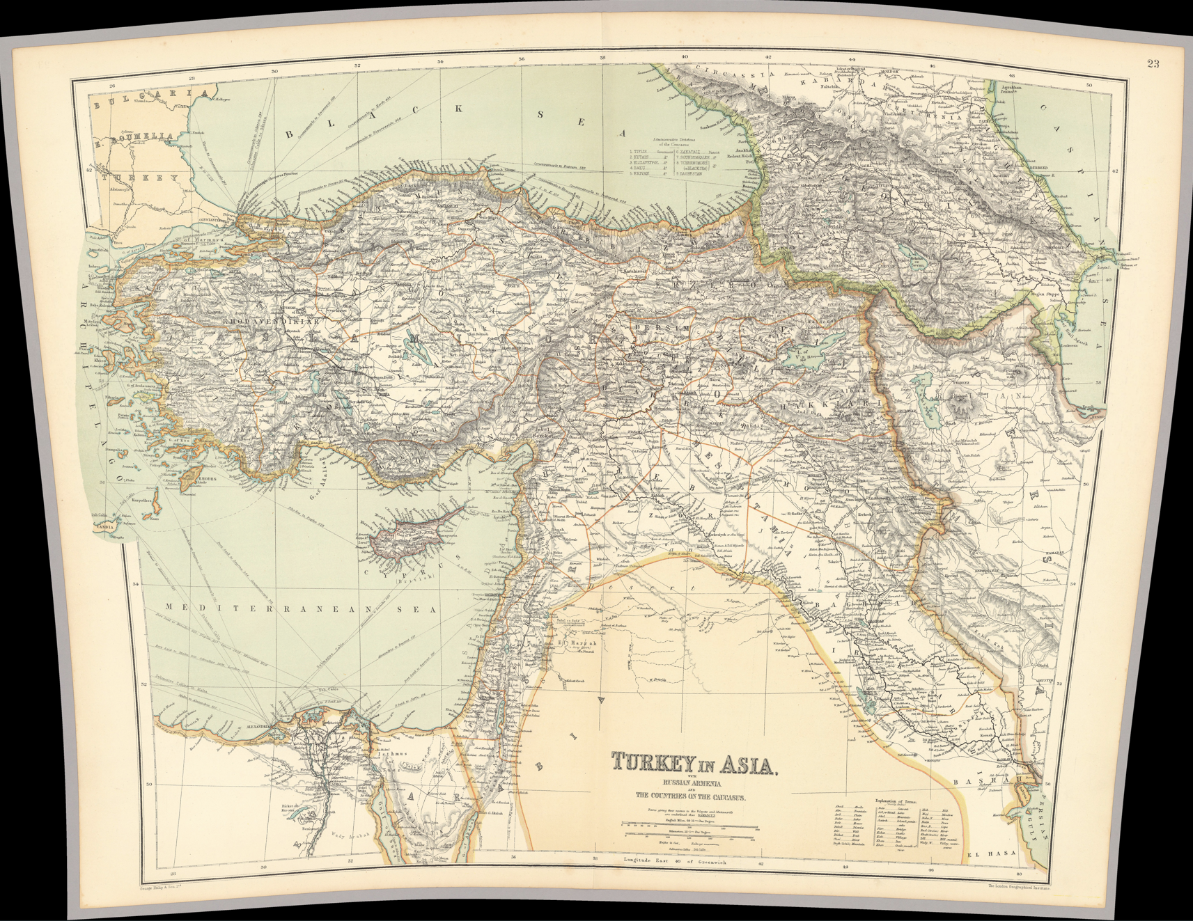
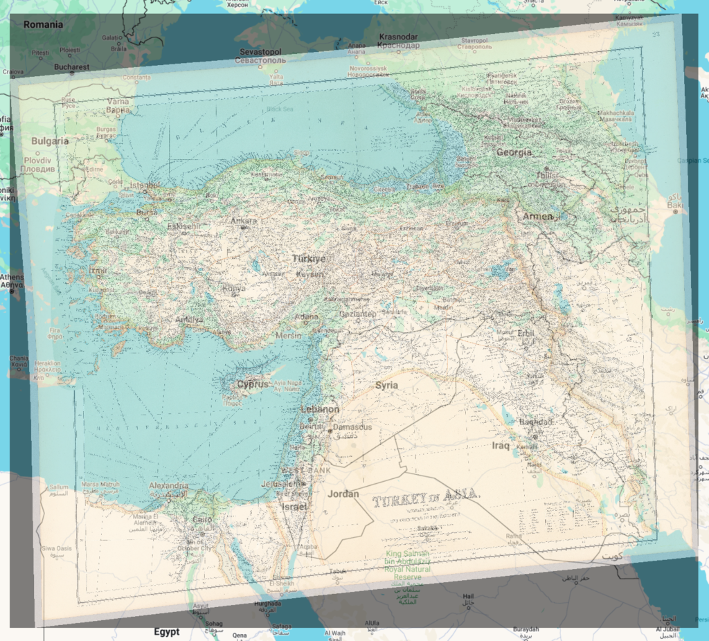
‘Turkey in Asia’ by George Philip & Son Ltd. circa. 1910 (original)
1. Are there any features on your historical map that would have been difficult to assign a vector categorization (point, line, polygon)? Why?
Excluding overcomplicated processes such as hypothetically placing down a bajillion pins to outline the three sea’s pictured inside my map from the perimiters of ‘difficult to assign vector categories’, there are two issues that I noticed over the course of this project. Firstly is something that I see as blindingly obvious, islands, exemplified most obviously by Cyprus. Is it possible to create a zone/zones inside a polygon that are not subject to it’s influence? I don’t know, that’s why I brought it up. Second is the map legend, how could this be vector categorized? Can it be vectored? Possibly if I had to much time on my hands and the line function, but this is unrealistic and not something I think the line function was made with the intention of being used for.
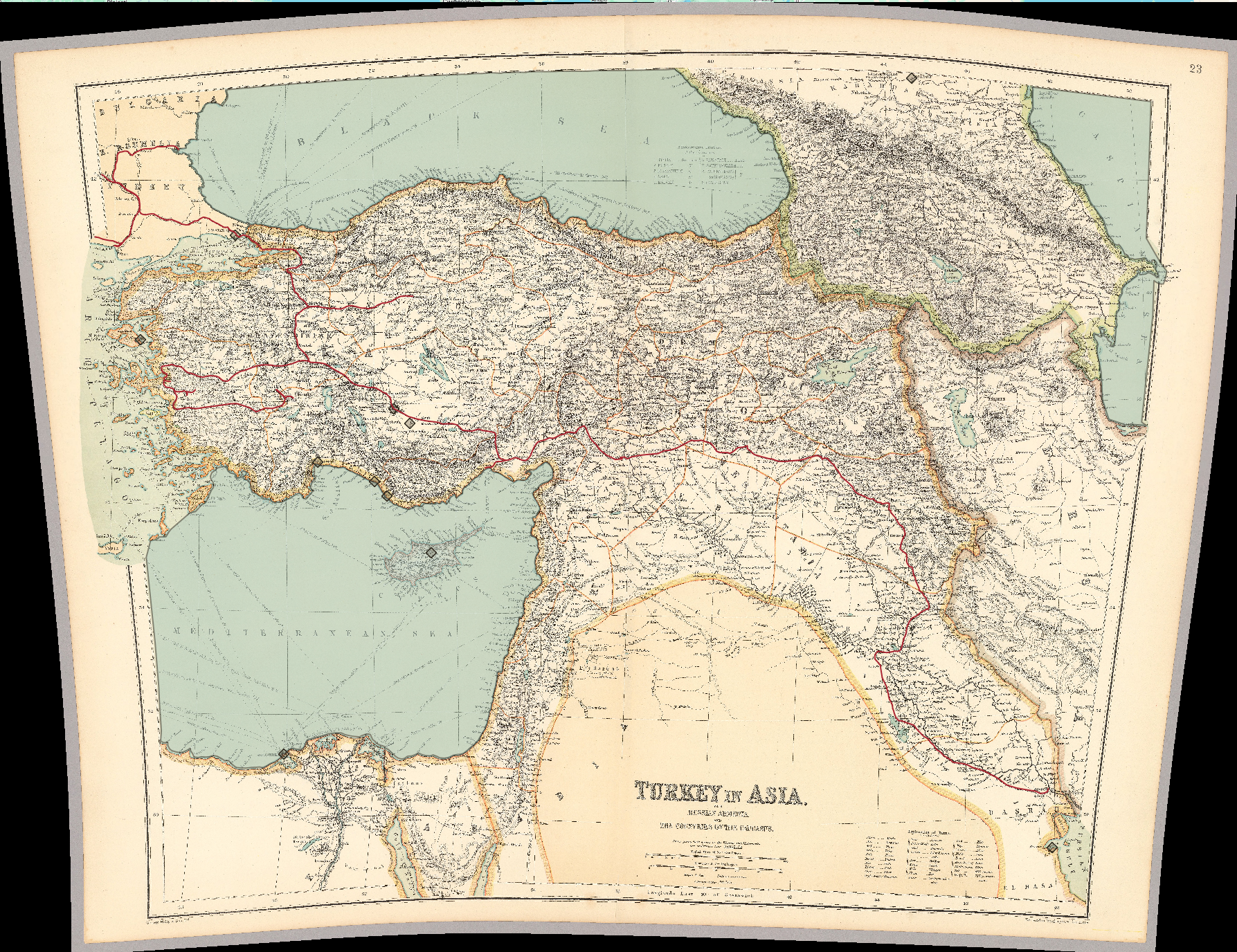
Georeferenced Map -> Vectored Map
2. What other attributes (aside from name) do you think would have been appropriate to add to your vector dataset?
Since I used my point function to designate several cities on this map, I think that population could be a helpful addition if someone was interested in knowing more about the location. Also with the line function that I used to emphasize the railroads that were marked on the map at this time, I think it would be helpful to list how many miles are covered between every branch, especially since this poor map is so warped. Same thing goes for the polygon function I used to outline the Black, Caspian, and Mediterranean sea’s, square mileage or something of the sort I guess.
Final Vectored Map
3. Did you detect any spatial relationships when digitizing your map that you would not have otherwise? Did you see your historical map in a new way? If so, how?
On my last task in this project of tracing the railroads throughout Turkey, I began to notice that they often went through the cities I had previously marked using the point function as my first step. It seems stupidly obvious that I’m now saying it out loud, but there were multiple cities I had randomly placed to get a feel for the function and the railroad happened to connect to them, that is all the justification I can give as a retort. It helped me conceptualize how easy it had become to travel, the spreading ideas and culture could flow smoothly using modes of transportation, like water in a river.
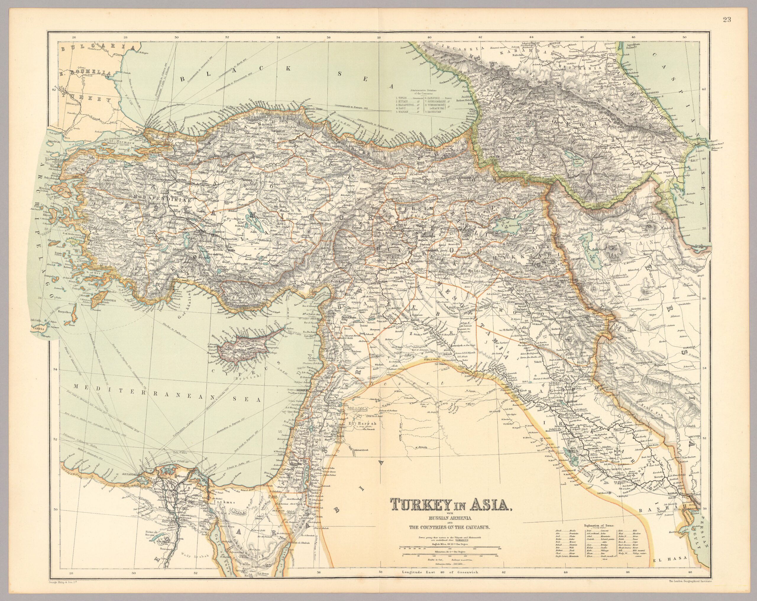
‘Turkey in Asia’ by George Philip & Son Ltd. circa. 1910 (original)
The above map titled ‘Turkey in Asia’ is part of a World Atlas published in 1910 by George Philip & Son Ltd. in London. This company was widely recognized for their precision and attention to detail, something that can still be easily confirmed still today. Through the process of layering this map over one created with satellite-imaging, I learned a lot about this pictured land and its relationship to time through their prominent differences.
Final Georeferenced Result
How might you use this georeferenced image to uncover new information about the history of the region you just mapped.
Through the creation of this georeferenced map of Asia minor, I placed many pins on big cities in different regions and cities close to the coast and periphery of Philip’s map to make sure they alighned with one another. Sometimes though, the capitols of these different regions no longer existed. This map was made right before the start of WWI, and Turkey has undergone many other internal and external conflicts outside of the world wars since the publication of this map. Even this now empty land where a bustling city used to be, this land that’s become overgrown with plants and wildlife since these people’s departure is evidence that can be used to give context to the history of this region. Although the absence of this information can be seen as an unfortunate and unnecessary loss, it’s amazing that even a significant lack of information can be utilized to further understand the context and time this ghost of a city existed within.
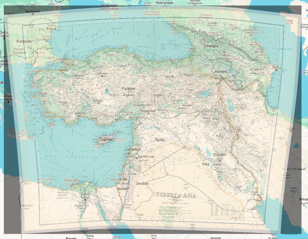
First Georeferenced Result
What are some weaknesses to this approach? Are there inaccuracies? Do some places map better than others? Why?
The above is the first georeferenced map I made. It had 8 points placed without much understanding of what their purpose was and it was bad. The final version, however, I took what I learned with this map and placed 19 points strategically, it’s still not perfect though, obviously, and this is where I think some possible inaccuracies could sprout from. The missing cities I spoke on in the previous paragraph existed, but there were times where I found one I thought was missing, but it turns out it had just changed its name, or because of the inaccuracies in my geomapping it had changed positions quite dramatically. I think that gridded maps, like the one we previously worked with on Omaha, would be much easier to map in this situation because you could simply place a grid on each intersection or prominent unmoved landmark. When it came to geomapping a land as large as Turkey, I found that the flow of rivers change, the ocean recedes or rises, and capitols rise and fall. The impermanence of all of these things though definitely made this assignment much more difficult for me.
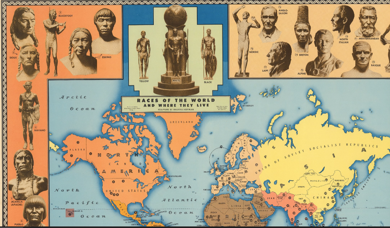
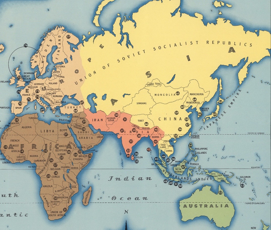
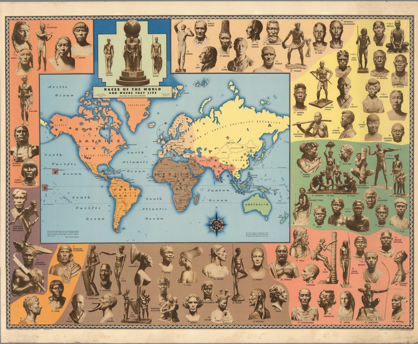
As Jeremy Crampton explains, “a racialized territory is a space that a particular race is thought to occupy” [1]. The representation of human populations in this simplistic manner is largely absent from current cartography, due to a “geographically continuous notion of human variation” and the fact that immigration has “undermined the notion of isolated races” [2]. However, the below map from the early-mid twentieth century represents territory as racialized:
Malvina Hoffman, “Races of the World and Where They Live,” C.S. Hammond & Co., 1944.
The title included in the above portion of the map, “Races of the World and Where They Live,” seems out of place. The modern-day United States and Canada is depicted as completely orange, signifying the inhabitancy of the six indigenous groups listed to the left. Such a depiction ignores centuries of colonization and immigration. Even by the distinctions of race proposed by the map, contemporary North America (in 1944) was inhabited by a greater number of racial populations than was included. Compare to a map from almost eighty years earlier:
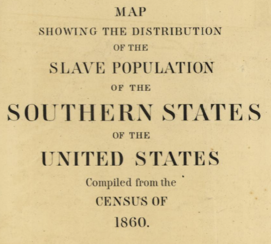
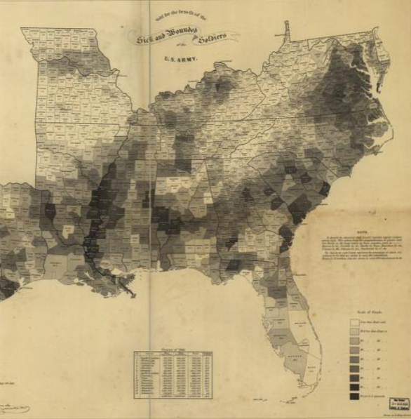
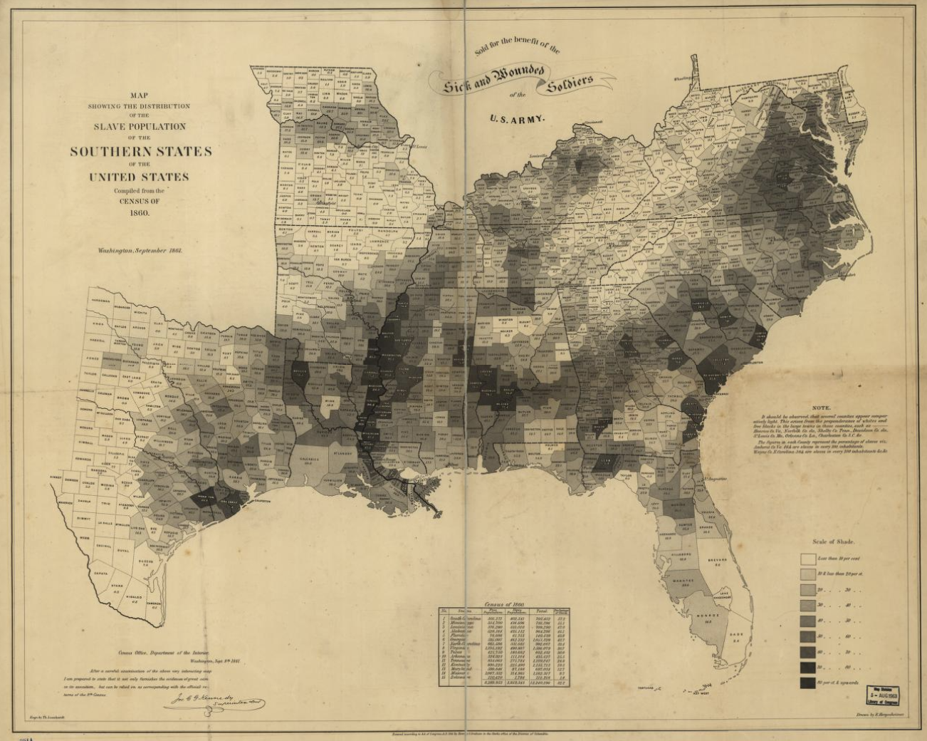
Edwin Hergesheimer, “Map showing the distribution of the slave population of the southern states of the United States. Compiled from the census of 1860,” Washington: Henry S. Graham, 1861.Hergesheimer, 1861.Hergesheimer, 1861.
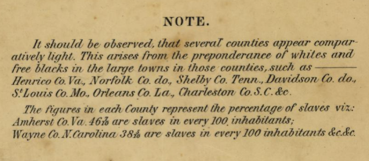
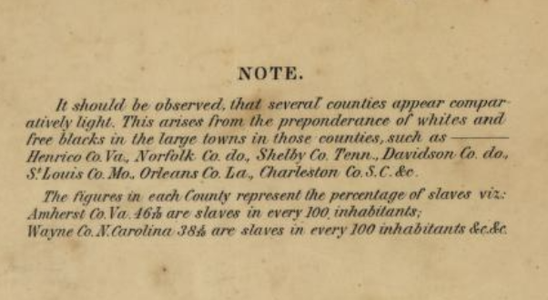
As the second image of the 1861 map illustrates, the distribution of population groups within the modern United States was much more complex than the 1944 map would imply. Moreover, the 1861 map does not purport to depict the populations of each county strictly by race; rather, its stated goal (as in the title) is to represent the distribution of enslaved individuals. Indeed, the map’s note indicates that both “whites and free blacks” will affect the proportion of slaves depicted for each county population.
Unlike the 1944 map, the 1861 map of slave populations does not subscribe to the idea of racialized territory as defined by Crampton. Multiple races are represented as inhabiting the same geographical space. Indeed, multiple races are even counted within the same category (free individuals). Contrast this to the strictly-defined racial-geographical borders of the 1944 map. Races are represented as geographically separate, alluding to other possible distinctions (biological, historical, moral) which are wholly false [3]. Isolating racial populations geographically, as the 1944 map does, facilitates political isolation and discrimination. Conversely, the 1861 map represents slavery accurately dispersed throughout the South, thereby reinforcing the immediacy and unavoidability of the problem.
Citation 1-3: Jeremy Crampton, “Maps and the Social Construction of Race,” from the History of Cartography Project (2008), p. 1232-1237.
Choropleth maps use different colors or shades to represent a particular attribute of a region, and maps of race are a notable example. However, mapping race has drawbacks, namely confining racial groups to a specific geographic territory and reinforcing race as an oppressive social construct.
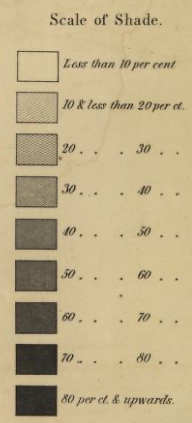
Edwin Hergesheimer created one such map using data from the census of 1860. His map displays the distribution of the South’s slave population. Each county is shaded, ranging on a scale between white and black, the latter representing a higher percentage of slaves.
The scale of shading on Hergeshimer’s map. From loc.gov.
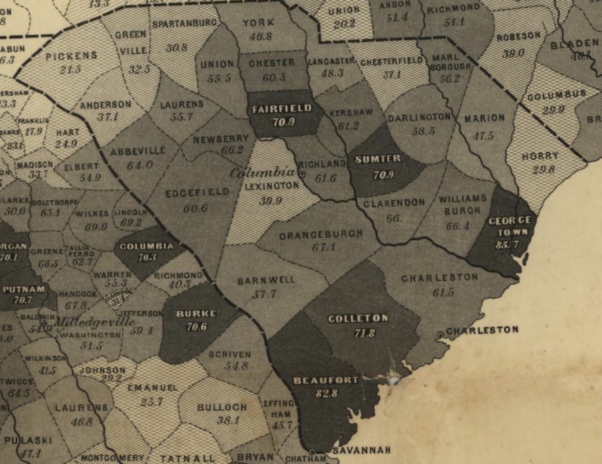
As the map depicts, entire counties are shaded. However, this creates a false representation of the true makeup of the population since the percentage of slaves within certain towns and cities may differ from that of the entire county. In other words, there is not an even distribution of slaves across the county, as suggested by the shading, because smaller localities may have either a higher or lower slave population. Therefore, because of the imposed borders, there is a lack of continuity or clines, which show a gradation of change (Crampton, 1237).
A zoomed-in look at South Carolina on the map. From loc.gov.
The shading is also significant because counties with higher slave populations appear darker, and in doing so, this reinforced the idea that dark skinned individuals belonged to the most “inferior” group: slaves.
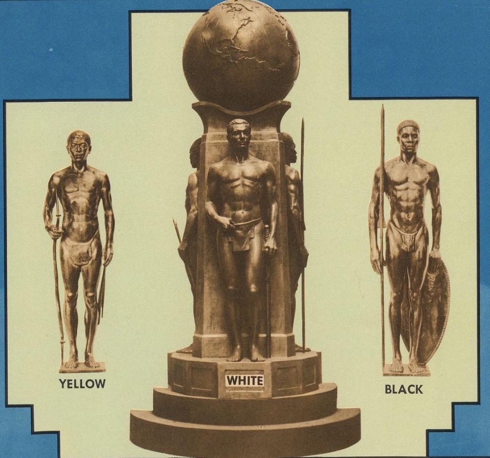
This attempt to reinforce humanity’s social construct of race and impose racial superiority is also apparent in Malvina Hoffman’s map, “Races of the World and Where They Live,” created in 1944. At the top, there are statues labelled as “White,” “Black,” and “Yellow.” The statue of the white man is on a pedestal and placed in the center to emphasize its importance. The map also “colors” regions to reflect these commonly used terminologies for race: Asia is yellow, Africa is brown, and Europe is light tan.
Hoffman included these statues at the top of the map. From DavidRumsey.com.
While this map justifies white supremacy, it also forces races into territorial groupings like Hergesheimer’s map does. However, Hoffman’s map does this on a global scale. In fact, the map depicts races that are native to certain regions, such as Native American, Asian, and African, but this confines them to specific places, thus ignoring immigration and global migration, which “have undermined the notion of isolated races” (Crampton, 1237).
The Eastern Hemisphere, in particular, is colored in a way that reflects the notion of race. From DavidRumsey.com.
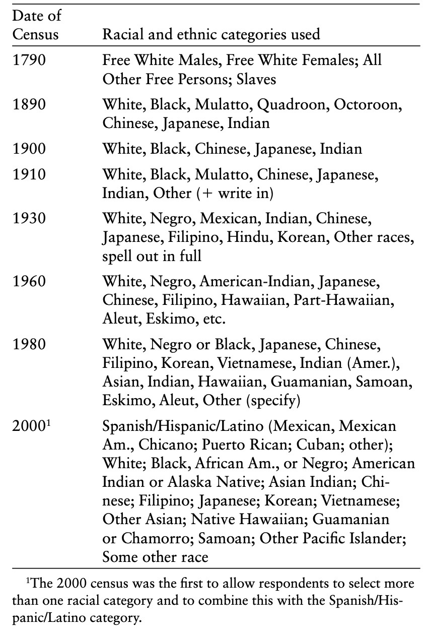
Taken together, these two maps show the evolving concept of race over time as racial categories have developed and become more nuanced like the 2000 census demonstrates.
References:
Crampton, Jeremy. “Maps and the Social Construction of Race.” In History of Cartography Project, 1232-1237. 2008.
Hergesheimer, Edwin. Map showing the distribution of the slave population of the southern states of the United States, compiled from the census of 1860. 1861. Library of Congress. https://www.loc.gov/resource/g3861e.cw0013200/?r=-0.316,-0.237,1.649,0.887,0.
Hoffman, Malvina. Races of the World and Where They Live. 1944. David Rumsey Historical Map Collection. https://www.davidrumsey.com/luna/servlet/detail/RUMSEY~8~1~291599~90063129:Races-of-the-world-and-where-they-l?sort=Pub_List_No_InitialSort%2CPub_Date%2CPub_List_No%2CSeries_No&qvq=q:races%20of%20the%20world%20and%20where;sort:Pub_List_No_InitialSort%2CPub_Date%2CPub_List_No%2CSeries_No;lc:RUMSEY~8~1&mi=0&trs=1.
For many years certain cartographers, eugenicists, and those with different political or economic motivations have mapped race in different ways. While a map may not explicitly state its purpose is to map race, the map may have an implicit goal of showing it. For example, the red lining maps between the 1930s and 1960s did not explicitly state it was mapping race, but it was used by corporation such as the Home Owners’ Loan Corporation to keep certain neighborhoods (predominantly of minority races) in poverty (1235).
The two maps below are maps that both map race, however, only one of them explicitly states that mapping race is its purpose.
The ”Races of the World and Where They Live Map” explicitly states in its title that it aims to classify all races of the world and designate them into specific biological regions. Created by Malvina Hoffman and published by the C.S. Hammond & Co. in 1944, this map provides nine different (color coded) classifications for race and the region members of that race occupy. The map provides little to no social or cultural understanding of race and, despite its publishing year, leaves no explanation for cultural make up of mass immigration throughout the decades. This map is reminiscent of Carl Von Linné’s classification of race into four categories, namely the “blue-eyed white Europeans, kinky-haired black Africans, greedy yellow Asians, and stubborn but free red Native Americans (1232). This map only presents race as a biological and geographical fact.
Despite not explicitly stating it is a map of race, the map “Map Showing the Distribution of the Slave Population of the Southern States of the United States”, undoubtably maps it. Following from Census Data, which in 1790, had Free White Males, Free White Females, all other Free Persons, and Slaves mapped as its categories, this map seeks to explain the breakdown of slaves in the United States, which despite not being explicitly states were almost entirely made up of one racial group (1233). The map also seems to attempt to clarify any misinterpretation of where certain races may reside in the United States with a note that says some areas only appear lighter than others, but that may be because there is a large preponderance of free blacks in the area.
This map also attempts to clarify any misinterpretation of the map by noting that some areas only appear lighter than others because there is a large preponderance of free blacks in the area. This note further pushes the implicit goal of mapping race by seeking to not “mislead” anyone about who occupies what areas.
While the first and second map imply that they are doing different things, both map race and confine race into strict boxes (social or biological) that it does not necessarily fit in to.
Bibliography
Crampton, Jeremy W., “Maps and the Social Construction of Race,” in The History of Cartography, Volume 6: Cartography in the Twentieth Century, ed. Mark Monmonier (Chicago: University of Chicago Press, 2015), 1232-1235.
Hergesheimer, E. Map showing the distribution of the slave population of the southern states of the United StatesCompiled from the census of. Washington Henry S. Graham, 1861. Map. https://www.loc.gov/item/99447026/.
Hoffman, Malvina. Races of the world and where they live. 1944. David Rumsey Map Collection. https://www.davidrumsey.com/luna/servlet/detail/RUMSEY~8~1~291599~90063129:Races-of-the-world-and-where-they-l?sort=Pub_List_No_InitialSort%2CPub_Date%2CPub_List_No%2CSeries_No&qvq=q:race;sort:Pub_List_No_InitialSort%2CPub_Date%2CPub_List_No%2CSeries_No;lc:RUMSEY~8~1&mi=45&trs=216#.