
Choropleth maps use different colors or shades to represent a particular attribute of a region, and maps of race are a notable example. However, mapping race has drawbacks, namely confining racial groups to a specific geographic territory and reinforcing race as an oppressive social construct.
Edwin Hergesheimer created one such map using data from the census of 1860. His map displays the distribution of the South’s slave population. Each county is shaded, ranging on a scale between white and black, the latter representing a higher percentage of slaves.
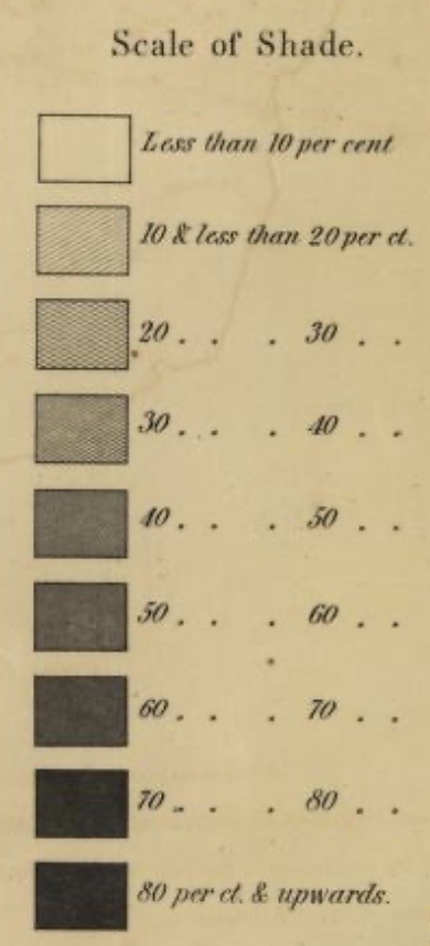
As the map depicts, entire counties are shaded. However, this creates a false representation of the true makeup of the population since the percentage of slaves within certain towns and cities may differ from that of the entire county. In other words, there is not an even distribution of slaves across the county, as suggested by the shading, because smaller localities may have either a higher or lower slave population. Therefore, because of the imposed borders, there is a lack of continuity or clines, which show a gradation of change (Crampton, 1237).
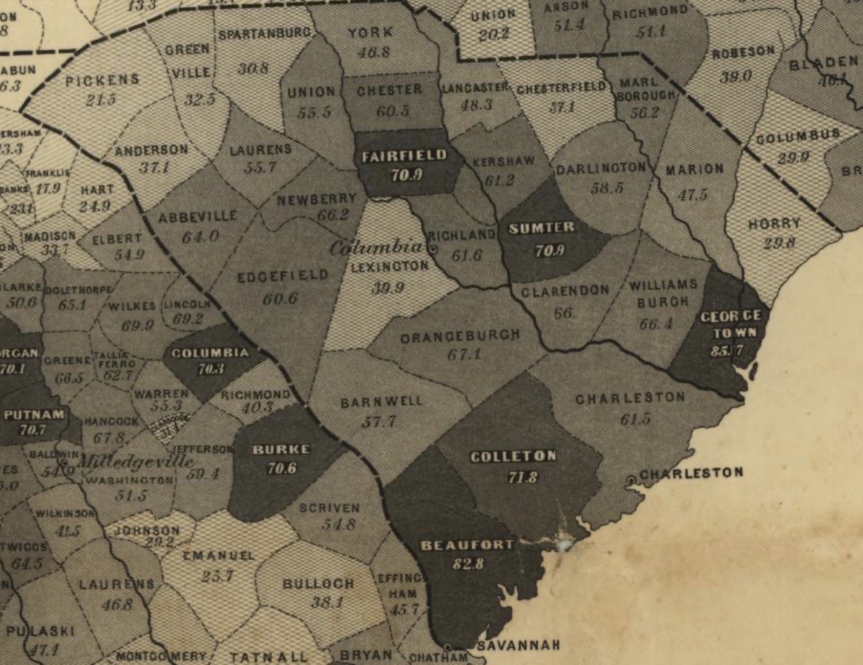
The shading is also significant because counties with higher slave populations appear darker, and in doing so, this reinforced the idea that dark skinned individuals belonged to the most “inferior” group: slaves.
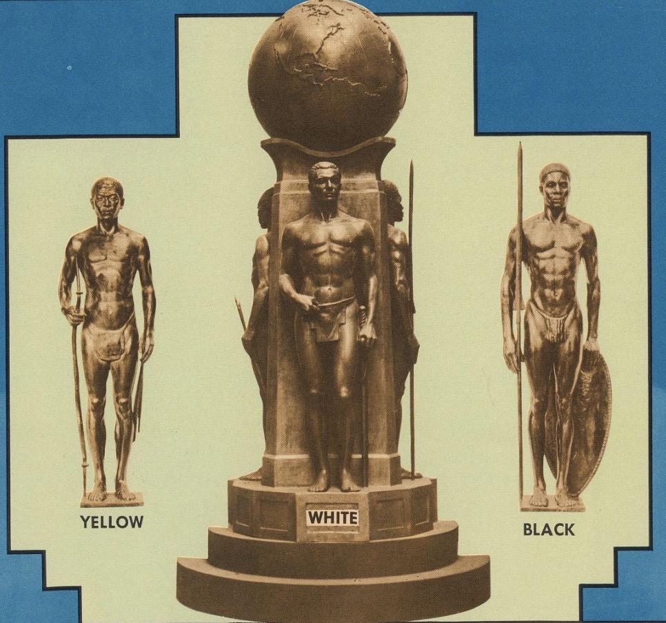
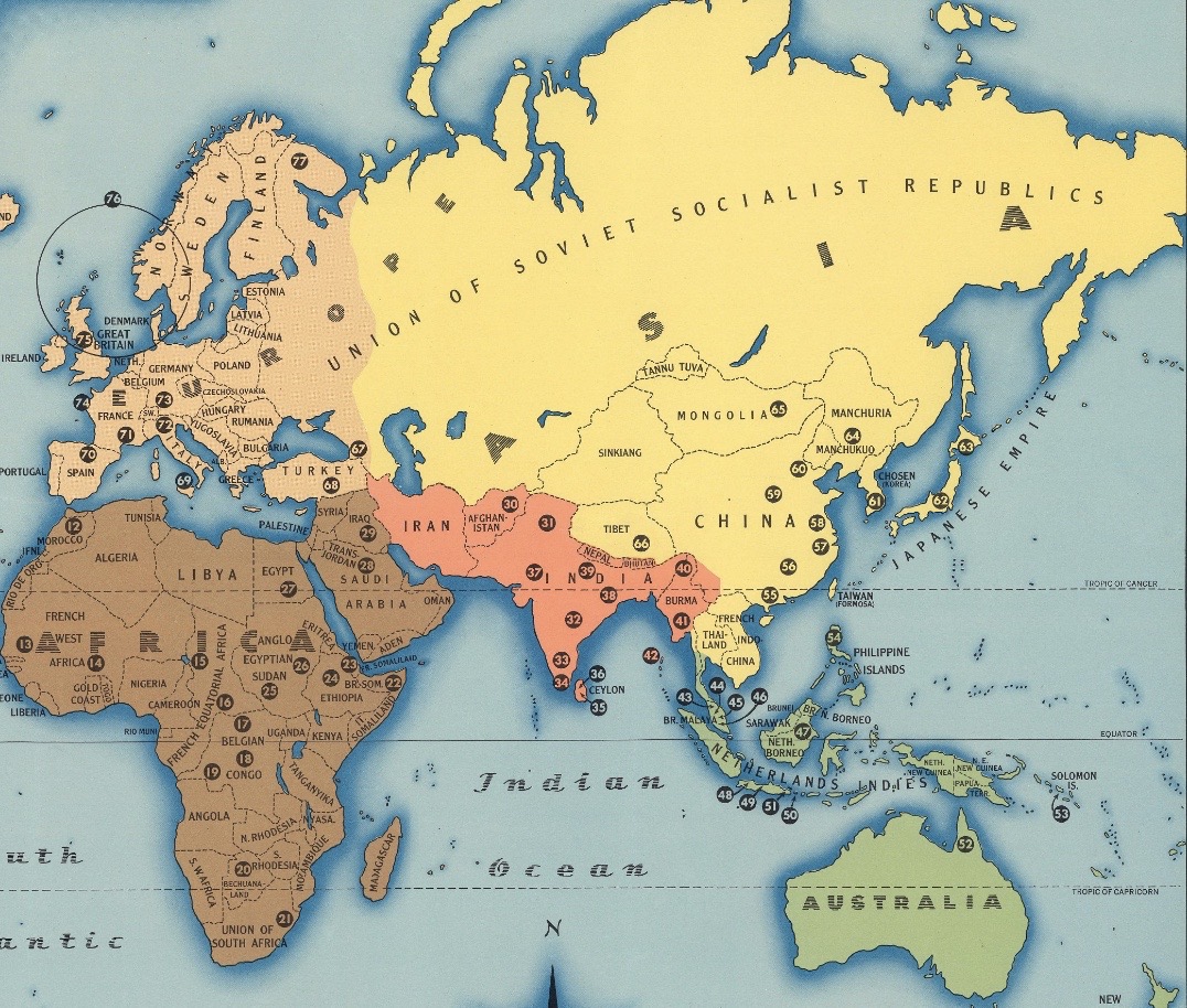
This attempt to reinforce humanity’s social construct of race and impose racial superiority is also apparent in Malvina Hoffman’s map, “Races of the World and Where They Live,” created in 1944. At the top, there are statues labelled as “White,” “Black,” and “Yellow.” The statue of the white man is on a pedestal and placed in the center to emphasize its importance. The map also “colors” regions to reflect these commonly used terminologies for race: Asia is yellow, Africa is brown, and Europe is light tan.
While this map justifies white supremacy, it also forces races into territorial groupings like Hergesheimer’s map does. However, Hoffman’s map does this on a global scale. In fact, the map depicts races that are native to certain regions, such as Native American, Asian, and African, but this confines them to specific places, thus ignoring immigration and global migration, which “have undermined the notion of isolated races” (Crampton, 1237).
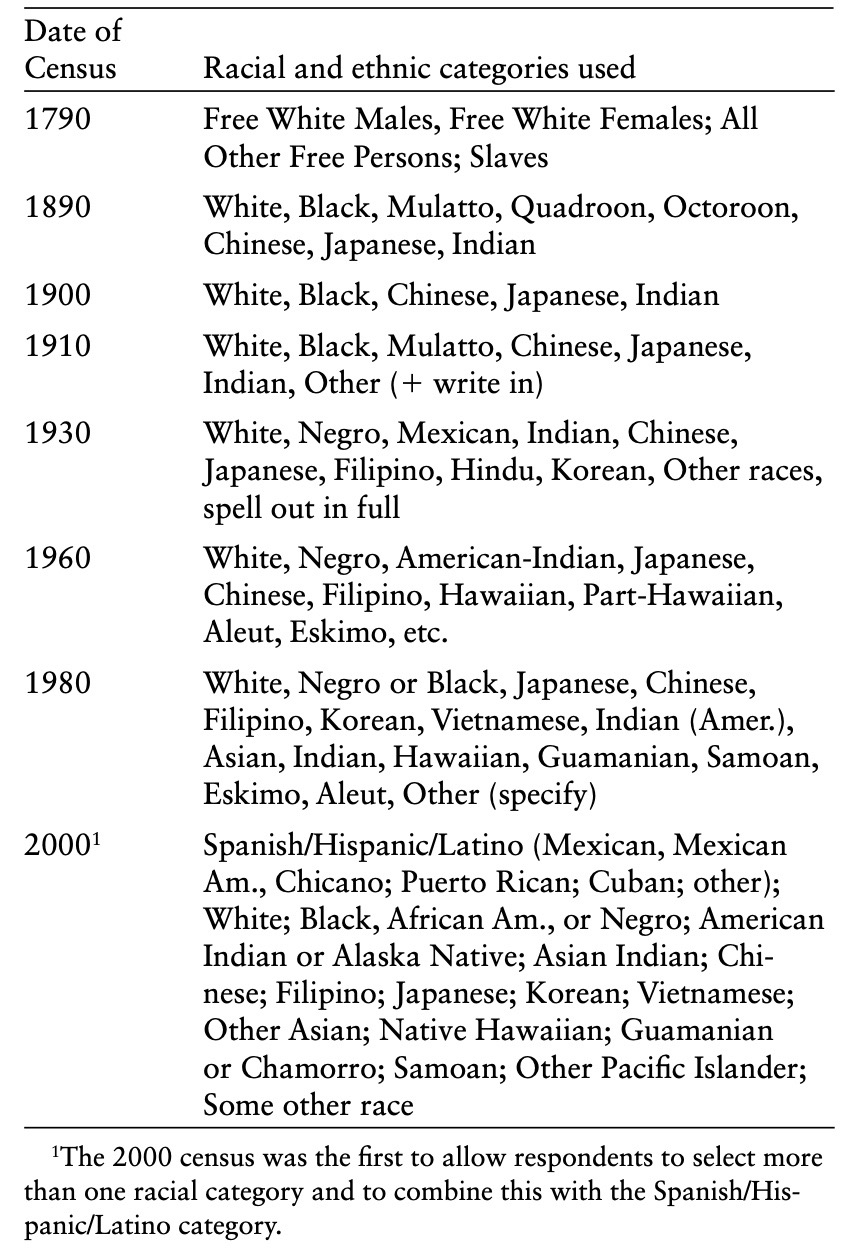
Taken together, these two maps show the evolving concept of race over time as racial categories have developed and become more nuanced like the 2000 census demonstrates.
References:
Crampton, Jeremy. “Maps and the Social Construction of Race.” In History of Cartography Project, 1232-1237. 2008.
Hergesheimer, Edwin. Map showing the distribution of the slave population of the southern states of the United States, compiled from the census of 1860. 1861. Library of Congress. https://www.loc.gov/resource/g3861e.cw0013200/?r=-0.316,-0.237,1.649,0.887,0.
Hoffman, Malvina. Races of the World and Where They Live. 1944. David Rumsey Historical Map Collection. https://www.davidrumsey.com/luna/servlet/detail/RUMSEY~8~1~291599~90063129:Races-of-the-world-and-where-they-l?sort=Pub_List_No_InitialSort%2CPub_Date%2CPub_List_No%2CSeries_No&qvq=q:races%20of%20the%20world%20and%20where;sort:Pub_List_No_InitialSort%2CPub_Date%2CPub_List_No%2CSeries_No;lc:RUMSEY~8~1&mi=0&trs=1.
Outstanding reflection Erin – it thoughtfully integrates both maps using the Crampton reading. “mapping race has drawbacks, namely confining racial groups to a specific geographic territory and reinforcing race as an oppressive social construct” – interesting insight – and speaks to the final question of our discussion. Can we NOT reproduce these hierarchies? I’d argue we can, but we have to be cognizant of audience and potential ways our visualization can be used (and misused). More on that to come!