
As Jeremy Crampton explains, “a racialized territory is a space that a particular race is thought to occupy” [1]. The representation of human populations in this simplistic manner is largely absent from current cartography, due to a “geographically continuous notion of human variation” and the fact that immigration has “undermined the notion of isolated races” [2]. However, the below map from the early-mid twentieth century represents territory as racialized:
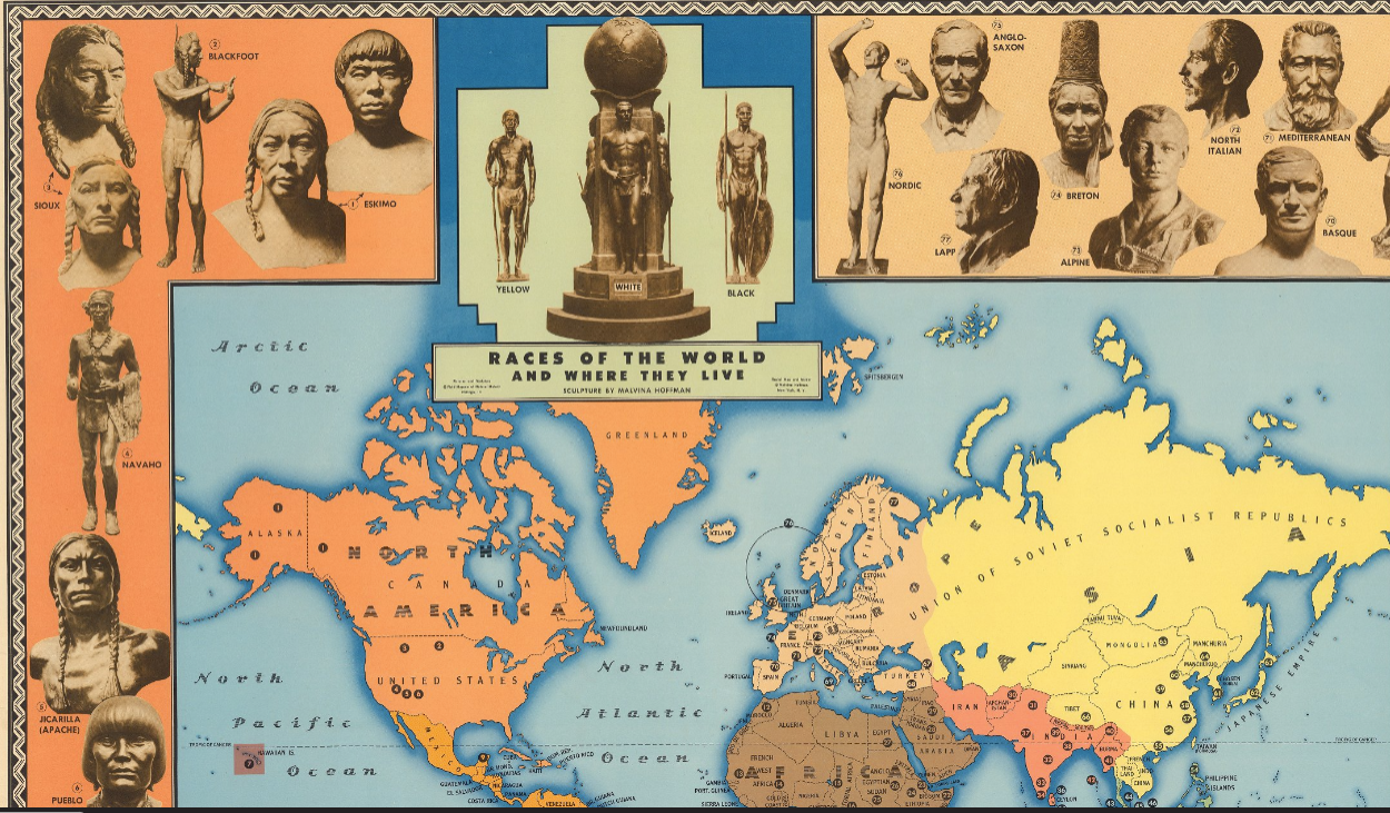
The title included in the above portion of the map, “Races of the World and Where They Live,” seems out of place. The modern-day United States and Canada is depicted as completely orange, signifying the inhabitancy of the six indigenous groups listed to the left. Such a depiction ignores centuries of colonization and immigration. Even by the distinctions of race proposed by the map, contemporary North America (in 1944) was inhabited by a greater number of racial populations than was included. Compare to a map from almost eighty years earlier:
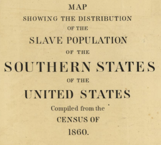
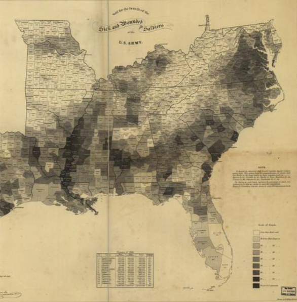
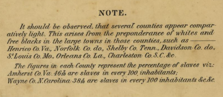
As the second image of the 1861 map illustrates, the distribution of population groups within the modern United States was much more complex than the 1944 map would imply. Moreover, the 1861 map does not purport to depict the populations of each county strictly by race; rather, its stated goal (as in the title) is to represent the distribution of enslaved individuals. Indeed, the map’s note indicates that both “whites and free blacks” will affect the proportion of slaves depicted for each county population.
Unlike the 1944 map, the 1861 map of slave populations does not subscribe to the idea of racialized territory as defined by Crampton. Multiple races are represented as inhabiting the same geographical space. Indeed, multiple races are even counted within the same category (free individuals). Contrast this to the strictly-defined racial-geographical borders of the 1944 map. Races are represented as geographically separate, alluding to other possible distinctions (biological, historical, moral) which are wholly false [3]. Isolating racial populations geographically, as the 1944 map does, facilitates political isolation and discrimination. Conversely, the 1861 map represents slavery accurately dispersed throughout the South, thereby reinforcing the immediacy and unavoidability of the problem.
Citation 1-3: Jeremy Crampton, “Maps and the Social Construction of Race,” from the History of Cartography Project (2008), p. 1232-1237.
Outstanding Wyatt – well written and convincingly argued. I love that you’re using one map as a springboard to deconstruct the other. As you note – these maps depict race, but not JUST race.