Erin Buglewicz, Blog Post 8: Mapping & Ethics

Monroe Work, a pioneer in the field of sociology, confidently asserted, “In the end facts will help eradicate prejudice and misunderstanding, for facts are the truth and the truth shall set us free” [1]. However, individuals and organizations often manipulate or misuse facts to promote their own views. For this reason, it is important to approach historical data visualization from an ethical standpoint, but although there are ways in which one can attempt to avoid bias, it is virtually impossible to eliminate entirely. This is especially true for maps because even seemingly minor elements like color, symbols, and interactivity can influence how viewers interpret data.

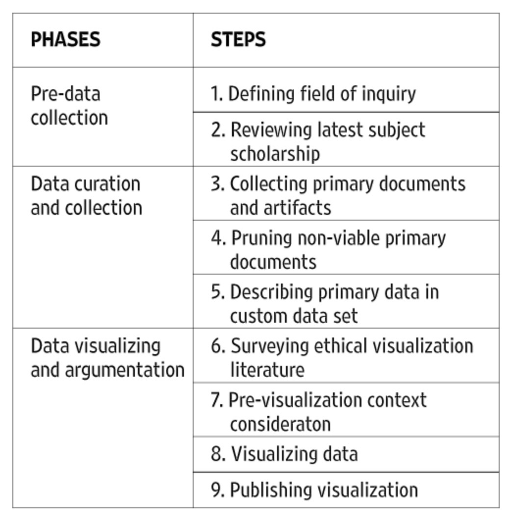
In “Racism in the Machine: Visualization Ethics in Digital Humanities Projects,” Katherine Hepworth and Christopher Church emphasized that to showcase data ethically, one must mitigate any harm to viewers and the subjects of a study as well as maximize the project’s ability to communicate information [2]. The authors then proposed an ethical visualization workflow that should be used when creating digital humanities projects, such as maps, to help eliminate bias and misrepresentations. The workflow introduces several steps that are part of one of three phases: pre-data collection, data curation and collection, and data visualizing and argumentation.

Ethical workflow proposed by Hepworth and Church.

By examining two mapping projects, Hepworth and Church were able to explain how researchers can apply this ethical approach to the creation and use of data visualizations. The first map that the authors analyzed was “Lynching in America: Racial Terror Lynchings,” created by the Equal Justice Initiative (EJI). This is a choropleth map showing the number of reported lynchings (of African Americans) across US counties between 1877 and 1950. 

“Lynching in America: Racial Terror Lynchings”

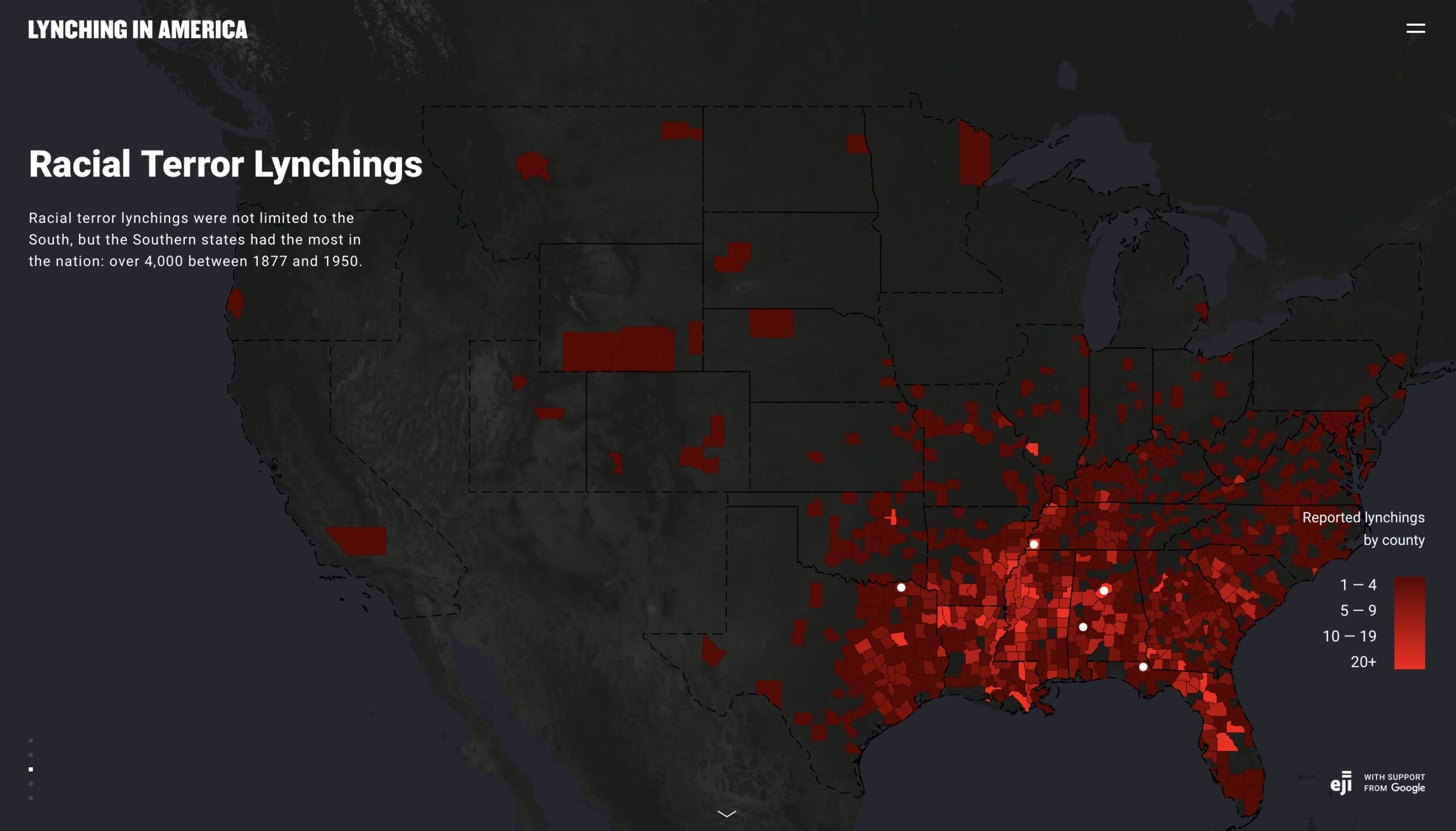
The map is visually striking. It uses a red color ramp to indicate the number of lynchings in each county, and against the dark background, this color indicates what it represents: bloodshed. Before even exploring the map and website, I was already well acquainted with EJI’s mission from previously reading Just Mercy and hearing the organization’s founder, Bryan Stevenson, speak in person at Creighton last year. Therefore, despite the map’s title suggesting otherwise, I was able to conclude that these lynchings only involved African Americans. When interpreting the map, it is important to know this background because it fuels EJI’s argument that historical violence and prejudice against blacks is at the foundation of their disproportionate representation within the current criminal justice system. Therefore, the map is merely a “promotional and advocacy tool” for EJI [2].

To most viewers, this map appears credible at first glance, especially as it is supported by Google, but on further inspection, it introduces some unethical implications. To begin with, it utilizes raw data, which is improper for a choropleth map. As Hepworth and Church noted, the number of lynchings in each county should be normalized against census population data [2]. This would eliminate any disproportionate representations of lynchings in each county. Moreover, this map also contains notable silences. As already mentioned, it solely focuses on African Americans who were lynched. The map is also limited by choices made during the data collection phase about what constitutes a “lynching.” The criteria chosen allowed EJI to create “a narrative around racial violence that excludes other minorities and other geographic locales” [2]. The map does, in fact, ignore much of the North and West, casting it in a dark color, and it primarily focuses the viewer’s attention on the South, which is bright red.

Hepworth and Church also examined “Map of White Supremacy’s Mob Violence,” a different map conveying similar but more nuanced data, which provided a better ethical visualization of racial lynching in the United States. This map, developed from research done by Monroe Work, has several key differences from the one produced by EJI that lend it greater credibility. To start, it is a complex and interactive dot density map, spanning from 1848 to 2021, which makes it relevant even in the contemporary era.

“Map of White Supremacy’s Mob Violence”

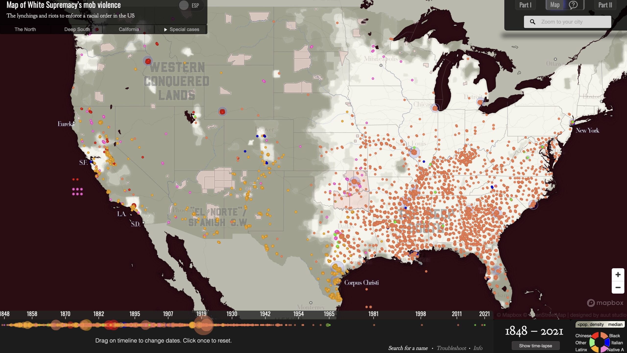
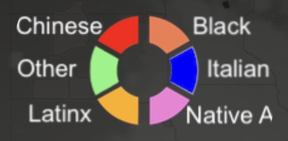
The aim of this map is arguably to “confront the user with the temporal and racial extent of white superiority-motivated lynchings, both qualities that are absent from the Racial Terrors Lynchings map” [2]. Thus, the scope of what this map covers is much larger, and it fills in gaps that the EJI did not cover. Most obviously, Work’s map includes the lynchings of several different races, not just African Americans. This demonstrates that racial violence was not limited to one group. 

Key for “Map of White Supremacy’s Mob Violence.”

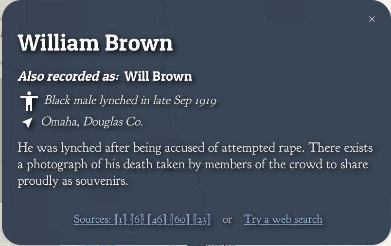
These dots are much more widespread than lynchings represented on the EJI’s map, where they were mainly clustered in the South. Additionally, each dot represents a reported lynching, including the name, where available, of every person as well as the year the lynching occurred. This information is also accompanied by a link to sources that viewers can click on to discover more. In doing so, this incorporates a sense of humanity and greater credibility into the project that EJI’s map lacks.

Example of a lynching case included on “Map of White Supremacy’s Mob Violence.”

Therefore, this second map provides a better example of an ethical visualization of data. This difference is namely apparent in the two maps’ arguments and silences (or relative lack of), and this comparison demonstrates why Hepworth and Church’s proposed workflow is effective and practical.

References:

[1] Work, Monroe, and Florence Work. “Map of White Supremacy’s Mob Violence.” Plain Talk History. https://plaintalkhistory.com/monroeandflorencework/explore/map2/#4/37.85/-99.5/0/18.

[2] Hepworth, Katherine, and Christopher Church. “Racism in the Machine: Visualization Ethics in Digital Humanities Projects.” Digital Humanities Quarterly. Vol. 12, no. 4 (2018). http://digitalhumanities.org/dhq/vol/12/4/000408/000408.html.

[3] Equal Justice Initiative & Google. “Lynching in America: Racial Terror Lynchings.” https://lynchinginamerica.eji.org/explore.

Week 9 Blog – Evan Murphy

The rapid conversion of prairie and grasslands into farm land throughout the Great Plains region was the catalyst for greater migration into the region. Population growth in the plains is easily trackable when compared to when land was converted into farmable land which also helps explain North Dakota’s population being lower than that of Kansas by a decently large degree, having over double the people living in Kansas than North Dakota. North Dakota’s later conversion into cropland has increased it’s population over the past one hundered years.

The map of Wheat per Square Mile on David Rumsey is very interesting to me. As a Kansan born and raised I know there is a lot of wheat produced in Kansas and sometimes forget how much wheat is produced in other regions of the country. However, I will not focus on that observation and will focus on Kansas. Almost the entire state is dedicated farmland and an aggressive amount of wheat is produced. However, I am more interested in why wheat is not produced in great amounts in the other parts of Kansas. The South West corner of the state is less suitable for crops than the rest of the state so it’s low to non existent wheat numbers make sense. Many of the bordering areas to that region are rated as a 1 which I would assume is due to lower water availability as Western Kansas runs on ground water from the Ogallala aquafer. Many of the central regions are fairly urban and have less wheat production and there are a few notable specs of Flint Hill Grassland preserves.

Figure 2.7 from the Cunfer reading displays how percent of grassland has changed over time. It seems that not much has happened since 1964 as far as grassland is concerned, but there are notable changes from 1945 to 1997. Why has there been little change over the past 80 years. Have there been new regulations put into place to reduce development or has it simply slowed down on it’s own?

Week 7 Blog Post 5: Mapping Urban Segregation

Using Laura Vaughan’s map titled “Mapping Society” the reader is shown how different factors like urbanism and how mapping can represent various divisions of a city. Vaughan also goes on to discuss that mapping urbanism is a type of mapping segregation throughout a city.

She also continues on to discuss and argue that self-segregation begins from a certain belief that the person has a natural feeling to be around people like themselves. We can see clear evidence of this today with the segregation of Omaha. The segregation and mapping can also represent the economic conditions of the area. Generally more affluent and White neighborhoods receive better quality facilities, more resources in schools, and greater chances for job security and skills training. Using this knowledge and comparing an Omaha census map and the Residential Security Map of 1936 this representation is still clear.

Another interesting map is one that was published by the Home Owner’s Loan Corporation titled “Map of Omaha and Vicinity” in 1937. This map is a clear example of red-lining and the HOLC published many of these maps and were made aware of how discriminatory they were because they used the legend as Best, Still Desirable, Definitely Declining, and Hazardous. The areas that were labeled Hazardous are the areas of Omaha that were predominately Black neighborhoods.

Vaughan. Mapping Society, 2018, discovery.ucl.ac.uk/10056449/2/Mapping-Society.pdf. 

Week 6 Blog Post 4: Mapping Otherness

The use and mention of different mapping techniques and the range of subjects like different race and their portrayal or various other demographic factors raises some ethical concerns. The usage of the techniques suggests that they were used as a way to enforce a certain way of thinking and to further societal norms that a certain group of people would always be better than another group. Much of the readings for this week force the reader reflect of the different practices of these cartographers and there motives behind making the maps the way that they did.

We can also see evidence of this using the maps below where they are specifically stating that it is using race as a determining factor and the other map was used by the Home Owners’ Loan Corporation to keep primarily minority neighborhoods in poverty.

Redlining maps used in 1930-1960 did not specifically state that they were mapping by race. The “Races of the World and Where They Live Map’ states very clearly in its title that this map aims to classify all races of the world and where they live. This map uses eight different colors to classify people into races and the regions that each race occupies. This map was created by Malvina Hoffman and published by C.S. Hammond & Co. in 1944.

Although it does not specifically state that it is a map of race, the “Map Showing the Distribution of the Slave Population of the Southern States of the United States” surely maps racial changes. This map uses census data collected in 1790 which had various categories such as: Free White Males, Free White Females, all Other Free Persons, and Slaves as its categories. The map even provides a side note towards the top that states that some counties map appear lighter in color that others due to the ‘preponderance of Whites and free Blacks in the large towns in those counties’. So while the map does not specifically state that it is mapping the racial demographics of the United States, it does account for the free and enslaves population and where they mostly reside.

Hoffman, Malvina. Races of the world and where they live. 1944. David Rumsey Map Collection. https://www.davidrumsey.com/luna/servlet/detail/RUMSEY~8~1~291599~90063129:Races-of-the-world-and-where-they-l?sort=Pub_List_No_InitialSort%2CPub_Date%2CPub_List_No%2CSeries_No&qvq=q:race;sort:Pub_List_No_InitialSort%2CPub_Date%2CPub_List_No%2CSeries_No;lc:RUMSEY~8~1&mi=45&trs=216#.

Hergesheimer, E. Map showing the distribution of the slave population of the southern states of the United StatesCompiled from the census of. Washington Henry S. Graham, 1861. Map. https://www.loc.gov/item/99447026/.

Crampton, Jeremy W., “Maps and the Social Construction of Race,” in The History of Cartography, Volume 6: Cartography in the Twentieth Century, ed. Mark Monmonier (Chicago: University of Chicago Press, 2015), 1232-1235.

Erin Buglewicz, Blog Post 2: Geological Map of Great Britain

In 1815, William Smith created the “first true geological map of anywhere in the world” (Winchester, xvi). In fact, Smith’s endeavor to create this map was representative of the era he lived in. During the latter part of the eighteenth century, individuals began to more frequently question the world around them, and this contributed to greater freethinking. (Winchester, 24). As a result, there were new advancements in science as well as an increase in communication and literacy. Smith’s map is one such example of this.

Smith’s 1815 map. From Strata-Smith.com.

In creating this map, Smith aimed to show different rock layers, or strata, in England. As shown by examples in the image below, the map’s key displays various colors that Smith employed to distinguish between the different strata. 

This map was a significant advancement in science, especially within the fields of geology and biology, because it countered the commonly held (but inaccurate) views about the nature of the earth that were influenced by religion. As Smith began to unravel the mysteries of the earth, he discovered new information that led to other developments, such as Darwin’s theory of evolution (Scott).

Compared to the 1815 version, Smith’s 1828 map appears similar due to the coloring but has some variations. To begin with, the map from 1828 includes detail more clearly. It includes the most relevant roads and towns in a way that appears less congested than the 1815 version. 

Smith’s 1828 map. From Strata-Smith.com.

Also, in the top right of the 1828 map, there is a label which signifies that the map shows coal districts.

At the time, the Industrial Revolution was still in full swing, and it “focused England’s attention on the compressed, hardened remains of ancient swamps – coal” (Scott). To harness this valuable resource and make it readily available, efficient transportation was essential, and England attempted to create canals for this purpose. William Smith worked as a surveyor for these canals, and this enabled him to map strata across the country (Scott). This enabled him to create such a detailed geological map of strata which was modified in 1828 to help coal prospectors identify what was underneath the surface of the earth and subsequently, where to dig. Thus, the 1828 version was more practical than Smith’s 1815 map, which was largely scientific, in the sense that it was used to promote industry.

References:

Scott, Michon. “William Smith (1769-1839).” NASA. https://earthobservatory.nasa.gov/features/WilliamSmith.

Smith, William. A New Geological Map of England and Wales With the Inland Navigations Exhibiting the Districts of Coal and Other Sites of Mineral Tonnage. 1828. “William Smith’s Maps – Interactive.” http://www.strata-smith.com/map/#info.

Smith, William. Geology of England and Wales with Part of Scotland. 1815. “William Smith’s Maps – Interactive.” http://www.strata-smith.com/map/#info.

Winchester, Simon. The Map that Changed the World: William Smith and the Birth of Modern Geology. New York, NY: Perennial, 2002.

Blog Post 2: William Smith

The UK, whilst appearing as a relatively unimpressive island adjacent to continental Europe, is somehow, throughout most of history, the luckiest empire in the world. In addition to colonizing over half the globe, when the Industrial Revolution rolled around, British people seemed to luck out once more, realizing their island is a giant mountain of coal.

Winchester, Simon. “A Land Awakening from Sleep.” The Map That Changed the World, Harper, 2001, p. 26.

However, Smith was more interested in rock stratification and fossils than coal. He mapped the stratifications of rock and rock layers in great detail.

William Smith’s Geological Map of England and Wales, from http://www.strata-smith.com/map/.

William Smith’s research worked in tandem with a relatively new and radical thought: the world existed long before the story of creation in the Bible’s Genesis.

From https://earthobservatory.nasa.gov/features/WilliamSmith.

The questioning of literal Biblical interpretations spurred not only Smith’s research, but industrialization itself. In order to use the coal found, they had to shun the idea that the world didn’t exist until humans came along. This also shifted the perspective that natural laws governed the physical world, rather than metaphysical/theologian laws/ideas governing the physical world. William Smith’s map came at a time when there was a shifting emphasis to scientific explanation and reason than focus on the spiritual.

Although Smith’s map is crucial to understanding the world and what lies beneath, his map didn’t do well, as the British government seemed to trend more towards mapping coal mines and points of monetary value, rather than academic. Later, these maps were important for the transportation of coal through digging canals around England, but were relatively overlooked until then, with Smith rotting in a debtor’s prison and living in poverty upon his release. Later, when the Industrial Revolution kicked into full-steam, his maps were crucial in water management (aquifers identified), location of coal deposits, and canal construction.

Chase County, Kansas Blog Post 1 Michael Lau

The Plat Book of Chase County, Kansas, is a property map from 1901. Published by the Warren Mortgage company, the map features no topography or latitude or longitude lines which would indicate a travel map. However, in its legend, it does indicate the various modes and methods of travel that are placed throughout Chase County. The county, however, is split into townships, with each of them being a parceled out more into differing estates. All of them numbered. Towns and cities are hatch marks, with the map taking particular focus on the transportation and the public services in each area. The Legend hinting to their priorities as schools and churches are given a symbol.

The map has several hand drawn additions and math surrounding it. It appears that the map was for investors in the region, or new homesteaders, to mortgage their land from the Warren Mortgage Company.

At the same time, this audience would either be locals or completely blind to the kind of land that they were buying, as besides whether there was a river on the property, there is no topological or ecological data present on the map. The people buying this land were thus not farmers or those who cared about the land other than for its location. O. Allen Weltzen quotes the geographer Yi Fu Tian in saying. 

“A geographer studies landscape “from ‘above,'” for example, but The side view … is personal, moral, and aesthetic. A person is in the landscape … from a particular spot and not from an abstract point in space.”

– Yi Fu Tian

In other words, every map is a metaphor and a lie. Thus, what is actually on these lands that the Warren Mortgage company doesn’t want its audience to find out? William Least Heat-Moon, the focus of O. Allen Weltzen essay, finds that;

Chase County, which the Flint Hills is a part of, is not a just some blank slate for real estate and state entities to draw on, it contains a unique ecological treasure that has been recognized today, though maybe less treasured back in 1901. So what does that say about the audience for this map? Were they settlers? Homesteaders? Regular people? It almost certainly wasn’t an indigenous group, as according to Heat-Moon, their relationship with the land was certainly more emotional and spiritual than the cold calculations on the side of a blank map would seem.

Perhaps then, the priorities of those drawing the borders and buying the land were never after the richness of the land itself, but the clinical calculus of economics and progress.

Bibliography

“Kansas Memory.” Kansas Memory – Main Page, Northwest Publishing Co., www.kansasmemory.org/item/209375/page/3. Accessed 28 Jan. 2024.

Weltzien, O. Alan. “A Topographic Map of Words: Parables of Cartography in William Least Heat-Moon’s PrairyErth.” Great Plains Quarterly, vol. 19, no. 2, Spring 1999, pp. 107–122.

William Least Heat-Moon. PrairyErth: (A Deep Map). Houghton Mifflin Company, 1991. Pages 3-24.

Erin Buglewicz, Blog Post 1: Chase County, Kansas

At first glance, the Outline Map of Chase Co. Kansas, 1901 appears to be nothing more than a simple reference map. However, by giving it a closer look and considering historical context, this map creates a proposition about land and settlement in Chase County.

The 1862 Homestead Act allotted 160 acres of federal land to each adult or head of household, and this encouraged people to settle in the American West. This map depicts land still open for settlement and sale in 1901, and this is denoted by the “Warren Mortgage Company” stamp in the top right corner of the map. On the top left, there is a key (titled “Explanations”) that lists symbols for infrastructure, such as railroads, schools, and post offices, which would be important to people looking to settle there. The purpose of this is to show, as William Least Heat-Moon explains, that Kansas serves as an intersection within the United States, and it is not merely “barren, desolate, monotonous” (10).

However, it is important to note an obvious silence in this map: the presence of Native American land. In Heat-Moon’s book, PrairyErth, he quotes Robert W. Baughman to note that before land could be sold, the government first needed to “clear the way” by removing indigenous peoples from their lands.

This image has an empty alt attribute; its file name is Screen-Shot-2024-01-21-at-11.26.09-PM-1.png

As Heat-Moon depicts, many incoming settlers held the false notion that the land in the West was nearly empty. He effectively explains this idea by contrasting an overhead view, such as one seen from above in an airplane, that consists of twelve quadrants to a more detailed “deep map” of Chase County.

In doing so, Heat-Moon is trying to combat the myth of emptiness within Midwestern states like Kansas. Due to his heritage and background, he also acknowledges the tie that Native Americans have to the land by including a short story.

Different groups will interpret Heat-Moon’s depiction of Chase County in twelve quadrants in their own ways. In one aspect, it compares to the Outline Map of Chase Co. Kansas, 1901 because it depicts large white spaces, seemingly showing open plots of land. However, for Native Americans, these white grids showed that vastness of their land and their belief that the open land should not be subdued or sold.

References:

Heat-Moon, William Least. PrairyErth. London: Andre Deutsch. 1991.

“Outline Map of Chase Co., Kansas, 1901.,” Northwest Publishing. https://www.kansasmemory.org/item/209375/page/3.

css.php