John Snow’s cholera map of 1855 was a tool that eventually aided in convincing London’s general public and health officials about the true nature of this mid-19th century disease outbreak. In its persuasion, the map generated downstream social and structural effects that stood as a precedent for disease prevention and health [1]. The cholera map recognizes disease closely connected to the ways in which communities interact, whereas Alexander Johnston’s 1856 “Geographical Distribution of Health and Disease in Connection Chiefly with Natural Phenomena” misses this point.
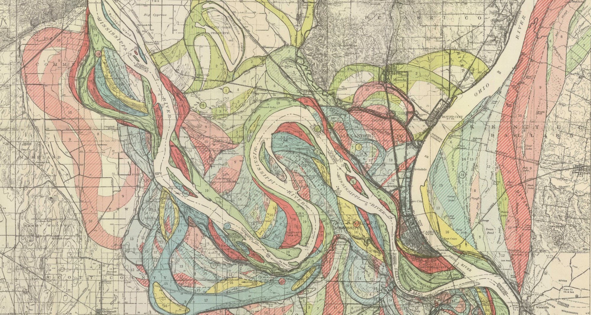
Snow’s map (pictured above) not only displays recent incidents of deaths from this mysterious disease, but it also successfully depicts an understanding of proximity to the source of contamination – the Broad Street water pump. The map presents a very important connection between where cholera is occurring and why it occurs where it does. It understands that disease, or cholera in particular, has a reliance on the way humans interact with their environment. As in this case, people in close proximity to the contaminated water source were likely to become ill, as one would logically secure their water from a pump that is nearby.

On the other hand, Alexander Johnston’s global map of disease does not encompass this aspect of disease to the same degree. It seems to make an oversimplification of the idea of disease, arguing that disease is inherently regional or territorial. Specific diseases are listed across particular continents, which makes the implication that an illness is tied to distinct geographical areas. Additionally, by color-coding parts of this world map based on latitude, it attempts to make the case that things like weather or regional climate are a main factor in the spread of the shown diseases.
In sum, Johnston’s map does not effectively portray the interactive aspects of disease as well as John Snow’s map does. By drawing connections between proximity to the predicted source of contamination and understanding how that source became contaminated via human activity, Snow succeeded in setting a epidemiological standard that the spread of disease relies on how people interact with their environment. Johnston’s map, conversely, makes the case that disease is fundamentally embedded in specific regions of the world.
[1] Johnson, Steven. 2006. The Ghost Map. Riverhead Books. pp. 1-22, 190-228.
[2] Johnston, Alexander. 1856. Geographical Distribution of Health and Disease in Connection Chiefly with Natural Phenomena. https://www.davidrumsey.com/luna/servlet/detail/RUMSEY~8~1~24722~940061:The-geographical-distribution-of-he.
[3] Snow, John. 1855. Cholera Map. https://kora.matrix.msu.edu/files/21/121/15-79-54-30-johnsnow-a0a1d5-a_16430.jpg.


Outstanding Sam- you’re really boiling it down to the “where” vs “why” of it all. Wonderful insight!