
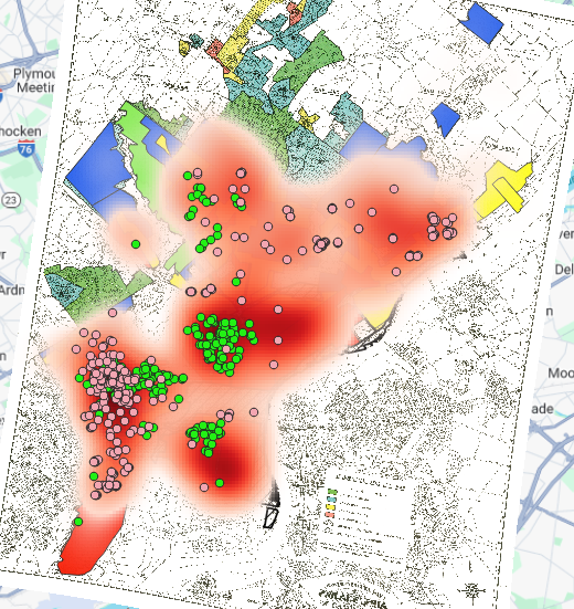
Some patterns that I saw between the mortgage companies and the locations that supplied loan was the correlation between areas with large populations of one race only being supplied by one mortgage company. This divide was mostly because of the racial divide in the city where mortgage companies like Berean which was an African American owned mortgage lender and MetLife which primarily only served the white Philadelphian population, would be the suppliers of loans only for race they represented because White Philadelphians could get loans at a much lower rate than Black Philadelphians through their corresponding mortgage company (Berean or MetLife). This could be seen in the map below that shows the locations of both of the mortgage lending companies with MetLife being represented by pink dots and Berean by green dots. Additionally, the shades of red behind the dots represent the overall rate of mortgages, with the darker the red the higher percentage of mortgages.
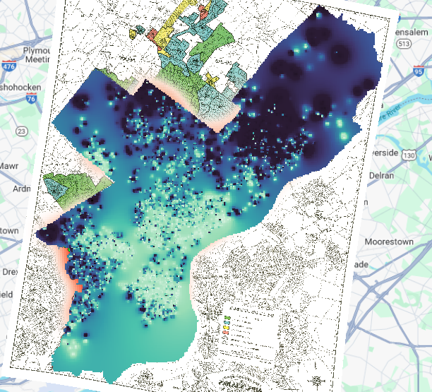
In comparison to the information shown in the map above, below the map shows the overall interest rates of mortgages. With the lighter the blue, the higher the interest rate with the darker blue showing a lower interest rate for mortgages.
Back to the racial demographics of the city, the map below shows the city’s racial distribution in zones with the lighter colors represent the African American population while the darker colors represent the white population. This clearly shows that the areas with higher black populations had higher interest rates with the areas with yellow areas from the map below directly correlate with the lightest blues in the map above.
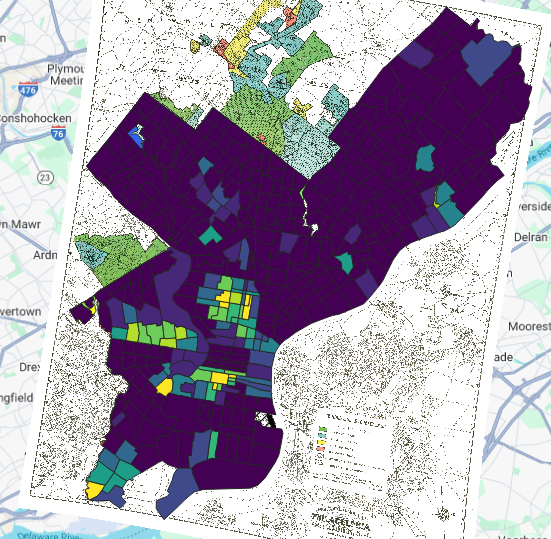
This is very reflective of the zoning that was performed during the New Deal Era which zoned different areas in accordance to whether they believed an area would pay their loans, where race played a large factor in deciding that they thought an area was eligible to receive and low mortgage interest rate. The zones in the map below are labeled by Green=Grade A, Blue=Grade B, Yellow=Grade C, Red=Grade D, with A having the lowest interest rates and D being the highest.

The map above was made by the Home Owners Loan Corporation (HOLC) to evaluate the risk of people defaulting their loans and as outlined above there were different grades given to each zone that was evaluated, and more often than not the grades the zones received correlated to the racial majority that lived in the zone, with zones with African Americans and immigrants often getting a lower grade than zones with large white populations. These maps I believe directly caused redlining to occur because it caused most African Americans to be labeled as a financial liability simply for the area they lived in that was graded badly on the basis of race. This led for interest rates in those zones to skyrocket and for their own mortgage lenders to be forced only to be able to offer high interest rates. Since at this time cities were still segregated by race and what was available in the area for those in these areas were the mortgage lenders like Berean which was African American-owned, that meant that African Americans only had one option that was not only close geographically but readily available for them to use and that option has very high interest rates making it hard to be able to afford a mortgage.
An additional layer that would be useful to be able to supply more evidence of discriminatory housing policy would be to see what factors in the environment around the areas with larger African American populations may be affecting the health of those in these areas. Whether that be an industrial plant that creates pollution or the main occupation of people in the area having a high mortality rate from disease caused from their occupation. Since if a populations health is at risk, than that can affect their finances from the lack of ability to work, and if they cannot work then they cannot afford healthcare and this can affect generations. This is called the ecological model in public health and can show how one small factor can affect multiple facets in a persons life.
The map below I believe demonstrates the most compelling evidence of redlining because the bottom layer of the map is the percentage of African Americans in Philadelphia with the lighter areas having a larger African American population and darker areas having a larger white population. While on the top transparent layer, it shows the interest rates and whether they are high (light blue) or low (dark blue). On this map you can see how the light parts of the bottom map directly correlate with the light areas of the top map showing that areas with a high African American population have high interest rates on their mortgage loans making them unable for the most part to take out loans, decreasing their ability to be able to afford to move.

Hmmm, this is tough. Even with the transparency adapted, its still quite cluttered isnt it? There MUST be some way to convey this message more SIMPLY! More on this in future weeks…