Emily Gaddy- Annotated Bib

Secondary Sources Bednarek Janet R. Daly. The Changing Image of the City : Planning for Downtown Omaha 1945-1973. Lincoln: University of Nebraska Press, 1992. 

  • Showcases Omaha’s City Planning and the planning of different highways throughout the metro area. There is few on the North Freeway itself, but it is interesting and helpful to see the other roads surrounding the construction of the Freeway, as they also cut through different minority communities. 

Hillier, A. E.. “Redlining and the Home Owners’ Loan Corporation.” Journal of Urban History. 29, no. 4 (2003): 394-420. https://doi.org/10.1177/0096144203029004002

  • This source is helpful in understanding the effect of the HOLC on American cities. The HOLC’s grip on American society and the creation of redlining is great for context to inform my understanding of types of segregation. 

Karas, David Patrick. “Highway to Inequity: The Disparate Impact of the Interstate Highway System on Poor and Minority Communities in American Cities.” New Visions for Public Affairs. 7, (2015).

  • Karas highlights the disparities between communities of color and their disproportionate number of road systems, compared to wealthier, white neighborhoods who have little highways, noise pollutants, and cars compared to their black counterparts. 

Leiker, James. “Challenging the Color Line in Kansas and Nebraska/The Revolution at a Regional Nexus.” In Black Americans and the Civil Rights Movement in the West, edited by Bruce A. Glasrud and Cary D. Wintz. Oklahoma: University of Oklahoma Press, 2019.

  • This helps lay the historical groundwork for segregation and racism in Midwestern cities. This specifically mentions Nebraska’s history of racism and racial violence. This has less to do with the road systems, but cultural context. 

McNichol, Dan. The Roads that Built America: The Incredible Story of the U.S. Interstate System. New York: Sterling, 2006. 

  • This lays the groundwork for Einsenhower’s expansion of America’s interstates. This also speaks of how these were funded, either through state grants or the federal government. This puts the highways into context, specifically in the rise of white suburbia and the burgeoning need for highways to transport white people to their homes created during White Flight. 

Mohl, Raymond A. “The Interstates and the Cities: The U.S. Department of Transportation and the Freeway Revolt, 1966–1973.” Journal of Policy History. 20, no. 2 (2008): 193–226. https://doi.org/10.1353/jph.0.0014.

  • Mohl speaks of divisions created by the U.S. highways and how they affected poor communities and communities of color. This also talks about city suits and other lawsuits put forth against highway building and how most of them failed.

Omaha Public Schools. “Making Invisible Histories Visible Collection.” University of Nebraska Omaha Archive and Special Collections. University of Nebraska at Omaha Libraries. https://archives.nebraska.edu/repositories/4/resources/3602.

  • OPS did a project on redlining specifically in Omaha. There are a few references to HOLC and the North Freeway. OPS also acknowledges their part in redlining Omaha and lack of access to resources in North Omaha.

Sasse, Adam. “A History of Redlining in Omaha.” North Omaha History, August 2, 2015. https://northomahahistory.com/2015/08/02/a-history-of-red-lining-in-north-omaha/

  • Adam Sasse is a great resource for Omaha history, specifically North Omaha. Sasse works in tandem with the Omaha Public Library and Black Plains History Museum. This particular article goes into detail on how redlining specifically affected North Omaha and South Omaha, mentioning the HOLC. 

Sasse, Adam. “History of the North Freeway in Omaha.” North Omaha History, December 3, 2023.https://northomahahistory.com/2020/10/28/history-of-the-north-freeway-in-omaha/comment-page-1/.

  • Again, Adam Sasse creates great articles on Omaha history. This one is the most comprehensive history I could find on the North Omaha Freeway. It lays out the planning of it, the reactions and protests, the demolition of multiple community buildings, and the demographics of the areas destroyed by the North Freeway. 

Strand, Pamela Joy. “‘Mirror, Mirror, on the Wall…’: Reflections on Fairness and Housing in the Omaha-Council Bluffs Region.” Creighton Law Review. 50, no. 183 (March 1, 2017). https://www.openskypolicy.org/wp-content/uploads/2020/10/StrandRedlining.pdf

  • Stand, a Professor of Law at Creighton, reflects on Omaha redlining and the power of maps on a community. She goes into detail on socioeconomic and racial segregation seen within Omaha and Council Bluffs and the resources anointed to different populations throughout the cities. 

Primary SourcesBlack Populations, 1960. nhgis.org, (based on data from U.S. Census Bureau; accessed April 1, 2024). 

  • The 1960s were the period in which White Flight was at an all-time high. More black people started to move into North Omaha during this period and built/moved into black suburban neighborhoods. The black middle class was created during this period, most of these neighborhoods clustered around what would later become the area of the North Freeway. This is the decade Eisenhower passed his Highway and Interstate Act and the decade Omaha started planning the North Freeway.

Black Populations, 1970. nhgis.org (based on data from U.S. Census Bureau; accessed April 1, 2024). 

  • The 1970s saw North Omaha’s demographics become less and less diverse, with most white people having left and the population consisting mostly of Black Americans. This decade saw the construction of the highway begin and civil suits followed from those in the North Omaha community. 

Black Populations, 1980. nhgis.org (based on data from U.S. Census Bureau; accessed April 1, 2024). 

  • This is the decade that the North Freeway was completed. This shows the population density surrounding the Freeway and the new, stricter segregation of Omaha’s quadrants of North, South, East, and West. 

City of Omaha, Nebraska, Nebraska Department of Roads, and US Department of Transportation Federal Highway Administration. North Freeway Corridor Study/Lake Street to Interstate 680/Omaha, Nebraska. Henningson, Durham, and Richardson, Inc. June 1975. https://govdocs.nebraska.gov/epubs/R6000/B002.0014-1975.pdf

  • Overall, this is the best resource I have found. This was a study done from the City of Omaha in collaboration with the US Department of Transportation. Within this study there are multiple maps of the city before the Freeway, along with community landmarks that were destroyed. There is also a study of the cultural reaction of the city, the suits that followed construction, and the impact of the Freeway on the community. It is very thorough. 

Johnson, Lerlean. 1982. Interview by Alonzo Smith. August 25, 1982. Interview MSS-0130, audio, University of Nebraska Omaha Archives and Special Collections, University of Nebraska at Omaha Libraries. 

  • University of North Omaha conducted a project to preserve Black Omaha history. Part of this project was their Oral History collection of interviews from Black people all over Omaha. In Lerlean Johnson’s interview he speaks of the North Freeway and how he was one of the people who filed a suit against the city and also protested the construction of the Freeway. 

Love Jr., Preston. “North Omaha Begins a New Chapter.” Omaha World Herald, July 7, 2022. https://omaha.com/opinion/columnists/column-north-omaha-begins-a-new-chapter/Article_7ead2720-fedb-11ec-a322-83c29e49a99a.html.

  • Preston Love Jr. writes about North Omaha trying to reconcile themselves with the rest of the city after the traumas inflicted and segregation. 

Impoverished Population, 1960. nghis.org, (based on data from U.S. Census Bureau; accessed April 3, 2024).

  • In 1960, North Omaha, specifically the area around the freeway was not as impoverished as it was later on, but still held a large portion of Omaha’s poorer citizens. This is the decade the idea of the Freeway started development. 

Impoverished Population, 1970. nghis.org, (based on data from U.S. Census Bureau; accessed April 3, 2024). 

  • Richer citizens left during periods of White Flight and during the start of construction of the North Freeway through their neighborhoods in the 1970s.  

Impoverished Population, 1980. nghis.org, (based on data from U.S. Census Bureau; accessed April 3, 2024). 

  • In the 80s, the Freeway was complete and North Omaha was split in half and cut off from the city. This helps to see the rates of poverty increase as the decades went on. 

Omaha, Nebraska Roads, 2005. dogis.org, (based on data from City planning records; accessed April 2, 2024). 

  • Douglas Ct. QGIS has a database of all the roads within the city that I’m able to download as a shapefile. This shows the North Freeway within the city and helps visualize the road. 

Wirt, Landon and Austin Knippelmeir. “A Freeway Splits and Omaha Neighborhood.” Omaha World Herald, December 18, 2022. https://omaha.com/a-freeway-splits-an-omaha-neighborhood/article_9817cad0-7ce9-11ed-806d-735ceb03ad97.html

This is an article done by college students at UNL and UNO for the Omaha World Herald that reflects on the history of the North Freeway and how it has changed the community.

(I would like to also mention NOISE Omaha, which has a huge list of resources for redlining including many static maps: https://www.noiseomaha.com/resources/2019/7/12/redlining-resources. Also, Adam Sasse and the Freeway Study have multiple maps throughout the readings, specific to Omaha. These show the old businesses, schools, and other community centers destroyed. The Freeway Study has been a detrimental resource during my research, especially considering both the cultural context and the sheer number of maps and data strewn throughout the document.)
Erin Buglewicz, Stage 3: Data Collection

Bibliography

Data Sources

“California Census Tract Boundaries.” [Feature Layer]. ArcGIS Online. June 15, 2014. https://services.arcgis.com/jDGuO8tYggdCCnUJ/arcgis/rest/services/CA_CT_boundaries/FeatureServer. This map displays the census tracts in California. This will be useful to reference when using census data to determine the boundaries of Hinkley’s census tract.

County of San Bernardino. “School Sites in San Bernardino County.” [Feature Layer]. ArcGIS Online. October 4, 2019. https://services.arcgis.com/aA3snZwJfFkVyDuP/arcgis/rest/services/SB_County_School_Sites/FeatureServer. This map shows schools located in San Bernardino County. This is important because there are no schools in the town of Hinkley. This map connects to other sources that I have found discussing the closure of the school in Hinkley and how that cause residents to leave.

Duranchacon, Henry. “Water Wells San Bernadino County.” [Feature Layer]. ArcGIS Online. December 20, 2020. https://services.arcgis.com/o6oETlrWetREI1A2/arcgis/rest/services/Water_Wells_San_Bernardino_County/FeatureServer. This map on ArcGIS Online displays wells and whether they contained hexavalent chromium at different points in time. Therefore, this data will be useful to map contaminated wells in Hinkley over time.

Izbicki, John A., Thomas D. Bullen, Peter Maclyn Martin, and Brian Schroth. “Delta Chromium-53/52 Isotopic Composition of Native and Contaminated Groundwater, Mojave Desert, USA.” Elsevier Ltd. January 2, 2012. https://www.researchgate.net/publication/253011745_delta53Cr_mixing_fractionation_and_exchange_in_contaminant_plumes. This article includes a simplified plume map of Hinkley, California. There are two separate plumes depicted, each showing different concentrations of chromium 6, as well as sampled wells within the plumes. This information will aid the mapping process and answer how factors like population are affected by water contamination.

Izbicki, John A., and Whitney A. Seymour. “Analyses of Regulatory Water-Quality Data.” In “Natural and Anthropogenic Hexavalent Chromium, Cr(VI), in Groundwater Near a Mapped Plume, Hinkley, California.” U.S. Geological Survey. June 2023. https://pubs.usgs.gov/pp/1885/d/pp1885d.pdf. This source discusses contaminated water wells in Hinkley Valley, and it includes a series of plume maps that show how contaminated groundwater has spread between 2008 and 2015. This will be important for marking wells that were contaminated as a result of PG&E’s actions and showing how the contamination has spread over time.

Manson, Steven, Jonathan Schroeder, David Van Riper, Katherine Knowles, Tracy Kugler, Finn Roberts, and Steven Ruggles. IPUMS National Historical Geographic Information System: Version 18. [1990 census tract]. Minneapolis, MN: IPUMS. 2023. https://www.nhgis.org. This data shows the total population in Hinkley’s census tract (119) for the year 1990. This information will be used to note the population density in 1990, when the water contamination in the town was beginning to reveal itself.

Manson, Steven, Jonathan Schroeder, David Van Riper, Katherine Knowles, Tracy Kugler, Finn Roberts, and Steven Ruggles. IPUMS National Historical Geographic Information System: Version 18. [2000 census tract]. Minneapolis, MN: IPUMS. 2023. https://www.nhgis.org. This data shows the total population in Hinkley’s census tract (119) for the year 2000. This information will be used to examine how the population density has changed since 1990.

Manson, Steven, Jonathan Schroeder, David Van Riper, Katherine Knowles, Tracy Kugler, Finn Roberts, and Steven Ruggles. IPUMS National Historical Geographic Information System: Version 18. [2010 census tract]. Minneapolis, MN: IPUMS. 2023. https://www.nhgis.org. This data shows the total population in Hinkley’s census tract (119) for the year 2010. This information will be used to examine how the population density has changed since 1990.

Manson, Steven, Jonathan Schroeder, David Van Riper, Katherine Knowles, Tracy Kugler, Finn Roberts, and Steven Ruggles. IPUMS National Historical Geographic Information System: Version 18. [1990 property values by census tract]. Minneapolis, MN: IPUMS. 2023. https://www.nhgis.org. This data shows property values within Hinkley’s census tract in 1990. This will be useful to show changing trends in property values over time and how they have been impacted by water contamination.

Manson, Steven, Jonathan Schroeder, David Van Riper, Katherine Knowles, Tracy Kugler, Finn Roberts, and Steven Ruggles. IPUMS National Historical Geographic Information System: Version 18. [2000 property values by census tract]. Minneapolis, MN: IPUMS. 2023. https://www.nhgis.org. This data shows property values within Hinkley’s census tract in 2000. This will be useful to show changing trends in property values over time and how they have been impacted by water contamination.

Wood, Isaac A., and Chris R. Maxwell. “Conceptual Site Model for Groundwater Flow and the Occurrence of Chromium in Groundwater of the Western Area, Pacific Gas and Electric Company, Hinkley Compressor Station, Hinkley, California.” Pacific Gas and Electric Company. January 14, 2013. This report presents the results of an evaluation of recent and historical data on groundwater in Hinkley, and it concludes that wells within a few areas contain chromium that is naturally occurring and not associated with the plume that formed as a result of PG&E’s actions.

Secondary Sources

Banks, Sedina. “The ‘Erin Brockovich Effect’: How Media Shapes Toxics Policy.” Environmental Law and Policy Journal. Vo1. 26. University of California, Davis School of Law. May 2003. https://environs.law.ucdavis.edu/archives/26/2/erin-brockovitch-effect-how-media-shapes-toxics-policy. This article provides an overview of the case that Erin Brockovich helped to create against the Pacific Gas and Electric Company. This will offer good historical context and insight into the facts of the case, which is necessary to know to understand the mapping project.

“Chromium in Drinking Water.” United States Environmental Protection Agency. February 23, 2024. https://www.epa.gov/sdwa/chromium-drinking-water. This source explains what the maximum contaminant level (MCL) is for chromium 6 and the importance of this standard. This standard will inform the mapping project by determining which wells are above the MCL.

Esquivel, Paloma. “15 Years after ‘Erin Brockovich,’ Town Still Fearful of Polluted Water.” Los Angeles Times. April 13, 2015. https://www.latimes.com/local/california/la-me-hinkley-20150413-story.html. This article discusses how residents are still feeling the effects of contaminated water, long after the case against PG&E settled in 1996. According to the article, hundreds of residents have fled Hinkley and property values have decreased. This information will help answer my historical question directly.

Lamb, Mike. “Map of Hinkley Wells Released.” Victorville Daily Press. August 3, 2014. https://www.vvdailypress.com/story/news/local/2014/08/03/map-hinkley-wells-released/36742004007/. This source includes personal statements from Hinkley residents who have witnessed issues with buying and selling property. This will mainly be useful to create the story associated with the map and provide more in-depth details.

Hillard, Gloria. “Erin Brockovich Town Faces New Threat.” National Public Radio. November 22, 2012. https://www.npr.org/2012/11/22/165672549/erin-brockovitch-town-faces-new-threat. This news article from 2012 includes statements from Hinkley residents who have reported that the contaminated water has spread several miles from its location a decade ago, but PG&E argued that the plume is larger merely because they are conducting more testing. This article will contribute to the narrative of the mapping project because it explores how the plume has spread.

Morgan, John W. “Preliminary Assessment of Cancer Occurrence in the Hinkley Census Tract, 1996-2008.” The Criterion. California Cancer Registry. March 2011. https://www.waterboards.ca.gov/rwqcb6/water_issues/projects/pge/docs/hinkley/ccr_032011.pdf. This provides information on the number of cancer cases within Hinkley’s census tract over a period of years after the PG&E case was settled. This will inform the narrative of the mapping project by explaining how chromium 6 is linked to cancer.

“Reflections on Hexavalent Chromium: Health Hazards of an Industrial Heavyweight.” Environmental Health Perspectives. Vol. 108, no. 9, September 2000. https://ehp.niehs.nih.gov/doi/pdf/10.1289/ehp.108-a402. This source highlights the Erin Brockovich case while discussing hexavalent chromium. This will help to show the importance of this mapping project and inform viewers that the Brockovich case is just one instance of water contamination that has affected the lives of many.

Richard, Chris. “For Town Made Famous By ‘Erin Brockovich,” a Toxic Sequel?” The Christian Science Monitor. January 4, 2011. https://www.csmonitor.com/Environment/2011/0104/For-town-made-famous-by-Erin-Brockovich-a-toxic-sequel. This news article details how PG&E began buying and demolishing homes as early as the 1990s. This may help explain trends for property values in Hinkley.

Self, Brooke. “Contaminated Water Plume Expanding Near Hinkley School & Church.” Victorville Daily Press. June 26, 2013. https://www.vvdailypress.com/story/news/2013/06/26/contaminated-water-plume-expanding-near/37150700007/. This article contains a statement from a water board official who explains that groundwater containing chromium 6 is within a mile radius of the school, and it also briefly discusses PG&E’s “purchase program.” This information will help to explain property values in the area and the reason behind the school closing (see article by Steinberg), which resulted in many people leaving Hinkley.

Steinberg, Jim. “Hinkley School Closing: Not So Fast, Says Appeals Court.” San Bernadino Sun. July 17, 2015. https://www.sbsun.com/2015/07/17/hinkley-school-closing-not-so-fast-says-appeals-court/. This news article discusses the closure of the Hinkley Elementary/Middle School. As a result of this, many people left the town. This will help explain changes in population over time.

Stage 3: Declan Dunham

Sources: 

Ambrose, Stephen. Undaunted Courage. New York: Simon and Shuster, 1996. 

  • This book explains the narrative of the Lewis and Clark Expedition. Going into detail, this book provides the stories, triumphs, and conflicts the Corps of Discovery encountered. This book will allow me to provide context regarding information about the Native American tribes, plants and animals, the men of the expedition. This book also divides the expedition into sections, which will provide quick and easy information. 

Bedini, Silvio A. “The Scientific Instruments of the Lewis and Clark Expedition.” Great Plains Quarterly 4.1.(1984): 54–69.  https://lewisandclarkjournals.unl.edu/item/lc.sup.bedini.01 

  • This article discusses the scientific aspect of the expedition. Stemming from the Enlightenment, the expedition of Lewis and Clark made a great deal of discoveries that were new to Western Science. President Jefferson provided Lewis and Clark access to all of the most innovative scientific instruments at the time. This includes the octant, sextant, and much more. This source will allow me to understand how Lewis and Clark made their scientific discoveries. 

Clark, William, Thomas W. Dunlay, Meriwether Lewis, and Gary E. Moulton. The Definitive Journals of Lewis & Clark. Lincoln: University of Nebraska Press, 2002. 

  • This book is the complete collection of the Journals of Lewis and Clark. This includes their thoughts on native american tribes, the land, and the events of the expedition. These accounts provide me with the ability to understand Lewis and Clark’s personal views on the expedition. 

Discover Lewis and Clark. “Discover Lewis and Clark.” Accessed April 2, 2024.  https://lewis-clark.org/sciences/geography/landsat-over-lolo/

  • This website is a collection of different documents, writings, and images about the Expedition. This source includes biographies of the members of the Corps of Discovery, maps used/created by the Corps, and pictures of the plants and animals discovered by the Corps. This will give me a stronger and more in-depth narrative of the expedition. 

Hoxie, Frederick E., and Jay T. Nelson. Lewis & Clark and the Indian Country : The Native American Perspective. Urbana: University of Illinois Press, 2007.

  • This book discusses the Lewis and Clark Expedition from a different point of view. Through discussing the expedition from the Native American perspective, we see this adventure in a unique way. This book will allow me to better see how Lewis and Clark interacted with each tribe and how these interactions benefited U.S. trade. 

Jackson, Donald. Letters of the Lewis and Clark Expedition, with Related Documents, 1783-1854. Urbana: University of Illinois Press, 1962. 

  • This book comprises the letters and records of the expedition. This includes letters to and from Thomas Jefferson and records of plants and animals. This source will allow me to understand the expedition from a diplomatic perspective. These letters and records will help me better understand the motives and repercussions of the expedition. 

Larsell, O. “Medical Aspects of the Lewis and Clark Expedition.” Oregon Historical Quarterly 56, no. 3 (1955): 211–25. http://www.jstor.org/stable/20612203.

  • This journal will allow me to understand the expedition’s effect on medicine. This source provides me with information as to the techniques and observations produced from the expedition. 

Outright, Paul Russell. Lewis and Clark: Pioneering Naturalists. Urbana: University of Illinois Press, 1969.

Peterson, Merrill D. etd., Thomas Jefferson:Writings. New York: Literary Classics of the United States, 1984.  

  • This source contains letters and writings written by President Thomas Jefferson. This book contains letters written to Merriwether Lewis in regards to the expedition. This book will allow me to better understand Thomas Jefferson and his scientific motives.

University Nebraska-Lincoln. “Lewis and Clark Journals – Maps.”  Accessed April 2, 2024. https://lewisandclarkjournals.unl.edu/images/maps 

  • This source contains the map that were used and created by Lewis and Clark. These maps showcase the rivers, mountains, and plains that crossed the expedition’s path. This source will allow me to view the expedition from above. It will also provide a great base map for my project. 

Data:

Discover Lewis and Clark. “The Astronomy Notebook.” Accessed April 2, 2024 https://lewis-clark.org/sciences/geography/celestial-data/astronomy-notebook/  

  • This source provides celestial data from the observation of Lewis and Clark. This data contains details of longitude and latitude, river points, and much more. This source will allow me to better understand the use of scientific observation during the expedition.

Discover Lewish and Clark. “Landsat over Lolo.” Accessed April 2, 2024 https://lewis-clark.org/sciences/geography/landsat-over-lolo/ 

  • This data provides satellite images of the Lewis and Clark Trail. This data highlights the river routes and the overland routes the expedition traveled on. This data will allow me to understand the expedition from a modern viewpoint. I will be able to see how the land has changed since the expedition. 

Laliberte, Andrea S, and William J. Ripple. “Wildlife Encounters by Lewis and Clark: A Spatial Analysis of Interactions between Native Americans and Wildlife.” Bioscience 53, no. 10 (2003): 994–1003. https://go.gale.com/ps/i.dop=BIC&u=creighton&id=GALE|A109405712&v=2.1&it=r&sid=summon

  • This source provides data that highlights the population of different wildlife species along the expedition’s route. These animals include buffalo, elk, and several other species. Many of these species were new to Western Science. This data will allow me to better understand the different regions that the Corps traveled through. 

Native Land Digital. “Native Land.” Accessed April 2, 2024.  https://native-land.ca/    

  • This source shares the land of every Native American tribe, specifically the region in which the Corps of Discovery traveled. This source will allow me to understand the geographic nature of the expedition in relation to Native Americans. This will also help me understand Native American trade relations. 

Preston, Vernon. Lewis and Clark: Weather and Climate Data from the Expedition Journals. 1st ed. Vol. 6. Boston, MA: American Meteorological Society, 2007. 

  • This book discusses the weather and climate observations of Lewis and Clark. This data showcases the climate of the plains, mountains, and the Pacific Northwest. Using this data, I could visualize Lewis and Clark’s impact on our understanding of todays climate. 

United States Census Bureau. 1860 Census: Agriculture of the United States. Data.Census.Gov <https://www.census.gov/library/publications/1864/dec/1860b.html>, 1860.   

  • This Census Bureau data showcases the Agriculture production in 1860.  This data highlights crop production, farm acreage, and cattle. This data will allow me to visualize the growth of the American West as a result of the expedition. I will use the journals and observations of Lewis and Clark to note the men’s view of the land. 

United States Census Buerau. 1900 Census: Volume I. Population, Part 1. Data.Census.Gov <https://www2.census.gov/library/publications/decennial/1900/volume-1/volume-1-p5.pdf>, 1900. 

  •  This Census Bureau data showcases population movements in 1900. This data shares the population and settlement increase within the United States. This data will help me discover how the expedition impacted American expansion. I will look at all the states and territories that thye Corps traveled through. 

United States Census Bureau. 1900 Census: Volume V. Agriculture, Part 1. Data.Census.Gov <https://www.census.gov/library/publications/1902/dec/vol-05-agriculture.html>, 1900.   

  • This Census Bureau data showcases the Agriculture production in 1860.  This data highlights crop production and cattle. This data will allow me to visualize the growth of the American West as a result of the expedition. I will use the journals and observations of Lewis and Clark to note the men’s view of the land.

United States Census Bureau. 1900 Census: Volume V. Agriculture, Part 2. Data.Census.Gov https://www.census.gov/library/publications/1902/dec/vol-06-agriculture.html>, 1900.

  • This Census Bureau data showcases the Agriculture production in 1860.  This data highlights total farm acreage and total farms in each state. This data will allow me to visualize the growth of the American West as a result of the expedition.  I will look at all the states and territories the Corps traveled through. I will also use the journals and observations of Lewis and Clark to note the men’s view of the land. 

University Nebraska-Lincoln. “Lewis and Clark Journals: Images of Plants and Animals”. Accessed April 2, 2024. https://lewisandclarkjournals.unl.edu/images/plants_animals 

  • This source provides the names of every plant and animal the expedition encountered. This source also provides a detailed description of these discoveries. This data will allow me to better understand the impact of the Corps’ botanical and wildlife discoveries. 

Stage 3: Levi Laib

Mapping Data

https://dsl.richmond.edu/panorama/redlining/map/CO/Denver/area_descriptions/D12#loc=15/39.7553/-104.9757&adview=selections

This site offers a map of Area D12 of Denver which is the Five Points Neighborhood. It also offers clarifying remarks on the area, and area characteristics which include favorable influences, detrimental influences, and trends of desirability within the next 10-15 years as of 1940. It also includes inhabitants, building presence, and availability of mortgage funds.

https://dsl.richmond.edu/panorama/redlining/map/CO/Denver/area_descriptions/D12#loc=15/39.7553/-104.9757&adview=selections&scan=2/64.4728/-119.8828.

This site is a continuation of the previous site and offers the physical paper that was used including all of the characteristics listed above. 

https://creighton.maps.arcgis.com/apps/mapviewer/index.html?webmap=eb614bde6392400bb98fe5e517c69c35

This map shows how many people were in the Denver metro area in 1950. 

https://www.loc.gov/resource/g4314dm.g00985190302/?sp=1&r=-0.168,0.488,1.471,0.75,0

This is a Sanborn map of the Five Points neighborhood. The area I would focus on is the places between 20th Avenue and 35th Street. This map shows the types of buildings in the area and what they might have been constructed with. For example, section 216 has buildings that are deemed fireproof while 212 is deemed as a special building. I can then look further into the specific areas within the Five Points neighborhood. 

IPUMS NHGIS Census Data

This will show me the census data during the 1930-1950 about race. 

https://www.frontiersin.org/articles/10.3389/fdigh.2015.00003/full

I am using this site as a guideline of what I hope to potentially achieve with my project. I won’t be able to do everything this project has done within the time frame. 

https://edition.cnn.com/interactive/2021/us/census-race-ethnicity-map

I am using this site to see the racial makeup of the Five Points Neighborhood today to see if things have changed. I am looking to contrast this with the census data

https://www.davidrumsey.com/luna/servlet/detail/RUMSEY~8~1~343146~90111299:Outline-&-index-map-of-the-city-of-

This Is a map of Denver around 1887. This map shows the index to subdivisions and additions to Denver. It also has an outline of the types of buildings within each subdivision. 

https://www.davidrumsey.com/luna/servlet/detail/RUMSEY~8~1~2202~180041:Thayer-s-Map-of-Denver-Colorado-

This is a map from 1879. I couldn’t find a more recent map but I will be able to use this one to look at how Denver was before the great migration and how Five Points was impacted by it. 

https://gisgeography.com/denver-neighborhood-map

This website shows modern-day maps of Denver in which I look at the Five Points neighborhood. I am hoping to overlay this as the background and potentially use it as a base map.

https://storymaps.arcgis.com/stories/335359ce0134441d82bb67833b3cac09

This is a story map of the segregation of Denver. I hope to potentially use the maps and the other information from it as I complete my project. 

https://storymaps.arcgis.com/stories/f37b2a0fa49b48038dad864fe60bb07f

This is a story map of the segregation of Denver. I hope to potentially use the maps and the other information from it as I complete my project. 

Secondary Sources

https://www.frontiersin.org/articles/10.3389/fdigh.2015.00003/full

I am using this site as a guideline of what I hope to potentially achieve with my project. I won’t be able to do everything this project has done within the time frame. This site also has some great information on Denver in general that I can use for the Five Point neighborhood. 

https://www.denver7.com/news/local-news/the-story-of-five-points-denvers-historically-black-neighborhood

This site is done by the local news station for Denver and discusses the story of the Five Points neighborhood. It also includes a video from the news station discussing the story of the Five Points neighborhood as it celebrated Juneteenth. 

AN HISTORICAL-URBAN GEOGRAPHICAL ANALYSIS OF BLACK NEIGHBORHOOD DEVELOPMENT IN DENVER, 1860-1970.

This is a book I haven’t been able to look at yet but put an interlibrary loan for. It discusses the black neighborhood development in Denver during the period I am looking for. 

https://www.proquest.com/docview/2322825076?pq-origsite=gscholar&fromopenview=true&sourcetype=Dissertations%20&%20Theses

This is a paper written about how transit-oriented development and gentrification affected the Five Points neighborhood in Denver.

https://digitalcommons.du.edu/cgi/viewcontent.cgi?article=1075&context=geog_ms_capstone

This is a paper that used GIS to analyze historical, contemporary, and spatial housing discrimination in Denver

This is a paper that discusses migration to the Urban West specifically looking at Seattle, Portland, Salt Lake City, and Denver

http://aas50.immtcnj.com/wp-content/uploads/2022/05/NCBS-Annual-Report-Final-March-2022.pdf#page=39

This paper discusses how Five Points is changing and the need for African American Reparations. It also includes maps that show the percentage of the population in Denver 25 and older with a bachelor’s degree, the racial and ethnic distribution of the Five Points neighborhood, and discusses redlining of the neighborhood.

https://coloradoencyclopedia.org/article/immigration-denver-1920-present

This is an article that discusses immigration to Denver during the Great Migration. It also includes a history of the Five Points neighborhood. 

https://storymaps.arcgis.com/stories/335359ce0134441d82bb67833b3cac09

This is a story map of the segregation of Denver. I hope to potentially use the maps and the other information from it as I complete my project. 

https://storymaps.arcgis.com/stories/f37b2a0fa49b48038dad864fe60bb07f

This is a story map of the segregation of Denver. I hope to potentially use the maps and the other information from it as I complete my project. 

Stage 3: Annotated Bibliography

Potential Data Sources

  1. 1940 U.S. Census Data with 2008 TIGER/Line +. IPUMS NHGIS. Accessed April 3, 2024. File download with census total population mapped by county. This data offers a snapshot of the total populations of counties in West Virginia and Michigan in 1940.
  2. 1940 U.S. Census Data on Occupation and Industry with 2008 TIGER/Line +. IPUMS NHGIS. Accessed April 3, 2024. File download with census occupation and industry mapped by county. As data on average household income was not explicitly surveyed by the U.S. Census prior to 1970, this data offers an alternative subject which, when compared between years, could reveal employment changes in the industrial sectors of Michigan and West Virginia.
  3. 1970 U.S. Census Data on Household Income with 2008 TIGER/Line +. IPUMS NHGIS. Accessed April 3, 2024. File download with census data on household income mapped by county. This data offers a snapshot of the average household income of counties in West Virginia and Michigan in 1970.
  4. 2000 U.S. Census Data with 2008 TIGER/Line +. IPUMS NHGIS. Accessed April 3, 2024. File download with census total population mapped by county. This data offers a snapshot of the total populations of counties in West Virginia and Michigan in 2000.
  5. 2010 U.S. Census Data on Household Income with 2010 TIGER/Line +. IPUMS NHGIS. Accessed April 3, 2024. File download with census data on household income mapped by county. This data offers a snapshot of the average household income of counties in West Virginia and Michigan in 2010.
  6. Detroitography. “Map of Detroit Auto Industry 1960.” Accessed April 3, 2024. https://detroitography.com/2014/04/18/map-of-detroit-auto-industry-1960/. A static map of assembly plants in Detroit in 1960. This can be used to compare plant numbers and locations between 1960 and the present day (with the MichAuto interactive map), thus providing an idea of change over time.
  7. MichAuto. “Michigan is Automobility Asset Map.” Accessed April 3, 2024. https://michauto.org/automobility-asset-map/. An interactive map of more than 400 facilities related to the Michigan automotive industry, including assembly plants and manufacturing centers. Though likely more exhaustive than my project layer will be, the site could nonetheless prove useful in pinpointing the location of major industrial sites.
  8. National Park Service. “West Virginia Coal Fields.” 1993. Accessed through Library of Congress. https://www.loc.gov/item/cmns000019/. Map indicating the major coal fields of West Virginia. In narrowing down the specific regions of West Virginia on which my project will focus, a map of the state’s actively exploited resources will prove useful.
  9. National Service Center for Environmental Protections. “Abandoned Coal Mine Areas in West Virginia.” Accessed April 3, 2024. A map of inactive mines in the state of West Virginia. Some regions contain more inactive mines than others, which is useful information to know as a search for locations with correlating demographic change.
  10. West Virginia Geological and Economic Survey. “Underground and Surface Mines.” Accessed April 3, 2024. https://www.wvgs.wvnet.edu/GIS/CBMP/all_mining.html. An interactive map featuring all documented coal mines in West Virginia; clicking on a location often produces a local map of a particular mine. Though more exhaustive than my own map will be, this resource will prove helpful in pinpointing the geographic location of any mine I do wish to map.

Secondary Sources

  1. Armstrong, Ben. “Industrial Policy and Local Economic Transformation: Evidence from the U.S. Rust Belt.” Economic Development Quarterly 35, no. 4 (June 2021): 181-196. This article examines the role of state industrial policy on the economy of two U.S. cities: Pittsburg and Cleveland. Though not focused on my two states of study, theories and arguments on the connection between policy, industry, and urban economic development could potentially be applied to geographic areas not covered by Armstrong.
  2. Arribas-Bel, Daniel, and Michiel Gerritse. “From Manufacturing Belt, to Rust Belt, o College Country: A Visual Narrative of US Urban Growth.” Environment and Planning A 47, no. 6 (2015): 1241-1253. Arribas-Bel and Gerritse study the factors (including manufacturing and employment) which account for the growth and decline of urban populations. The article could offer supporting evidence, or possible alternative explanations, for population change in the significant urban center(s) that fall within my project’s scope.
  3. Bell, Shannon Elizabeth, and Richard York. “Community Economic Identity: The Coal Industry and Ideology Construction in West Virginia.” Rural Sociology 75, no. 1 (2010): 111-143. An article on the strategies corporations preserve the “economic identity” of communities that have become disconnected from the industry due to mechanization and environmental impacts. This article offers further context on the coal industry’s relationship with West Virginia communities.
  4. Ballard, Charles. Michigan’s Economic Future: A New Look. East Lansing, Michigan State University Press, 2010. A book providing an overview of the Michigan economy as a whole, including sections and manufacturing and the automobile industry. Ballard confirms the primacy of the automobile industry, but cites economic trends to argue that manufacturing in Michigan generally declined between 1963 and 2008, my project examines the effect of this observed change on surrounding populations.
  5. Blaacker, Debra, Joshua Woods, and Christopher Oliver. “How Big is Big Coal? Perceptions of the Coal Industry’s Economic Impact in West Virginia.” Organization and Environment 25, no. 4 (2012): 385-401. An article examining how public perception of coal mining has not responded to decreases in employment. If locals are not responding to mechanization and deindustrialization as I hypothesize, perhaps this article’s theory on public perception could be playing a role.
  6. Burns, Shirley S. Bringing Down the Mountains: The Impact of Mountaintop Removal Surface Coal Mining on Southern West Virginia Communities. Morgantown, WV: West Virginia University Press (2007). A book that traces the history of coal mining in West Virginia, including the turn to mechanization and the industry’s effect on local residents. As the West Virginia coal industry is a primary focus of my study, Burns’ work could help me to pinpoint the periods in time when mechanization and economic demand were impacting the employment of surrounding populations.
  7. Cole, Robert E., ed. The American Automobile Industry: Rebirth or Requiem? Ann Arbor: University of Michigan Press, 1984. A written record of a university panel event on the automotive industries of the United States and Japan. Several of the speakers discuss the present and past state of the industry, which offers an economic snapshot of manufacturing plants (including in Michigan) about halfway through the timespan of my study.
  8. Hobor, George. “Surviving the Era of Deindustrialization: The New Economic Geography of the Urban Rust Belt.” Journal of Urban Affairs 35, no. 4 (2012): 417-434. Hobor argues that the cities best able to survive deindustrialization are those that can evolve and diversify their economies. More specifically, Hobor finds that a generally observed loss in manufacturing jobs across the Rust Belt did not necessarily lead to economic instability. My project will, in a way, seek to test Hobor’s results by studying the household impact of the lost industrial employment.
  9. Lequieu, Amanda McMillan. “‘We made the choice to stick it out'” Negotiating a stable home in the rural, American Rust Belt.” Journal of Rural Studies 53, no. 1 (July 2017): 202-213. An article studying home and community in a region of Wisconsin known for its dependence on iron mining. Observed links between a mining industry and the local community could also apply to coal-mining regions of West Virginia.
  10. Tams, W.P. The Smokeless Coal Fields of West Virginia: A Brief History. 2nd edition. Morgantown: West Virginia University Press, 2001. A comprehensive overview of the coal industry in West Virginia, written at its arguable high point. Topics relevant to my study, beyond general context, include employee relations and the reality of life in mining settlements.

Isabel Blackford Stage 3

Annotated

  1. Gudde, Erwin G. 2009. California Gold Camps: A Geographical and Historical Dictionary of Camps, Towns, and Localities Where Gold Was Found and Mined; Wayside Stations and Trading Centers. Univ of California Press.

This source names all of the mining settlements that popped up during the California Gold Rush along with a quick summary of each town. This will prove helpful as I am using this source to map out all of the new mining settlements that came to be during the gold rush.

2. Phelps, Robert. “‘All Hands Have Gone Downtown’: Urban Places in Gold Rush California.” California History 79, no. 2 (2000): 113–40. https://doi.org/10.2307/25463690.

The article gives a description of gold rush towns allowing there to be a more accurate visualization. This source will be useful as it describes what urbanization is and how it is applied to the gold rush.

3. Mann, Ralph. “The Decade after the Gold Rush: Social Structure in Grass Valley and Nevada City, California, 1850-1860.” Pacific Historical Review 41, no. 4 (1972): 484–504. https://doi.org/10.2307/3638397.

This article details two cities and how they both flourished during the gold rush, and once the gold rush ended one was more successful than the other. This will be beneficial as in my story map I plan on comparing and contrasting two gold rush towns and why one was successful and why one is nothing more than a ghost town now.

4. Jolly, Michelle Elizabeth. Inventing the City: Gender and the Politics of Everyday Life in Gold-Rush San Francisco, 1848-1869, 1998.

This article talks about the gender imbalance in San Francisco and how that was attributed to the influx of men traveling to California in search of gold. This will prove helpful with my project as I will map show the gender imbalance in my map and through this article I will be able to prove that this is because of the influx of male settlers from the gold rush.

5. Zhang, Nan, and Maria Abascal. “Cultural Adaptation and Demographic Change: Evidence from Mexican-American Naming Patterns after the California Gold Rush.” Journal of Ethnic and Migration Studies 50, no. 1 (2024): 132–48. doi:10.1080/1369183X.2023.2259039.

This article analyses the native population of California before the gold rush and how the occurrence of the gold rush changed the actions of those who lived their prior to the massive influx of those looking to strike rich on gold. This will prove helpful as I analyze the data from before the gold rush to after it has concluded.

6. Epstein, Terrie. “The Pride and Pain of Chinese Immigration: Folk Rhymes from San Francisco’s Chinatown.” OAH Magazine of History 5, no. 2 (1990): 51–54. http://www.jstor.org/stable/25162737.

This article details the experience of Chinese immigrants during the gold rush and how discrimination led to a significant number returning to China. While mapping out the different demographics this article will help explain some of the migration patterns of Chinese immigrants and why living in California was difficult specifically for them.

7.Roth, Mitchel. “Cholera, Community, and Public Health in Gold Rush Sacramento and San Francisco.” Pacific Historical Review 66, no. 4 (1997): 527–51. https://doi.org/10.2307/3642236.

This article talks about how the cholera epidemic spread from the eastern half of the United States to the west coast during the gold rush. Disease especially ran rampant due to the gold rush towns because the towns were not built with sanitation in mind in terms of infrastructure. This will help for demonstrating how little preparation went into these towns when they sprung up.

8. Chan, Sucheng. “A People of Exceptional Character: Ethnic Diversity, Nativism, and Racism in the California Gold Rush.” California History 79, no. 2 (2000): 44–85. https://doi.org/10.2307/25463688.

This article points out the vast diversity that California has always had from the multitude of Native American tribes to what California is today. The demographic information in this article will be useful by providing a snapshot into how the diversification of California has changed over the course of time.

9. Wood, Warren C. “Fraud and the California State Census of 1852: Power and Demographic Distortion in Gold Rush California.” Southern California Quarterly 100, no. 1 (2018): 5–43. https://www.jstor.org/stable/26413484.

This article offers some information regarding census data that I will be using for this project and giving insight that not all the information can be guaranteed to be true. This allows the information to be taken with a grain a salt and to be looked at in a way that allows the data to be further analyzed.

10. Rohrbough, Malcolm. “No Boy’s Play: Migration and Settlement in Early Gold Rush California.” California History 79, no. 2 (2000): 25–43. https://doi.org/10.2307/25463687.

This article gives some insight on the migration to California during the gold rush and the events that led up to thousands moving across the country, and the world in hopes of finding gold. This will be helpful to explain why people were migrating, especially as I map out the increase in population over time.

Secondary sources

  1. Pio, Jason Gauthier History Staff. n.d. “January 2017 – History – U.S. Census Bureau.” https://www.census.gov/history/www/homepage_archive/2018/january_2018.html.
  2. “From Gold Rush to Golden State  | Early California History: An Overview  | Articles and Essays  | California as I Saw It: First-Person Narratives of California’s Early Years, 1849-1900  | Digital Collections  | Library of Congress.” n.d. The Library of Congress. https://www.loc.gov/collections/california-first-person-narratives/articles-and-essays/early-california-history/from-gold-rush-to-golden-state/.
  3. American Experience, PBS. 2017. “The California Gold Rush.” American Experience | PBS, October 11, 2017. https://www.pbs.org/wgbh/americanexperience/features/goldrush-california/.
  4. “Resource 6-1a: California Population by Ethnic Groups, 1790-1880.” n.d. https://explore.museumca.org/goldrush/curriculum/1stcalifornians/resourcesix.htm.
  5. “Tribes – Native Voices.” n.d. https://www.nlm.nih.gov/nativevoices/timeline/311.html.
  6. American Experience, PBS. 2017a. “The Gold Rush Impact on Native Tribes.” American Experience | PBS, September 18, 2017. https://www.pbs.org/wgbh/americanexperience/features/goldrush-value-land/.
  7. “The Growth of Cities in the Gold Rush Era.” n.d. Calisphere. https://calisphere.org/exhibitions/15/growth-of-cities-in-the-gold-rush-era/#:~:text=Cities%20up%20and%20down%20the,an%20impact%20on%20its%20geography.
  8. “San Francisco | History, Population, Climate, Map, & Facts.” 2024. Encyclopedia Britannica. April 2, 2024. https://www.britannica.com/place/San-Francisco-California/The-growth-of-the-metropolis.
  9. “Historical Impact of the California Gold Rush.” n.d. Norwich University – Online. https://online.norwich.edu/historical-impact-california-gold-rush.
  10. “———.” n.d. Norwich University. https://online.norwich.edu/historical-impact-california-gold-rush.

Post No. 6 – Mapping Ghosts White as Snow

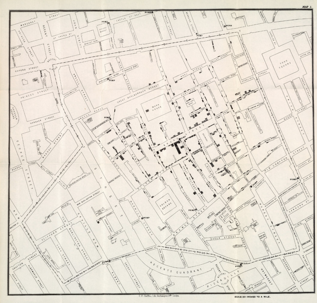
John Snow, On the Mode of Communication of Cholera, Map 1, 1855
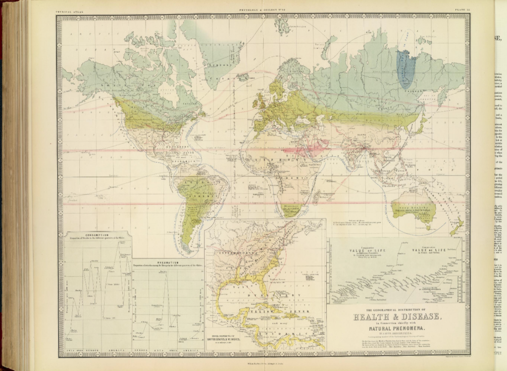
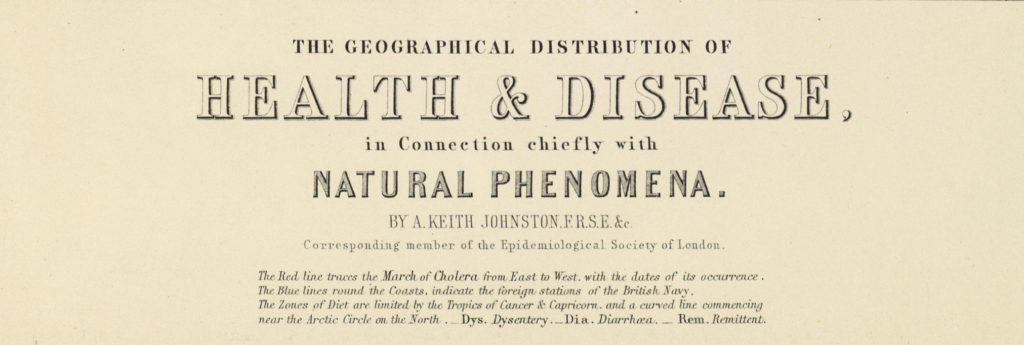
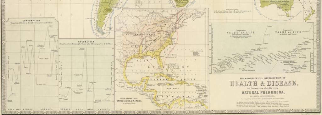
Alexander Johnston, The geographical distribution of health & disease, in connection chiefly with natural phenomena. (with) Fever districts of United States & W. Indies, on an enlarged scale, 1856

These two maps were created to express similar arguments, this being disease is connected to x.  In John Snow’s case, the disease was cholera, and x was the pump on Broad Street. In Alexander Johnston’s case, the disease was consumption, rheumatism, yellow fever, dysentery, leprosy, typhus, &c. and x was their geographic location. While the structure of their arguments are the same, the subjects and the methods they used to present them lie on opposite ends of the same spectrum.

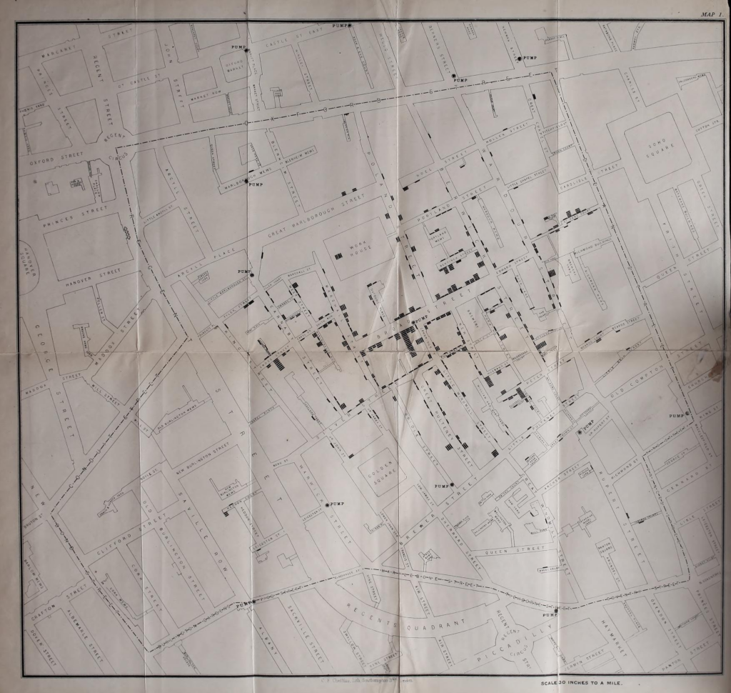
In 1855, John Snow published the 2nd Edition of On the Mode of Communication of Cholera. In this work, Snow included an enlarged map from his first edition with updated stats infamously known today as “John Snow’s Ghost Map”. “Map 1” served as a visualization of the locations of deaths by cholera and water pumps across the district of Soho, London. It was the first of its kind to display data like this and a straightforward aide in understanding the argument Snow made, that these deaths were somehow connected to the pumps.

Parish of St. James, 1855

When Snow’s research was published in 1855, it was unpopular. But before his research could fade into obscurity, Rev. Whitehead’s continued investigation into waterborne illness proved true with Map 1 being a major contributing factor. After this, variations of “Map 1” was reproduced for many publications such as the Report on the cholera outbreak in the Parish of St. James, Westminster, during the autumn of 1854 because of it’s straightforward visualization, catapulting it into fame and cementing Snow’s name in medical history.

The same might not be said for Alexander Johnston’s map. The Geographical distribution of Health & Disease, in Connection chiefly with Natural Phenomena was published in 1856. Its subject encompassed the entire world and every disease known to man within it at this time[kidding]. His goal was to map a correlation between the amount of deaths diseases caused and the climate of the region the disease impacted along with a varying number of other factors.

Johnston’s thematic map was hugely different from Snow’s reference map for many obvious reasons. A large component of this may be attributed to the enormous amount of information it depicts, from the statistical diagrams line the bottom of the page to the colors identifying the climates in different regions. Upon first glance, it is easy to compare Johnston’s map to the same fate Cooper’s map was described to have met in The Ghost Map reading.

” As exacting as Cooper’s map was, it ultimately had too much detail to make sense of the story… For a map to explain the true cause behind the Broad Street outbreak, it needed to show less, not more. “

– The Ghost Map, 193

While this statement was proven true when it came to the impact its complexity had on its re-printability and the ease of comprehension in it’s viewers, the global-encompassing nature of its subject made most of the maps additional information necessary to the argument.

Since it’s creation, Johnston’s holistic approach to the creation of this map has been celebrated as one of the pioneering maps that connected the disciplines of cartography and epidemiology. While detailed to the point of exhaustion, the additional graphs worked well to express the impact the same disease had on different cities across the world and inspired following generations of cartographers to look for additional information to put on maps like this.

Alexander Johnston, "The geographical distribution of health & disease, in connection chiefly with natural phenomena. (with) Fever districts of United States & W. Indies, on an enlarged scale.", 1856
John Snow, "On the Mode of Communication of Cholera, 2nd Edition", 1855
Steven Johnson, "The Ghost Map", 2006
The Cholera Inquiry Committee, "Report on the cholera outbreak in the Parish of St. James, Westminster, during the autumn of 1854", 1855
Leah R. Keith

Mapping Ethics Blog post- Marie Amelse

When reading and exploring the Equal Justice Initiative and then the Monroe & Florence Work Today websites they at first seem to be relaying the same message, with varying different minor details and framings, however “Racism in the Machine” Hepworth and Church do a great job on contrasting these two different visualizations and representations of racial violence from the dawn of the civil war onward. At first they do not seem that different from each other, but after digesting both and especially after also reading from Hepworths and Church’s analysis, you can see how stark the differences really are. In the end they presented and even chose data in different ways even when seemingly portraying the same idea.

Monroe & Florence Work were especially aware of sourcing and defining their data, and it is clear the current website also shares this sentiment. The Work’s were very deliberate in searching for the validity of lynchings, as a result this website is honest in communicating that their database is likely underreporting the incidents of lynching. The Work Today website also includes education information on different definitions of lynching.

Here, this window shows an option to show both a “Strict definition” and a “Broader definition”. Even within their website there is transparency that the same message end up looking very different based on definitions the statistics revolve around.

On the other hand the Equal Justice Initiative ( EJI) is not as clear on the definitions of what the graphs and statistics show. Although it is clear that the numbers focus on the deep south. Below is one of the main slides on the Lynching in America webpage. Interestingly in span of time which spanned over 70 years there was only “2 reported” lynchings in California and “1 reported” lynchings in Michigan. This contrasts with the data from the Work website which reports 26 for both states in that same time range under the “Broader definition”.

Above, is the Lynching map shown on the EJI website. As Hepworth and Church, the EJI has a strong emphasis on the deep south, almost portraying racism as clustered and almost solely being perpetrated in the South. Below is is a 100 year span from the Work website, which presents the continental US all together, and while the mob violence is concentrated in the South, it is shown to be an issue that is present throughout the U.S.

Another thing that was a variable that Hepworth and Church presented was even who these different data bases considered who lynchings could be perpetrated against. The Work Today website made it clear it was a racially motivated crime that could be committed by white mobs against any racial minority, EJI on the other hand sole focused on lynchings against African Americans. Can this mitigate historical violence against Native Americans, Asian-Americans, or other racial minorities? In this case it is especially important to take into account the larger goals of who creates these data sets. EJI, for instance is focused on fighting mass incarceration, and especially fight the inequality against Black Americans within the criminal justice system. The publisher of the Monroe & Florence Work Today website is #PlainTalkHistory, whose focus is to tell the multicultural and multiracial history of the US that can too oftenly be ignored in popular US history lessons. Knowing these things on the creators can add more context to the maps and messages they create.

Mapping Ecological and Economical Disaster

1880

1900

1940

The most obvious change to me was Oklahoma, as we can see in the 60 years of these maps, more data was being collected. This can be verified because the data had become more split up to provide more accuracy. since 1880 it is known that the population in Midwestern states has grown significantly and as the population expanded so did the land use. These maps show an understandable display oof the cultivation od land use through 60 years.

css.php