Erin’s project details the water contamination of Hinkley, California with Chromium-6 and how this contamination has continued to affect residents in many aspects of their lives. Erin begins her paper with an introduction to her question and information regarding the methods she used to gather data and information. She then continues her project with the introduction of the 1996 lawsuit that brought Hinkley, California to the forefront of news. Residents of Hinkley, California had had alarming health problems ranking from cancer to birth defects, all tied to PG&E’s gas compressor station. The remainder of Erin’s paper explains what Chromium-6 is and how this was related to PG&E, how the problem began, and how it has continued. She analyzed health effects, property values, access to education, and population changes.
I thought that Erin’s project was very visually interesting to look at. She added a lot of elements in her project that engaged her reader. She had side bars, interactive maps, and I especially liked that touch of adding in the audio recording of news. I thought this really helped the reader take away the human aspect of this project. I also appreciated how informative Erin’s project was. I felt like I got a good understanding of the problem as it first existed as well as how it continues to be a problem for residents in Hinkley today. I thought Erin’s maps worn informative and they made the information being presented easy to understand.
The main critique I had for Erin’s paper was organization. I felt as though there was some jumping around between topics and years. For example, the legal case is brought up several times throughout, but I think it could have been all one section. I also thought that information about Hinkley, such as median home value, property value, and population could have been organized more directly with each other, while information about Chromium-6, the plump, and PG&E could have been organized more directly with each other.
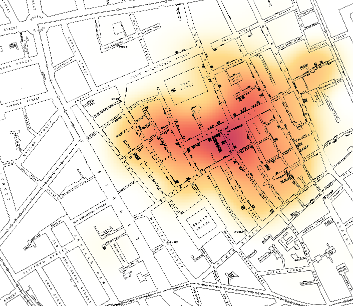
This heat map demonstrates regions in which there was a heavier concentration of of Cholera deaths. The darker the region the more deaths. Without seeing specific dots indicating death, you can still see a heavy correlation between the broad street pump and amount of deaths.
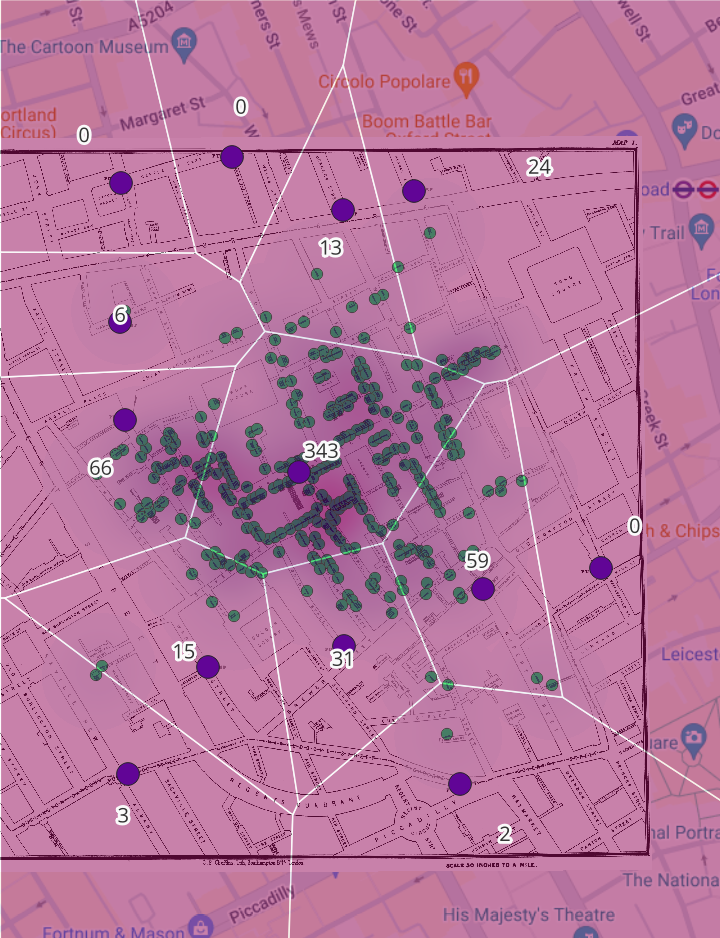
This map demonstrates several different factors. Each polygon represents the closest distance to each pump (the purple dot). Each green dot is a death or a number of deaths. Each polygon also lists the amount of death in one region. This map indicates that there is a heavy correlation between the Broad Street Pump and the most deaths in the region.
I think that Heat Maps would be a good tool to show area impacted. In this case, certain areas were more impacted by the cholera epidemic than others. Areas can also be impacted by severe weather or crime. I think in this case, Voronoi polygons were more useful because it indicated that a pump, which required walking distance, was the source of the disease. Polygons show a better relationship to distance than needed to travel than heat maps.
I think Voronoi polygons could specifically be useful in my project because I am mapping access to schools. Distance to schools, and distance to a “good” school has a lot of determination on outcomes like future earnings. Mapping the access to good schools could help demonstrate a pattern in student outcomes in different neighborhoods of Omaha.
The Dust Bowl was an event that impacted Central and Southern States during the 1930s. It has been attributed to a number of different causes, including the over cultivation of land during droughts.
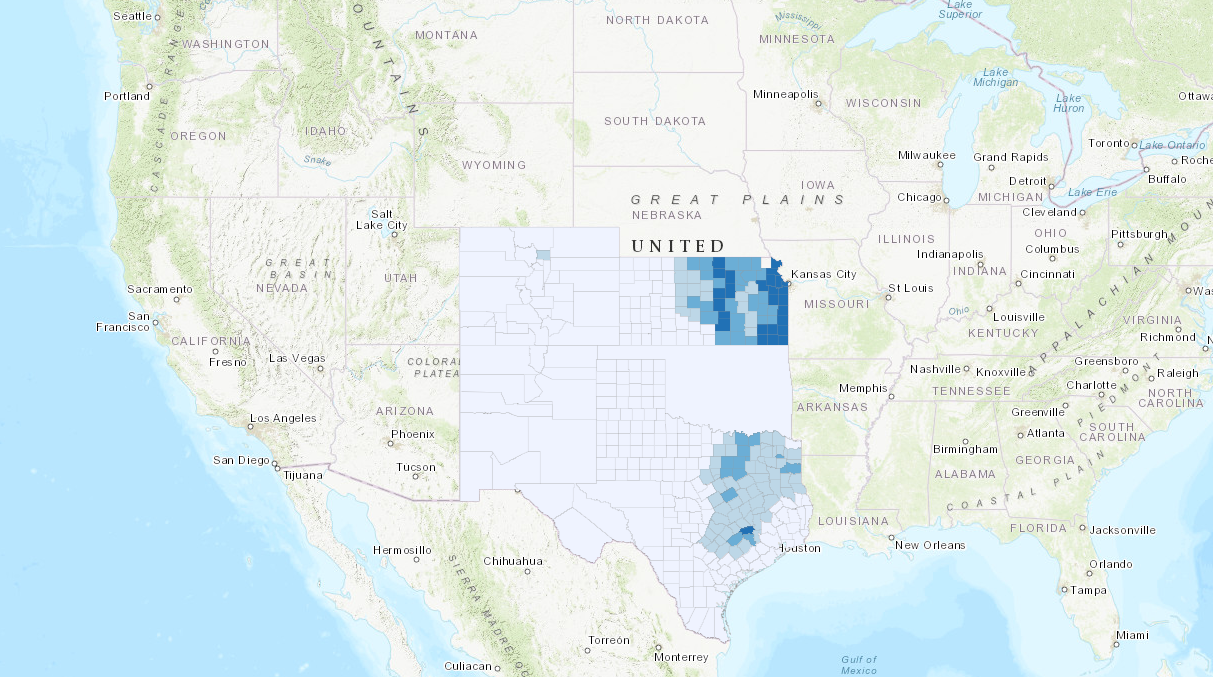
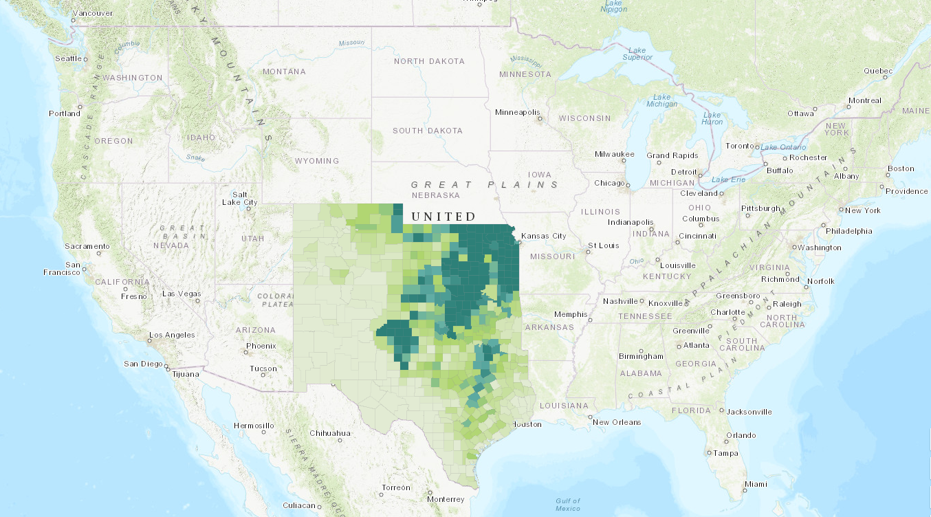
This is a map of the total cultivation of land in 1880 in the states most impacted by the Dust Bowl. Land Cultivation is primarily centered around eastern Kansas and eastern Texas.
This is a map of the total cultivation of land in 1900 in the states most impacted by the Dust Bowl. Land Cultivation has expanded to include regions of central Kansas and central Oklahoma, while the area of Texas has widely remained the same, but the amount of cultivation in each individual county has changed
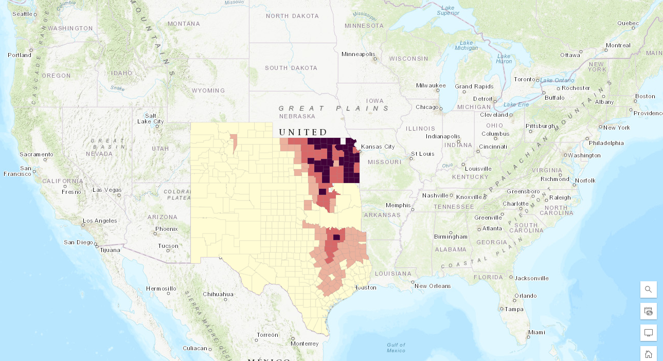
This is a map of total cultivation of land in 1940 in the states most impacted by the Dust Bowl. Cultivation has further expanded to include most of Kansas, Oklahoma, and eastern and central Texas. It has also more heavily expanded into Colorado and New Mexico.
I think this map helps to prove the theory that land cultivation accompanied by droughts helped contribute to the dustbowl. There is a definite increase in land cultivation across this area, and over cultivation accompanied by abnormal weather conditions can be a recipe for disaster in agricultural areas.
CreightonGISArchive. “Omaha Public Schools. ArcGIS. Last updated May 8, 2020.
This Web Map layer provides the locations of the Omaha Public Schools, as well as population and demographic information.
CreightonGISArchive. “Omaha 1950 African American Demographics.” ArcGOS. Last updated May 8, 2020.
This Web Map layer provides a mapping of the African American population in the 1950s. This is relevant to my project (specifically the 1955-1975 date range) because it provides some population data for the historic event of Omaha’s segregated schools.
CreightonGISArchive. “Omaha Demographic Analysis.” ArcGIS. Last updated Mar. 17, 2022.
This layer provides a modern demographic analysis of Omaha, featuring different distinctions, such as race, income, age, and education.
Omaha School Directories (a variety of dates)
Housed at an Omaha Public Library, the Omaha School Directories should provide me with the name and location of the schools within my earliest and middle date ranges so that I can map them. It should give me addresses and idea of school access and how it has changed over the decades.
This source can also double as a secondary source due to the background information it provides, but it provides data and mapping for Special Education programs in OPS, as well as the funding by each district for special education programs.
Census Data – 1950 through 2020 – NHGIS
This Data will cover a variety of fields (depending on the data range). Most importantly, it will cover demographics surrounding race and poverty.
This layer provides a map of all current private schools. Though it includes all private schools across the state of Nebraska, I can filter it to the Omaha Metro Area, plus Ralston, Millard, and Elkhorn.
This map gives a breakdown of school districts. I think it is also useful because it provides some demographic information, such as total population, and gives a visual of the shape of the district.
University of Montana. “Disability Counts: Date Lookup Tool.” Rural Institute. https://rtc.ruralinstitute.umt.edu/geography/DataLookupTool.asp
This interactive tool allows you to create a data set regarding disability in specific areas across the country, I plan to use the information on age, race, and disability in Douglas, Cass, and Sarpy Counties.
Omaha Public Schools. “Omaha Public Schools: Building Locations.” https://www.ops.org/site/handlers/filedownload.ashx?moduleinstanceid=2326&dataid=2316&FileName=OPS%2036×36%20-%20School%20Locations.pdf
This is the current map of the 2023-2024 Omaha Public School System and the boundaries for each school. I would ideally also like to find the opt in data for OPS to get an idea of how “solid” the district boundaries are.
The majority of my current secondary scholarly sources provide either some historical background information or social scientific research on discrimination in schools on the basis of race and disability, as well as its impacts on student education.
Johnson, Tekla Ali, Greg Wiggan and Deborah Brown Quick. “African American Administration of Predominately Black Schools: Segregation or Emancipation in Omaha, NE.” African Cultures and Policy Studies, 2009.113-129.
This article focuses on the issues of class, poverty, and race. Despite decades of work to rid the nation of segregated practices, a school system that functions in some way off of income inevitably perpetuates segregation on the basis of poverty and race.
Lake, James A., and Richard Hansen. “Negro Segregation in Nebraska Schools – 1860 60 to 1870.” Nebraska Law Review, vol. 33, no. 44.
This a review of 1950s deliberations about the practices of segregating schools in Nebraska. This article is important to provide some historical context to my first date range of 1955-1975.
Hoy, Frank Allan. A Study of the Relationship Between Declining Enrollment and Desegregation Litigation in the School District of Omaha. Lincoln: The University of Nebraska, 1978.
This book provides more historical background into the practices of segregation and the policy of “separate but equal” in Omaha during the 1950s, 1960s, and early 1970s.
Bennet, Gary G. A Study of Court-Ordered Desegregation in the School District of Omaha, Nebraska 1972-1977. Lincoln: The University of Nebraska, 1979.
Similar to the last source, this article provides more background on the Omaha-centric practice of segregation with a more specific date range. This article moves in to my second date range of 1975-2000.
Washington, Marguerita Leetta. An Analysis of Educational Attitudes of Black Youth Within the Omaha Public School System (Nebraska). Lincoln: The University of Nebraska, 1985.
This article provides a social science background on the attitudes around education that Black Youth and Omaha held during the 1970s and 1980s. It explores how racism, segregation, and desegregation in the Omaha Public School system has impacted these attitude and some potential outcomes for them.
Oberst, Byron B. “A Community Approach to Specific School Learning Disabilities: The Omaha STAAR Project.” Journal of Learning Disabilities, October 1973.
This article is published in the wake of the Rehabilitation Act of 1973 which was the United States first big push to give rights to those with disability’s. This specific article stems from this legislation, designing a school program that could be implemented in Omaha to benefit those with disabilities.
Rabak-Wagener, Judith, Peter J. Ellery, and Richard D. Stacy. “Analysis of Health Education Provided to Students with Disabilities in Nebraska.” Journal of Health Education, 1997.
Though this article only concerns one specific type of education (health), it demonstrates the attitudes surrounding educating students with disabilities in the 1990s. It can ask questions about if similar patterns are seen in other forms of education.
Sullivan, Patricia M. and John F. Knutson. “Maltreatment and Disabilities: A Population-Based Epidemiological Study.” Child Abuse and Neglect, October 2000.
This is an article examining the nationwide prevalence of treatment of children with disabilities in schools, one of their specific resources is school records. This is important to the overall purpose of my project, because understanding how people are treated in a school can help to understand their specific school outcomes.
Nebraska LB 1024 and LB 641
These are two Nebraska State Legislations that concern districting and redistricting on the Omaha Public School District System. They drew nationwide attention with threats of suit from OPS and the NAACP. This is important to my project because it falls within the date range of my third group, 2000-2020.
Aron, Laudan, and Pamela Loprest. “Disability and the Education System.” The Future of Children vol. 22, no. 1. Spring 2022, 97-122.
This is another broad article on the nature of disability education in the United States and its benefits and shortcomings. It provides both a historical and contemporary background to disability in schools.
Leake, David W., and Robert A. Stodden. “Higher Education and Disability: Past and Future of Underrepresented Populations.” Journal of Postsecondary Education and Disability, vol.27, no. 4. 2014. 399-408.
This article explores how specific acts of legislation including the Rehabilitation Act and the Americans with Disability Act have impacted schools. Both of these acts take place in a set part of my date ranges, and I am hoping to use the information to locate some mapping data regarding disabilities and their change over time.
This website provides some great historical information about some historically segregated schools in Omaha, as well as key historical figures on the issues of race and segregation in Nebraska.
The reading, “Racism in the Machine: Visualization Ethics in Digital Humanities Projects,” by Katherine Hepworth and Christopher Church began its discussion by introducing the problem of neutrality in digital projects. While many things have the perception of neutrality, their structures, choices, and backgrounds come from long-imposed structures of oppression, like racism. Attempting to create a neutral project (especially one generated by AI), will inevitably result in the same problematic structures current society is created on becoming visible and a prominent aspect of those projects. Digital Projects need an argument, or at least some critical intention.
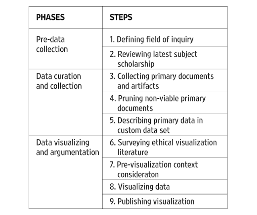
A chart of Hepworth and Church’s outline
Within the argument or critical intention of a digital project, it is important to approach it with a plan of action. Hepworth and Church’s paper proposes a multi-step plan, to best ethically create a digital project. This plan had three phases (pre-data collection, data curation and collection, and data visualizing and argumentation). Between the three phases outlined, Hepworth and Church propose nine steps (defining the field of inquiry, reviewing the latest subject scholarship, collecting primary documents and artifacts, pruning non-viable primary documents, describing primary data in a custom data set, surveying ethical visualization literature, pre-visualizing context consideration, visualizing data, and publishing data).
Of the steps and phases that Hepworth and Church lay, I believe that surveying and pre-visualizing is one of the most important ethical considerations. The inclusion of a test audience or test projects draws a distinction between maxim-based, or deontological ethics, and consequential ethics. While I believe that deontological ethics has some merit, I also believe that the consequential aspect of digital projects is the more important consideration. The saying “the road to hell is paved with good intentions” is important here. One’s purpose for creating a project could be neutral or positive, but its actual consequence is negative. Take the AI Twitter Chatbot for example. The maxim behind the creation of this bot was to create a fun experiment (an ethically neutral to the positive distinction), however, the consequence was a racist chatbot (an ethically negative distinction). Bluntly, in consideration of publishing a widespread digital project, intention does not matter (at least not to the same extent as consequence).
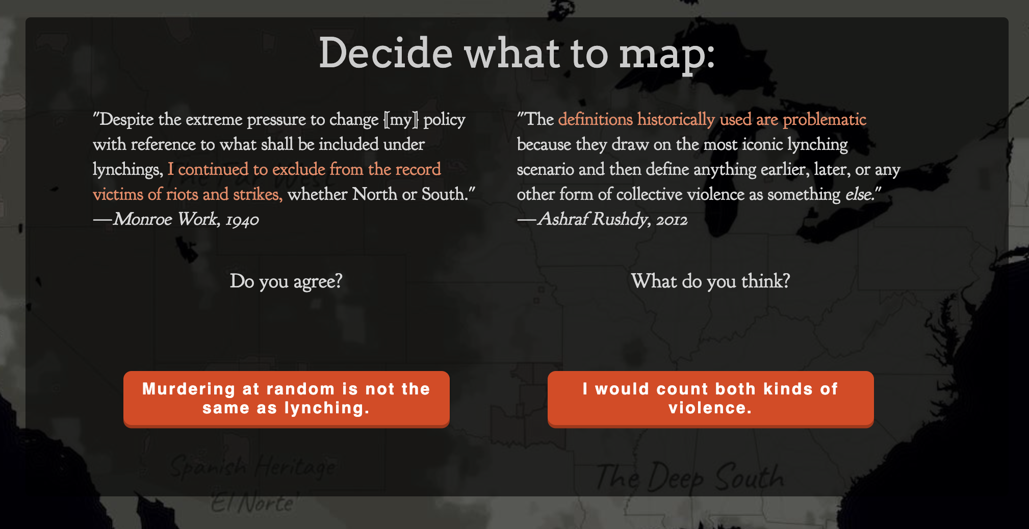
The examination of maxims and consequences can be evaluated in the two digital humanities projects that were outlined in the reading, “Lynching in America: Racial Terror Lynchings” and “White Supremacy Mob Violence.”
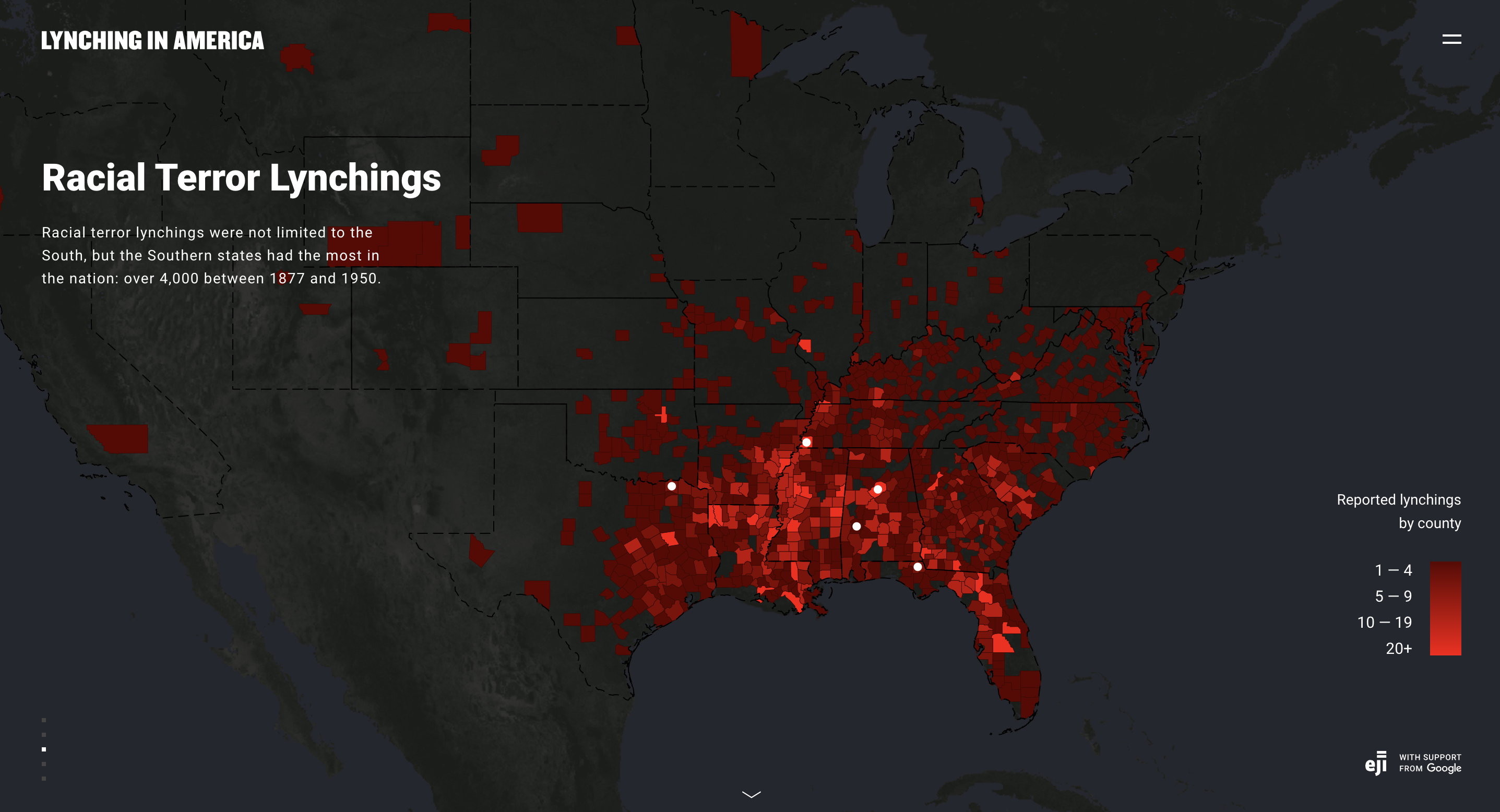
A screen grab of the current “Racial Terror Lynchings” Project
The intention of “Lynching in America; Racial Terror Lynchings” was to be part of a larger group’s work on prison reform. However, the consequences of this project do not ethically reflect the noble maxim of the project. The first problem, as outlined by Hepworth and Church, is that it initially made little consideration for lynchings that occurred outside of the Deep South. When it did consider these lynchings, it still only considered African American lynchings. The consequence of this project is that it becomes less of an argument and more of an assertion. The assertion is that African Americans were the sole victims of lynching and that this act of terror was a predominantly geographic problem.
Without clearly presenting the evidence, or presenting any other information on lynchings that occurred against non-African American individuals, the project does not allow the viewer to think for themself, and draw a conclusion outside of the assertion made. Instead, the project asserts its own (incorrect) conclusions to the reader, a conclusion that is backed by its purpose as a tool for prison reform. The issue with the argument of this project is not that it is a weak one, terror lynchings on a racial basis are a well-backed historical event (especially those committed against African Americans). The issue is also not that the cause of the project is bad. The issue is that there is no argument at all, instead the project is an assertion that gives in inaccurate understanding of lynchings.
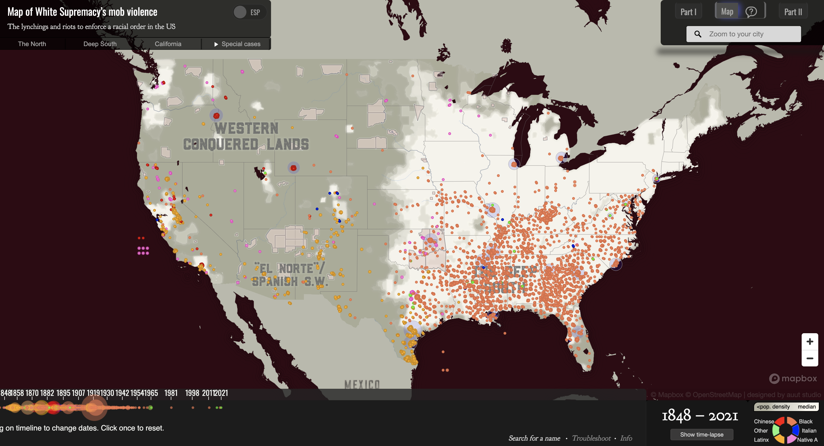
A screen grab of the “White Supremacy’s Mob Violence” map
A picture of some of the interactive features of the “White Supremacy Mob Violence Project”
Provided as an alternative to the “Lynching in America” project, the “White Supremacy Mob Violence Project” provides a more ethical example of its consequence. The first striking difference between the two is how much more interactive this project is. Throughout the project, the reader is provided with choices. They can choose whether they consider something murder or not. They can choose whether or not they want to see the sources of information. The reader is provided definitions and examples to inform these choices. Within the actual map, each instance of lynching is given information. A person’s name, or at least identifying features is given (as well as the known reason for the lynching). The race of the person lynched is also given (a stark contrast from the information presented in the first project). The consequences of this project are an argument, not an assertion. With the information given to the viewer of the project, the project argues for the reader to evaluate. Looking at the races of people lynched, the reasons for the lynchings, and the dispersal of the lynching, the reader is left with the argument that these were racially influenced hate crimes.
Both projects have noble maxims. The first project intends to call to mind the problems with the modern prison system, especially the problems faced by African American men. The second project intends to highlight America’s historic problem with white supremacy’s mob violence. However, it is the consequences that distinguish to two ethically. The consequence of the first project draws an asserted conclusion that leaves out information and can be seen as misleading to an audience on the historical violence that occurred. The consequence of the second project is an informed viewer who can consider a strong argument on the racial motivations behind lynchings.
Bibliography
EJI and Google. “Lynching in America: Racial Terror Lynchings.” https://lynchinginamerica.eji.org/explore
Hepworth, Katherine and Christopher Church. “Racism in the Machine: Visualization Ethics in Digital Humanities Projects.” Digital Humanities Quarterly. Vo. 12, no. 4 (2018).
Monroe and Florence Work. “White Supremacy Mob Violence.” https://new.express.adobe.com/webpage/nKAyaWTMZtLxS/
The scope of my project will be to look at and compare three time ranges; 1955 to 1975 (with a focus on the last decade of the range, as this is when segregation ended, impacting segregated schools in Omaha, such as Lake School, Kellom School, and Lothrom School), 1975-2000 (with a focus 1990 and on, as the there is a population spike nearing the start of the 2000s), and 2000-2020 (as population has continued to increase, and legislation impacting education was presented). I am currently debating whether to consider any questions surrounding Covid-19, but at this time I am leaning towards no. I aim to look at schools primarily through two lenses, that being race and disability, but depending on information available I may also consider religion. I will consider schools within the Omaha Area (not just Omaha Public Schools), which include Bellevue Public Schools, Bennington Public Schools, Elkhorn Public Schools, Omaha Public Schools, Papillon-La Vista Public Schools, Ralston Public Schools, and Westside Community Schools. There are also 15 non-denominational private schools and 18 catholic schools within this area.
Some possible sources to consider is Census Data, which would provide information on race, disability, and religion. Several maps of the racial breakdown of Omaha should also be considered. The school district breakdown map of Omaha should also be considered, as well as bus maps that can explain help demonstrate children’s access to education. The Omaha School Project also presents some interesting maps, such as the mapping of disability funding in each school district (as well as funding in general). Non map related sources that could be consulted is legislation surrounding access to education, such as legislation desegregating schools and bills introduced in the early 2000s that were subject to law suite by the NAACP for discriminatory. News papers detailing the opening and closing of schools will will also be important.
My final project will be an interactive web map, ideally with three different maps that can be overlaid or filtered out to demonstrate the changes that have occurred within and between the three different time ranges. I think this is the best way to present this project because it would allow for information to be presented on each school, and patterns to be recognized through the lens of race, religion, and disability.
This project is an important piece of scholarship because a correlation between poverty and education has been shown. Outlining access to education as demographics in Omaha have changed throughout the decades may help point out patterns in inequality. With a changing demographics (especially in an increase in population) schools have been added in Omaha, but schools have also closed and moved locations. Each of these decisions impact children’s access to education, as well as a decision made by some decision.
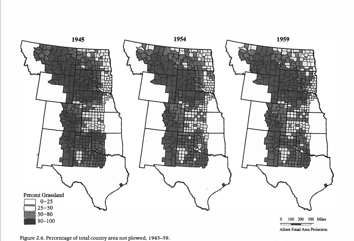
The maps of the changes to the grasslands of the Great Plains demonstrate a mapping of the changing tension between humans and nature, and how that tension has developed with an influx of people and the creation of new technology within the last century and a half.
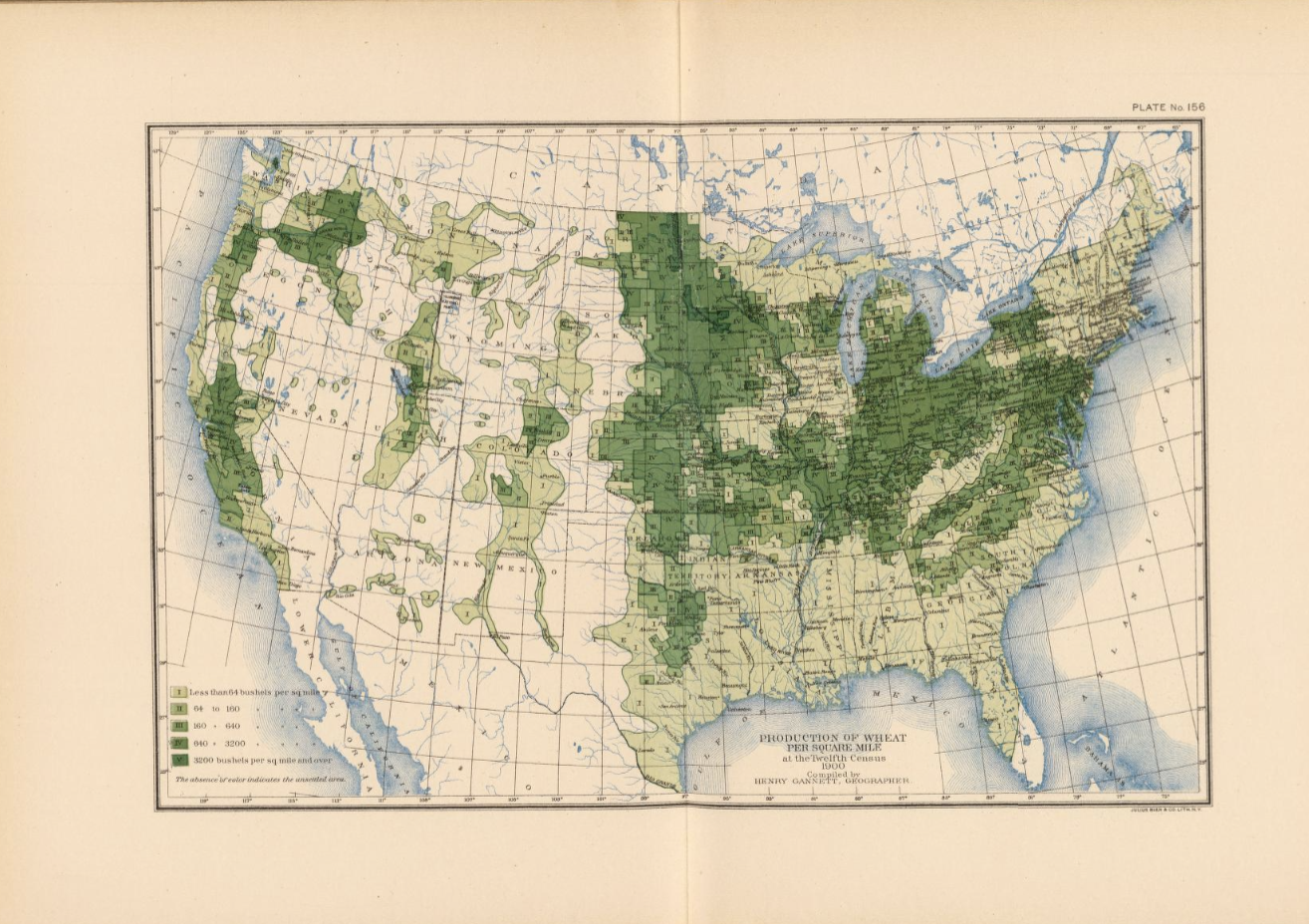
Henry Gannett’s map, 156. wheat/sq. mile, demonstrates the tension between humans and nature in 1903. In the western part of states like North Dakota, South Dakota, and Nebraska, there is a clear divide between land that is used for farming and land that is not. Geoff Cunfer explains several reasons for this task. Firstly, plowing the land to make the Great Plains suitable for farming was a slow task, taking decades for just one family’s farm to be plowed to a level that satisfied them (Cunfer, 18). The other, is that some land was not suitable for farming, even after being plowed – causing it to be turned back over and used for range land. There is a limit to human use of the land. This is a tension between nature and humans. Humans are attempting to exploit an ecological niche with technology, but nature can be unpredictable. Rain, rocks, elevation, and many other factors battled farmers from transforming the grasslands.
Cunfer’s figures continue to demonstrate the ever-changing tension between nature and humans. Humans have continued to attempt to turn the grasslands into something else, with the mapped divide from Gannett slowly being reduced throughout the decades. To do this, they utilized new tools, technologies, and techniques to better develop and maintain land for their needs. However, tensions between humans and nature come from several different sources, such as carrying capacity, natural resources available, suitable environments to live in, and the ability to successfully apply tools and technology to a sustainable development of land. What are the consequences from increasing the tension between nature and humans?
One example of disaster occurring from increasing the tension between humans and nature is actually one that occurred in the very region being mapped. This was the Dust Bowl of the 1930s. Humans experienced natural consequences of nature, like drought and poor production and decided to overproduce suboptimal land with new machinery (increasing tension). The drought and production caused soil erosion, which would plague the area in dust storms for a decade (further demonstrating the result of too much increased tension between humans and nature).
Bibliography
Cunfer, Geoff. 2005. On the great plains. Texas A&M University Press, pp. 16-37.
National Drought Mitigation Center. “The Dust Bowl.” University of Nebraska. https://drought.unl.edu/dustbowl/#:~:text=Due%20to%20low%20crop%20prices,would%20cause%20the%20Dust%20Bowl.
Gannett, Henry. 1903. “Production of Wheat per Square Mile at the Twelfth Census 1900.” DavidRumsey.com.