
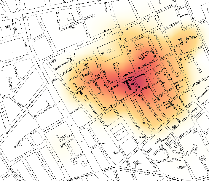
This heat map demonstrates regions in which there was a heavier concentration of of Cholera deaths. The darker the region the more deaths. Without seeing specific dots indicating death, you can still see a heavy correlation between the broad street pump and amount of deaths.
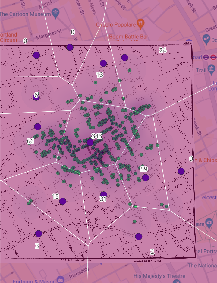
This map demonstrates several different factors. Each polygon represents the closest distance to each pump (the purple dot). Each green dot is a death or a number of deaths. Each polygon also lists the amount of death in one region. This map indicates that there is a heavy correlation between the Broad Street Pump and the most deaths in the region.
I think that Heat Maps would be a good tool to show area impacted. In this case, certain areas were more impacted by the cholera epidemic than others. Areas can also be impacted by severe weather or crime. I think in this case, Voronoi polygons were more useful because it indicated that a pump, which required walking distance, was the source of the disease. Polygons show a better relationship to distance than needed to travel than heat maps.
I think Voronoi polygons could specifically be useful in my project because I am mapping access to schools. Distance to schools, and distance to a “good” school has a lot of determination on outcomes like future earnings. Mapping the access to good schools could help demonstrate a pattern in student outcomes in different neighborhoods of Omaha.
Nicely done.