Blog Post 3 Evan Murphy

The United States, like many of the countries that have been major powers over the past two centuries does not have a past free of colonialism. The widely produced map of the United States that only includes the contiguous 48 states, Alaska and Hawaii fails to tell a complete and accurate story of the US. This map, shown below is so common within the US that an iteration of it hangs above my bed. This map lacks the complete nuance that is needed to understand the rich history of the country, leading to many misconceptions by Americans and others about the nation.

US Logo Map by Daniel Immerwahr

Although the ‘logo map’ fails to give a complete dive into the complexities of the us borders and territories, Immerwahr’s other map also fails to do so. The map below shows all the outer borders of the US states and territories but does not provide borders between the contiguous states or actual locations of any of the territories, this map also fails to capture the nuance that Immerwahr claims to desire, despite the map’s old age.

Map of the Greater United States as it was in 1941, Immerwahr

Bill Rankin’s map from 2007 of the territory of the United States does a much better job at capturing the detail of the country and even gives some information on each colony or territory and it’s governing structure. The map is in depth and features many legends to explain the importance of each feature. A fragment of the map shows the layers of government within each of the US states and a wider portion of the map is dedicated to the territories and their layers of government.

Bill Rankin – The Territory of the United States (2007)

Overall it seems that Immerwahr is willing to go to great lengths to criticize the mapping techniques and strategies of the United States and the so called ‘logo map’, but fails to provide a more robust resource to portray this, while Rankin does.
Blog 3- The American Empire

Daniel Immerwahr’s “logo map” from the guardian with the inclusion of Hawaii and Alaska is the common map used to educate students about the geography of the United States. It creates the “illusion” that the United States is just the 51 states and that Alaska and Hawaii were the only “outside” territories added.

However, the United States is a lot bigger and more powerful than what the “logo map” shows. Bill Rankin’s-The Territory of the United States (2007) has multiple maps that show America’s territories and military power. On the map titled “US Military Installations” I was shocked by how vast the tiny red dots stretched on the map. I’ve always been taught that the United States is a superpower that can project its power throughout the world. However, the article also shows the territory that the United States still controls in the 21st century, and to my surprise the United States controls a significant amount of territory.

Another detail the map of the United States includes is the addition of the Native American reservations. Following America’s War for Independence the young country began to seek land to the west. This desire increased during the 1840s when the idea of “manifest destiny” promoted young settlers to move out west to seek their fortune. However, this exploration and settlement came at the cost of the indigenous peoples who lost their land often due to military conflict with the United States. Today, multiple tribes live on reservations in multiple states in the US often, having their own autonomous government.

One detail I found interesting from the Guardian article titled: “How the US has hidden its empire.” Is when the author (Daniel Immerwahr) visited Manila she saw signs of American colonial rule throughout the city. While America successfully “hid” its empire on the mainland the effects of American rule can still be felt and seen throughout her former colonies. The author observed people in Manila speaking English and people using American made products despite the Philippines no longer being an American colony.

Blog Post #3

This week’s reading helped me explore the role maps play in both documenting history and altering how we perceive history through images.

Susan Schulten’s “Mapping The Nation” explores the idea that maps helped define American identity and had massive influences on shaping the nation in the 19th century. Schulten makes the statement early that the history of the United States has always been about growth, gain, and expansion. The United States has been a nation built on the idea of expansion from its inception and maps have helped both illustrate and propagate those ideas to its current state. Susan Schulten also uses the “logo map” as a prime example for how maps pushed ideas and eras of expansion.

This simple outline of the United States is exactly what comes to mind when I think of the United States. Even before I think of the flag, I can see the odd juts of Florida, Maine, and the southern tip of Texas. In Schulten’s “Mapping The Nation” Willard argues that on top of their navigational uses, national maps held deeper meanings politically. Willard states “…that maps were traditional representations of territory as well as abstract symbols of national power” (Schulten, 38). This map excludes 2 states and multiple other territories under the United States’ wide reach across the globe yet it still is the primary symbol of the size and strength of the United States.

However, in contrast to the simplicity of the logo map that excludes other pieces under United States rule, Rankins’ “The Territory of the United States, shows the full extent of US imperialist power. Bill Rankin’s map shows a detailed map of the United States along with Hawaii, Alaska, as well as other US territories. Rankin’s map also uses separate maps of the world to show US military installations, land leased by the US, and other borders to show the waters the US oversees.

Bill Rankin’s “The Territory of the United States” (2007)

While Rankin’s map shows the long reach of the US, maps like the logo map effectively hide the United State’s imperialist history. Images like the logo map that have been flashed at us over time exclude the fact that we still occupy a lot more land that wasn’t originally ours and/ or properly obtained. This is on top of the fact that images of the contiguous 48 also detail stolen land.

While we think of images like the logo map that show America as this mainland unified power, maps like Rankin’s display the vastness of the American empire that is very much hidden from the world.

Blog 3: A culture of patchwork, Samuel Duncan

To ask a modern American citizen to even name all fifty states that make up the United States of America would be a near-impossible task. Many people only know “The Big Ones”—those depicted in media, such as California, New York, Illinois, and Florida. The readings for this week emphasize the various authors’ points about not only the varying geography of states but also their respective cultures, resources, and identities.

The image above is the “Logo Map” by Daniel Immerwahr. The lines that we have come to accept between states appear superficial when viewed through a different lens. One state’s identity does not reflect the priority given to one state over the other. Many people forget about the “American Empire” that many claim no longer exists. In Immerwahr’s map, Hawaii and Alaska are not included. Today, we know those as states, regardless if they are separated by land or sea. However, many American citizens forget about the Protectorate, Puerto Rico.

In How the US Has Hidden Its Empire, Daniel Immerwahr brings up the country’s climate during the Second World War. Many refer to wars involving the United States as European conflicts, such as the World Wars. Or the Vietnam War, or more recently, the conflict in the Middle East. Many forget the Spanish-American War in 1898, which gave ownership of the colonies in the Philippines to America. In December of 1941, the Empire of Japan attacked Pearl Harbor in Hawaii, which was not added to the union until 1959. Yet, as explained by Immerwahr, the address from President Roosevelt only for Hawaii is mentioned. One of the main points from Immerwahr regards the idea of “Why is one territory valued over another?”

The question of “why?” is never truly answered, as seen in Bill Rankin’s Map The Territory of the United States. The areas controlled by the United States range significantly across the Pacific Ocean and into the Gulf of Mexico. The idea is where the United States ends, and the less important areas begin.

One possible interpretation of the United States’ attitudes after the bombing of Pearl Harbor could be that only places of significant military presence are noteworthy to the country as a whole. I was not personally active during the bombing of Pearl Harbor. Still, I could understand how people of the greatest generation would not be as concerned with areas under attack unless the attack affected something they understood, like the military.

People in 1940s America were weary and hardened by the great depression and the Great War. The presidential address displays a call to action for the American people. the reading made a point regarding how President Roosevelt included in his presidential address that “the Japanese squadrons had bombed not the “island of Oahu,” but the “American island of Oahu.” According to these maps, the United States military could give American protectorates their validity. This may be a reach, but given the record expressed throughout the 20th century, that interpretation could be valid.

Daniel Immerwahr. “How the U.S. Has Hidden Its Empire.” The Guardian. 15 February 2019.

Rankin, Bill. 2007. “The Territory of the United States.” http://www.radicalcartography.net/us-territory_12m.png.

Immerwahr, Daniel. 2019. “Logo Map.” The Guardian. https://i.guim.co.uk/img/media/c5086ec4135a39e4bf56ab4cf36a81775ae43cab/981_136_5970_3583/master/5970.jpg?width=620&dpr=1&s=none

Blog Post 3: Schulten

I first began my course of action looking at the map titled The Territory of the United States: A Patchwork of Jurisdictions and Rights. Immediately I was drawn to the smaller images around the central United States. This map shows the States, and some additional American territories. I then began to read through the legend and noticed that it was broken down in land and water control, land boundaries, and status control among others. I appreciated that on the largest map, I was able to see all of the layers easily. I was then able to tie it in with the Schulten reading which started off with a brief history of map making.

Schulten alluded to the fact that maps of the past were not common until the Revolution made them relevant. As we as a comment that after the Republic, maps became an important way to document a “national” past. He also went on to speak about the the fact that most maps of the time reflected understandings of territories and the organization in legal and feudal terms, not geographical.

This also correlates back to the map and it division of colored pieces on the map depicting the overlapping of various forms of government and the state lines separating them. On the map provided there is no clear distinction of geological features aside form lakes. Although the made does give mention to different land and water areas with a colorful legend.

These images further support Schulten in his position about the practicality and usability of. each map. He also mentioned Emma Willard in the chapter and her back ground as a school teacher, as well as, her difficulty being able to understand or read the map. She found that maps raised a concern for visual dynamics of learning and the importance behind them. She also mentioned that maps of the time unmatched their ability to convey complexity. Using scholars like Emma Willard, and many more, is how cartographers in the modern day are able to create maps ensuring practicality and assistance of maps.

Georeferencing in QGIS Evan Murphy

How might you use this georeferenced image to uncover new information about
the history of the region you just mapped.

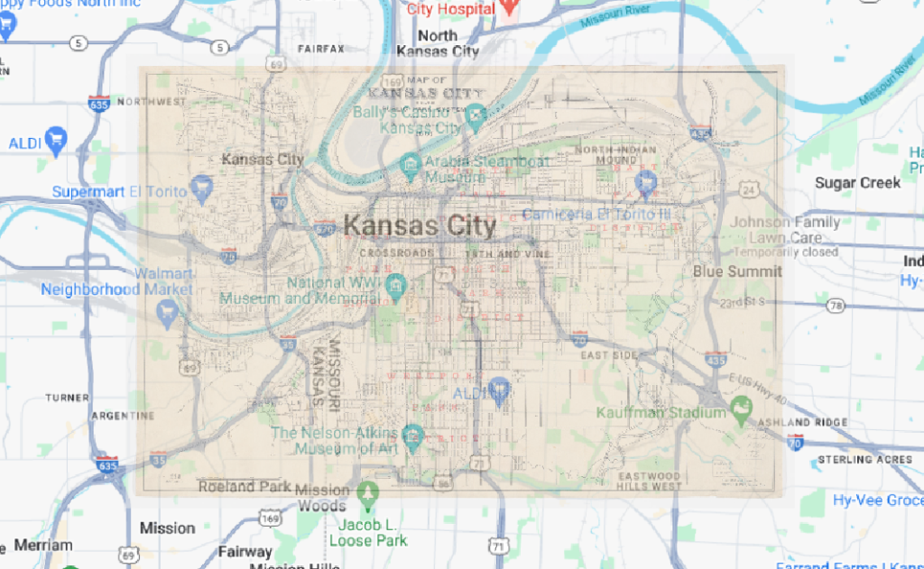
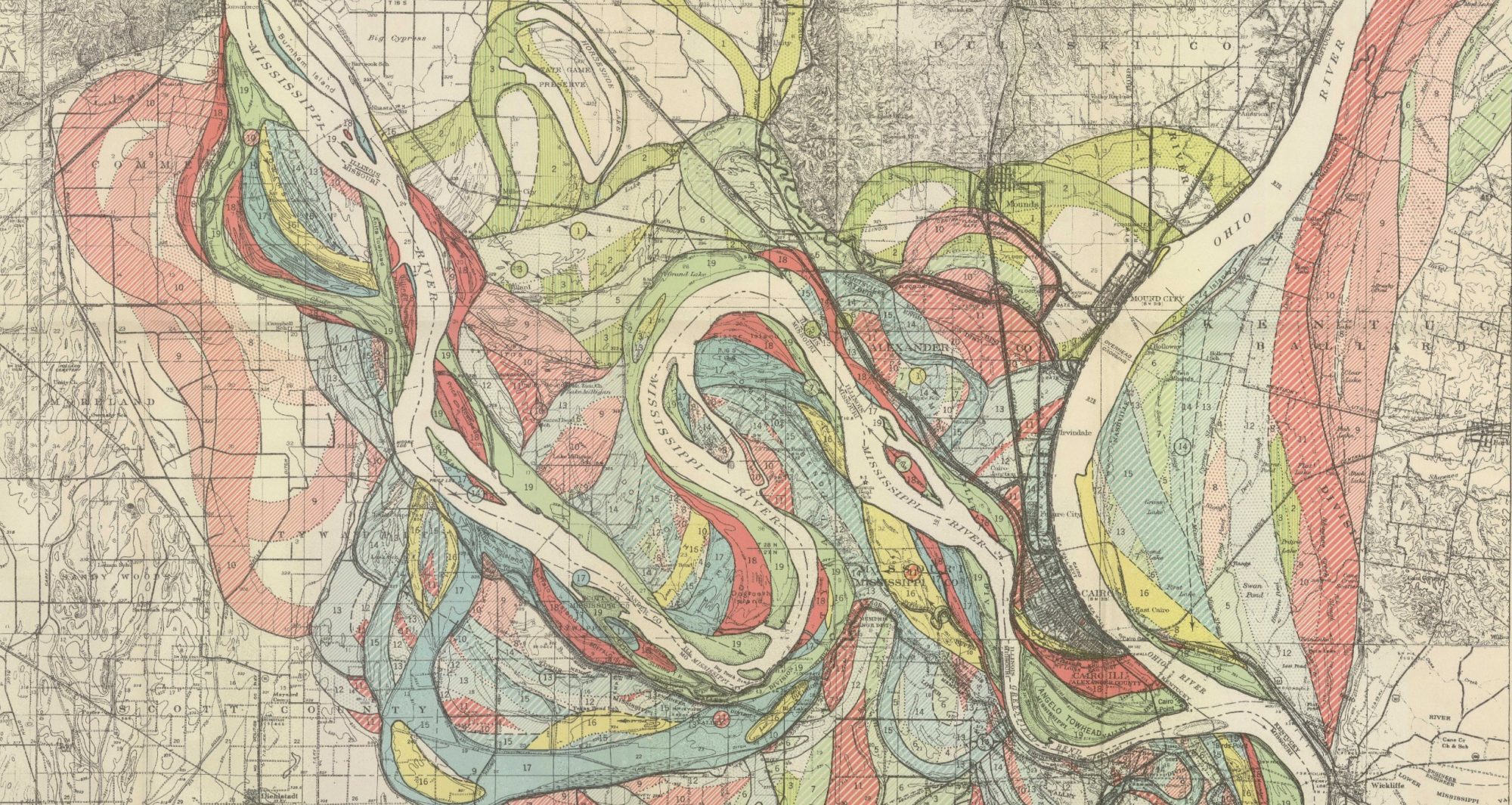
There is a lot of changes that are noticeable just through this reference of Kansas City. The most interesting in this map which was a map of parks in Kansas City. Many of the park boundaries have expanded and changed slightly, but not to a massive degree. Notably the boundaries of the Parade and the North Terrace have changed slightly. There are also many new interesting things in the Parade including the founding of the Negro League Baseball Museum. Other changes are visible on the map as well, many of the rivers in the surrounding area have changed course and it is obvious on the map, especially at the top right of the 1901 map. Overall, change over time is clearly mapped out through this exercise.

What are some weaknesses to this approach? Are there inaccuracies? Do some
places map better than others? Why?

One of the weaknesses of this approach is definitely the changes in park boundaries. The reference being a map of parks in the area and cemetery’s caused me to use these points as references often. There should be some obvious discrepancies between the two maps due to the changes in borders although much of the map looks good overall. The closer the map is to the Kansas border the more accurate it is. This is likely due to there being more parks closer to the rivers and no other notable points in Kansas City at this point. Overall the map is not the best reference to use due to it’s age and the change of rivers.

css.php