Post No. 3 – How to Hide an Empire

In 1944, Rand McNally & Company(McNally) added an atlas titled This is My Country to their legacy of publications. With the help of the artist, Elmer Jacobs’ simplistic & colorful artstyle combined with beautiful photos of the U.S., McNally tells their readers about their country. A country comprised of natural landscapes and colonial monuments that they believed composed the essence of their country.

Folded and tucked away on the last page, this pictographic map, created by Mr. Jacobs after being commissioned by McNally to be folded up and tucked away as a bonus on the last page of this publication.

Mr. Jacobs followed their commissioners requests well, following a provided template of the US, drawing the locations spoken of within the book, and on top of this, made a nice and interesting map to look at. Why did McNally have such peramaters? They had a vision that could only be conveyed through the display of certain components of the United States. This atlas by McNally explores the large swathes of land they called the United States, intentionally leaving territories unmentioned because they were “not an integral part of this country”. This vision is reinforced through their lack of mention, and who could argue with something they were never told? Through their publications and maps, McNally argued for what land ‘truly’ made up the United States through marking the territories under U.S. rule as ‘foreign’, a decision that has contributed to the alienation of citizens in the U.S.’s territories and a well founded sense of mistrust toward Their Own Country today.

An important question to ask when looking at any set of data is what the intention(s) behind its creation. McNally had beliefs on what the U.S. was and its nature that they wanted their readers to believe as well. The interpretations McNally held on the U.S. through a perspective is unavoidable and not what should be taken issues with. They start when certain information must be ignored to maintain this understanding. To create this explanation of an idea, territories that combined with the states to make up their country were cut, going unmentioned within the pages of this atlas, which had many negative consequences of people then and today.

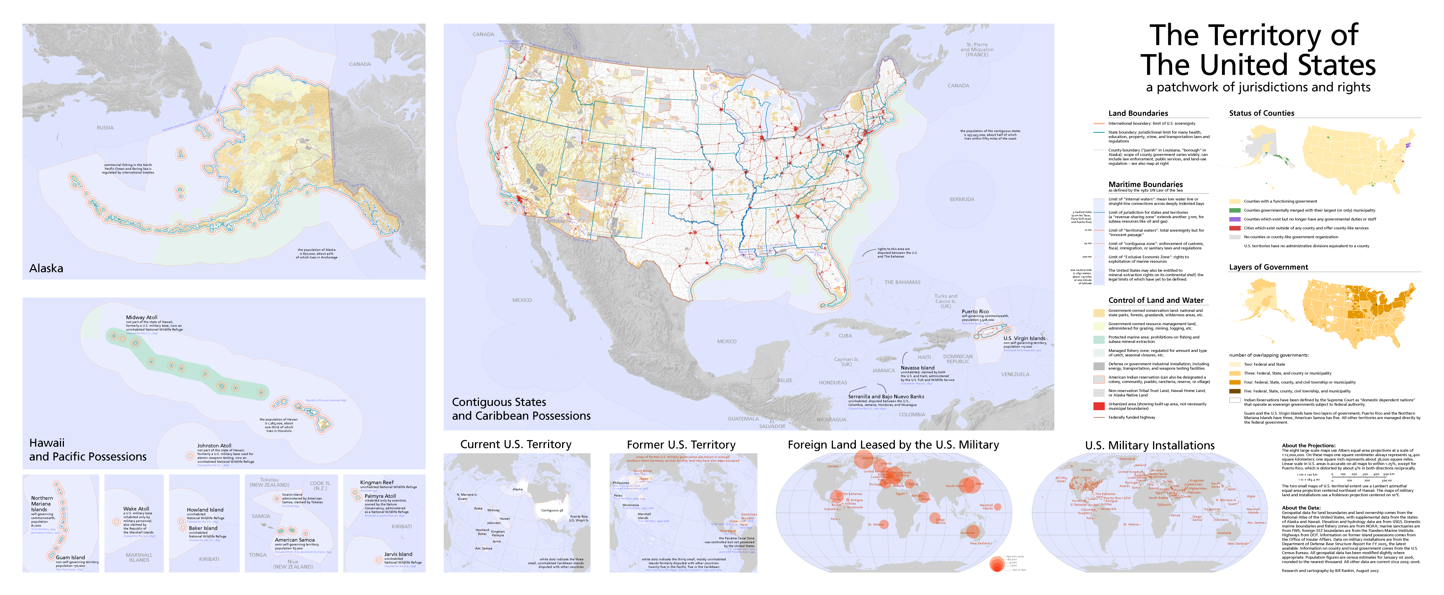
In Daniel Immerwahr’s publication to The Guardian, How the U.S. Has Hidden its Empire, the consequences U.S. territories have suffered until now because of this unbalanced relationship is . Many important points are brought up in the span of this article; topics such as the intentional exclusion of U.S. territories in the Philippines from FDR’s final speech despite bombing comparable to Pearl Harbor being inflicted upon them. The betrayal many of those territories felt as they found out that the country they belonged to, the U.S., had chose not to dispatch any help. However, this main goal was to draw attention to the colonial presence the U.S. has held since long before FDR’s speech on the “Japanese Planes Bomb Honolulu, Island of Guam”. Revealing to his readers the complicated relationship the U.S. has with its own ideals; Freedom, Equality, and Independence.

“In 1941, the year Japan attacked, a more accurate picture would have been this:

Immerwahr 2019

This land, called the ‘greater United States’, includes all of the US territories and satellite states as their true size [except for the scattered islands in the bottom left corner]. McNally in their other publications listed the US territories like Hawaii, Puerto Rico, the Philippines, and Alaska as ‘foreign’. When questioned about this decision by some school kids, they responded:

“It is foreign to our continental shores, and therefore cannot logically be shown in the United States proper.”

Rand McNally & Company

The intentional decision to argue that these U.S. territories were not ‘integral components of the U.S.’s identity’ has created a culture that disreguards these citizens humanity and existence. Attempts made by entities like McNally to create an American identity that unites and uplifts our populous has come at the cost of the disacknowledgement of these citizens rights and protections deserved of many who should fit into this definition. Today, this old argument has resulted in a widespread unawareness of the very existence of these territories and in those who are aware, a reluctance to address the unstable status of U.S. territories and the rights they hold. Their categorization itself is not harmful, but the treatment recieved based off their definition and restrictions applied can.

Leah R. Keith
Sources
Jacobs, Elmer. A Pictorial Map of the United States. - David Rumsey Historical Map Collection
Rankin, Bill. Territory of the United States
Immerwahr, Daniel. How the U.S. has Hidden its Empire, 2019

Agricultural Yield Blog Post 7 Michael Lau

156. Wheat/ sq Mile is an informative US census map from 1846-1914 covering the number of bushels of wheat being harvested in each region. This is shown in the gradient of green, with the largest wheat producing regions producing over 3200 bushels of wheat per sq mile.

The map was made for policymakers and for the public, but its overall goal is to introduce where it was possible to grow wheat abundantly and thus have an excess of food for the nation. This, of course, comes at the expense of grassland, which is what the book “On the Great Plains” argues, with the varying temperature and weather affecting the expansion of plowed land.

“Rain, or lack of it, is the driving factor in Great Plains land use…”

Cunfer, 29

In fact, according to Cunfer we have very rarely plowed more than 30% of the grassland area in during the 19th and 20th century.

Most of the grassland that is counted in this table is used for cattle and other livestock. This can be used to how the relative disparity between livestock raising to an agricultural yield, as livestock is worth more due to the number of resources that they take up. In this case, in terms of land.

How we map things often shapes the policy decisions that affect everyone’s lives. From where we build interstate highways to where we introduce new agricultural programs. Thus, as with all data presentation, we must do so ethically. Providing a fair representation of the real world, is providing a truth that we can make use of. Interpreting and omitting truths is unfortunately part of data representation. Not everyone can have a voice, without it being too caught up in the hundreds of other voices being presented. This map of the prairies, omits many different things, like the availability of water in the region, rail lines which haul off cattle and wheat. But perhaps this is the best representation of the data, providing the largest voice to the dataset that they think is important. And in anycase, policy makers would and should be consulting other pieces of data to make their decisions.

Biliography

“156. Wheat/Sq. Mile.” n.d. Accessed March 11, 2024. https://www.davidrumsey.com/luna/servlet/detail/RUMSEY~8~1~32209~1151551.

Cunfer, Geoff. “Pastures and Plows.” In On the Great Plains: Agriculture and Environment. Texas A&M University Press, 2005.

Blog Post 9- Marie Amelse

In 1872 the Great Plains was opened by the U.S government for public domain homesteading. This really marked the beginning of a vast transition of land to more cropland, then less cropland, then more again in a push and pull that marked the Great Plains for the next 100 years. 

This a snapshot of wheat bushel production in the year 1900. This map was created by Henry Garrett, where the darker the color means the greater the wheat production was in that area. It is important to note that while the same scheme would persist after the initial plowing, their county production year to year or decade to decade would vary all across the Plains, this could be due to rainfall for that year or if farmers in that area simply sowed less that specific year. Garrett created a simple map to follow, with little more than the reference information necessary in order to recognize the message of the map. 

On the other hand, Geoff Cunfers figures from “Pastures and Plows,” on the Great Plains shows this gradual change over time of land usage shifting to and from pastures and cropland.

Even by the last agricultural census taken in 1991 there was still a significant amount of grassland on the Great Plains. Even with the huge advancements in the previously 150 years, there is still significant “untamed” grasslands in the Great Plains.

Cunfer, Geoff. “Pastures and Plows.” In On the Great Plains: Agriculture and Environment. Texas A&M University Press, 2005.

Gannett, Henry. Production of Wheat Per Square Mile at the Twelfth Census 1900. U.S. Census Office, 1903.

Erin Buglewicz, Blog Post 7: Mapping Ecology

Beginning in the late 19th century and progressing mostly in the 20th century, the “plow-up” of the Great Plains was a slow but important ecological change that converted about a third of the prairie into cropland. However, nearly 70% of the land (265 million acres) was left relatively untouched or merely grazed by livestock and mowed for hay (Cunfer, 19). This information points to the underlying fact that nature significantly limited people who tried to change the plains.

From On the Great Plains: Agriculture and Environment.

Geographer Henry Gannett created a map of the continental United States, showing the production of wheat per square mile, using data from the census of 1900. The legend in the bottom left corner explains that areas in darker shades of green produce more bushels of wheat than lighter ones. Areas that are white were unsettled at that time. Overall, Gannett’s map is rooted in one time, specifically 1900.

Gannett’s Wheat/sq. mile map. From DavidRumsey.com.

However, in On the Great Plains: Agriculture and Environment, Geoff Cunfer shows a series of choropleth maps of the region, focusing on several significant years between 1880 and 1997. Instead of wheat production, these maps depict the percentage of each county’s total area that remained unplowed in that year, and together, they represent change over time. Darker shaded counties have a greater percentage of grassland remaining.

From On the Great Plains: Agriculture and Environment.

As previously noted, very little land was plowed in the 19th century as the process had just begun amidst the homesteading era. The 1920 map does show more plowed land, but the western plains were largely untouched due to environmental limitations for farming, such as rainfall, temperature, soil quality, and topography (Cunfer, 34). The arid conditions in the western plains were therefore more suitable to ranching than farming, which meant that more grassland remained there, than in places like central KS.

Figure 2.4 from On the Great Plains: Agriculture and Environment.

Figure 2.5 – which includes maps of 1925, 1935, and 1940 – shows the transition era, during which farmers reached the limits of what land could be plowed, peaking in 1935, and creating an equilibrium between pasture and cropland.

Figure 2.5 from On the Great Plains: Agriculture and Environment.

The 1940 map marked the start of stability, and the remaining two figures show relatively little change in the percentage of remaining grassland across the various counties. However, by 1997, there was a significant reduction in cropland because the Conservation Reserve Program was paying farmers to take land out of crop production (Cunfer, 35).

1997 map from Figure 2.7 from On the Great Plains: Agriculture and Environment.

Overall, both Gannett and Cunfer’s maps imply that nature was the major factor that limited how people used the land across the Great Plains.

References:

Cunfer, Geoff. “Pastures and Plows.” In On the Great Plains: Agriculture and Environment, 16-36. Texas A&M University Press, 2005.

Gannett, Henry. Production of Wheat Per Square Mile at the Twelfth Census 1900. U.S. Census Office, 1903. https://www.davidrumsey.com/luna/servlet/detail/RUMSEY~8~1~32209~1151551:156–Wheat-sq–mile-?sort=pub_list_no_initialsort%2Cpub_list_no_initialsort%2Cpub_list_no_initialsort%2Cpub_list_no_initialsort&qvq=w4s:/what%2FAtlas%2BMap%2FStatistical%2BAtlas%2FAgriculture%2Fwhere%2FUnited%2BStates;sort:pub_list_no_initialsort%2Cpub_list_no_initialsort%2Cpub_list_no_initialsort%2Cpub_list_no_initialsort;lc:RUMSEY~8~1&mi=28&trs=71.

Madeline King, Blog Post 9 – Mapping Tension Between Humans and Nature

The maps of the changes to the grasslands of the Great Plains demonstrate a mapping of the changing tension between humans and nature, and how that tension has developed with an influx of people and the creation of new technology within the last century and a half.

Henry Gannett’s map, 156. wheat/sq. mile, demonstrates the tension between humans and nature in 1903. In the western part of states like North Dakota, South Dakota, and Nebraska, there is a clear divide between land that is used for farming and land that is not. Geoff Cunfer explains several reasons for this task. Firstly, plowing the land to make the Great Plains suitable for farming was a slow task, taking decades for just one family’s farm to be plowed to a level that satisfied them (Cunfer, 18). The other, is that some land was not suitable for farming, even after being plowed – causing it to be turned back over and used for range land. There is a limit to human use of the land. This is a tension between nature and humans. Humans are attempting to exploit an ecological niche with technology, but nature can be unpredictable. Rain, rocks, elevation, and many other factors battled farmers from transforming the grasslands.

Cunfer’s figures continue to demonstrate the ever-changing tension between nature and humans. Humans have continued to attempt to turn the grasslands into something else, with the mapped divide from Gannett slowly being reduced throughout the decades. To do this, they utilized new tools, technologies, and techniques to better develop and maintain land for their needs. However, tensions between humans and nature come from several different sources, such as carrying capacity, natural resources available, suitable environments to live in, and the ability to successfully apply tools and technology to a sustainable development of land. What are the consequences from increasing the tension between nature and humans?

One example of disaster occurring from increasing the tension between humans and nature is actually one that occurred in the very region being mapped. This was the Dust Bowl of the 1930s. Humans experienced natural consequences of nature, like drought and poor production and decided to overproduce suboptimal land with new machinery (increasing tension). The drought and production caused soil erosion, which would plague the area in dust storms for a decade (further demonstrating the result of too much increased tension between humans and nature).

Bibliography

Cunfer, Geoff. 2005. On the great plains. Texas A&M University Press, pp. 16-37.

National Drought Mitigation Center. “The Dust Bowl.” University of Nebraska. https://drought.unl.edu/dustbowl/#:~:text=Due%20to%20low%20crop%20prices,would%20cause%20the%20Dust%20Bowl.

Gannett, Henry. 1903. “Production of Wheat per Square Mile at the Twelfth Census 1900.” DavidRumsey.com.

Blog Post 9

The Great Plains of the United States is a wide, open, and flat region located in the central United States. From pre-history to the early 19th century, the plains were filled herds of millions of buffalo and its only occupants were small populations of native tribes whose villages dotted the plains. This changed during the 19th century when the idea of “manifest destiny” promoted immigrants to travel westwards to reestablish themselves. Followed by in 1862, when Lincoln signed into law the “homestead act” which increased the amount of immigrants to the Midwest.

If I’m reading the map correctly… these sets of maps featured on David Ramsay, shows the removal of the prairie overtime. This map produced in the 1900s shows the production of wheat from land that has been plowed overly farmers. From the short time that westward expansion began to 1900, we can see that vast areas of the plains have been converted to farmland.

Moving forward to the 1960s and 70s, we notice an interesting pattern that arose during the plowing of the plains. In areas with high humidity, fertile soil, and access to ports, the grasslands have virtually disappeared by the 60s and 70s. Those fields had all been converted to farmland, roads paved over them, or became locations of large cities such as Dallas, Oklahoma City, San Antonio, etc. Yet, some untouched areas of grassland remain on the map and this is due largely to weather and geography. The areas with large grasslands ranging from >60 to 90%, were found to contain “bad soil’ an example of this can be found near Holton, Kansas. That small region of preserved grassland and prairie was found to contain soil that was too rocky for farming as such, this area was spared the devastation caused by plowing. Another example found on these maps is far Northern Texas and Western New Mexico. While this area does contain the cities of Amarillo and Lubbock, the climate is very dry with little to no rainfall throughout the year and rocky soil. Thus, this area was unable to support large population centers causing settlers to move away and settle in a more hospitable environment.

Blog Post

The American plains have long been tamed by the people who have lived in this great country. From the Native Americans who predate the United States by hundreds of years to the farmers of today, the Plains region has been the heartbeat of the continent for a long time. Focusing mostly on United States history, the Great Plains have been crucial from the era of westward expansion to today. However, with steady development and farming, the grasslands of the plains have been decimated in turn for farmland.

Cunfer’s “On the Great Plains” illustrates how the thick grasses of the great plains were plowed up over the course of half a century and the effects the plowing has had on the grasslands of the west.

Cunfer, 2005

Cunfer’s map shows the percentages of grassland throughout the great plains region steadily drop throughout the 1900’s seemingly cutting the grasslands to half what they used to be prior to 1900.

However, using Gannett’s map of Wheat per square mile in 1903, we can see that most of this depleted grassland had become farming land, especially in the Kansas and Nebraska area

Gannett, 1903

There is a clear correlation where the grassland sat in 1900, was still “unsettled” with most of the light farming in the 1903 map occurring on the very edges of the grassland.

Mapping Change in Grasslands

The Great Plains is an area that has long been associated with being the breadbasket of the United States as it produces wheat for the rest of the nation. However, it was not always like this. As settlers from Europe came over and with Westward Expansion, land west of the Mississippi River became more and more settled. This was also in part due to the Homestead Act of 1862 which allowed citizens to own and settle a parcel of land known as a homestead. As settlement increased, the introduction of farming technologies and colonization led to a decrease in grasslands in the area known as the Great Plains. A yellow text on a white background

Description automatically generated

As we can see in the maps found in Cunfer’s book, we can see that as time went on, the percentage of grassland decreased over time. The map depicting the percentage of grassland in 1880 shows there is an abundance of grasslands that have not been plowed yet. 

Comparing this same area but much later, we can see that by 1997, there were very few regions that still had 80-100% grassland and there were regions where there was no grassland.

While we see that the presence of grasslands in the Great Plains has decreased over time, it is important to look at why they may have decreased. As we can see in Henry Gannett’s map depicting Wheat production per square mile in 1903, wheat is becoming much more common in the Great Plains. If we compare Gannett’s map with Cunfer’s map in 1903, the maps are related. Where we see a decrease in grassland, there is an increase in wheat production. I am sure that if we were to look at wheat production per square mile during a different year, I would assume that it would match the decrease in grassland as presented in Cunfer’s maps.  

Cunfer, Geoff. 2005. On the great plains. Texas A&M University Press, pp. 16-37.

Gannett, Henry. 1903. “Production of Wheat per Square Mile at the Twelfth Census 1900.” DavidRumsey.com.

Emily Gaddy – Mapping and Tracking Changing Ecology

Cunfer argues that the “plowing of the Great Plains for crop agriculture did not happen quickly,” which is true- the Great Plains had existed for centuries before European settlement, however, the introduction of European technologies and the colonization of the American West greatly contributed to a significant loss of farmland and ecosystems.

Geoffe Cunfer, “Pasture and Plows,” On the Great Plains, 2005. P. 18.

Before the introduction of the plow, American grasslands were far more abundant.

Cunfer. P. 31.

Humans and the environment obviously have a relationship to one another- both can shape and change one another. One aspect of this is Westward Expansion. As more people spread out West and plows were brought, wheat production went up, but grasslands started to disappear.

Henry Gannett, Wheat/sq. Mile, 12th census of the US, 1903.

This map is from 1903, here’s Cunfer’s map of grassland, for reference:

The commercialization of land was also something that was spread throughout the Western territories. When Native land was divvied up and disseminated to white settlers without consent, the sacred grasslands of the Plains Natives were destroyed for commercial agriculture and desecrated by those who saw land as a commodity. Some grasslands were destroyed intentionally by white settlers to speed along the centuries-long genocide and forced assimilation of Natives. Over-grazing led to more grasslands depleting, as well as the scramble to California during the Gold Rush. Settlers looking for gold or families looking for religious freedom would travel together with their wagon trains and leave destruction in their wake.

Riley Filipowicz Blog Week 9

The history of farming on the Great Plains shows tons of different successes and failures. By 1900, only the far eastern plains had over 25% of land plowed. Most farming occurred from 1870 to 1920. By 1920, a clear pattern emerged, with more cropland in the eastern plains. The western plains remained mostly for ranching due to arid conditions. Rainfall and temperature were key factors, in determining the areas that were suitable for farming or ranching.

If you take a look at this map you can see the areas that had the highest wheat grown per square mile. This map further shows that the Great Plains was the perfect spot to grow wheat. The temperature and rainfall were suitable for growing this crop. For example, areas such as Southwest America do not receive enough rainfall resulting in little agriculture there.

Examining the additional maps in “On the Great Plains” offers a different glimpse into the transformative nature of the region’s landscape over time. One notable trend that I caught wind of was from the maps showing the consolidation of areas dedicated to agriculture. This shift is because of the evolution in agricultural practices, where farmers are increasingly optimizing their land usage. I think this happened because of the relationship between technological advancements and farming efficiency. As technology continues to progress, farmers can harness more sophisticated tools and methods. That would obviously lead to increased productivity. Because of those improvements, the need for more land may diminish, as farmers can achieve higher amounts of production within more concentrated areas. This not only reflects the adaptability of agriculture to change with the times but also shows the potential for sustainable farming practices. The connection between technology, land use, and agricultural output is an interesting aspect of the changing dynamics of the Great Plains.

css.php