Madeline King, Blog Post 10 – Maxims vs Consequences

The reading, “Racism in the Machine: Visualization Ethics in Digital Humanities Projects,” by Katherine Hepworth and Christopher Church began its discussion by introducing the problem of neutrality in digital projects. While many things have the perception of neutrality, their structures, choices, and backgrounds come from long-imposed structures of oppression, like racism. Attempting to create a neutral project (especially one generated by AI), will inevitably result in the same problematic structures current society is created on becoming visible and a prominent aspect of those projects. Digital Projects need an argument, or at least some critical intention.

A chart of Hepworth and Church’s outline

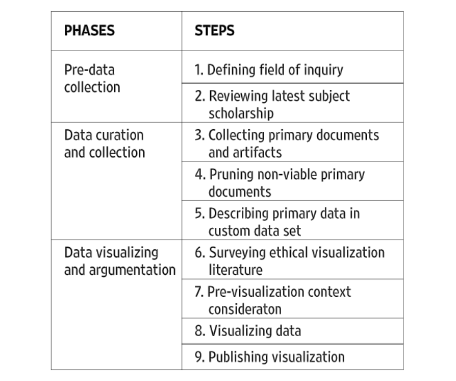
Within the argument or critical intention of a digital project, it is important to approach it with a plan of action. Hepworth and Church’s paper proposes a multi-step plan, to best ethically create a digital project. This plan had three phases (pre-data collection, data curation and collection, and data visualizing and argumentation). Between the three phases outlined, Hepworth and Church propose nine steps (defining the field of inquiry, reviewing the latest subject scholarship, collecting primary documents and artifacts, pruning non-viable primary documents, describing primary data in a custom data set, surveying ethical visualization literature, pre-visualizing context consideration, visualizing data, and publishing data).

Of the steps and phases that Hepworth and Church lay, I believe that surveying and pre-visualizing is one of the most important ethical considerations. The inclusion of a test audience or test projects draws a distinction between maxim-based, or deontological ethics, and consequential ethics. While I believe that deontological ethics has some merit, I also believe that the consequential aspect of digital projects is the more important consideration. The saying “the road to hell is paved with good intentions” is important here. One’s purpose for creating a project could be neutral or positive, but its actual consequence is negative. Take the AI Twitter Chatbot for example. The maxim behind the creation of this bot was to create a fun experiment (an ethically neutral to the positive distinction), however, the consequence was a racist chatbot (an ethically negative distinction). Bluntly, in consideration of publishing a widespread digital project, intention does not matter (at least not to the same extent as consequence).

The examination of maxims and consequences can be evaluated in the two digital humanities projects that were outlined in the reading, “Lynching in America: Racial Terror Lynchings” and “White Supremacy Mob Violence.”

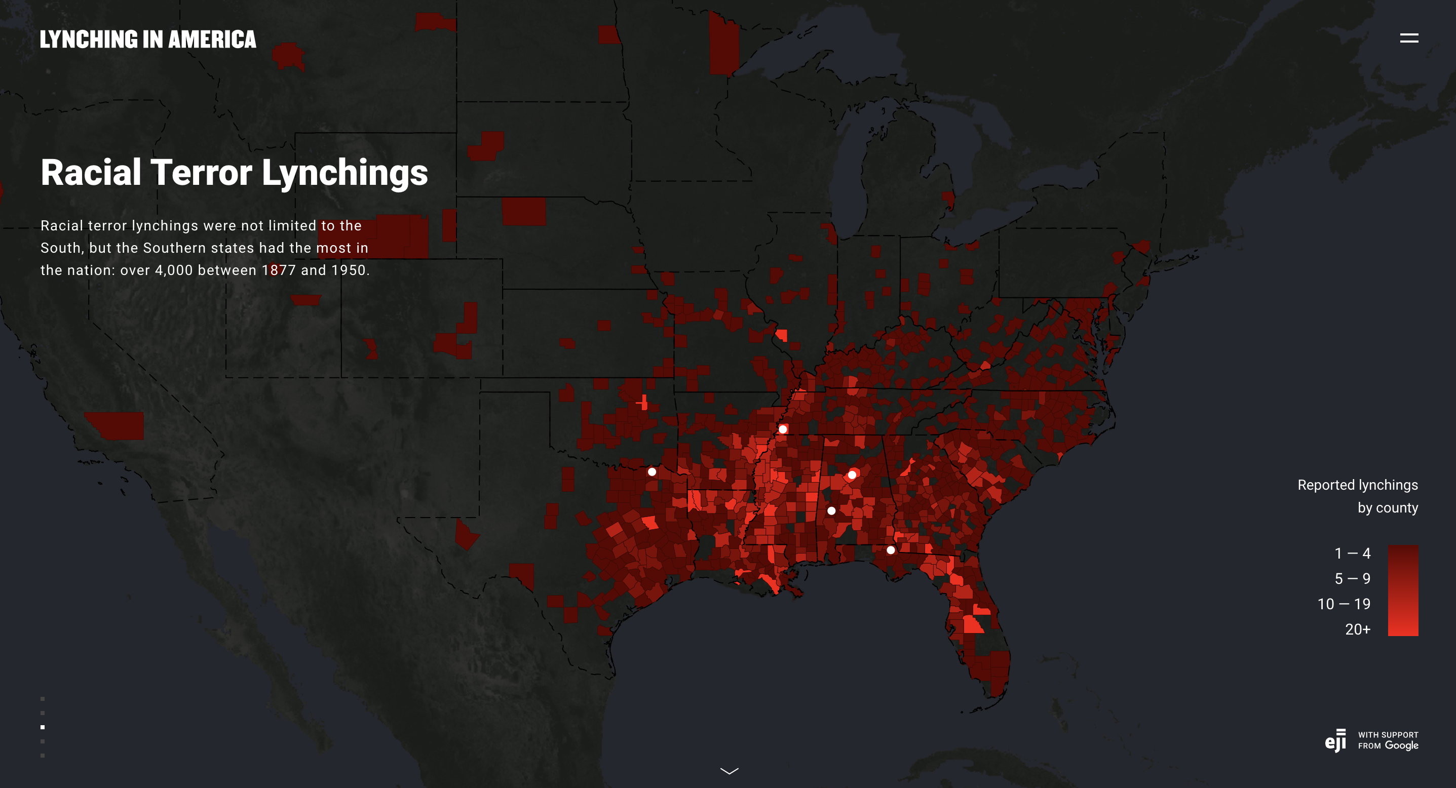
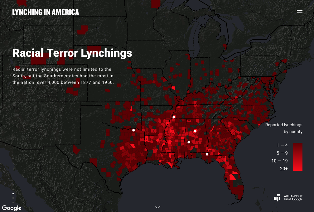
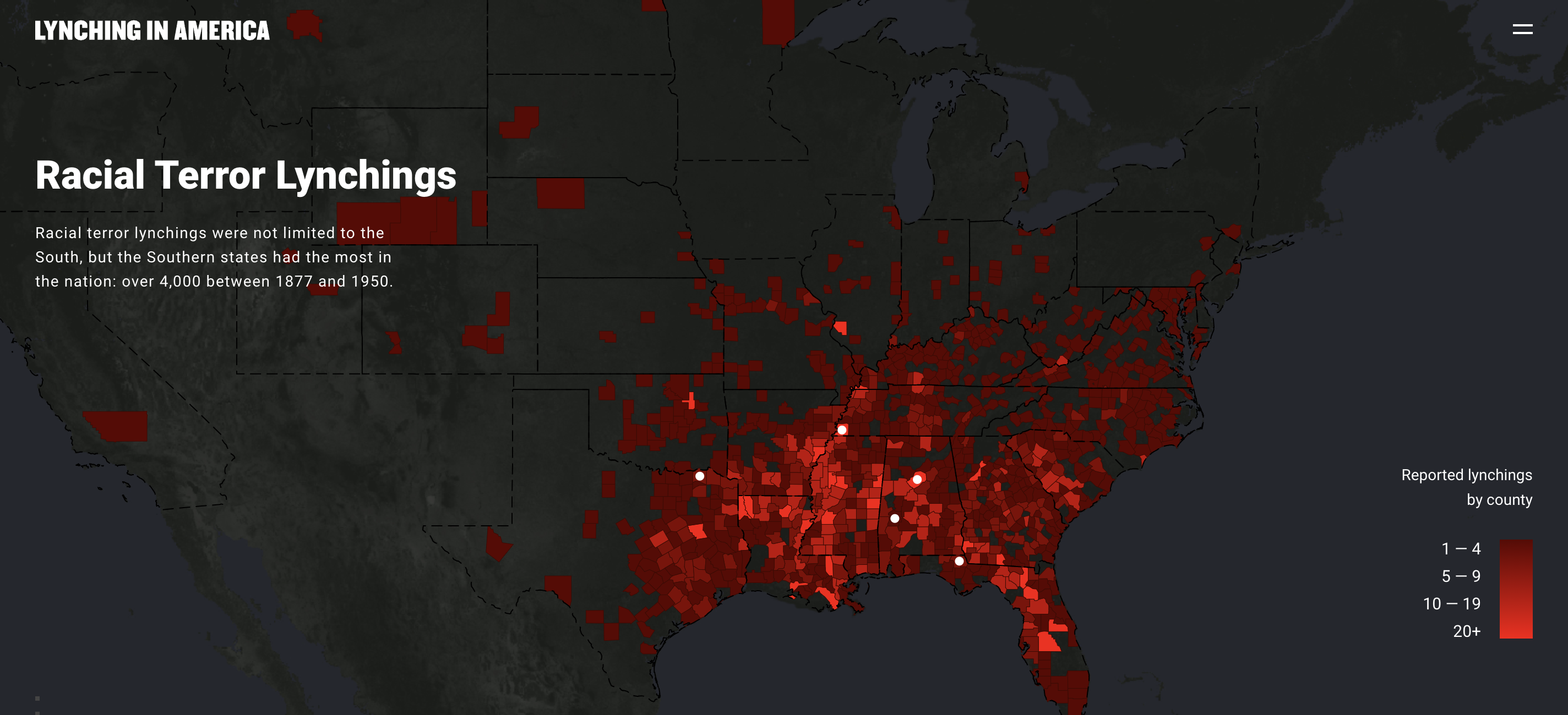
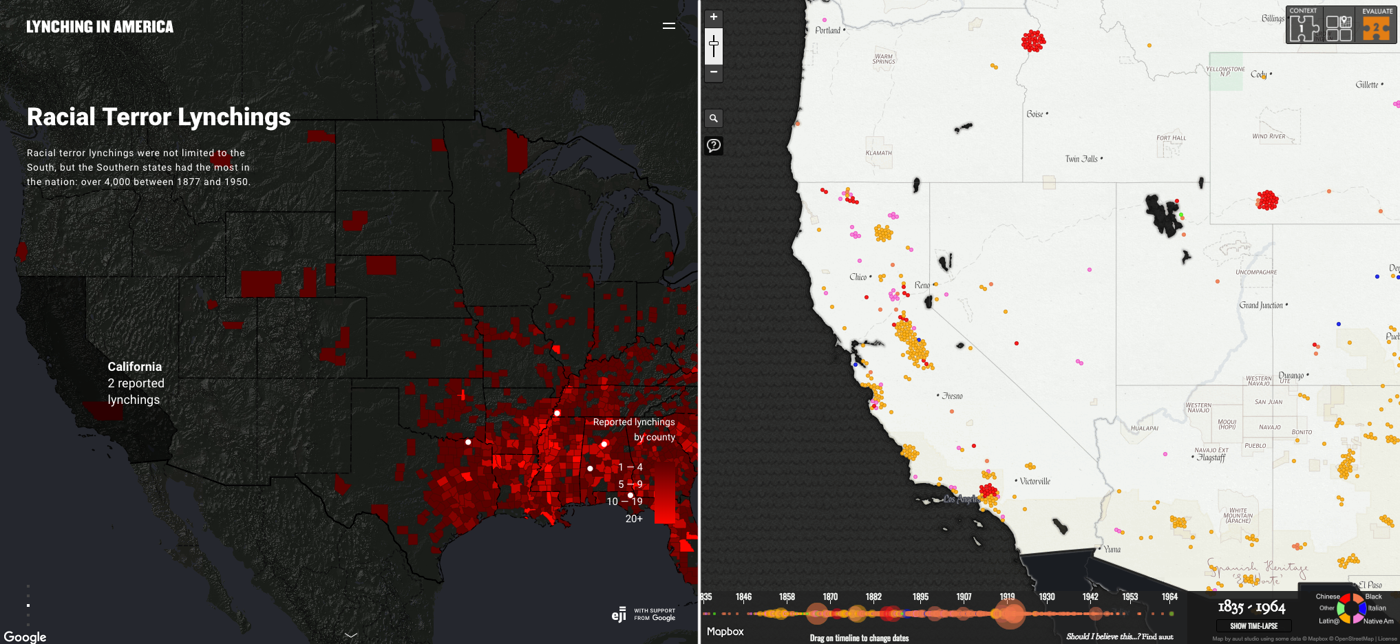
A screen grab of the current “Racial Terror Lynchings” Project

The intention of “Lynching in America; Racial Terror Lynchings” was to be part of a larger group’s work on prison reform. However, the consequences of this project do not ethically reflect the noble maxim of the project. The first problem, as outlined by Hepworth and Church, is that it initially made little consideration for lynchings that occurred outside of the Deep South. When it did consider these lynchings, it still only considered African American lynchings. The consequence of this project is that it becomes less of an argument and more of an assertion. The assertion is that African Americans were the sole victims of lynching and that this act of terror was a predominantly geographic problem.

Without clearly presenting the evidence, or presenting any other information on lynchings that occurred against non-African American individuals, the project does not allow the viewer to think for themself, and draw a conclusion outside of the assertion made. Instead, the project asserts its own (incorrect) conclusions to the reader, a conclusion that is backed by its purpose as a tool for prison reform. The issue with the argument of this project is not that it is a weak one, terror lynchings on a racial basis are a well-backed historical event (especially those committed against African Americans). The issue is also not that the cause of the project is bad. The issue is that there is no argument at all, instead the project is an assertion that gives in inaccurate understanding of lynchings.

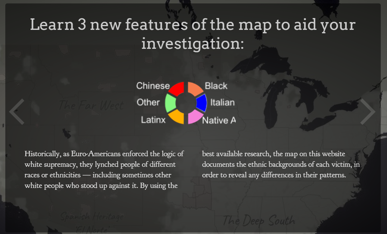
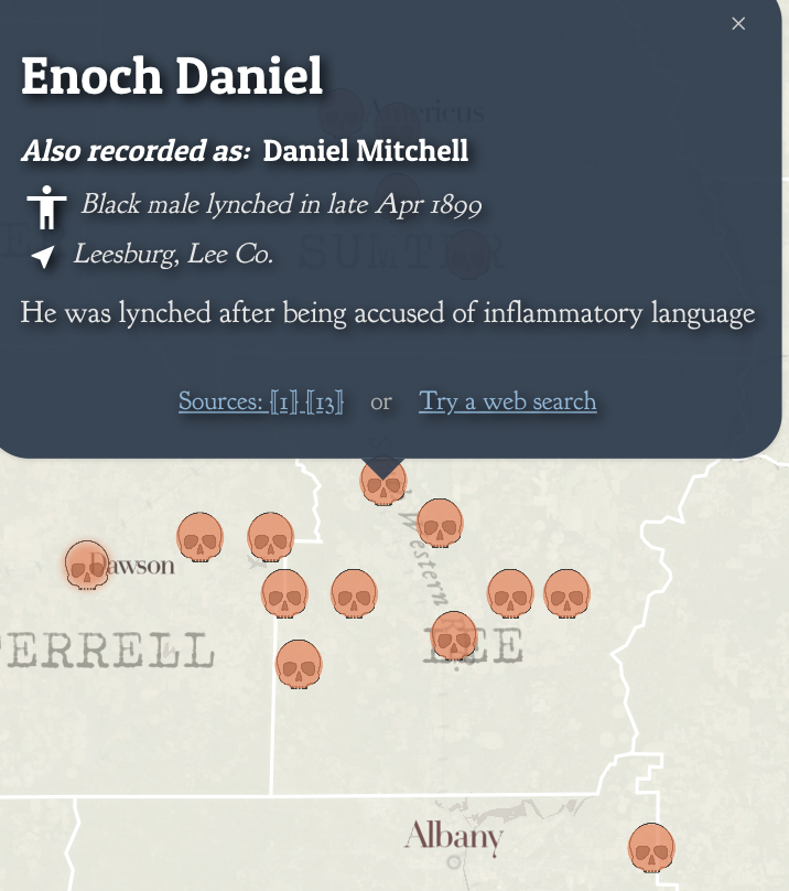
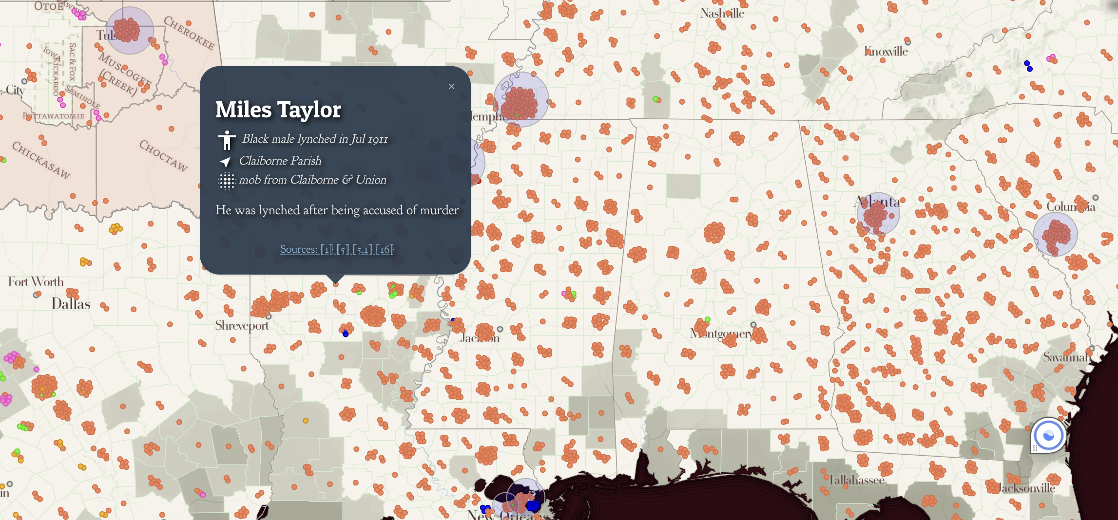
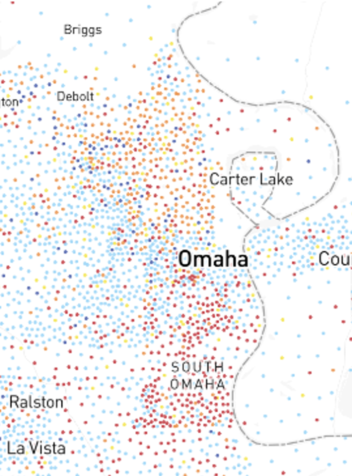
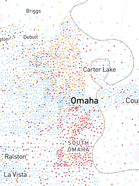
A screen grab of the “White Supremacy’s Mob Violence” map

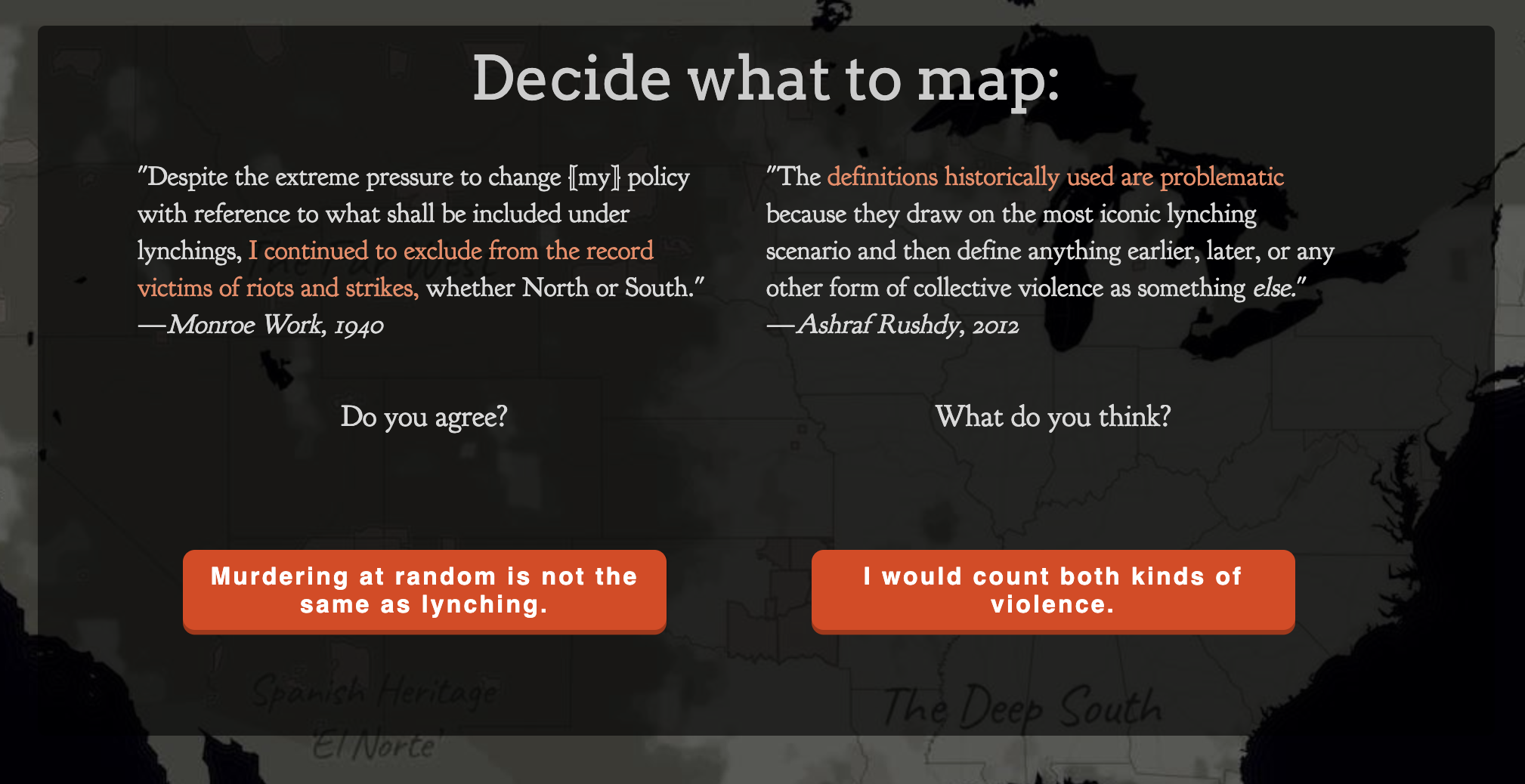
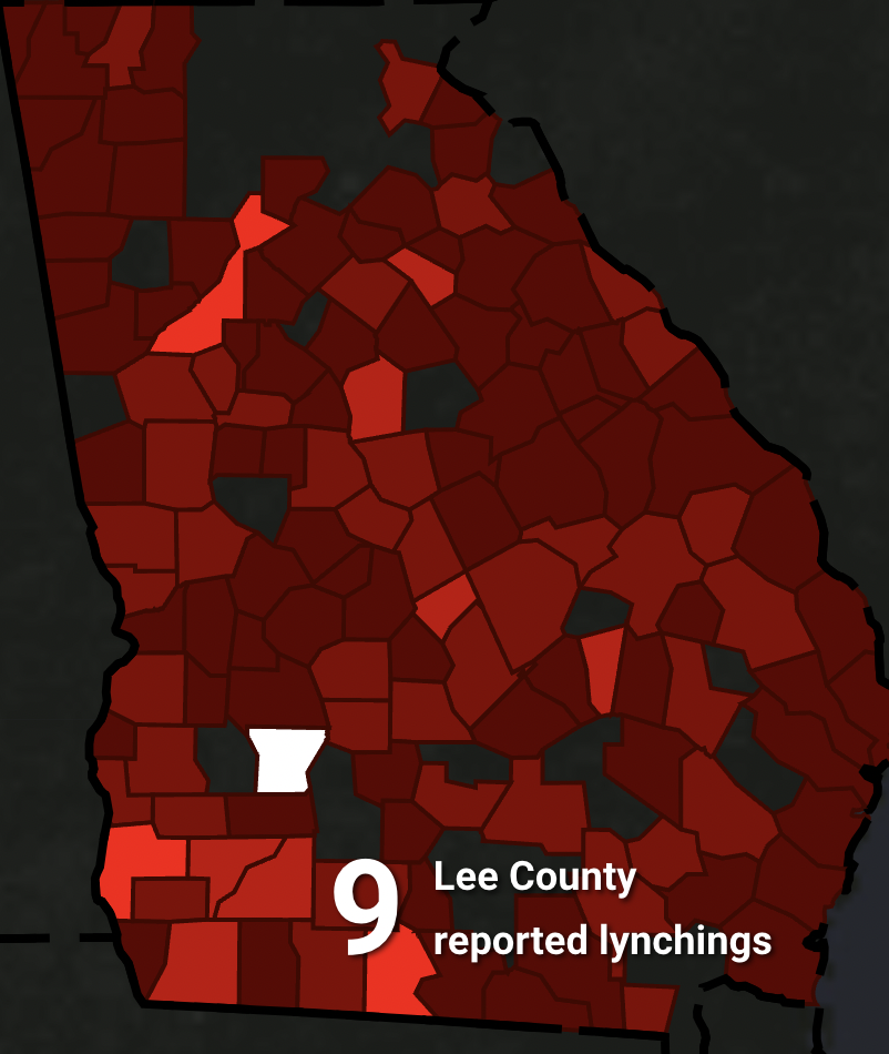
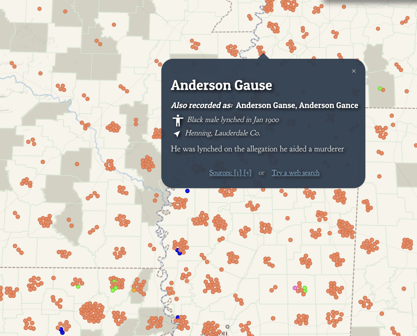
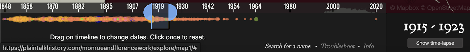
A picture of some of the interactive features of the “White Supremacy Mob Violence Project”

Provided as an alternative to the “Lynching in America” project, the “White Supremacy Mob Violence Project” provides a more ethical example of its consequence. The first striking difference between the two is how much more interactive this project is. Throughout the project, the reader is provided with choices. They can choose whether they consider something murder or not. They can choose whether or not they want to see the sources of information. The reader is provided definitions and examples to inform these choices. Within the actual map, each instance of lynching is given information. A person’s name, or at least identifying features is given (as well as the known reason for the lynching). The race of the person lynched is also given (a stark contrast from the information presented in the first project). The consequences of this project are an argument, not an assertion. With the information given to the viewer of the project, the project argues for the reader to evaluate. Looking at the races of people lynched, the reasons for the lynchings, and the dispersal of the lynching, the reader is left with the argument that these were racially influenced hate crimes.

Both projects have noble maxims. The first project intends to call to mind the problems with the modern prison system, especially the problems faced by African American men. The second project intends to highlight America’s historic problem with white supremacy’s mob violence. However, it is the consequences that distinguish to two ethically. The consequence of the first project draws an asserted conclusion that leaves out information and can be seen as misleading to an audience on the historical violence that occurred. The consequence of the second project is an informed viewer who can consider a strong argument on the racial motivations behind lynchings.

Bibliography

EJI and Google. “Lynching in America: Racial Terror Lynchings.” https://lynchinginamerica.eji.org/explore

Hepworth, Katherine and Christopher Church. “Racism in the Machine: Visualization Ethics in Digital Humanities Projects.” Digital Humanities Quarterly. Vo. 12, no. 4 (2018).

Monroe and Florence Work. “White Supremacy Mob Violence.” https://new.express.adobe.com/webpage/nKAyaWTMZtLxS/

The Ethics of “Mapping History”

Before opening the article “Racism in the Machine: Visualization Ethics in Digital Humanities” I took a peak at the maps depicting lynching in the United States discussed in the article. Even without the background the article provided me, many of the ethical issues of the Equal Justice Initiative’s (EJI) map were readily apparent to me. I found the map quite limited in the information and context it could provide as a visualization technique.

Lynching In America by EJI and Google, Image Courtesy LynchingInAmerica.eji.org

As mentioned in the article, the EJI’s map focused almost solely on the South.[1] It did this to the point that I found it difficult and somewhat frustrating that the map could only really provide me information about that region. Also, the fact that states that did not register lynchings of African Americans were not represented with their political borders on the map, while those that did register lynchings of African Americans were highlighted in contrast with the dark background made understanding a relatively complete picture of lynching in the United States impossible via this map, and thus the map more frustrating to use.

Notice the contrast between Arizona and New Mexico and their lack of political borders due to the absence of lynchings against African Americans in those states. However, this visualization is misleading as there were numerous lynchings in both states, particularly against Latinos. | Lynching In America by EJI and Google, Image Courtesy LynchingInAmerica.eji.org

All this felt misleading or limiting for this data visualization. As a reader, I want to understand these lynchings in context, context that the map’s focuses on political boundaries in the South and presenting solely lynchings of African Americans severely limits.[2]

When I opened the map from Monroe & Florence Work Today, I was absolutely stunned by its ability to provide me with much of the context the EJI’s map lacked. The notification and explanation screens displayed before I could access the map not only got me to think about what this map visualized, but also what it did not visualize.

One such notification/explanation screen | Monroe and Florence Work Today, Courtesy PlainTalkHistory.com

The most effective way this project gets its readers to think about how lynchings in the United States are visualized is through the choice it gives readers between depicting lynchings according to a “narrow definition” and lynchings according to a “broad definition.”

Monroe and Florence Work Today, Courtesy PlainTalkHistory.com

In all honesty, no other digital mapping project I have seen has made me think as long and hard about data visualization as this seemingly simple, two-option question. As Hepworth and Church pointed out in their article discussing ethics in the digital humanities by comparing the EJI and Monroe & Florence Work Today maps, the Monroe & Florence Work map places it emphasis on humanizing the victims of lynchings and not simply depicting them as data points. The map does this by plotting each lynching victim as a single point on the map which, when clicked, gives information and references discussing who the person was and why they were lynched.

Monroe and Florence Work Today, Courtesy PlainTalkHistory.com

The choice the Monroe and Florence Work map provide readers of what lynching data to depict I discussed above also help to avoid depersonalizing the victims of lynchings as mere datapoints. It instead makes readers think about the context in which these victims were killed. It makes readers think about the social dynamics of these killings and what it must have been like for those subjected to such atrocities.

Analyzing these maps has reminded me of how data and date visualizations are not neutral in any way, shape, or form. Data and algorithms can never be fully divorced from humans. As Church and and Hepworth state in their article, “[H]umans are at the center of algorithms, not only as their creators, but, in the case of data-driven algorithms, as the producers of the content they shape and present.”[3]

Data and data visualizations occupy a unique ethical landscape. While the ethics of a written piece may become quite obvious with a thorough read, it may take much more to uncover whether data you observe have been ethically collected, produced, and represented. Raw data, with its cold, seemingly authoritative, numbers and figures give off the explicit impression of impartial authority. However, methods of data collection, who collected the data, who funded the data collection, and the purpose of the collection of the data can all result implicit which can often remain invisible until thoroughly inspecting or investigating a dataset.

Data visualization also has a similarly authoritative nature. When you look at a picture, map, infographic, or other visualization its graphics can often captivate you and provide you with what appears to be an authoritative and unquestionable narrative as sources and methods and put into the background while the story of the data is pushed to the front.

All this makes me recognize the importance of providing transparency in any mapping projects and data visualizations I create. By being upfront with my data sources and the processes by which I conglomerated, prioritized, and ultimately visualized data in my projects will allow readers to be more critical of my work, seeing it not as monolithically authoritative, but instead as a piece of a larger puzzle of the historical reality. It is also important that I acknowledge what my maps and data visualizations omit and why I chose to (or subconsciously) omitted those datapoints or features. All these steps promote the ethical use, display, and dissemination of digital humanities projects like the one I will create for my final project in this class.

Bibliography

[1] Katherine Hepworth and Christopher Church, “Racism in the Machine: Visualization Ethics in Digital Humanities Projects,” DHQ: Digital Humanities Quarterly 12, no. 4 (2018), 3.

[2] Hepworth and Church, “Racism in the Machine,” 3.

[3] Hepworth and Church, “Racism in the Machine,” 1-2.

Map Citations in Order of Appearance:

Equal Justice Initiative and Google, Lynching In America: Racial Terror Lynchings, Lynching In America, https://lynchinginamerica.eji.org/explore.

Plain Talk History, Map of White Supremacy’s History of Lynchings/Map of White Supremacy’s Mob Violence, Plain Talk History, https://plaintalkhistory.com/monroeandflorencework/explore/.

Ethical Implications of Mapping History – Emily Gaddy

Growing up in what is colloquially called the “Dirty South,” there is an expectation of stupidity and racism associated with Southerners, especially those from the Dirty South. There is the misconception that we tote around shirts with “THE SOUTH WILL RISE AGAIN” in bold letters amidst the backdrop of the Confederate flag. Our accents are seen as hillbilly (especially in Appalachia) and there is no regard to the rich culture and there is no mention of black Southerners unless it is in regards to slavery or acts of racial violence. These stereotypes are not only rooted in racism, but also classism (often ignored in the United States). Only recently, with Georgia (my home state) becoming a swing state, are there more talks around political disenfranchisement in terms of voter suppression and the realization that a lot of Southern voices have been stifled by the (often) loud, far-right populations of those states. I credit Stacey Abrams for finally opening the floor up to conversations about modern-day voter suppression of black voices.

In digital mapping, there is a reliance on human-made algorithms and the whims of the mapmaker themself. The article we read used the example of the Twitter-made, AI, Taytweets, which used people’s Tweets to learn how to communicate less like AI and more like an actual person. Of course, humans are not infallible, and the computer coders that create AI are not neutral, so, as the articles states:

And that:

“Racism in the Machine: Visualization Ethics in Digital Humanities Projects”

It makes sense that misconceptions and stereotypes about differing geopolitical states would be prevalent in mapping and geographical history projects. The maps we used for this blog post show the same subjects, but in contrasting ways.

(Lynching in America, EJI and Google).

This map, made with a partnership with Google and EJI (the Equal Justice Initiative), focuses almost entirely on the state of racial violence in the Deep South. We’ve spoken in class about how maps tell stories and this one recirculates the stereotype of racial violence and racism being an act mostly committed in the South. While a majority of black lynchings did take place in the South, it is also important to note that that is because a higher concentration of Black people lived in the South than the North.

Visualizing data that exclusively focuses on the African-American experience in the Southern United States provides an important argument about the nature of Jim Crow racism. However, purporting such data to be an inclusive representation constitutes a harm in the sense that it perpetuates common narratives of racial violence as a southern exception to an otherwise inclusive nation.

“Racism in the Machine”

This shapes the systematic oppression and structure of white supremacy as being something linear- of power birthed from the top and trickled down to the bottom percent of people within white hegemony. White supremacy is not, pun intended, black and white. Racial violence, while extremely horrific is not the full story of white supremacists and their maltreatment and persecution of other racial and ethnic groups. Racial violence is usually the escalation of decades of whites being able to get-by with “smaller” crimes and abuses:

The conflation of lynching with the full extent of racialized violence in United States history obscures the historic depth and breadth of the oppression of people of color. A black individual was far more likely to suffer public humiliation, assault, rape, and murder than a public lynching.

“Racism in the Machine.”

I understand the reason why the mapmakers chose lynching, however, it is a physical and tangible manifestation of racial violence. The stories of black people being raped or abused are far too commonplace, so therefore there are few records documenting the crimes. However, white supremacy thrives not just on murderers and extremist groups like the Aryan Brotherhood, but on the complacency and the actions of everyday white people, who use “not me” statements and ignore the white supremacists tendencies that are conditioned into the white American populous through years of American historical propaganda and nationalism, regardless of geographic region or state. I lived in Southwest Missouri for a bit and I was surprised by how prevalent the Klan was there. I knew someone whose grandfather was a founding member of the Klan in Southwest Missouri. One day when I was cleaning out a closet in their home, I found their grandfather’s bloodstained Klans robes. It was terrifying- to see the ghostly manifestation of the United States racist terrorism in person.

The other map, made by Monroe Work, showcases more nuances in white supremacy, showing it is not burdened by state borders and that the white nationalists do not simply punch-down on African-Americans, but other racial groups and even some white ethnic groups (referencing Italians).

(White Supremacy Mob Violence).

This map depicts a number of lynchings within Westward Expansion, California, and the Midwest.

I wanted to use my county from home as an example for why Work’s map does a better job than the EJI map.

Here is Lee County, GA on Work’s Map:

Here is Lee Ct. on the EJI map:

There is no mention of the names of those who were murdered, nor is there a reference to sources in the EJI map. Work’s map not only provides the reasoning behind the hate crimes, but also their sources to add supplementary materials to their storytelling.

I think within digital humanities, one has to be careful how their story is portrayed to an audience. As an English major as well as a history major, I have learned a lot in creative writing classes that whilst a story I write means one thing to me, once it is published it takes on different meanings depending on the audience. If I wasn’t a Southerner or if I didn’t read the article, I cannot help but wonder if I would understand the focus on the American South as a hotspot for racism in the EJI map. I think this is something to be mindful of when mapping minorities or the trauma of others. Data should come from multiple sources and nuance should be added if possible and applicable to the subject matter. I understand that the EJI map is political- it is meant to shock and it is meant to be minimal. They are demanding collective action as fast as possible, but (and not to go all Foucauldian again) ignore the non-linear construction of power under white supremacy. This is dangerous, white supremacy has seeped into the minds of not just white people, but minoritized groups as well, who foster hatred for other racial groups and/or even their own. This allows racism to fly under the radar. Lynching is just a stark example of what happens when this racism goes unchecked and festers before it becomes infected and is only cured through egregious acts of violence.

Monroe Work Today’s Map of White Supremacy Mob Violence is an exemplar of ethical visualization, not because it is free of two centuries of baggage and biases, but because it acknowledges them, while also acknowledging the potential pitfalls of the very endeavor of transforming human beings into visualized historical data.

“Racism in the Machine.”

Stories, especially those that are not are own, are hard to tell. It is important to acknowledge biases and provide the resources for audiences to reach out and interact with stories from members of the community that the mapmaker is trying to tell. People are not unerring, but there is something to be learned from accountability and the avoidance of knee-jerk reactions of “not me!” or “I don’t see color!” Only then can conversations begin to take place and the fostering of learning can begin. Readers should also, then, question the sources of information and the potential argument presented from visualizing history. It would be impossible for a historian to show every facet of history in their map, but one should question if those silences are intentional.

Gabe Murphy: Blog 8

With any argument, publication, presentation, or comment (online or in person), ethics should be considered. In terms of mapping, one should value honesty, fairness, and an unbiased representation of the proposition they are trying to make. With any set of data, numbers and visuals may be skewed/edited in order to promote a certain agenda–which is something all readers should be aware of. Look into map cartographics and classifications. Look into the data sources. Look into the map-makers history. All of these things can guide you towards the reliability of the map, and if its methods are ethical. History itself is much more than just numbers, but unreliable storytellers and map-makers can use data to enhance a story that is far from the truth. Remember the example of the vehicular crashes map of Southern California that was presented in class; it appeared as if certain areas had unsafe roads, bad drivers, or a mix of both? However, it was more of a representation of population numbers than anything else. More people means more drivers, which means more crashes. The author used this to their advantage to show an “increased danger associated with driving.” Yet that was far from reality. Those with bad intentions can do similar things with all sorts of topics and maps–so be aware of what is presented, how it is presented, and who is presenting it. When creating maps of your own, remember these values and uphold standards that you want others to adhere to.

Now, let’s take a dive into this week’s assigned readings. The two maps given are much more than sheer numbers: they are deep maps with associated readings and stories. In Monroe’s map, each lynching is tied to a name, gender, when they were lynched, where they were lynched, and why they were lynched.

Monroe & Florence Work Today. 2016. “Map of White Supremacy Mob Violence.” PlainTalkHistory. https://plaintalkhistory.com/monroeandflorencework/?u=2

It uses point vectors to associate deaths and certain coordinates (I presume), a very effective and efficient way to differentiate this map from a typical choropleth map. The tie to personal stories creates a much darker effect for the reader–instead of promoting people just as numbers. 

Monroe & Florence Work Today. 2016. “Map of White Supremacy Mob Violence.” PlainTalkHistory. https://plaintalkhistory.com/monroeandflorencework/?u=2

Further, a timeline along the bottom expertly shows change over time (a common struggle for cartographers). I would like to use/create something like this for my final project. 

Instead of using maps TO tell a story like Monroe, EJI tells a story and uses maps to AID in this. It first delivers personal anecdotes, quotes, memories, and a short film to show how slavery progressed into a looming issue of lynching, and now into mass incarceration. Monroe focused on the issue of lynching, while the EJI went back to the root issue (slavery) and showed how this progressed as laws/society changed. An important quote guiding me towards this realization was from Anthony Ray Hinton, an inmate who was wrongly put on death row. 

Equal Justice Initiative. “Lynching in America.” EJI. https://lynchinginamerica.eji.org/explore

Clicking on this then takes you to a short film about his circumstances, and further down the page two maps are presented. One shows the migration of African Americans out of the south using a decade-by-decade choropleth maps of state AA % population, and another is a choropleth map county-wide for lynching data. 

For both of the projects above, original reports and sources are listed so that readers are able to read and come to their own conclusions if need be. I like their acknowledgment of this issue and the transparency aspect that it provides. A great solution for a possible ethical dilemma. 

In the last assigned source, an article going over both of these projects and the associated ethics behind historic visualizations is given. Similarly to what I prefaced earlier, it highlights the fact that the author uses intentional silences to promote their cause (ie: EJI and systemic racism).

Hepworth, Katherine & Christopher Church. 2018. “Racism in the Machine: Visualization Ethics in Digital Humanities Projects.” Digital Humanities Quarterly, 12(4). https://digitalhumanities.org/dhq/vol/12/4/000408/000408.html

This again shows the importance of digging into the data/sources used, the map itself, and the individual/group that made the map. Different symbology, scales, classifications, colors, and other cartographic elements can be used to alter data in a way that it should not be. While the sole point of maps is to create and maintain a proposition, they should not be used to falsely promote a point for argumentation’s sake. Mapmakers themselves should adhere to ethical standards, but in the fact that this is not always how it works, readers need to be given access to original sources and be aware of tricks/deceptions used to portray data.

Blog Post 8: Declan Dunham

The Jim Crow era is a dark chapter of American History. African Americans across the country experienced discriminatory laws. Among some of the challenged African Americans faced were lynchings. When mapping racial history, like lynchings, it is important to be mindful of the ethical ideas surrounding it.

According to Katherine Hepworth, ethical implications can vary. She writes, that these maps are “demonstrating how choices about representation, interaction, and annotation in their data visualizations either do harm in the sense described above, or challenge dominant narratives” 1. In other words, when it comes to mapping race, representation and how we define our terms matter. These maps highlight the importance.

Equal Justice Initiative
Map of White Supremacy Mob Violence

In both of these maps, we see visualizations of racial violence across the United States. In the first map, created by Equal Justice Initiative, we see it centered on the Southern United States. Granted, a majority of racial violence occurred in the South, however, the first map gives you the idea violence outside of the South was nonexistent. In the Map of White Supremacy mob violence, we see much more detail and inclusivity. This map highlights White Supremacy mob violence which includes every racial minority group. This includes, Chinese, Black, Italian, Latinx, and Native American. This map also shares details about each individual case.

Map of White Supremacy Mob Violence, Miles Taylor

Besides representation, how we define our term matters. According to Plain Talk History, there are two definitions of “Lynching”. A strict definition of lynching is when the lynchers “believed they were righteous, never worried they might face charges. To them, a dead victim meant justice: the matter was settled, and townspeople would move on” 2. The broader definition of lynching is the belief when “perpetrators did not claim to be agents of justice. They knew it was murder—in their rage, they didn’t care. This was a homicidal spree to avenge the established order” 3. As you can see, these two defintions of lynching are different. Because of this, how you define “Lynching” means including or excluding a wide variety of victims.

In conclusion, when mapping racial violence, it is important to understand representation. This means that we need to think about who we want to include and how we want to include them. To do this, we must be able to define what we are researching. By doing this, we create the ability to expand or reduce our representation.

  1. Hepworth, Katherine & Christopher Church. 2018. “Racism in the Machine: Visualization Ethics in Digital Humanities Projects.” Digital Humanities Quarterly, 7.  ↩︎
  2. Monroe & Florence Work Today. 2016. “Map of White Supremacy Mob Violence.” PlainTalkHistory ↩︎
  3. Monroe & Florence Work Today. 2016. “Map of White Supremacy Mob Violence.” ↩︎

Riley Filipowicz Blog 8


The focus on lynchings in African American history, especially in the Southern US during Jim Crow, is crucial. But it almost simplifies racial violence to a certain extent. Lynchings were horrific and symbolic of white supremacy, but they’re just a small piece of a much larger puzzle. Racial oppression included many forms of abuse, not just public executions. Lynchings have become a symbol of racial hatred, shaping attitudes and policies.

While lynchings are often associated with the Southern United States during the Jim Crow era, it’s important to recognize that they weren’t only happening in this region. Lynchings occurred throughout the country, including in the North and West. They might have been less frequent but were almost more powerful. African Americans faced all sorts of racial violence in various parts of the nation. They showed that racial problems were not just subject to only happening in the South. Lynchings served as brutal displays of racial terror and domination.

Comparing the two maps shows big differences, especially on the West Coast. In California, it shows two different maps. One of them shows only lynchings of African Americans, and the other depicts lynchings of all sorts of various races such as Italians, Latinos, and Native Americans. The second map shows widespread lynchings across California, reflecting white supremacy enforcement. However, the first map lacks clarity and suggests fewer lynchings in California actually happened. This is problematic as it downplays California’s history of racial violence, which goes against efforts like the Equal Justice Initiative’s aim to challenge black incarceration.

I took this screenshot from the article, Lynching In America. I placed the map in 1950, so it shows the percentage of the total US African American population. The South obviously has the highest percentage of African Americans, but the fact that there were even lynchings in areas outside of the South is super powerful and important. Recognizing that lynchings occurred beyond the South is important for understanding the total extent of racial violence in American history. Lynchings in regions outside the South, like the West and Midwest, challenge the common belief that racial terror was limited to a specific area. These incidents across diverse regions highlight the widespread nature of racism. Take California for example, the first image I included makes it seem like only two lynchings happened there. That is an incorrect depiction because the next map I included shows that lynchings in California were not rare, and were actually rather common.

Understanding where data and information come from and its context is crucial for accurate understanding. Without this understanding, there’s a risk of misinterpretation or drawing incorrect conclusions. For example, if you did not include all of the maps in the article, one might think lynchings were not that big of a problem in California. Prioritizing transparency and critical analysis of data origins helps readers understand the full picture.

Emma Reed, Blog Post Week 11

Mapping the history of sensitive topics such as racial violence and white supremacy comes with large ethical implications that must be considered when understanding and interpreting maps. The “Racial Terror Lynchings Map” which was created by the Equal Justice Initiative looks to document the lynchings of African Americans primarily in the United States South. While this map can be used as an advocacy tool as it highlights the historical targeted injustices and their current day implications such as mass incarceration, they map reviews many critiques. Firstly, it has a narrow focus and overlooks other marginalized groups experiencing similar targeted violence during its time period such as Native Americans, Asian Americans, and Mexicans. It also has an emphasis on the Southern regions of the United States, but these other marginalized groups often experience injustices outside of the South. The map immediately centers itself on the United States South, even when there are counties outside the region that are marked as lynchings occurring. When comparing this map to the “Map of White Supremacy Mob Violence”, the latter takes a more inclusive route as it acknowledges the violence inflicted in different geographical regions and to other minority populations.

Secondly, the differences between these two maps are even more polarized when comparing the state of California. The “Racial Terror Lynching Map” shows just two occurrences of lynching in California and does not provide any further information. We know that the map is looking at 1877 to 1950, however it does not provide the date for these lynchings, nor does it show them over time. However, by looking at the “Map of White Supremacy Mob Violence” it shows lynchings of Chinese, Italian, Mexican, Native American, and Black populations, provides dates for each, and the story behind each case given the information available. Also interesting to note is by zooming in on California, it is seen that there are 7 cases of Black lynchings when the “Racial Terror Lynching Map” only displayed 2, effectively disregarding 5 lives while also providing little to no information in general. When looking at sensitive topics such as this, authors must acknowledge any biases in their research or presentation of the material, including violent actions taking against other groups that you might not be depicting in your map.

The author, Hepworth, proposes an ethical visualization workflow that can provide a framework for ethical considerations in the mapping of historical data. It places an emphasis on the importance of clearly defining your subject, thoroughly reviewing previous literature, a wholistic collection of data, and publishing your findings with the underlying datasets. By reviewing existing literature of not just one, but all affected groups, scholars can gain a deeper understanding of the historical context and identify potential biases in the data and how that might affect their presentation of it. This can also prevent inaccurately classifying groups based on stereotypes or marginalizing different groups. In addition, scholars can chose to represent each victim instead of using aggregate data which leads to the map appearing less personal and human. Finally, when it comes to publishing, authors must be transparent about their sources for both their methodology and data. By clearly outlining where the data came from, how it was collected, and how it is visualized, allows the viewers to have a clear and reliable understanding of the map. This can provide a helpful understanding of tactics to use in order to minimalize the harm to both the audience and the subjects of maps while still remaining effective in your presentation. 

Stage 2 – Andrew Merfeld

Andrew Merfeld

  1. Scope of the Project: I hope to figure out the historical background of the cultures that were formed due to the Silk Road. I plan to look more deeply into the areas of East Asia, Central Asia, South Asia, and the Mediterranean region. The time period that I am thinking about studying would be from about 130 BCE until roughly the 1400’s.
  2. Possible Sources: I plan to use primary historical documents that are available on Blueline to help me take a deeper look into the cultures created during this time period. When looking through the online database, there were a couple of documents that stood out to me when looking up “Silk Road Culture” in the online database. Hopefully these documents can give me a better idea of some of the cultural exchanges that were cultivated due to the Silk Road.
  3. As of right now, my plan is to use QGIS and do some sort of interactive web map through the program. I’m hoping I am able to pin point some of the cultures and where they were, and if they still exist and turn that into some sort of interactive map.
  4. I am hopefully able to offer insight on the connectedness of some of the countries and areas that were along the Silk Road. I think it will be interesting to see if some of the values, beliefs, and practices are still alive today. I’m hoping that I can find reasons as to why some of the cultures that were around back then are no longer a thing, and vis versa.

Post No. 5 – Mapping Segregation

1937 -> 2021 Map of Omaha

It has always been clear that Omaha is a still a very segregated city today. It can be heard through the connotations attached to places like ‘North’ or ‘South’ Omaha in conversations about this city, but how has it gotten to this point? Everything surrounding us today has a history and the images, when compared, above do well to start answering this question.

The first ‘Residential Security Map’, also today known as a red lining map, made by M.H. la Douceur in 1937 divides Omaha up into four rankings. The highest rank was a green ‘A’ titled ‘best’ in the bottom right corner, ‘A’ areas were places mortgage companies would not have to be too scrupulous when giving out loans and would typically be given lower interest rates in. The rankings go down to a dark blue, to a yellow, then finally to a red ‘D’ – hazardous. ‘D’ areas were places mortgage companies were either highly encouraged to avoid and if they did not gave high interest rates to the individuals inside this rank. It was as clear then as it is clear today that this sectioning off of land hugely disadvantaged non-white populations living inside of Omaha.

In the map published by CNN using 2020 census data the aftereffects of redlining in Omaha are clear. While there is now a moderate amount of white households in North and South Omaha, in general, Hispanic and Black households have stayed within the same borders as previously outlined. Laura Vaughan delves into some of the reasons for this. There is a disadvantage factor to start, higher interest rates take a longer time to pay off and take more money no matter the household the longer they take to get paid off. An interesting point Vaughan touches on as well is the communities that form within these lines that may make individuals reluctant to leave.

Leah R. Keith
Maps
Map of Omaha and Vicinity - 1937
Race and Ethnicity Across The Nation- 2021
Sources
Mapping Society

Post No. 4 – Maps as Data & Culture in Context

Hergesheimer, Edwin. Map Showing the Distribution of the Slave Population of the Southern States of the United States. Compiled from the Census of 1860.

Hoffman, Malvina. Races of the World and Where they Live.

Who were these two maps made for? Is data in a void of its own, objective? Yes. Are the eyes and minds it is made and consumed by objective? No. The dominant way of interpreting data does not mean it is by any means ‘objective’.  Factors such as the reason(s)  for its collection and compiling by its creator, the interest(s) its existence is then used to serve, down to how each of its observers choose to interpret it are not objective.

Edwin Hergesheimer’s distribution map of the slave population inside Southern States is objectively, just that. Setting this map inside the context of the year it was published, 1861, its importance to this time period is revealed, coinciding with the start of the civil war. This map was used to develop important battle strategies to the Union in this war that would knock out much of the South’s economic infrastructure (reflected in map) and lead to their eventual victory in 1865. The meaning of this map has become deeply attached to the civil war because of this use it served.

In a similar way, Malvina Hoffman’s pictoral map of the races of the world and where they live is objectively true. What matters here, however, is how this information was used in that time period. These sculptures were commissioned by the Field Museum of Chicago in 1933 and put up on display in 1941.

During the early twentieth century geographers and geographical institutions such as the American Geographical Society (AGS) played a significant role in promoting racial and eugenicist views.

– Crampton, pg. 1932

This small detail was not a coincidence. In this era fields such as anthropology and archaeology could have been considered subsections of ‘the science of eugenics’. A science that would only become largely condemned after the rise and downfall of the Nazi party in Germany, but had strong roots in Western, including American, scholarly institutions since the 1860’s.

The efforts of Hoffman were not done with malicious intent, but the intentions of the artist will not always steer their creations to be seen in the light they desired to be seen in. In the modern day, fifty of Hoffman’s works have been put back up on display, many now with their names attached to their statues, which stand as memorializatoins of their existance and not as their undoing.

Leah R. Keith
Hoffman, Malvina. Races of the World and Where they Live
Hergesheimer, Edwin. Map Showing the Distribution of the Slave Population of the Southern states of the United States. Compiled from the census of 1860
Crampton. "Maps and the Social Construction of Race" from the History of Cartography Project (2008), pgs. 1232-1237
Looking at Ourselves, Rethinking the Sculptures of Malvina Hoffman
css.php