
With any argument, publication, presentation, or comment (online or in person), ethics should be considered. In terms of mapping, one should value honesty, fairness, and an unbiased representation of the proposition they are trying to make. With any set of data, numbers and visuals may be skewed/edited in order to promote a certain agenda–which is something all readers should be aware of. Look into map cartographics and classifications. Look into the data sources. Look into the map-makers history. All of these things can guide you towards the reliability of the map, and if its methods are ethical. History itself is much more than just numbers, but unreliable storytellers and map-makers can use data to enhance a story that is far from the truth. Remember the example of the vehicular crashes map of Southern California that was presented in class; it appeared as if certain areas had unsafe roads, bad drivers, or a mix of both? However, it was more of a representation of population numbers than anything else. More people means more drivers, which means more crashes. The author used this to their advantage to show an “increased danger associated with driving.” Yet that was far from reality. Those with bad intentions can do similar things with all sorts of topics and maps–so be aware of what is presented, how it is presented, and who is presenting it. When creating maps of your own, remember these values and uphold standards that you want others to adhere to.
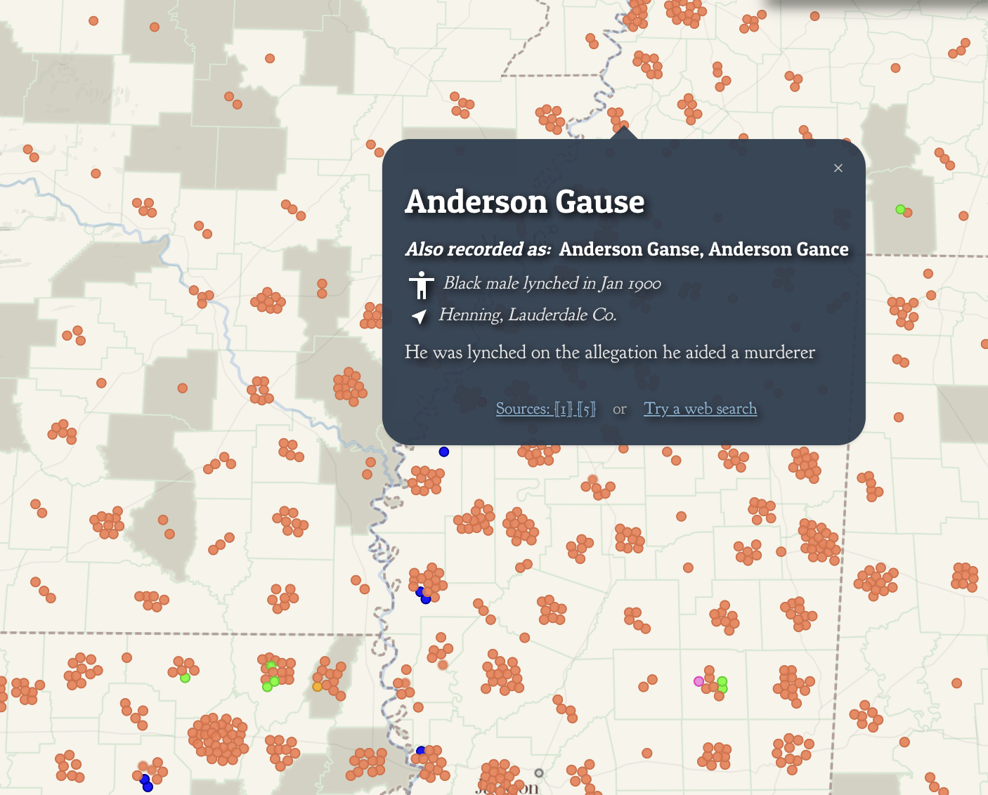
Now, let’s take a dive into this week’s assigned readings. The two maps given are much more than sheer numbers: they are deep maps with associated readings and stories. In Monroe’s map, each lynching is tied to a name, gender, when they were lynched, where they were lynched, and why they were lynched.
Monroe & Florence Work Today. 2016. “Map of White Supremacy Mob Violence.” PlainTalkHistory. https://plaintalkhistory.com/monroeandflorencework/?u=2
It uses point vectors to associate deaths and certain coordinates (I presume), a very effective and efficient way to differentiate this map from a typical choropleth map. The tie to personal stories creates a much darker effect for the reader–instead of promoting people just as numbers.
Monroe & Florence Work Today. 2016. “Map of White Supremacy Mob Violence.” PlainTalkHistory. https://plaintalkhistory.com/monroeandflorencework/?u=2
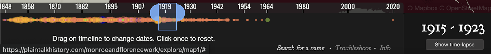
Further, a timeline along the bottom expertly shows change over time (a common struggle for cartographers). I would like to use/create something like this for my final project.
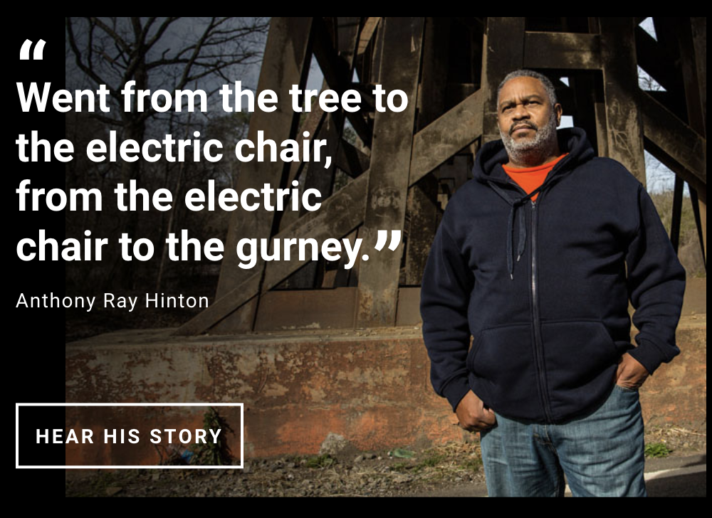
Instead of using maps TO tell a story like Monroe, EJI tells a story and uses maps to AID in this. It first delivers personal anecdotes, quotes, memories, and a short film to show how slavery progressed into a looming issue of lynching, and now into mass incarceration. Monroe focused on the issue of lynching, while the EJI went back to the root issue (slavery) and showed how this progressed as laws/society changed. An important quote guiding me towards this realization was from Anthony Ray Hinton, an inmate who was wrongly put on death row.
Equal Justice Initiative. “Lynching in America.” EJI. https://lynchinginamerica.eji.org/explore
Clicking on this then takes you to a short film about his circumstances, and further down the page two maps are presented. One shows the migration of African Americans out of the south using a decade-by-decade choropleth maps of state AA % population, and another is a choropleth map county-wide for lynching data.
For both of the projects above, original reports and sources are listed so that readers are able to read and come to their own conclusions if need be. I like their acknowledgment of this issue and the transparency aspect that it provides. A great solution for a possible ethical dilemma.
In the last assigned source, an article going over both of these projects and the associated ethics behind historic visualizations is given. Similarly to what I prefaced earlier, it highlights the fact that the author uses intentional silences to promote their cause (ie: EJI and systemic racism).
Hepworth, Katherine & Christopher Church. 2018. “Racism in the Machine: Visualization Ethics in Digital Humanities Projects.” Digital Humanities Quarterly, 12(4). https://digitalhumanities.org/dhq/vol/12/4/000408/000408.html
This again shows the importance of digging into the data/sources used, the map itself, and the individual/group that made the map. Different symbology, scales, classifications, colors, and other cartographic elements can be used to alter data in a way that it should not be. While the sole point of maps is to create and maintain a proposition, they should not be used to falsely promote a point for argumentation’s sake. Mapmakers themselves should adhere to ethical standards, but in the fact that this is not always how it works, readers need to be given access to original sources and be aware of tricks/deceptions used to portray data.
Well done Gabe – I particularly like your deeper-than-usual dive into the EJI/Google map. This is the strongest use of material from class I’ve seen in blogs this week too. Your strongest blog the semester and a fitting conclusion to blogs in the course!