
This article discussed the mapping of groups of people, specifically races. In the beginning, it explains different ways cartographers used to think about race, and then the idea of how the mapping of the races extended into census collections larger general ideas about race. It points out that oftentimes times one race will also be broken down into other races within one race.
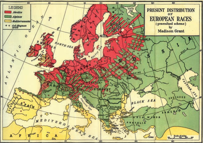
This map is one example of this happening, in this instance the map creator broke down Europeans into three sub-races, but even then could not seem to decide what sub-category different regions of people fit into, especially towards the middle of the continent.
The article pointed out that many maps of race are choropleth maps, with different colors representing different races or concentrations of races, with very few other features accounted for, such as political lines or large natural features such as rivers and large bodies of water. This helps keep the attention focused on the message of the map. However, some maps of race might be less based off of statistics and more off of perception. Although still, it begs the question of what places a person in a race category?
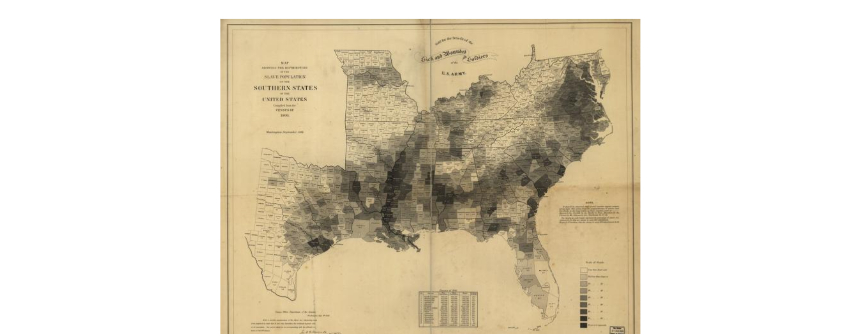
This map above is much more explicit where it gets its data than the previous map. It complied its data from the 1860 census and they broke up the information into percentiles within counties. This second map has much more information surrounding the mapped area than the first one, but it includes important information like why the map was made for the benefit of the wounded soldiers, the raw numbers of populations in the states, and a note on important information to consider on how even their carefully constructed map could still be misinterpreted. Still, some of these text blurbs represent more than they are just saying, one I thought about was how this map connected to the support of wounded soldiers.
Crampton, Jeremy W., “Maps and the Social Construction of Race,” in The History of Cartography, Volume 6: Cartography in the Twentieth Century, (Chicago: University of Chicago Press, 2015).
Hergesheimer, E. Map showing the distribution of the slave population of the southern states of the United StatesCompiled from the census of. Washington Henry S. Graham, 1861. Map. https://www.loc.gov/item/99447026/.