
As I examined these maps, I couldn’t help but draw a connection to something familiar. It reminded me of my high school world history class, where we took a look into the spread of the Black Plague across Europe. The connections between mapping diseases then and now struck me, and made me realize this is a very common thing that happens.
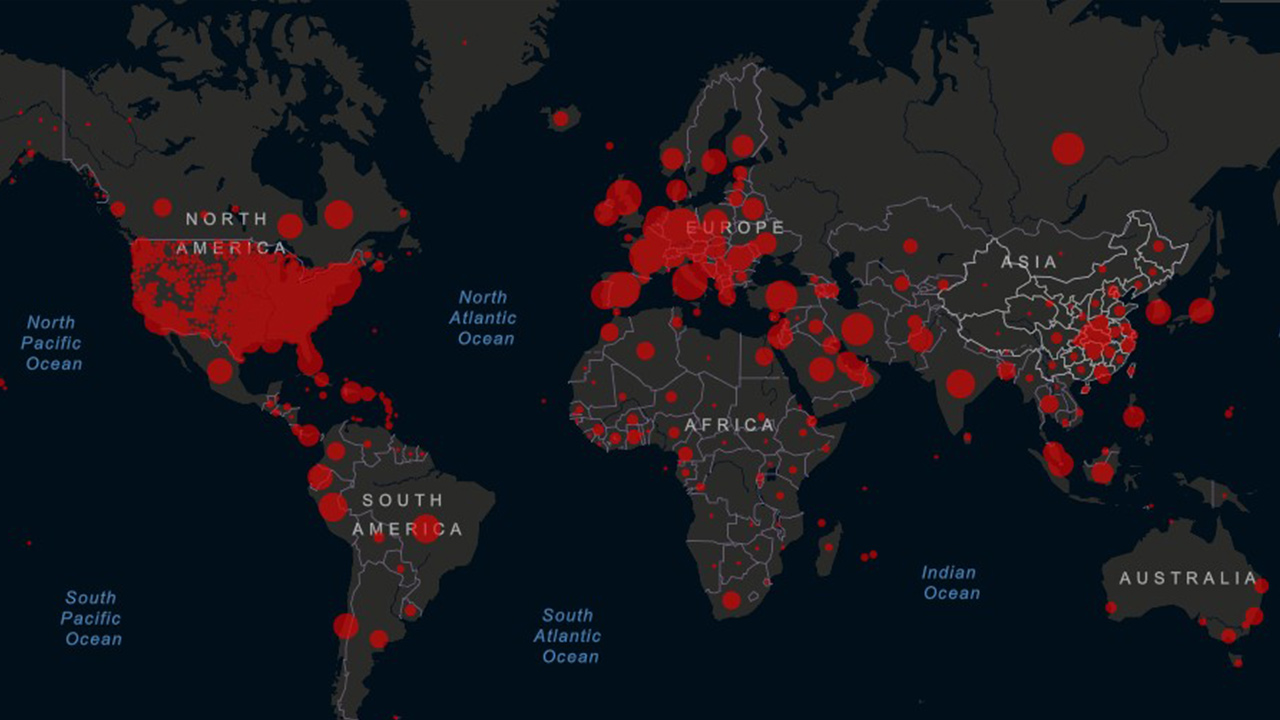
Examining Jon Snow’s map, also reminded me that we found ourselves similarly looking at maps depicting the spread of Covid just a couple of years ago. These visuals became a staple on the news, illustrating the spread of the pandemic. It struck me how common mapping diseases has become, showing the significance of visualizing such data for a better understanding of public health challenges.
Jon Snow’s 1855 map, even though it is super old still resembles the maps we saw just a few years ago. Focusing on the spread of Cholera, this historical map caught my attention for its description of hospital locations and water pump placements. The depiction of water pumps is even more interesting because of their role during the 1800s. It’s fascinating to see how the map not only traces the disease’s movement but also shows infrastructure that played an important part in combating the spread of Cholera during that era.
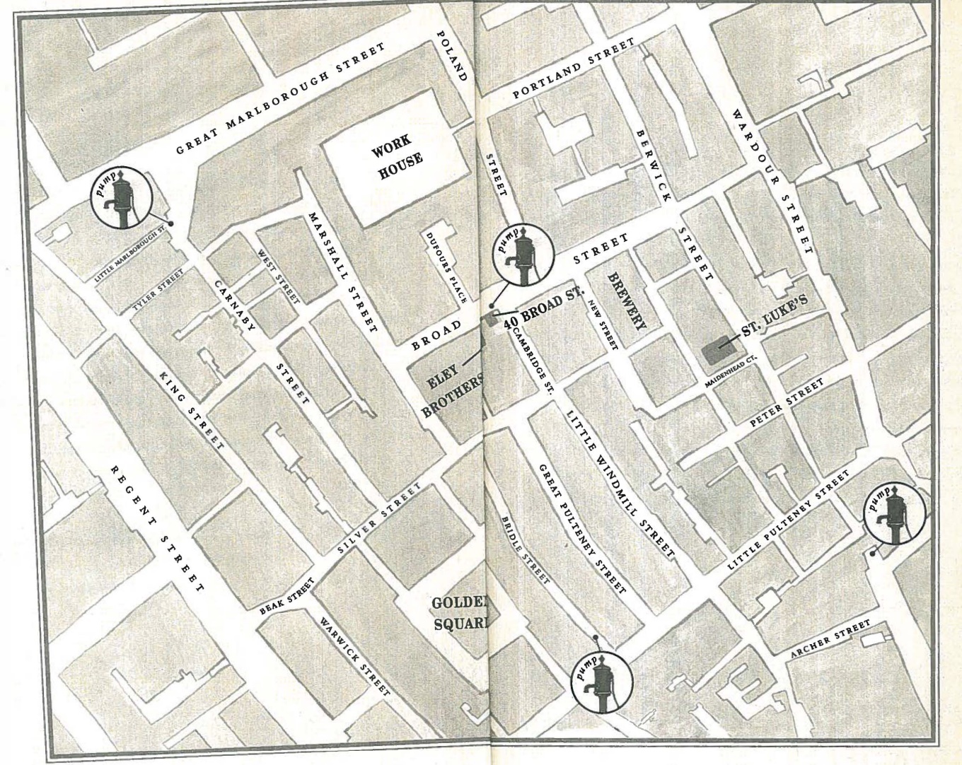
Nice incorporation of outside material, and you’re right, medical mapping of disease remains an incredible powerful tool of analysis and public health – my question for you is WHY? Why are they such powerful tools (in Snow and Johnston’s [unmentioned] day – and still today?)