Ethics of Mapping History

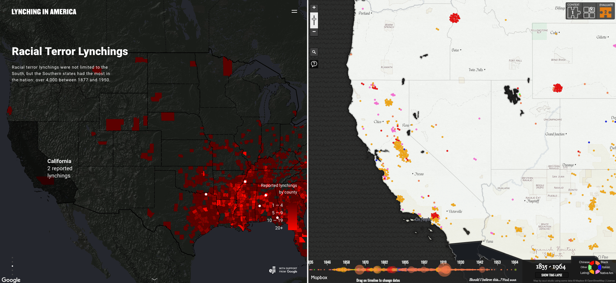
The actual injustices carried out during the Jim Crow of American history can never be fully mapped or measured. Some groups, like the Equal Justice Initiative, have attempted to use raw data to display lynchings as a statistic. People who were murdered in a heinous way become points on a map.

Map from EJI depicted a very southern-based map of lynch crimes during the Jim Crow era.

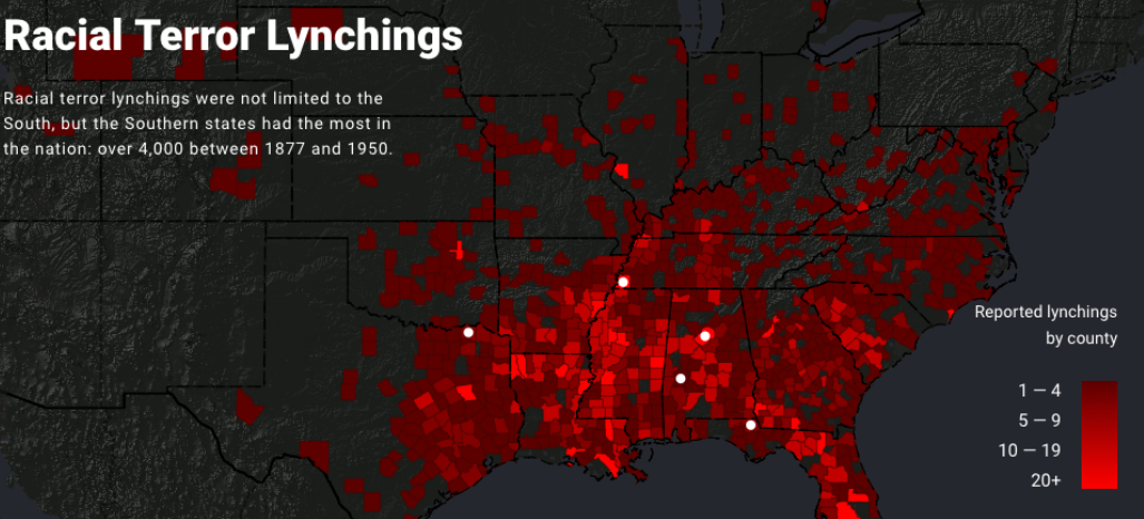
This map is flawed in multiple ways. The data focuses nearly completely on the southern states. The reality of the lynching during and after the Jim Crow did not just occur in the South; it is a disservice to those who were murdered to claim to have a comprehensive map of lynchings while excluding states north or west of Texas. Katherine Hepworth writes, “demonstrating how choices about representation, interaction, and annotation in their data visualizations either do harm in the sense described above or challenge dominant narratives.” The map does represent a terrible crime against a certain group, but it can be seen more as a tool to push an agenda. “Lynching in America is a promotional and advocacy tool for the Equal Justice Initiative, primarily created to visualize data within (and thereby promote) the report “Lynching in America,” which records lynchings of African Americans and frames lynching as a societal tool — enabled through mob violence and discourses of white superiority” (Kepworth) This demonstrates how ethics are essential when performing research and displaying data in such a way.

Map of White Supremacy Mob Violence from MonroeandFlorenceWorkToday

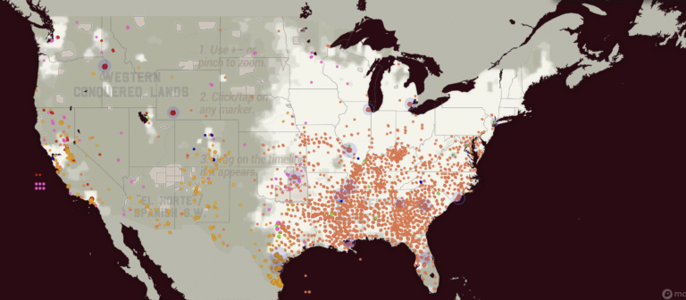
The second map depicts lynch crimes as much more a widespread human tragedy. This map from Monroe and Florence’s Work Today depicts lynching during the Jim Crow era in a more unbiased and human light. On the site, you can see individual names. The first map shows counties reporting the number of lynchings specifically against black Americans. The Monroe and Florence Work map today shows Chinese, Black, Latinx, Native, Italian, and other groups in their data. This map is a great example of what can be lost when looking at tragedies like lynching as nothing more than data. The human side of the event is forgotten. Stories are lost.

These maps made me think about how data visualizations are not static. Data and algorithms are from human experiences and sometimes suffering. Church and Hepworth write, “[H]umans are at the center of algorithms, not only as their creators but, in the case of data-driven algorithms, as the producers of the content they shape and present.”

The ethics of mapping is unique in how maps can leave out critical data and still represent data that can be used. Audiences for maps decide what data is shown. No map can show everything. As seen above, some maps are biased in what they choose to show, leading to a pushed idea. Those who subscribe to that idea have a partial picture of what Jim Crow-era lynching encompassed.

Mapping ethics also needs to be concerned with what is being displayed. Each dot on the Monroe and Florence Work Today is a person who lost their life in senseless, unjust violence. The map displays how this violence was not just in one region or against one group. The ethics of the Monroe and Florence map displays how some maps lack ethics and only exhibit one group.

  1. Hepworth, Katherine & Christopher Church. 2018. “Racism in the Machine: Visualization Ethics in Digital Humanities Projects.” Digital Humanities Quarterly, 7.  ↩︎
  2. Monroe & Florence Work Today. 2016. “Map of White Supremacy Mob Violence.” PlainTalkHistory ↩︎
  3. Monroe & Florence Work Today. 2016. “Map of White Supremacy Mob Violence.” ↩︎

Riley Filipowicz Blog 8


The focus on lynchings in African American history, especially in the Southern US during Jim Crow, is crucial. But it almost simplifies racial violence to a certain extent. Lynchings were horrific and symbolic of white supremacy, but they’re just a small piece of a much larger puzzle. Racial oppression included many forms of abuse, not just public executions. Lynchings have become a symbol of racial hatred, shaping attitudes and policies.

While lynchings are often associated with the Southern United States during the Jim Crow era, it’s important to recognize that they weren’t only happening in this region. Lynchings occurred throughout the country, including in the North and West. They might have been less frequent but were almost more powerful. African Americans faced all sorts of racial violence in various parts of the nation. They showed that racial problems were not just subject to only happening in the South. Lynchings served as brutal displays of racial terror and domination.

Comparing the two maps shows big differences, especially on the West Coast. In California, it shows two different maps. One of them shows only lynchings of African Americans, and the other depicts lynchings of all sorts of various races such as Italians, Latinos, and Native Americans. The second map shows widespread lynchings across California, reflecting white supremacy enforcement. However, the first map lacks clarity and suggests fewer lynchings in California actually happened. This is problematic as it downplays California’s history of racial violence, which goes against efforts like the Equal Justice Initiative’s aim to challenge black incarceration.

I took this screenshot from the article, Lynching In America. I placed the map in 1950, so it shows the percentage of the total US African American population. The South obviously has the highest percentage of African Americans, but the fact that there were even lynchings in areas outside of the South is super powerful and important. Recognizing that lynchings occurred beyond the South is important for understanding the total extent of racial violence in American history. Lynchings in regions outside the South, like the West and Midwest, challenge the common belief that racial terror was limited to a specific area. These incidents across diverse regions highlight the widespread nature of racism. Take California for example, the first image I included makes it seem like only two lynchings happened there. That is an incorrect depiction because the next map I included shows that lynchings in California were not rare, and were actually rather common.

Understanding where data and information come from and its context is crucial for accurate understanding. Without this understanding, there’s a risk of misinterpretation or drawing incorrect conclusions. For example, if you did not include all of the maps in the article, one might think lynchings were not that big of a problem in California. Prioritizing transparency and critical analysis of data origins helps readers understand the full picture.

Final Project: Stage 1

How did the end of World War 2 affect the geography and reconstruction of Cologne, Germany? What was rebuilt? What was not? How does the destruction alter the city to this day? More than 20,000 buildings received damage throughout the duration of the Second World War, and more than 10,000 buildings were destroyed.

I want to research how much the bombings and destruction have affected the city to this day. How has urban development been altered? Were there parts of the city that were never rebuilt? Are there parts of the city that received more attention for reconstruction? Are there parts of the city that were wiped away completely in exchange for something completely different? I would like to focus on the city’s change over time and overall development due to WW2.

Final Project: Stage 2

For my final project I have chosen to investigate the number of people who have moved on to high education in Omaha, Nebraska. A recent QGIS project I completed about mortgages and loaning companies made me interested in looking at the education levels of. those individuals and comparing the two maps. The scope of my project will be looking at Omaha from 1920 to 2020, in order to receive a wide, but manageable, set of data. The possible sources of data for my project will consist mostly of digital maps and online data. I will be doing research into the typical education of the 1920s and how that has obviously changed when approaching 2020. I will also take into consideration the gender gap and the financial burden of going to school.

My final project will be displayed in a story map format because I feel this is the best way to display the different maps while giving context around and about them. This project will not only show that higher interest rates where given out to communities with typically more of a minority population, as well as those individuals who live in more affluent neighborhoods received higher education from schools with better resources. I feel as though the comparison of these maps will paint a clear and concise point about the red lining that took place in Omaha 100 years ago, but as well as the discrimination and segregation of minority communities.

Erin Buglewicz, Stage 2: Project Proposal

My final mapping project concerns developments in the small town of Hinkley, California, prior to and following the landmark case Anderson, et al. v. Pacific Gas and Electric, settled in 1996. Although it may evolve or slightly change as my research proceeds, the historical question I am hoping to address is how have factors such as population density and poverty levels in Hinkley been affected by contaminated drinking water? I will focus on mapping Hinkley with an emphasis on showing a correlation between the location of PG&E facilities and contaminated domestic wells or other drinking water sources. More specifically, this project will consider developments in population density and poverty levels spanning from the 1990s, right before the contamination came under the scrutiny of Erin Brockovich, to the 2010s.

To create my final mapping project, I will search for and employ different sources to find relevant data. Some possible sources that I may use include local newspapers, plume maps showing the spread of contaminated water in Hinkley’s groundwater sources, census data of the town between the 1990s and 2010s, legal documents concerning the case itself, and additional relevant information from sources like the California Water Boards. Additionally, I will also further explore ArcGIS Online to access base maps, which I may reference and use, particularly in terms of water contamination. I will also plan to research secondary sources, which will enable me to provide historical context to my maps. Some of these secondary sources may be reports and studies related to the water contamination in Hinkley, especially if they discuss socio-economic factors that contribute to how poverty levels have changed in the community over time.

For my final project, I plan to create a story map. Based on the nature of my project, this type of map would be effective for several reasons. A story map would enable me to introduce the topic of water contamination and the case involving Hinkley, CA. Because the storyline of the case against PG&E is vital to understand the historical context, it is essential that I incorporate the story alongside maps of the town that I will produce. Besides maps, this type of map project will also allow me to provide other visuals and video clips, if applicable, to enhance the story. Moreover, utilizing a story map will enable me to highlight important data and sites, such as PG&E’s facilities and contaminated water within Hinkley. After showing this, I will be able to clearly delineate my conclusion on how Hinkley has changed as well as why studying this case is relevant today.

This mapping project will ultimately serve as a case study for how contaminated drinking water affects communities. By exploring factors such as population density and poverty levels, both before and after Erin Brockovich helped to unearth the truth about the contamination, this project will display how the town of Hinkley has changed. This information will provide scholarly value because it can help inform contemporary discussions about environmental justice and policies as well as foster environmental advocacy, especially in terms of maintaining clean drinking water sources. This project will also have historical impact because it will delineate water contamination over a period of time and how the community has changed as a result. 

Project Proposal

My plan is to look into Forest Park in Saint Louis, what the city’s intention for it is, and what it actually means to people during different points in time. Since it’s such a small area and I’m covering a range of different times and contexts, I think a series of detailed maps would be best. These would either be interactive maps or infographic maps, like the map of the United States by Bill Rankin that we looked at in week five. Instead of going into such deep detail with the map symbols, though, my text would be about historical context. I’d like to figure out how to put as much information on my topic into the maps, themselves, but I do think the accompanying writing will have to do a lot of the heavy lifting.

In addition to historical context, I’d provide specific, real-world examples of ways that people have used the park. For recent history, I plan on interviewing people I know, but looking further back, I’ll need to get these stories from newspapers or personal journals. This will be easy when it comes to the World’s Fair, but trickier for the time in between then and the present. Historical maps and pictures will also be very useful.

This project will illuminate the effects of spacial design and city spending, how much they correlate with the actual use of the space, and the ideologies that have driven the development of the park. What, and who, is it supposed to be for? Is the intention consistent with reality? I think I’ll come up with more ways the project has scholarly value as I do research, but at this point, I think I’ll find racial inequality and the idea of hostile vs. welcoming spaces emerging as a strong theme.

Mapping Ecological and Economic Disaster

Geoff Confer’s “Pasture and Plows” argues that the “plowing of the Great Plains for crop agriculture did not happen quickly,” which is true to a certain extent. The Great Plains had existed for many centuries before European settlement. The colonization and technologies that they brought with them allowed for the plowing of the American west to be exacerbated which contributed to a significant loos in farmland and various ecosystems.

Before the introduction of the plow, American grasslands were much more abundant. Humans, expansion, and the environment obviously play a crucial part together. As more people were expanding westward, more of the grasslands were being plowed for agricultural uses as well as disappearing all together to created houses, schools, etc.

Henry Gannett’s map of the westerly plains shows that with the technological state of the 1900s, there is a clear limit to man’s ability to completely alter a landscape. As noted in the map above, we can see that there was some land that was unable to be stripped of its natural state and converted for agricultural use.

References

Cunfer, Geoff. 2005. On the great plains. Texas A&M University Press, pp. 16-37.

Gannett, Henry. 1903. “Production of Wheat per Square Mile at the Twelfth Census 1900.” DavidRumsey.com.

Mapping Disease

During the mid-1880s in London cholera outbreaks were taking over the city. London was growing rapidly and by 1851 it was the largest city in the world. Due to the sheer amount of people in such a small space, waste management, or lack there of, became a tremendous problem. This problem was amplified by the popularity of water closets and the lack of a functioning sewer system (Johnson, 12). Because of these problems, cesspools that contaminated drinking water were causing a massive cholera outbreak.

John Snow’s Cholera Map from 1855 uses a type of bar graph to chart the number of deaths surrounding the Broad Street water pump which was the main source of contaminated water. This map aided in the development of the theory of disease transmission through water. This theory was seen as ground breaking because many people had thought the disease was spread through the air, because of the horrible smell due to improper waste management.

Alexander Johnston’s map the was produced a year after Snow’s, depicts the spread of disease on a global scale. Johnston attempts to link a natural phenomenon and disease transmission, he more or less links human movement and disease. This is very similar to the way Snow ties foot traffic around London to cholera contaminated drinking water.

Johnston’s map shows the British navy in blue and the routes they took around Africa and southwest Asia. It is noted that diseases are more widespread here than in places like Australia were the British had no contact at. I feel as though Johnston’s map would be easier to follow if he were to have focused on one disease, one color, and a wider area other than multiple diseases, multiple colors, and a smaller area. In my opinion John Snow’s map is easier to read and has created a better argument for the spread and progression of diseases.

References

Johnson, Steven. The Ghost Map: The Story of London’s Most Terrifying Epidemic — and How it Changed Science, Cities, and the Modern World. New York: River Head Books, 2006.

Johnston, Alexander. The Geographical Distribution of Health and Disease, in Connection Chiefly with Natural Phenomena. Edinburgh and London: William Blackwood and Sons, 1856. David Ramsey Historical Map Collection, https://www.davidrumsey.com/luna/servlet/detail/RUMSEY~8~1~24722~940061:The-geographical-distribution-of-he.

Snow, John. Cholera Map. 1855. https://kora.matrix.msu.edu/files/21/121/15-79-54-30-johnsnow-a0a1d5-a_16430.jpg.

Samuel Duncan: Blog Post Week 7

Nearly every aspect of America, geographically, has been recorded, surveyed, or designated to some degree. Nature does not always fit a mold. Often, nature breaks whatever humans set parameters in wild or catastrophic ways. This week’s maps display human parameters for nature in the great plains from the late 1800s onwards.

The map above is taken from Geoff Cunfer’s “On the Prairie” book. The maps show the percentage of grassland in individual counties. Over the years, the ecological impact of American expansion has moved from East to West. The westernmost portions of the recorded data remain the most grass-covered, while the east suffers. The reason for this is grassland devastation comes from the American government taking dominion over all of the land that that America encompassed. Cunfer explains that it is “to clear-cut a forest, but more absolute because the effort to maintain only a single species continues year after year.”

The ecological devastation comes from Americans requiring grassland for plowing, farming, and grazing for cattle. Compare the graphs above to a census taken around 1900. The devastation is displayed more accurately and with a more widespread map.

Henry Gannett, “Production of Wheat per Square Mile at the Twelfth Census,” U.S. Census Office, 1903.

How do these maps display an ecological disaster? The sheer volume of grassland destroyed over the years is drastic to any ecosystem. The amount of species that perished so that one could thrive is grounds for disaster. The people displaced, such as native Americans, are immeasurable. This map displays American expansion and the devastation a population is capable of on a massive environmental scale.

Geoff Cunfer, On the Great Plains: Agriculture and Environment, College Station: Texas A&M University Press, 2005.

Final Project: Stage 1

How has the level of education changed over the past 100 years in Omaha? Why does the number of college students seem to rise and fall so quickly? I feel as thought it would be interesting to look into the level of education across the city of Omaha from 1920 to 2020. One of our recent QGIS projects looked into the mapping of mortgages and interests rates given out to buy homes. From that project we were able to see that the higher interest rates were given out in communities with typically more of a minority demographic. I think it would be interesting to map the changes in education levels and compare it to the map I made of interest rates as well. 

css.php