
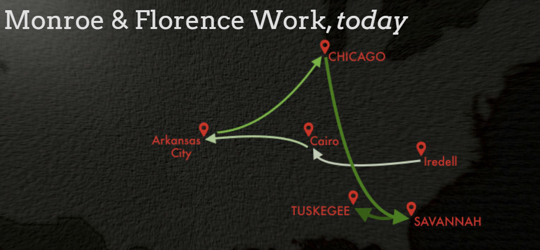
Monroe and Florence Work studied and tracked all lynching’s in the US due to the fact that no one was tracking them over all the small town newspapers. The map below shows where they moved throughout their lives in the story map dedicated to them. Them having to relocate so many times to get accurate data and continue there research was a key part of the beginning of the story map. If they had not had to move around so much it is possible that the information would have become public much faster than it did.
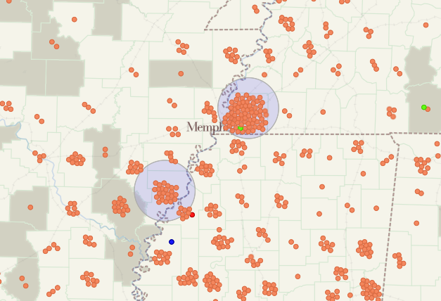
Below is a section of the Monroe and Florence Work map that depicts the lynching’s in and around Memphis, TN. Interestingly, the areas in and around cities have more lynching’s then the other areas although they are obviously depicted by numbers and not per capita. I would have expected most lynching’s to be rural as law enforcement tends to be more prominent in cities.
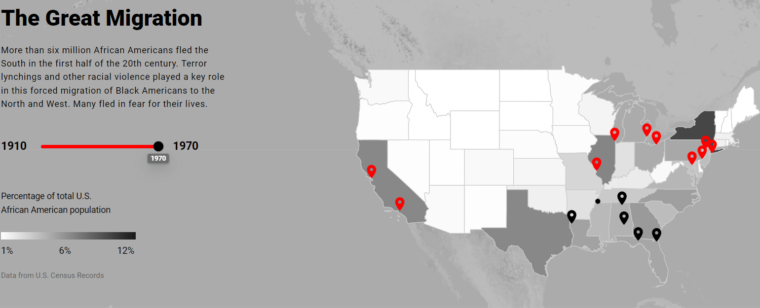
The Lynching in America Map depicts the lynching’s from more of a data standpoint than a story standpoint, focusing less on the activist and more on the reasons for the activism. My favorite aspect of the map is the section dedicated to the Great Migration, the slider is easy to use and helpful but the best aspect of the map in my opinion is using specific examples of cities that had large population changes, both by gaining and losing a large percentage of black residents.
The paragraph below from the Racism in the Machine: Visualization Ethics in Digital Humanities Projects discusses how humans were able to teach AI racism displays how deeply ingrained it is in our society. This phenomenon is not unique unfortunately, I remember an AI Seinfeld program that ran on twitch nonstop for about a week but got shut down when people taught it to be racist.

The image below is a screenshot from the Racism in the Machine article depicting a difference in information between the two maps, specifically in California but in the west as a whole, this difference in information is showcased as one of the flaws that comes from not using the data collected by Monroe and Florence Work.
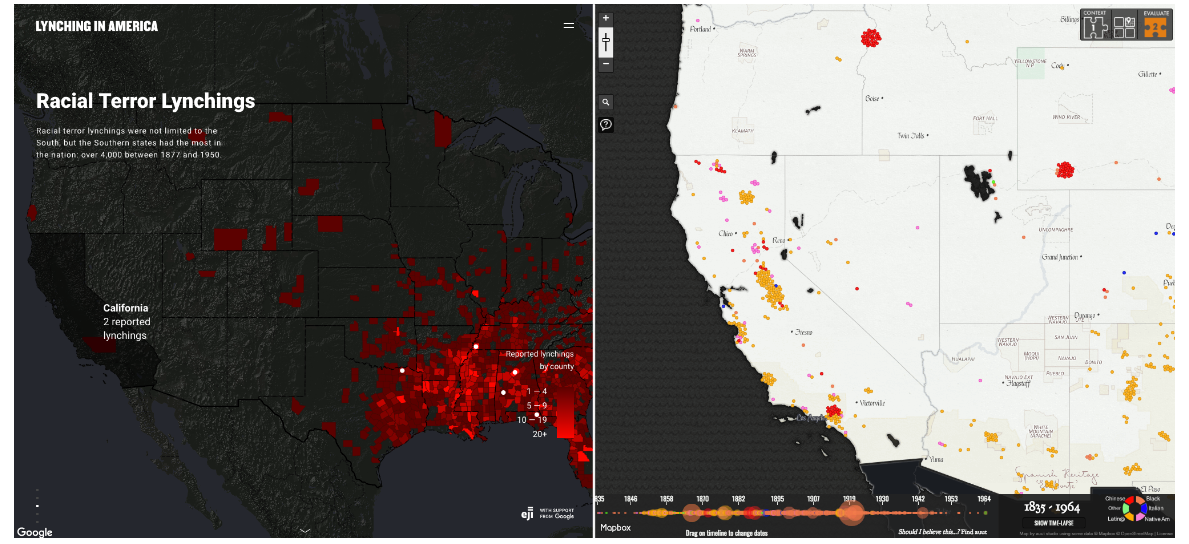
Overall the differences between the two maps are an interesting look into what data is readily and easily accessible at this point in time, which impacts the public memory of lynching’s. At this point the public memory of these events being accurate is remarkably important as there are so many misconceptions and misunderstandings about these events. I also appreciate that the Monroe and Florence Work maps contain demographic information on who was being lynched rather than simply that people were lynched. It gives more information and makes the people that were killed appear as they are, as people.
A decent effort, but not the strongest you’ve produced this semester. The engagement with the article (especially its ethical components) is somewhat thin. Late.